Figma UI Kit
Figma UI Kit
About the Figma UI Kit
We've built a Figma UI Kit to use alongside the guidance and code you'll find on this website. It'll make it easier to prototype and build things quickly.
All Figma resources have been built with our users in mind, with a strong focus on making sure accessibility is embedded from the start. That way we can provide an amazing experience that is usable for everyone.
Accessing the library for internal users
The UI Kit is turned on by default for all projects within our community. Check that you are using the latest version.
-
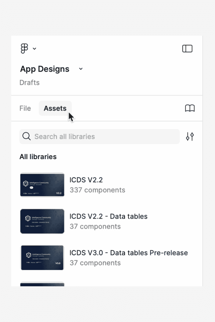
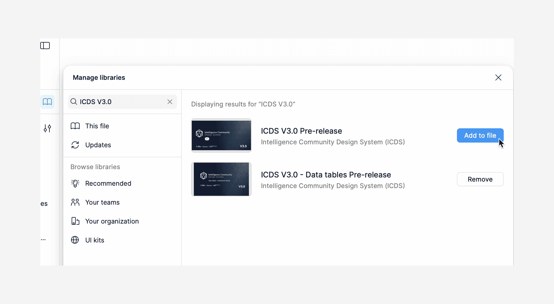
In a new or existing Figma design file, click 'Assets' from the left-hand side panel then click the 'Team library' icon (the book).

-
Make sure the latest Intelligence Community Design System library is added.

Enabling dark mode on components
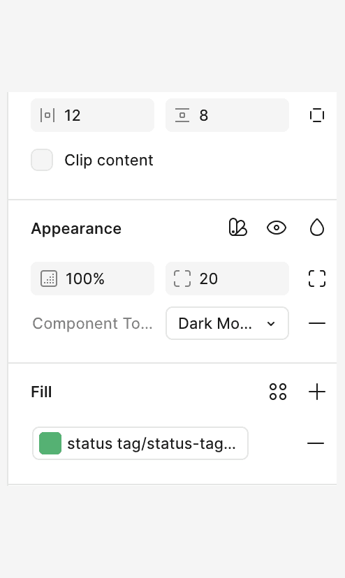
ICDS has dark mode variants for each component, which you can toggle between in your Figma designs.
You can achieve this as follows;
-
Select the component in the design.
-
On the right-hand side, under component properties, locate the
Themedropdown.

-
Change the selected value from
LighttoDark. -
The appearance of the component will change to utilise associated dark mode component tokens.

Not part of the Intelligence Community?
We've published our
You can make a copy of it in your local files and use the components in your designs. This is a static version and you won't automatically receive component updates. Check Figma Community regularly for new updates and versions.
-
Navigate to the
Intelligence Community UI Kit on Figma Community -
Duplicate the library into your drafts and connect your project files.
-
Use the
swap libraries
If you want to request a new feature, or if you notice any issues, you can
Data table Figma UI Kit
We have released our