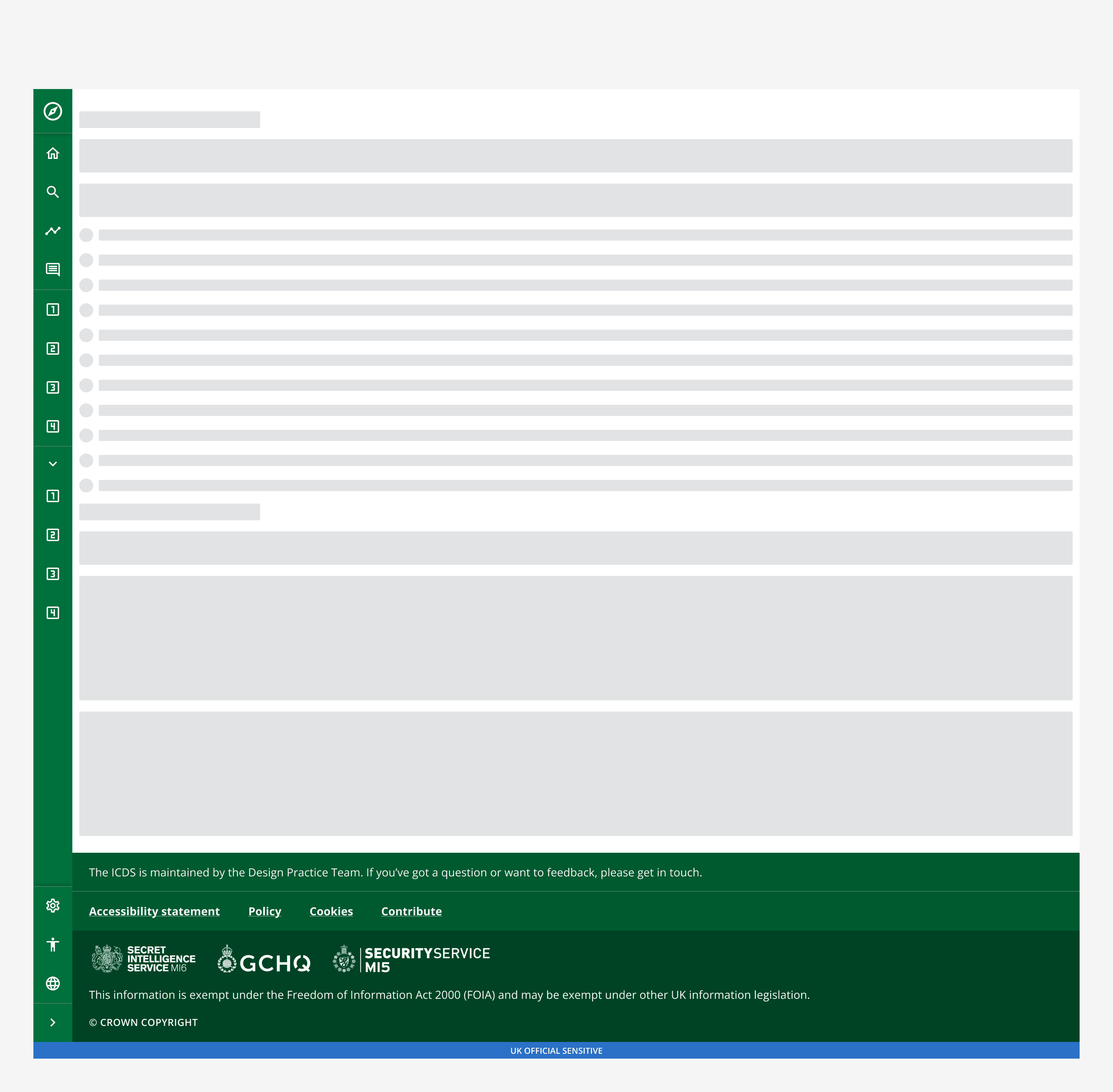
Side navigation layout
Side navigation layout
Introduction
This pattern includes the components:
With options for:
When to use
When choosing a layout pattern, make sure it works for all pages within your app and avoid switching layout patterns on different pages.
Use the side navigation layout to help provide more screen space for the main content. Side navigation is well suited to apps that have mutually exclusive features that need to be switched between easily from any page. For example, email providers often use side navigation to provide maximum screen space for email content whilst allowing constant access to other pages.
When not to use
For intranet-style and content-heavy apps, use the top navigation layout as it's better suited for providing links to a large number of pages.
Use either the top navigation layout or the side navigation layout. Don't use both at the same time.
Implementation
Make sure the pattern always fits the entire viewport and is never within another page container. The pattern content will adapt responsively when the viewport changes.
Always place the footer at the bottom of the page and below the fold, meaning users should scroll to see it.
Variants
Use the side navigation layout with additional components including page header to create other common layouts.
Page header
Use a page header to display an introduction to the content of the page. Add additional elements to provide actions, navigation or inputs at the page level.
For more information, see the
Back to top
Use the back to top component to help people quickly return to the top of a long page.
Consider using it on all apps to improve usability for everyone, including keyboard-only and some assistive technology users.
Don't use back to top when the page is designed to fill the viewport without scrolling.
For more information, see the
Customisation
This pattern can be branded to change the look and feel of the app. Use the

Accessibility considerations
When configuring a page make sure to follow all
We’ve tested this pattern against WCAG 2.1 Level AA. It’s been tested with NVDA and VoiceOver, and several different users with different interaction methods.