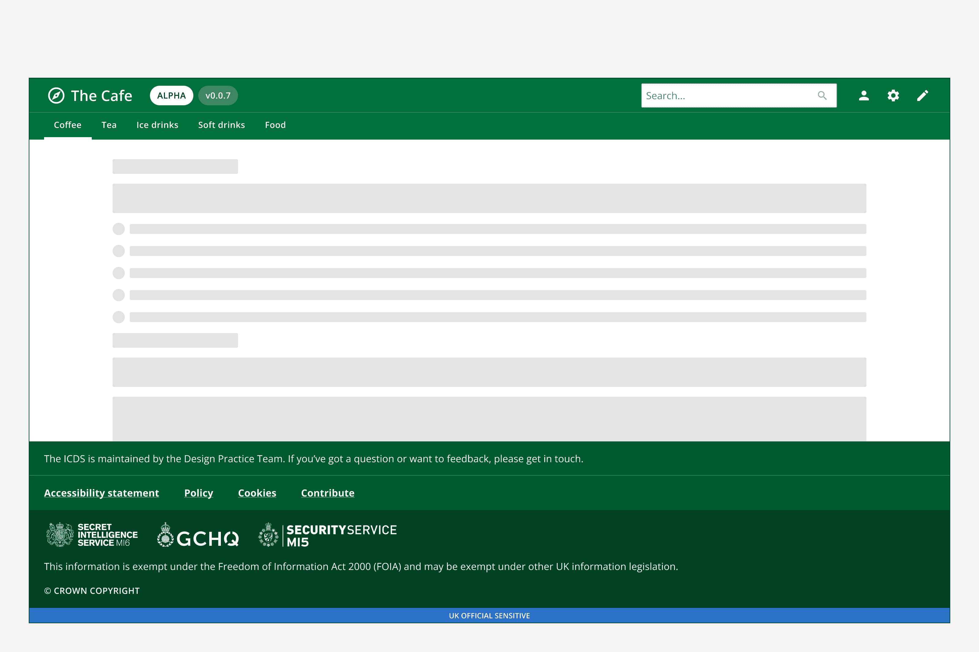
Top navigation layout
Top navigation layout
Introduction
This pattern includes the components:
With options for:
When to use
When choosing a layout pattern, make sure it works for all pages within your app and avoid switching layouts on different pages.
Use the top navigation layout for article pages or content-heavy apps with lots of text.
Use the top navigation layout with a mega-menu for access to a large range of navigation items.
Use a mega-menu for apps with complex page structures where every page should be accessible from any other page through the mega-menu. For example, department stores or supermarkets use a top navigation with mega-menu to provide access to their large number of product categories.
When not to use
For apps that require constant access to switch between pages, use side navigation as it's better suited for providing quick access and maximising the screen space for page content.
Use either the top navigation layout or the side navigation layout. Don't use both at the same time.
Implementation
Make sure the pattern always fits the entire viewport and is never within another page container. The pattern content will adapt responsively when the viewport changes.
Always place the footer at the bottom of the page and below the fold, meaning users should scroll to see it.
Variants
Use the top navigation layout with additional components including page header to create other common layouts.
Page header
Use a page header to display an introduction to the content of the page. Add additional elements to provide actions, navigation or inputs at the page level.
For more information, see the
Mega-menu
Use a top navigation with a mega-menu for apps with more than eight navigation options or options that can be grouped into categories. The main link groups are displayed in the top navigation and open a mega-menu when hovered over or focused.
For more information, see the
Back to top
Use the back to top component to help people quickly return to the top of a long page.
Consider using it on all apps to improve usability for everyone, including keyboard-only and some assistive technology users.
Don't use back to top when the page is designed to fill the viewport without scrolling.
For more information, see the
Customisation
This pattern can be branded to change the look and feel of the app. Use the

Accessibility considerations
When configuring a page make sure to follow all
We’ve tested this pattern against WCAG 2.1 Level AA. It’s been tested with NVDA and VoiceOver, and several different users with different interaction methods.