Layout and spacing
Layout and spacing
Using consistent layouts
The eight-pixel, fluid column grid provides the basis for every page. It enables consistent positioning and sizing of all UI components to build structure into the designs, and speeds up the creation of new pages and components.
Columns enable pages to be defined responsively, so that they look great on any device or screen size. Every component can be positioned across a number of columns and spacing between components is maintained through the use of gutters.
Using the eight-pixel square provides visual rhythm throughout the UI components as it allows internal elements to be consistently placed, and creates a continuous vertical flow using spacing tokens.
The eight-pixel square
Every component is created upon a grid comprising of eight-pixel squares. Each internal element uses position, sizing and padding values in multiples of eight pixels so that they align to this grid. Some smaller or more compact elements can use fractions of the eight-pixel square to achieve sizes such as four or two pixels.
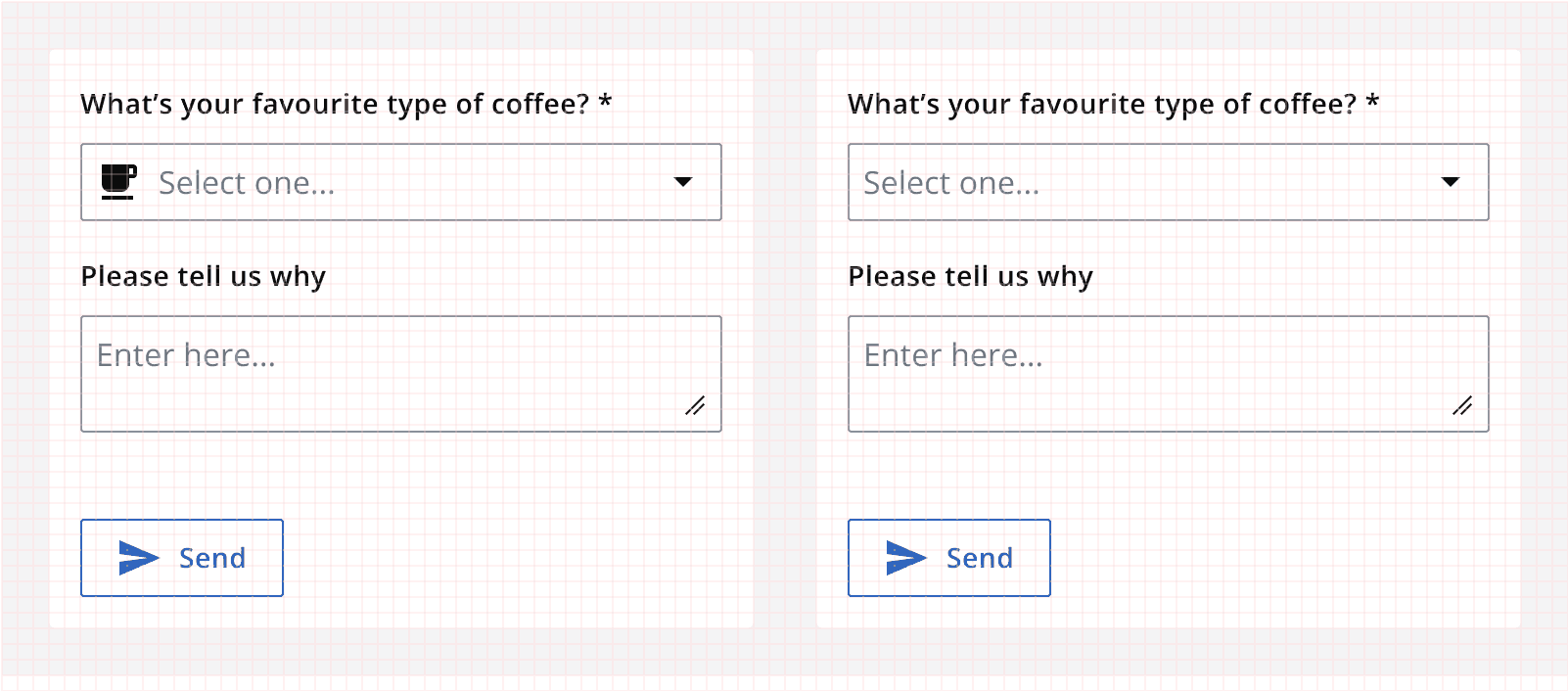
Spacing tokens are used within the components to make sure they are consistent and to allow the quick update of spacing within the system by changing the token values. The spacing tokens are all multiples of the base eight-pixel grid square.
| Spacing token | Value |
|---|---|
| --ic-space-xxxs | 0.125rem |
| --ic-space-xxs | 0.25rem |
| --ic-space-xs | 0.5rem |
| --ic-space-sm | 0.75rem |
| --ic-space-md | 1rem |
| --ic-space-lg | 1.5rem |
| --ic-space-xl | 2rem |
| --ic-space-xxl | 3rem |
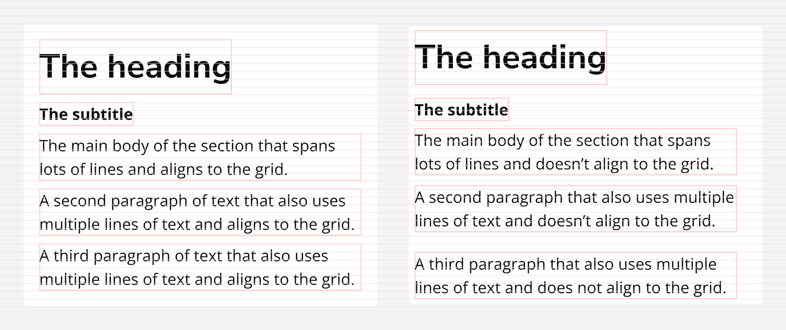
Elements are vertically laid out on a page also using these spacing tokens. This helps to provide vertical rhythm throughout a page’s contents and makes it easier to understand by organising the content into repeatable spacing patterns.
The fluid column grid
It's important that page content is visible on any screen size. The fluid column grid helps us quickly define how content will display at different screen sizes by specifying the number of columns any given component will span horizontally.
It dictates the positioning of each individual component along with the horizontal spacing between them, as well as how they will contract and expand when the viewport is resized.
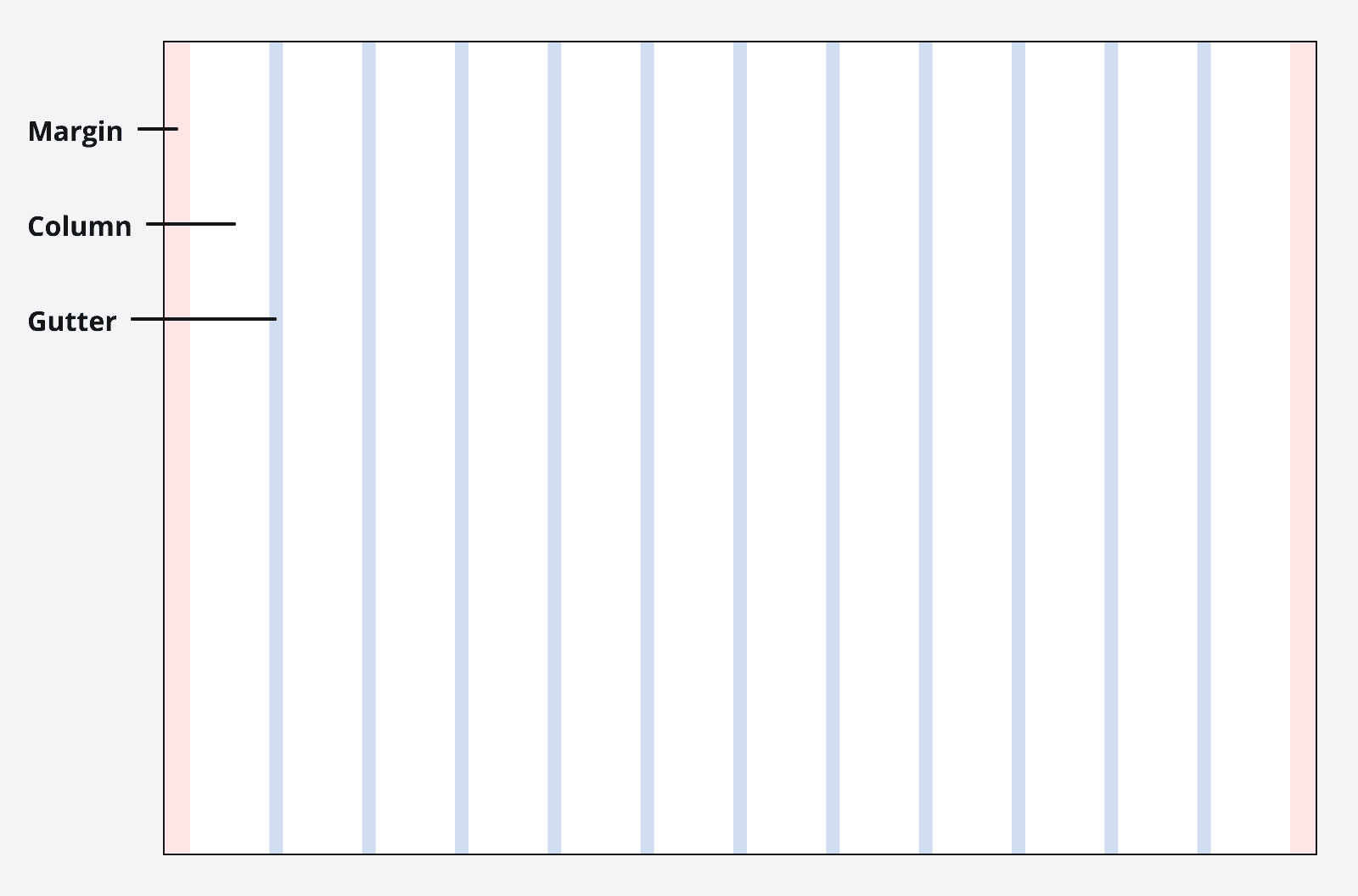
The fluid column grid is made up of three elements: margins, columns and gutters. The values for each of them can differ across different breakpoints.
Margins
The margins are the spaces between the left and right sides of the screen and the content itself. Margins can either be fixed, or set to scale depending on the implementation of the page at a given screen size.
Gutters
The gutters are the spaces between columns. These are always equal to one another, but can be changed to increase or reduce at different screen sizes.
Columns
The columns define the area that content can be placed. The number of columns can be set differently across different screen sizes and scale in width as the viewport scales.
Breakpoints
Breakpoints are defined horizontal viewport sizes that can be used to trigger changes in the values for margins, gutters and columns. This is what enables us to change how content is laid out as a screen changes in size.
| Breakpoint | Number of columns | Gutters | Margins |
|---|---|---|---|
| xs (<=576px) | 4(scaling) | 8px | 8px |
| sm (577–768px) | 8(scaling) | 16px | 16px |
| md (769px–992px) | 12(scaling) | 16px | 16px |
| lg (993px–1200px) | 12(scaling) | 16px | 16px |
| xl (>1200px) | 12(scaling) | 16px | 24px |
Max-width
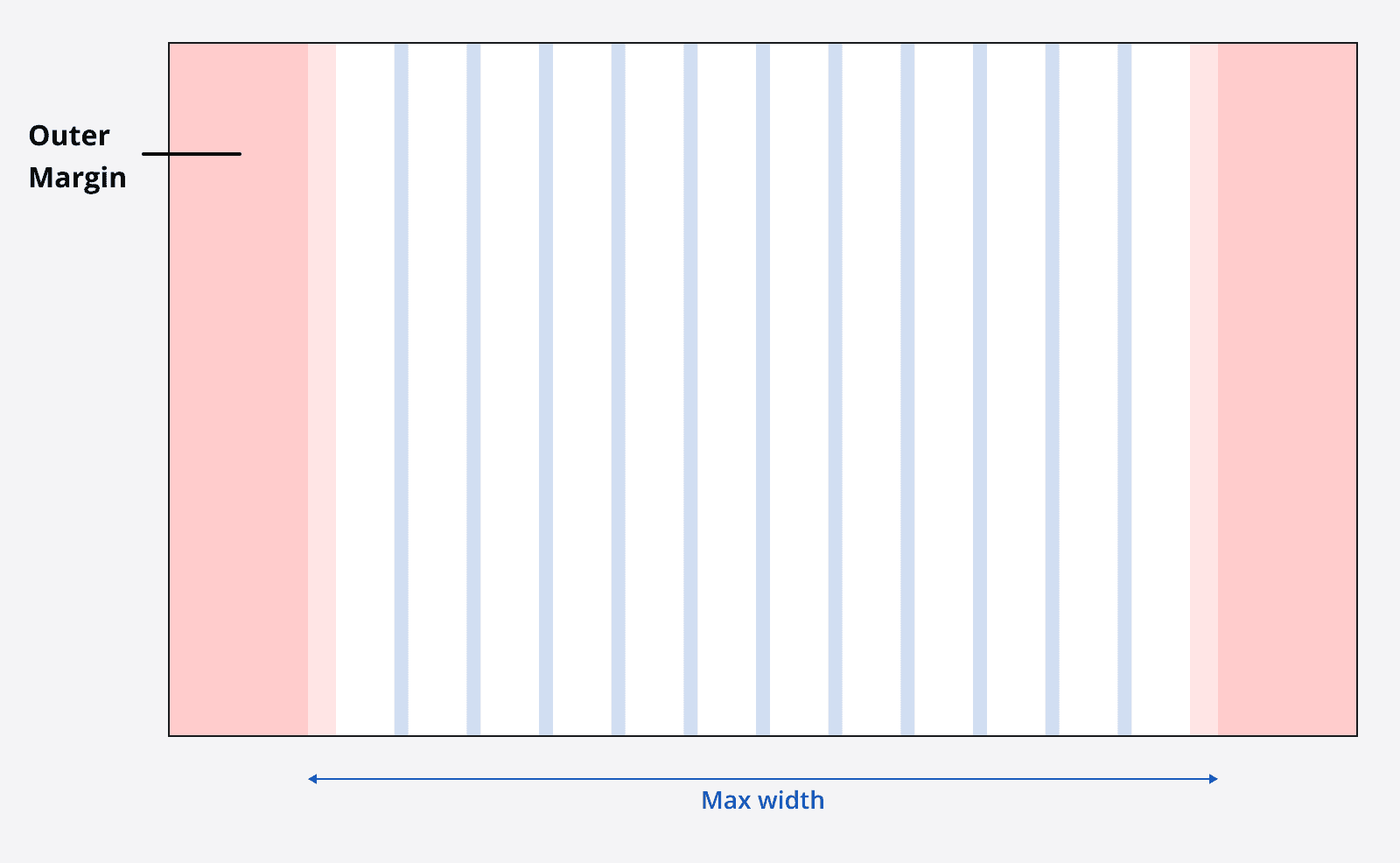
The grid can be constrained to a max-width if you don’t want the grid to span the entire viewport. This can be useful for very large displays, or to maintain a good readable line length for your page’s copy.
The max-width will limit the width of your grid to the max-width value, and add scaling outer margins around the grid container.
Laying out content using the grid
Page content can be defined as spanning a number of columns, and this number of columns can change across each breakpoint.
For example, a card component may span three columns on the extra large breakpoint, but span all four columns on the extra small breakpoint.
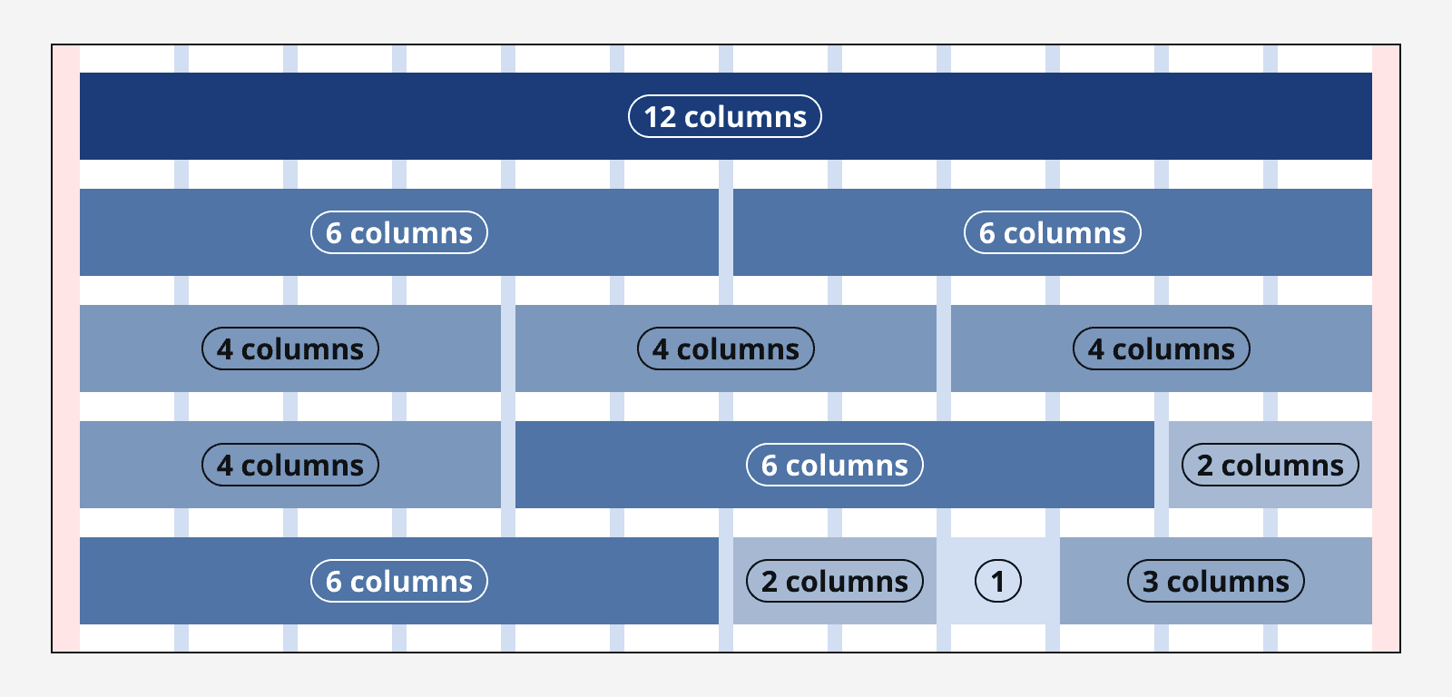
Not all content has to span a number of columns, it can instead be defined as having a fixed width and simply positioned so that it is aligned with the columns.
Take care when using fixed width elements so that they don't overflow the screen when it is reduced in size.
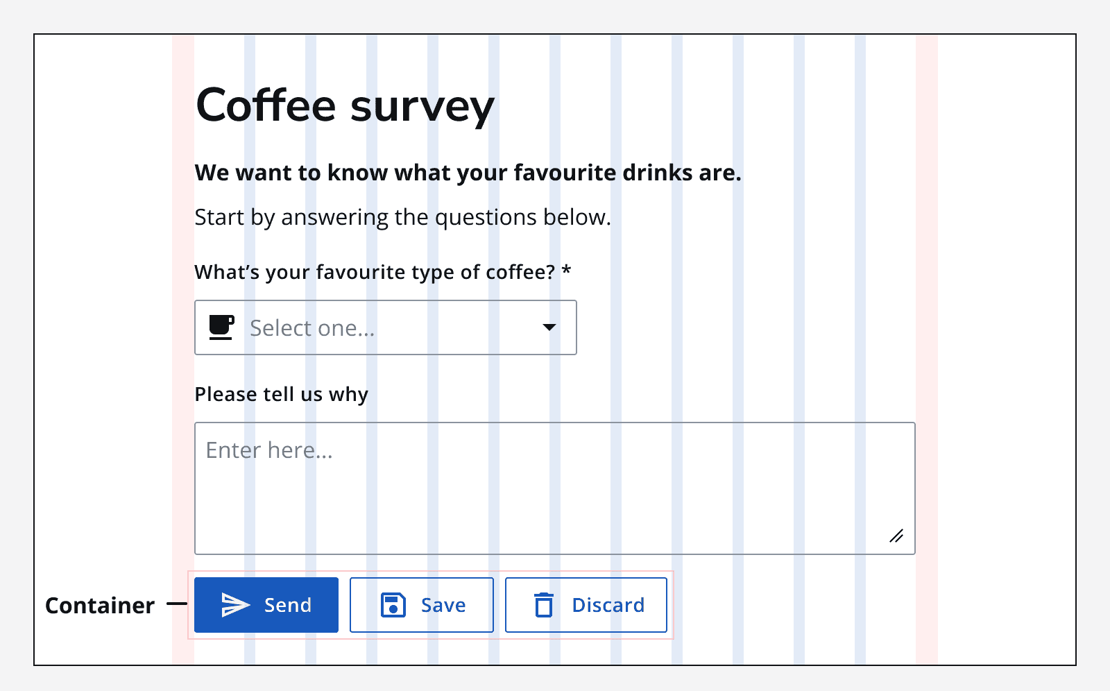
Content can be added to containers so that only the container is set to span grid columns. This can be useful when trying to align content in an enclosed area.
Fixed column grid alternative
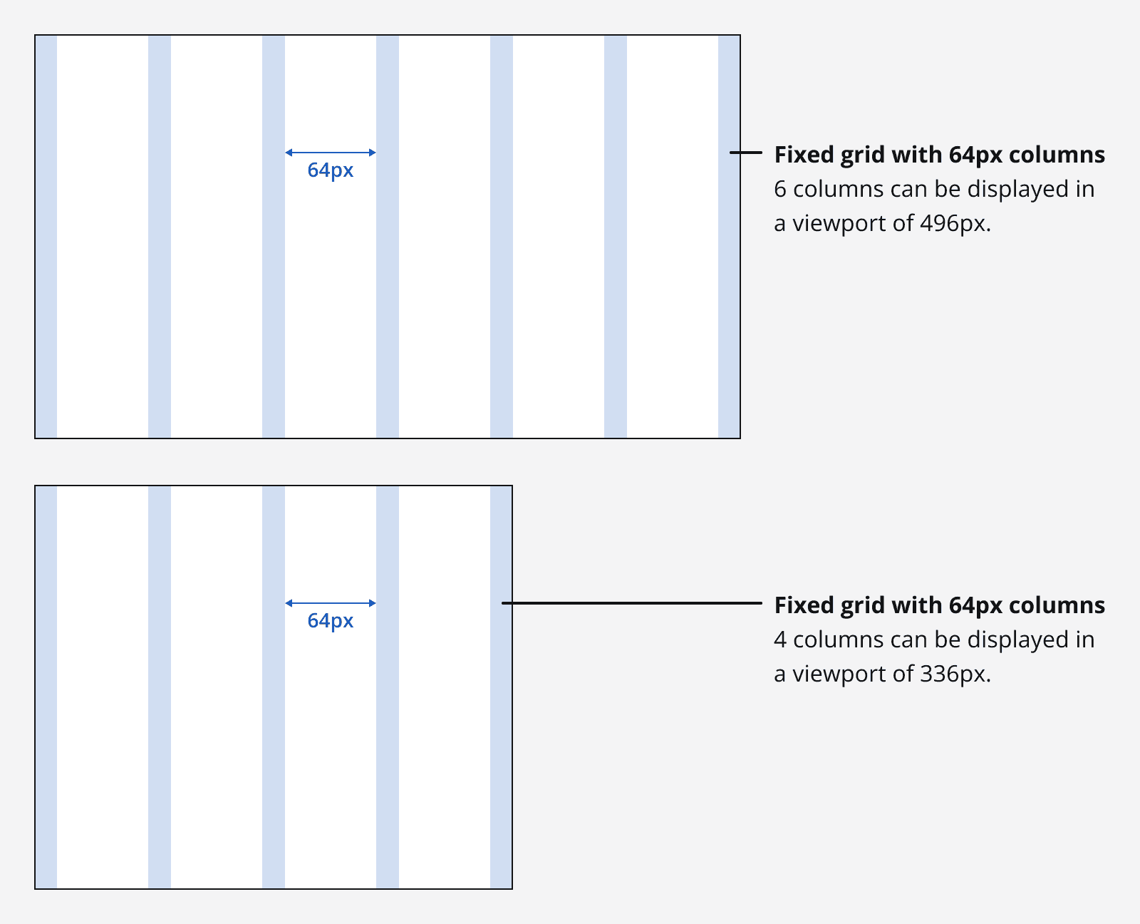
A fixed grid can be used instead of using the fluid grid layout defined above. Instead of the number of columns being specified, specify the fixed width of each column, and the page will include more columns as it grows in width and space becomes available. This can be useful when you are laying out content that can’t resize as the columns resize.
Zoom
When a page is zoomed in upon using the browser controls, the page and breakpoints will behave as if the screen size were changed. A zoom of 400% on a starting viewport that is 1280px wide is equivalent a screen that is 320px wide. This is one reason why it is really important to always specify your apps responsively so that all your content can be viewed equally by all users.
Grid influencers
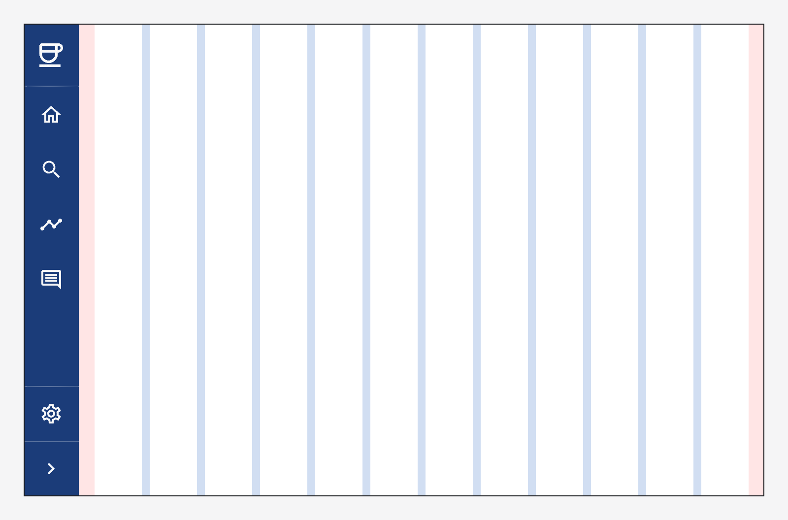
Sometimes other page elements exist outside of the grid and influence how it is sized. Including a fixed size side navigation forces the grid to occupy the remaining available horizontal width of the viewport.
For guidance on how these spacing and layout rules are applied within components, see