Designing for accessibility needs
Designing for accessibility needs
Introduction
The Home Office has created effective
This page displays the generic design implementations that benefit multiple forms of accessibility. We have suggested the following design guidelines to be used when designing a page or service.
Large font
Writing in a large font size will put less writing on a page and make the words more readable.
Accessible font size recommendations can be found on the
Our eyes are most often drawn to the larger text on a page. Less words on a page will feel like less effort to read.
Tabbing order
Allowing people to use the tab button on their keyboard to navigate between elements on a page will improve accessibility. Some people are unable to use a mouse, so this option increases accessibility.
The default keyboard navigation order must be logical and follow the visual flow of the page — i.e. left to right, top to bottom.
Descriptive actions
Ensure that actions describe their feature. Having a button or link that says ‘click here’ isn’t beneficial if ‘here’ isn’t specified.
Using descriptions stating exactly what the action does is more accessible.
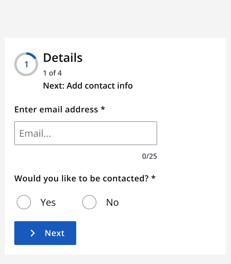
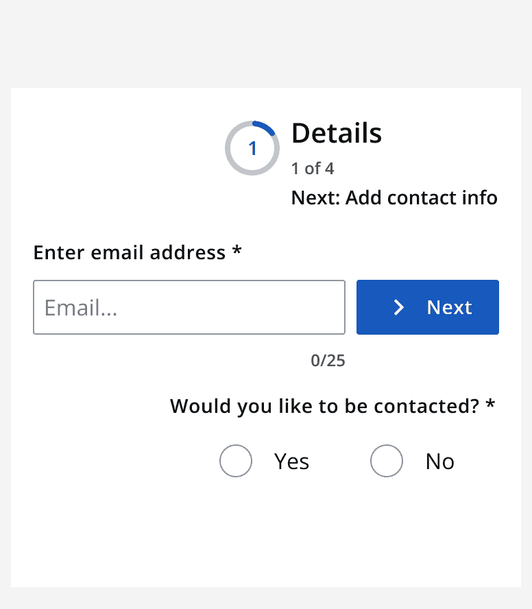
Simple linear layouts
Ensure data is displayed in a linear format that is readable for people. Don’t use confusing layouts.


Get user's opinions
Before confirming a design, we suggest you reach out to other members of your community to validate your design and make sure it works for people with accessibility requirements.
For more information explore how to
Additional accessibility resources
Check out the specific accessibility needs pages for more detail regarding designing for specific accessibility needs.