Accordion
Accordion
Introduction
An accordion is an expandable and collapsible section that is used to show and hide content. Accordions are used to shorten the length of a page by hiding information.
Group accordions to hide more content on the page and to structure content into different sections.
An accordion group can be nested within another accordion to create one layer of nested content. Do not nest more accordion groups within an already nested accordion group. Only use one level of nesting.
Interactive example
Our coffees - Ingredients
When to use
Use accordions to organise information, shorten the page length and reduce the scroll time when the page is initially loaded.
Use accordion groups to categorise accordions into sections with a title.
For example, use an accordion group for a frequently asked questions (FAQs) page.
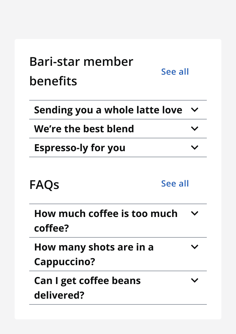
Use the accordion title section to title the group of accordions and contain the 'see all' or 'hide all' button. Don’t display a title to achieve a title section with only the 'see all' or 'hide all' button.
Use 'see all' and 'hide all' functionality to show or hide all information from all accordions at once.
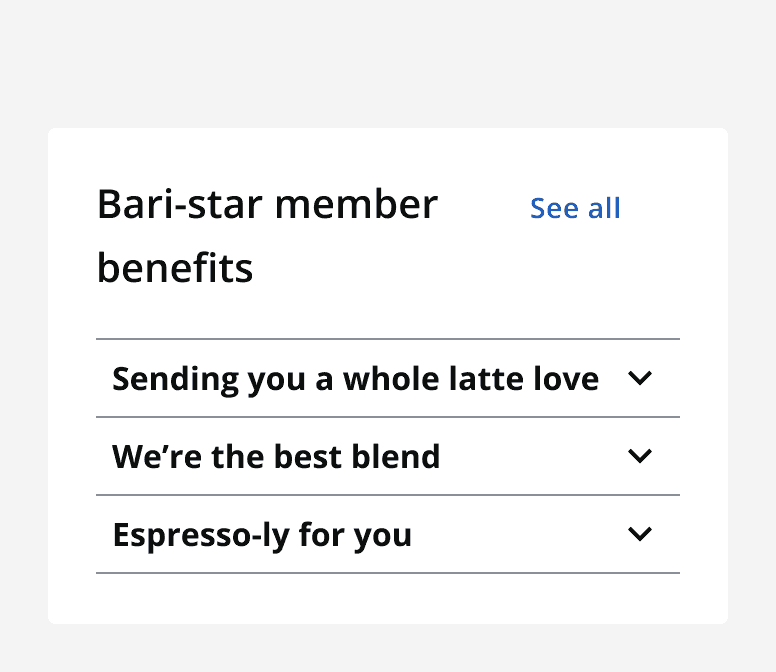
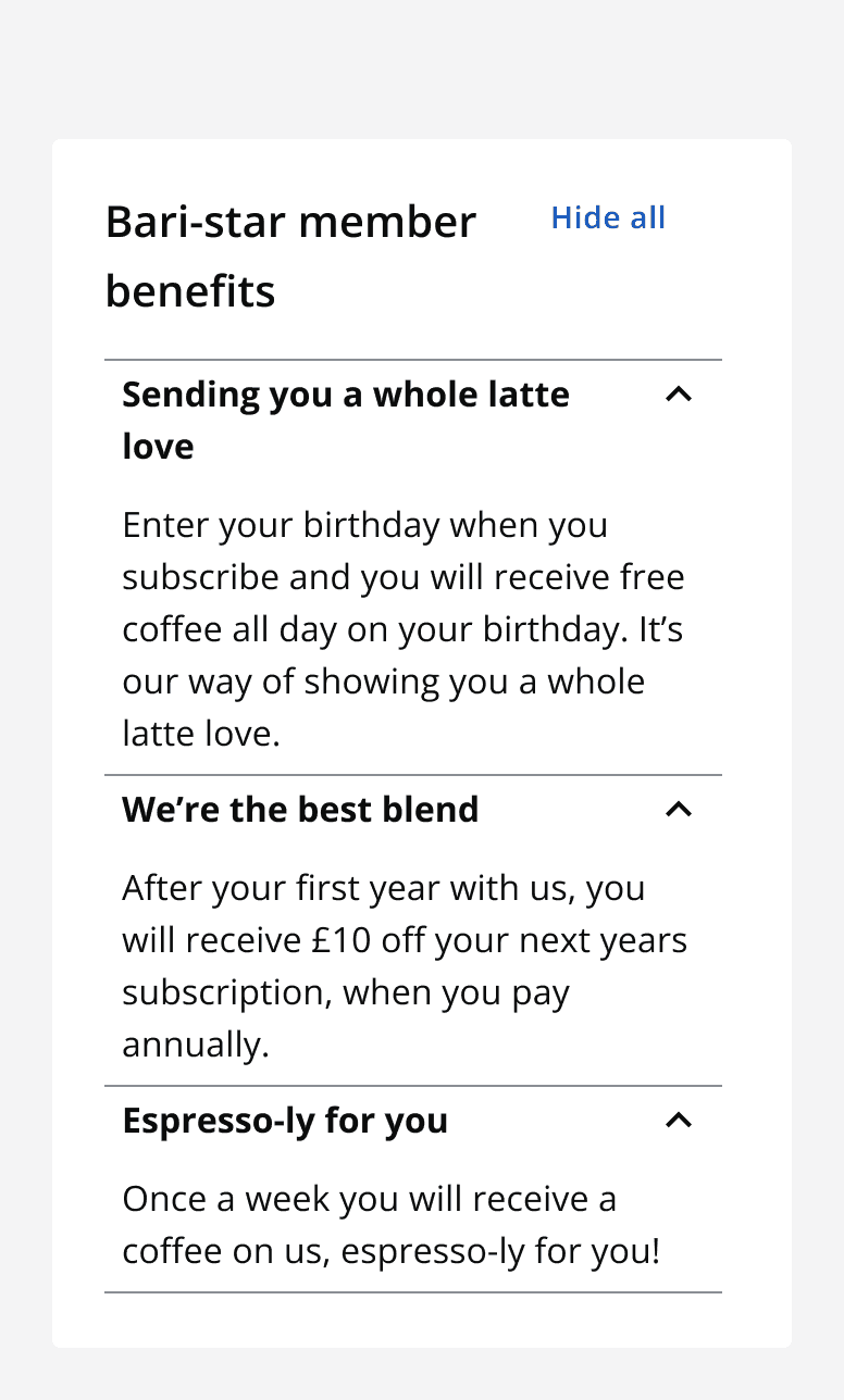
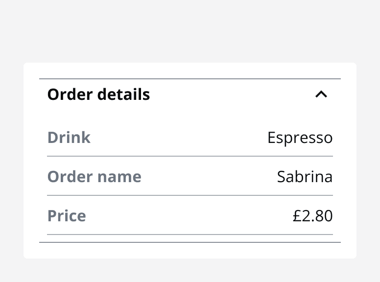
Add custom content to an accordion using the slotted section to create different uses for your accordions.
Set an accordion to open one at a time when the information in the accordions is unrelated.
Set an accordion to open all at once when all information can be viewed at the same time and is related.
When not to use
Do not use accordions when all information is critical to the people using the page.
Avoid overusing accordions to hide all information on a page. Accordions may be ignored if used too frequently.
Do not place accordion groups within nested accordion groups, one layer of nesting is the maximum.
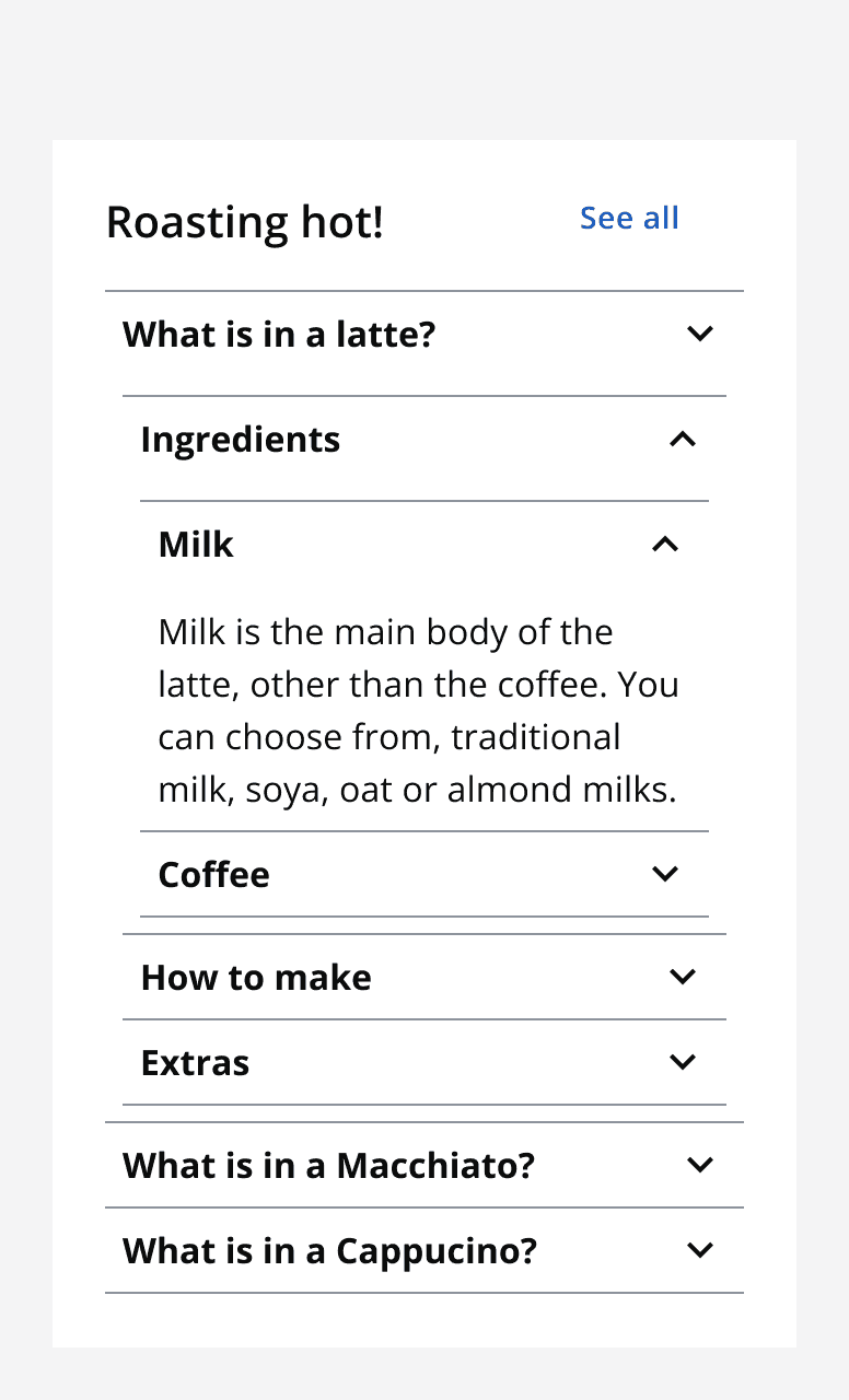
Do not use nested accordions as a replacement for an accordion group. Consider using multiple accordion groups on the page instead.
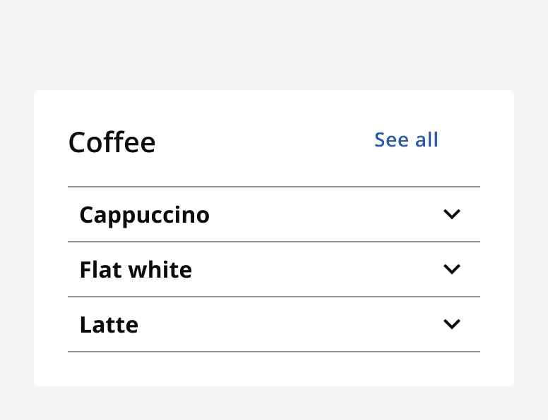
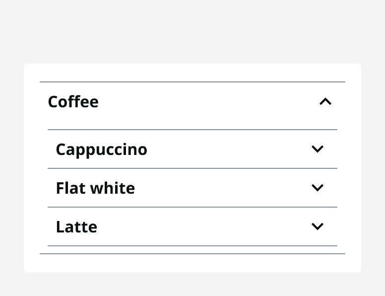
Colour
Use the dark or light theme withmonochrome={true}
to achieve colour contrast compliance when using accordions on different coloured backgrounds.
Sizing
Use an accordion's size property to change its vertical size and achieve compact or spacious layouts.
Set the width of the accordion depending on the screen size or the container that is being used.
Layout and placement
Use accordions in main page content. Accordions can also be placed within other components to organise content.
Content
Heading and title
When using a title for an accordion group, make sure it is relevant to the information provided by each accordion header.
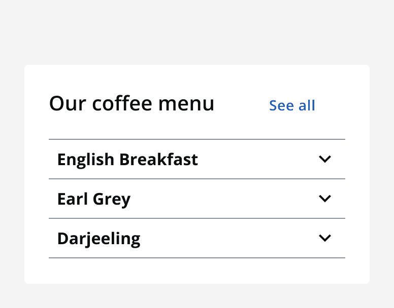
Always give an accordion a suitable header that is relevant to the information that it contains.
Relevant titles and headings allow people to skip over the information if it is not relevant.
Accordion content
Use text content by default or use the accordion slot to provide custom content or layouts.
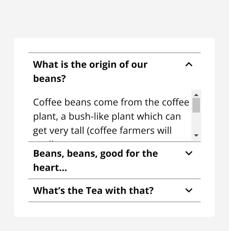
Do not make accordion content scrollable as this will interfere with the page scroll.
Icons
Use an icon on an accordion header to provide additional meaning or to aid in recognition.
Make sure that the icon is understandable and relevant to the accordion header and content.
Always provide alternative descriptions for icons if they aren't decorative. Only use icons if they are necessary, they are removed as default.
Accessibility considerations
Make sure to change an accordion’s semantic heading style to achieve a logical heading structure on the page.