Badge
Badge
Introduction
An example of the badge component.
Interactive example
Component variants
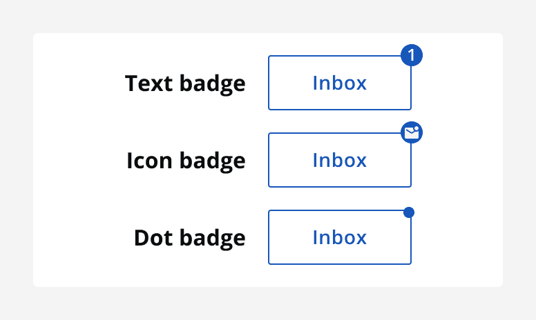
There are three types of badge available:
-
Text badge: Contains a short text label.
-
Icon badge: Contains an icon.
-
Dot badge: Badge background without any content.
When to use
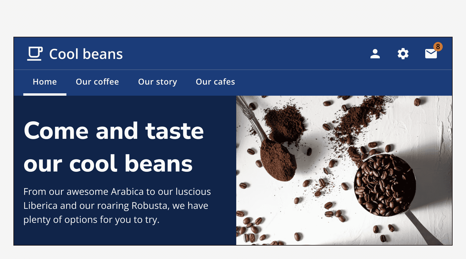
Use badges to draw attention to new or updated information. For example, use them to display an item count such as the number of new notifications, or to display an icon such as a padlock icon for locked content.
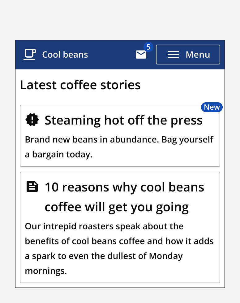
Use text badges to attach short labels to other information. For example, a badge could be used to highlight a new item in a list. Remember to keep labels concise.
Use a dot badge to indicate that something has changed or updated without displaying a text label or icon.
Use a text badge with numerical label to show the number of updates.
For example, use a dot badge to highlight that new comments are available to review, without giving the number of new comments.
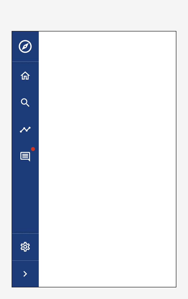
Only use badges when the component that it is attached to allows navigation to where the information related to the badge is stored. For example, a button that navigates someone to their inbox may show a badge displaying the number of new notifications that can be found there.
One exception is when using icon badges to add additional meaning only. For example, use an icon badge with a padlock icon to indicate that something may be currently locked due to access rights.
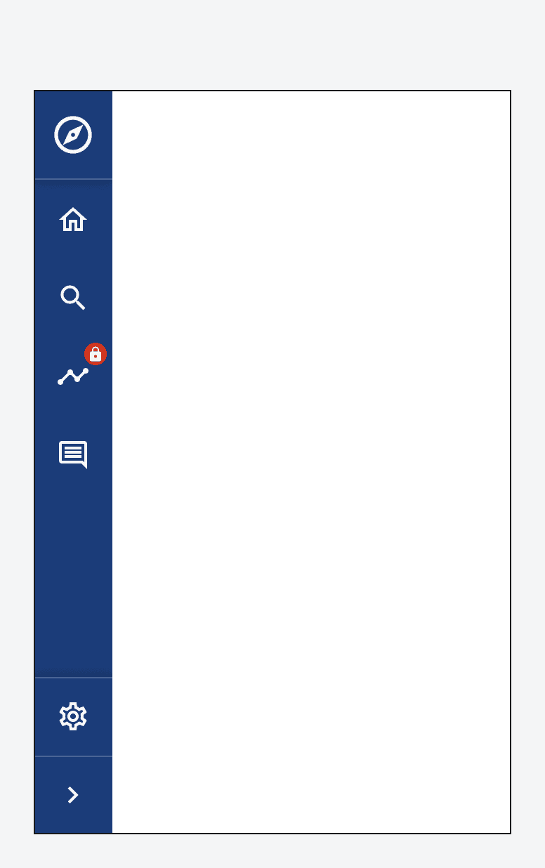
Use badges to convey status, but make sure to use a status icon on the badge to provide a clear way of understanding the status. Don’t rely only on the colour of the badge to indicate status.
For example, use a success status dot badge to indicate that something has gone online, but always try to back up the status message with textual messaging elsewhere on the page.
When not to use
Don’t use text badges as the only method of showing information, back the message up elsewhere. For example, show a toast notification for a new message whilst also adding a text badge to an inbox icon button.
Avoid attaching badges to non-interactive components. Aim to attach a badge to components that allow navigation to the information that the badge relates to.
Don’t use an icon badge as the only means of showing information on a non-navigational component. Always back up the message by including written messaging elsewhere on the page or showing feedback when the component is clicked.
For example, if using an icon badge with a lock symbol to indicate limited access to a navigation button, then allow the navigation button to still be clicked, but show a message stating that it is locked using a dialog or alert.

Avoid using badges as the only way of indicating status. Always show information about the status in full on the page that the badged component navigates to.
Don’t use multiple badges to indicate many different statuses at the same time as it is hard to understand what the different statuses could mean. When using badges to convey status, use one type of status badge at a time.
For an application showing different system statuses, don’t place multiple status badges on a component to show separate information such as online status as well as system health status.
For example, on an app for displaying coffee orders to baristas, don’t show multiple status badges on a single order. Don't display a badge to indicate time since the order was placed as well as a badge to indicate remaining number of products.
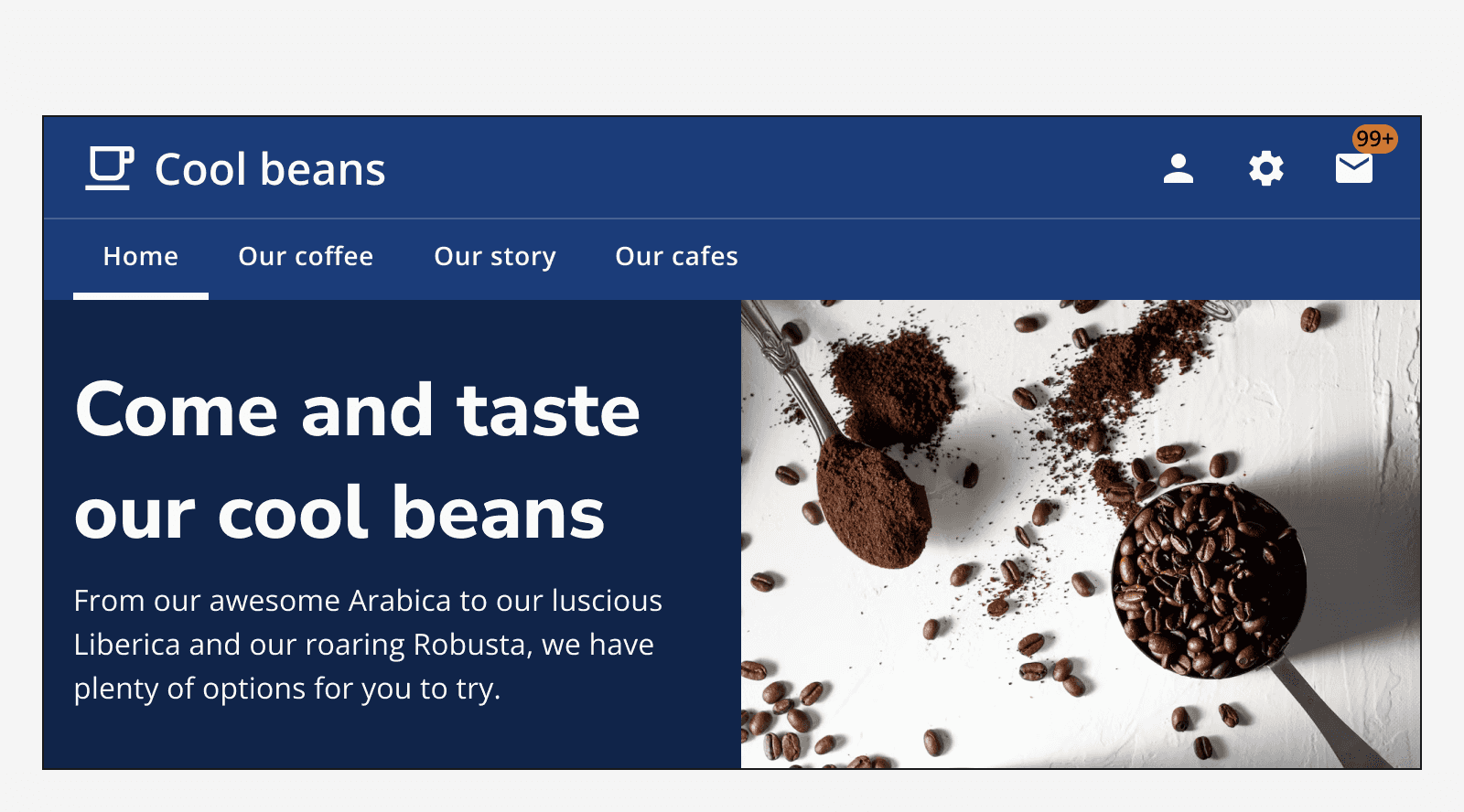
Avoid using badges with more than four characters, including the ‘+’ symbol. Use the ‘maxNumber’ property to limit what is displayed before a ‘+’ symbol is added. For example, this can be used to show ‘99+’ notifications.
Colour
Use the different colour variations of badges to make sure it achieves at least 3:1 colour contrast ratio with its background.
Specify a custom colour for the badge, but take care to make sure the colour contrast requirements are met.
Sizing
Use the same sized badge for the size of the component that the badge is attached to. For example, use a large sized badge with a large sized button.
Layout and placement
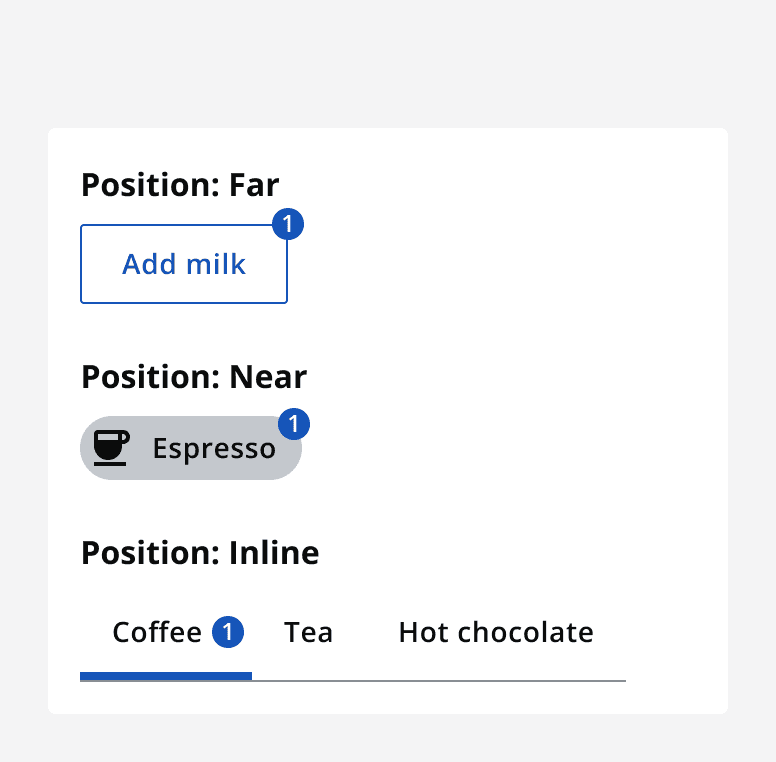
Badges are always positioned in the top right corner of the component they are attached to. Make sure the badge overlaps the border of the component by adjusting the badge’s positioning using the ‘far’ and ‘near’ positioning options. For square components use the ‘far’ positioning option, and for rounded components use the ‘near’ positioning.
For components that are adjacent to one another, such as tabs, use ‘inline’ badge positioning so that the badge sits in line with the component’s label.
Content
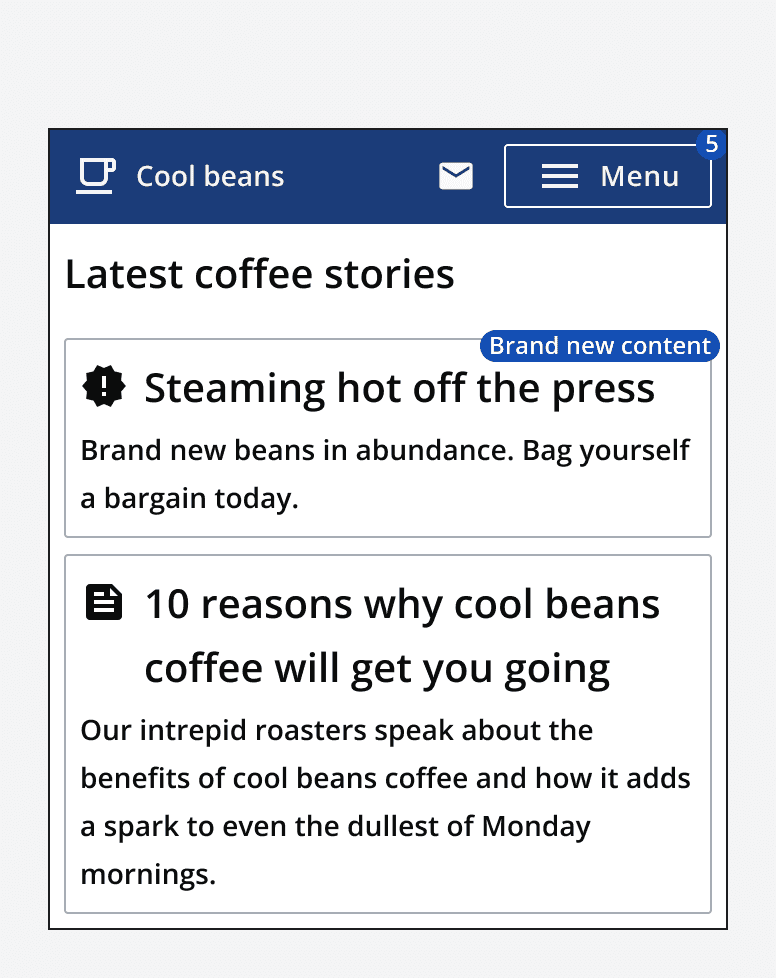
Make sure that it is obvious what the badge relates to. Only use badges when the component it is attached to is labelled clearly to indicate what the badge references. For example, a numeric badge on an inbox is easily understandable, whereas a numeric badge on a menu button may not be as clear as to what the badge represents.
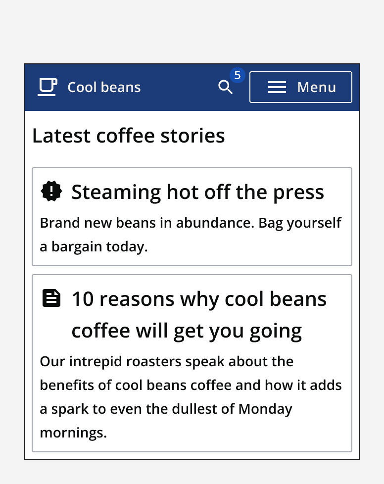
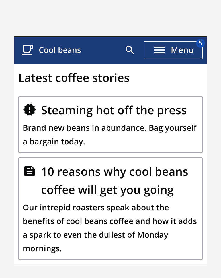
When using text badges, keep the text label short and only use a single word. Avoid using more than four characters on a text badge. For example, use a text badge to label something as ‘New’. Don’t use badges to add long labels; consider adding that information elsewhere instead.
If displaying numbers in a text badge, then set the ‘maxNumber’ property to limit the number of characters shown. This will show a ‘+’ symbol if the value is larger than the maxNumber.
Always provide an accessible label to add context to a badge’s label for the benefit of people who use a screen reader. Make sure to include any visible label within the accessible label.
Take care when using icon badges so that the icon is immediately understandable to its context. Don’t use abstract or ambiguous icons as this will make it hard to understand what the badge represents.
Accessibility considerations
Always provide a badge with an accessible label to add context for people who use screen readers. For example, a text badge displaying the number 10 might have an accessible label that reads ‘10 new notifications’.
When using an icon badge, make sure that the icon alt-text makes sense to its function and use the accessible label to add context.
When setting a badge’s colour, make sure it meets the minimum contrast requirement of 3:1 for non-text elements.
If a badge is added to a page because of a status update, make sure that screen readers announce its presence by using a live region.