Chip
Chip
Introduction
Chips are compact, rounded elements on a page. They display a label and can contain a leading icon. Chips can be used for several purposes and are useful to quickly understand content and context of a page. The heavily rounded edge on Chips makes them easily distinguishable from Buttons. They are always displayed in a dedicated section of the page, for example above a data table.
Component variants
Interactive example
There are three types of chip: Action, Dismissible and Static. Action and Dismissible chips are interactive, whereas Static chips simply present information and aren't actionable.
Style
Chip has two style variants.
Filled
Use filled chips to provide high emphasis on the displayed information.
Outlined
Use outlined chips to provide low emphasis on the displayed information.
Size
Chip has three size variants: small, medium, and large.
Dismissible chips
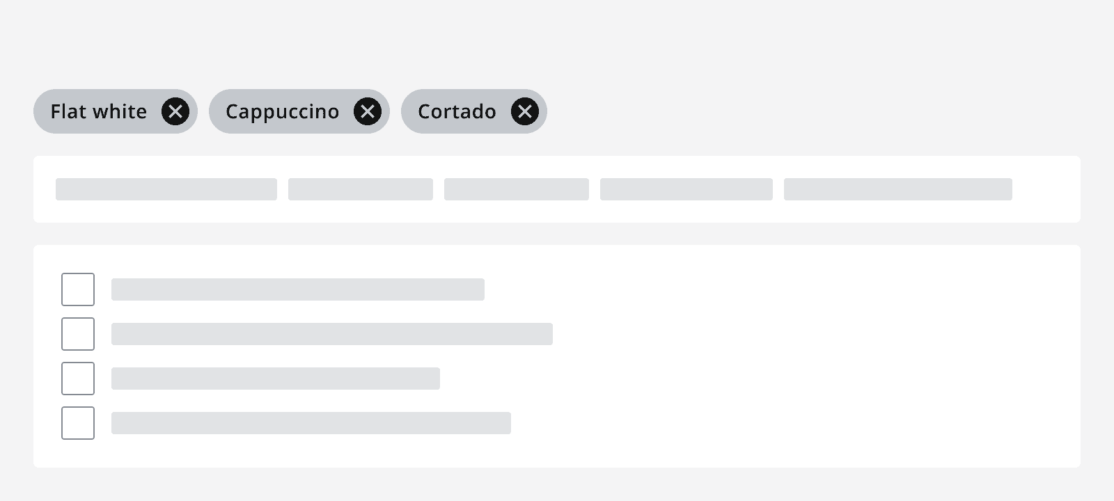
Use a dismissible chip to show selected data from a user action that can be cleared by dismissing the chip. This is often used in the context of filtering and selection.
Static chips
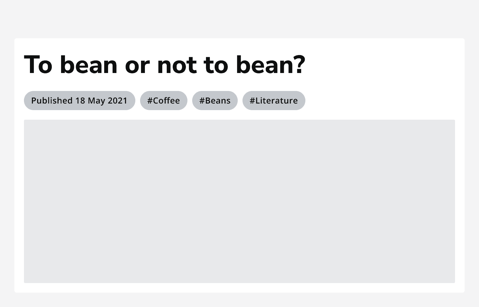
Use static chips to display information that does not need clearing. They aren't interactive, so they don't present any action and they can't be dismissed.
When to use
Dismissible chips
Use dismissible chips when you need to choose multiple items from a list but need to show items after they've been chosen.
Common use cases include:
-
A list showing which filters have been selected for a search.
-
Choosing multiple recipients of a message.

Static chips
Use static chips when you need to simply display a piece of information with no interaction, such as a label.
Common use cases include:
-
Labelling or drawing attention to a particular card or row because of its state.
-
Displaying the current location of an item.

When not to use
Dismissible chips
Don't use dismissible chips where the user can't re-select the item presented in the chip.
For example, if used to show a selected filter, after dismissing the chip and clearing the filter, it can be applied again later.
Static chips
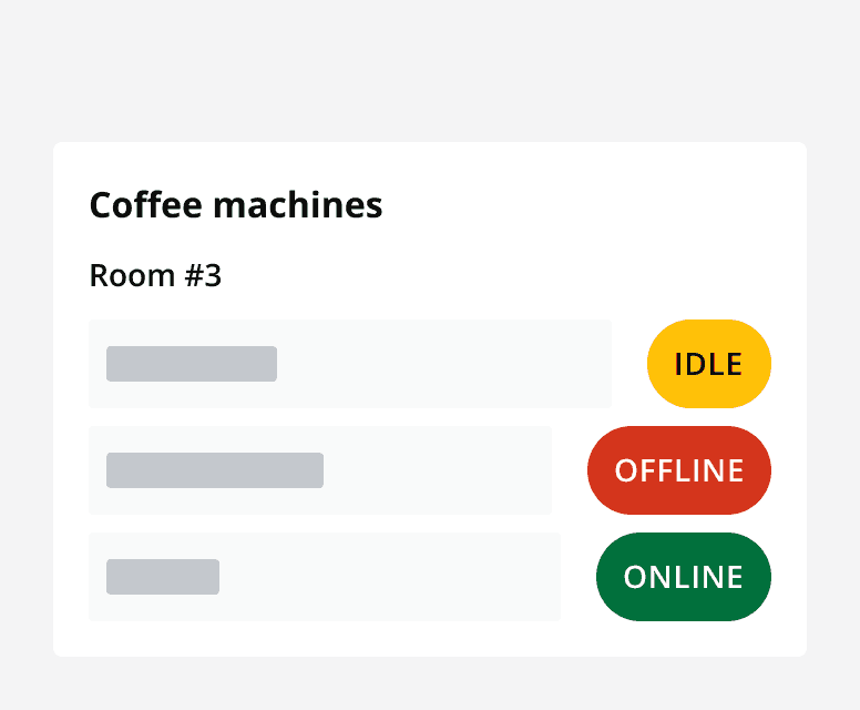
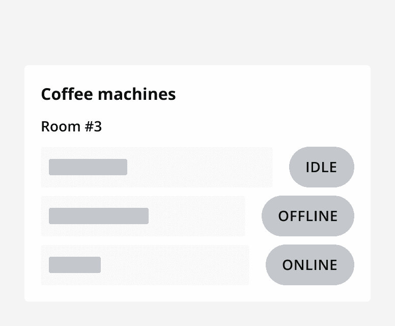
Don't use static chips to show status. Use


Layout and placement
Chip grouping
When using chips in a group, make sure they are left aligned and are positioned next to each other in a row.
Only position chips on multiple rows if there isn't enough horizontal space to show them on one, or if they are segmented into labelled groups.
Content
Labels
Use concise labels for better readability. Longer labels will force the text to wrap.
Icons
Use an icon on the left of a chip to provide additional meaning.
When including an icon in a chip make sure that the icon is understandable and relevant to the information presented.
Always provide alternative descriptions for icons or mark them as decorative. Don't use icons if they aren't necessary.