Data table
Data table
Canary components
Canary components are unstable components that are released for testing purposes.
We value any feedback from users willing to try them in their applications.
These components should not be used in production apps without understanding the risk that changes may occur in order to fix bugs or improve functionality.
For more information on Canary components, read our approach to
Additional details on the props and events for this component can be found in the
Component demo
Interactive example
When to use
Use a data table when you need to display structured data clearly and efficiently in rows and columns, allowing users to scan, compare, and understand large amounts of information.
Use a data table when users need to interact with the data, such as sorting columns, selecting rows for bulk actions, or navigating through large datasets with pagination controls.
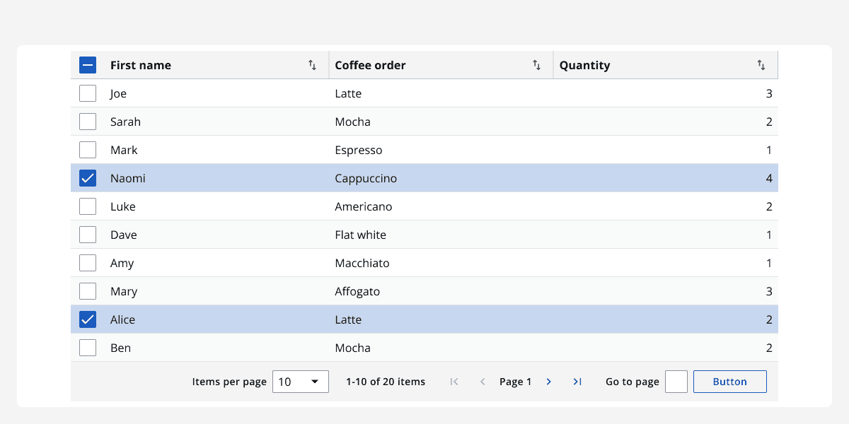
Use a data table when providing a visual structure helps contextualise complex data, making it easier to identify trends, relationships, or anomalies.
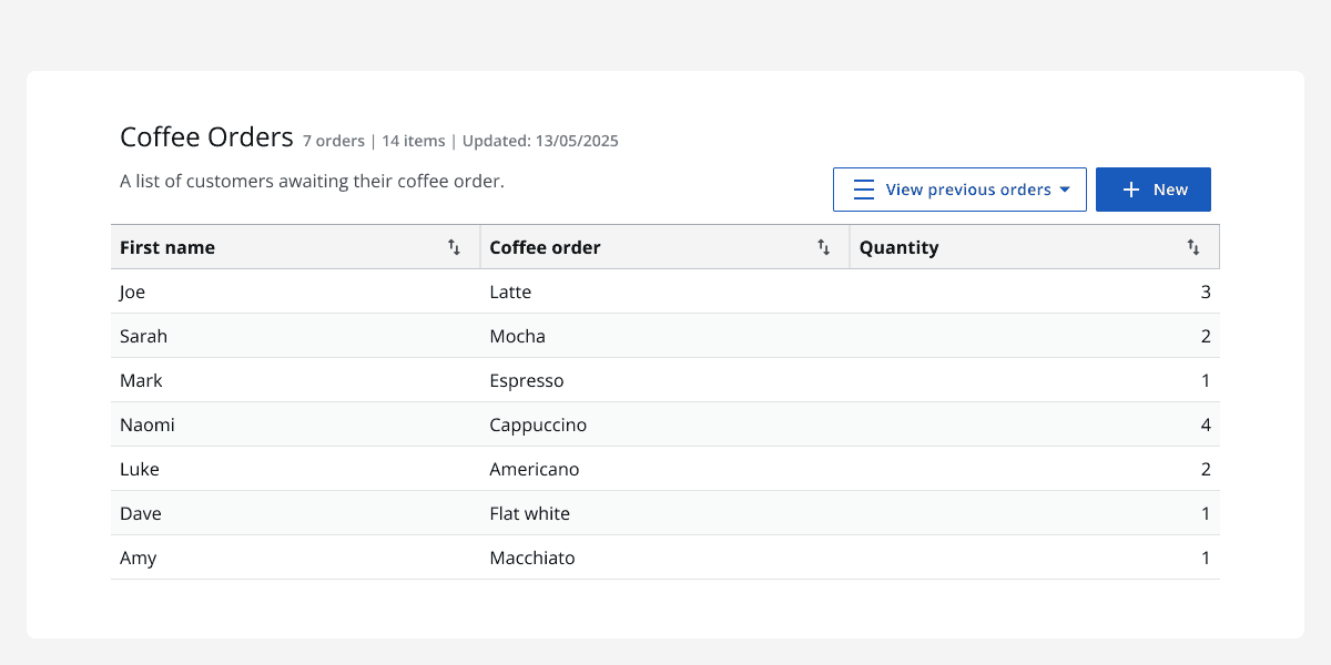
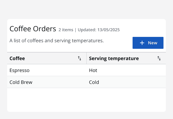
Use additional components like theic-data-table-title-bar
(IcDataTableTitleBar
) to supply context, metadata, or related actions, helping users understand the purpose or scope of the data without leaving the page.
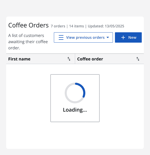
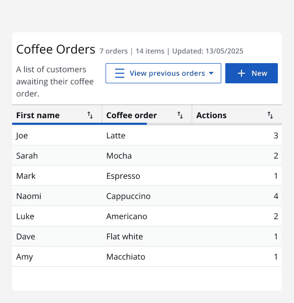
Use theloading
andupdating
props for asynchronous data fetching to inform users of loading states.
When not to use
Avoid using a data table when presenting simple data where tabular structure adds unnecessary complexity.
Similarly, avoid using pagination for very small datasets, where all data fits comfortably on one page, as this adds unnecessary navigation.
Interaction behaviour
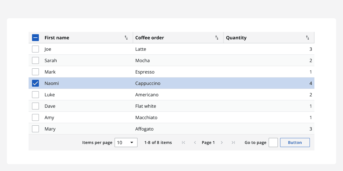
Data table rows can be selected interactively by enabling row selection, which adds checkboxes in the leftmost column and header. Clicking a checkbox selects that row, and selecting the header checkbox selects all visible rows on the current page.
Sorting controls appear next to column headers whensortable
is enabled, allowing users to toggle between ascending, descending, and unsorted states.
The default pagination bar includes controls to change the current page, select items per page, and jump directly to specific pages.
Custom action elements can be added within cells, with keyboard-accessible interactive components like buttons that respond to user clicks.
Content in cells may be expanded or truncated using configurable truncation patterns such as tooltip hovers or "See more/See less" toggles.
Sizing
By default, the table width is 100% to fill its container, but you can specify exact dimensions for the table using thewidth
andheight
props in px, %, or rem.
Use thedensity
prop to adjust the table's padding and font size, choosing from dense for a compact view, default for standard spacing, or spacious for a more open and readable style.
Individual column widths are controlled via the columnWidth property in each column definition.
The table layout is fixed by default to prioritise set column widths over cell content, but it can be switched to auto for column widths to be dictated by content size.
Row heights can be customised globally usingglobal-row-height
(globalRowHeight
) or on a per-row basis withvariable-row-height
(variableRowHeight
).
Layout and placement
Position the data table as a main content element on the page where tabular data presentation is key.
Use theembedded
prop to display the table as a standalone component with its own border when it should not span the entire width of a section.
Pagination controls are placed under the table by default to facilitate navigation through large datasets.
Sticky column headers improve usability when the table is tall and requires vertical scrolling.
Content
The data table supports a wide range of content including:
-
Text with optional wrapping or truncation controlled through the
truncation-pattern(truncationPattern) prop. -
Row and column headers which have their own icon slots. Custom icons can be added per cell, per column, or within headers.
-
Custom column and row styling via
alignmentandemphasisprops to highlight important data or improve readability. -
Descriptions can be added inside cells, positioned beneath the main data text to provide additional context.
-
Action elements can be displayed to the right side of cell content, supporting keyboard accessibility.
-
Checkboxes for row selection appear in a dedicated column when enabled.
-
Loading and empty states to display data status.
Accessibility considerations
Use thedescription
property inloading-options
(loadingOptions
) to ensure a meaningful ARIA label is provided for screen readers whilst the data table is in a loading state.