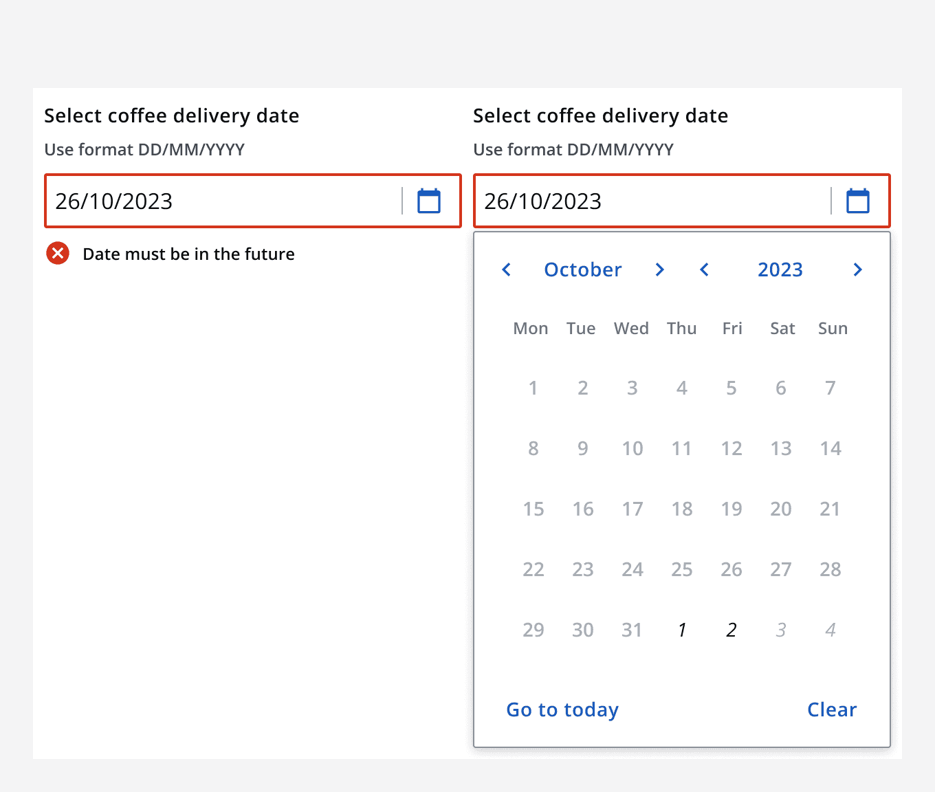
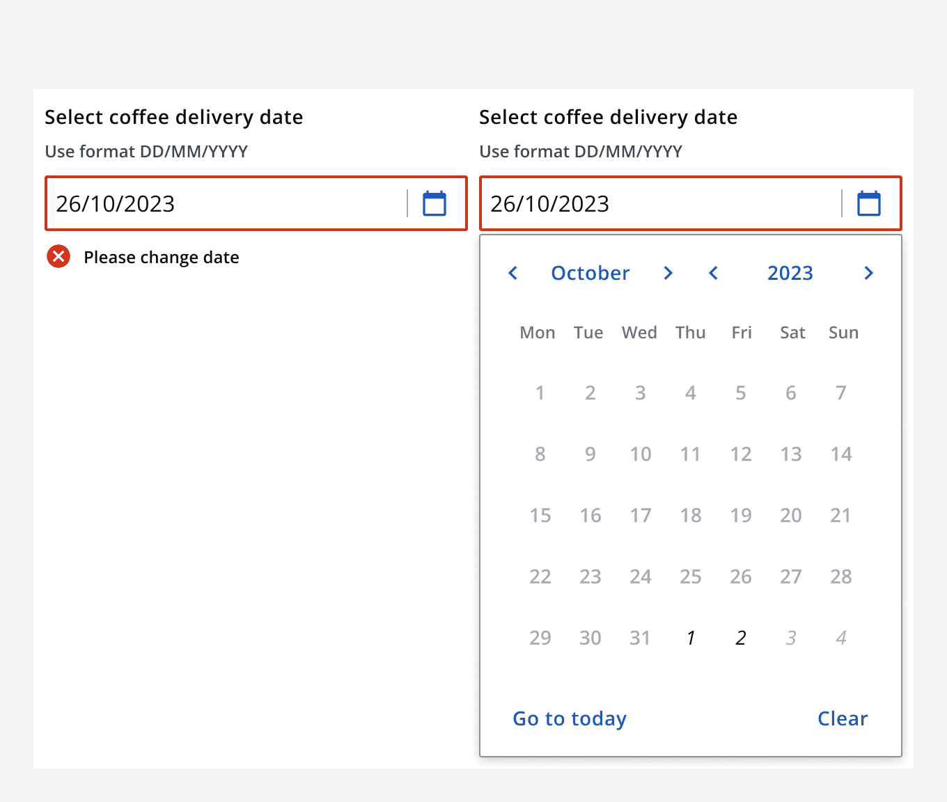
Date picker
Date picker
Canary components
Canary components are unstable components that are released for testing purposes.
We value any feedback from users willing to try them in their applications.
These components should not be used in production apps without understanding the risk that changes may occur in order to fix bugs or improve functionality.
For more information on Canary components, read our approach to
Additional details on the props and events for this component can be found in the
Component demo
Interactive example
When to use
Use a date picker to select an event that is near to the present time.
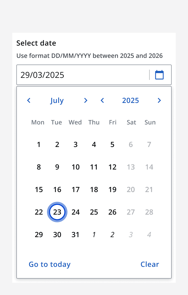
Use a date picker to select a date that is known or desired, such as an appointment.
Use a date picker to select a single date where visualising that date could be useful.
Use a date picker when there is a need to view a date in context. For example, if there is a need to see which day of the week a future event occurs.
When not to use
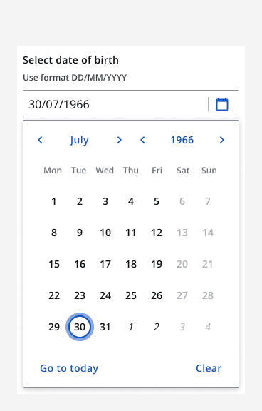
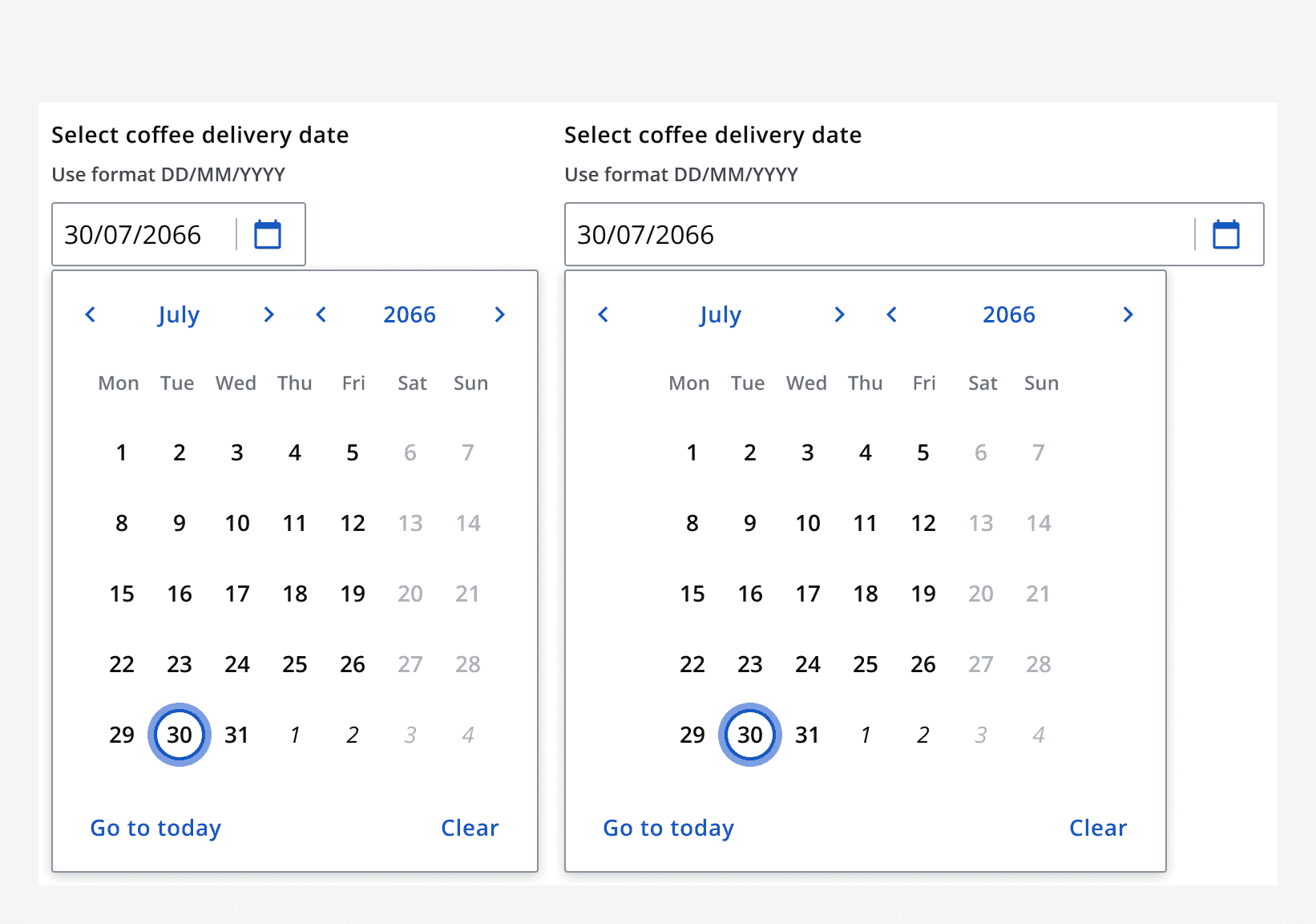
Avoid using a date picker for well-known dates, such as dates of birth, because it is often easier to type this into a field. For example, if selecting 30/07/1966, consider using
Sizing
Use the date picker size properties to change its vertical size and achieve compact or spacious layouts.
Width
Use the resizing options to increase or decrease width to match other elements in a form.
Use the
Content
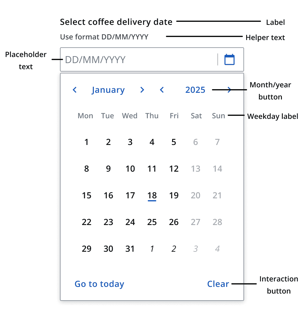
Labels
Use
Helper text
Use helper text to indicate restrictions in your date input such as not allowing weekends.
Placeholder
Use a placeholder to demonstrate an example of the desired input. Do not add essential information into the placeholder as it will be hidden when a date is entered into the field.
Interaction
Setopen-at-date
to specify the date in view when the date picker is opened. If no date is set, the date picker will default to showing the current date.
The
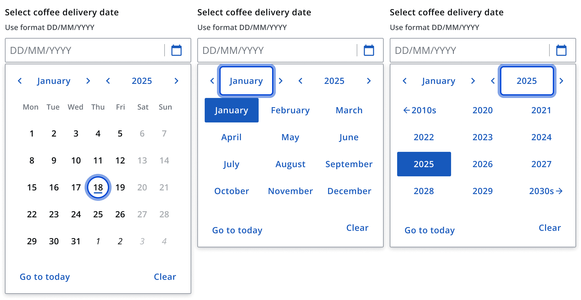
Use the month and year buttons to quickly navigate between larger spans of time to find the intended date.
Validation
See
