Divider
Divider
Introduction
Dividers are used to separate different elements in groups of content. They make it easier for people to understand and navigate the interface.
Interactive example
Coffee options
Colour, white space, images, lines, and shadows are all great examples of visual dividers. An example of a functional divider is 'full-width' which uses the entire length of a layout, whilst 'inset' dividers align with the leading edge of the screen.
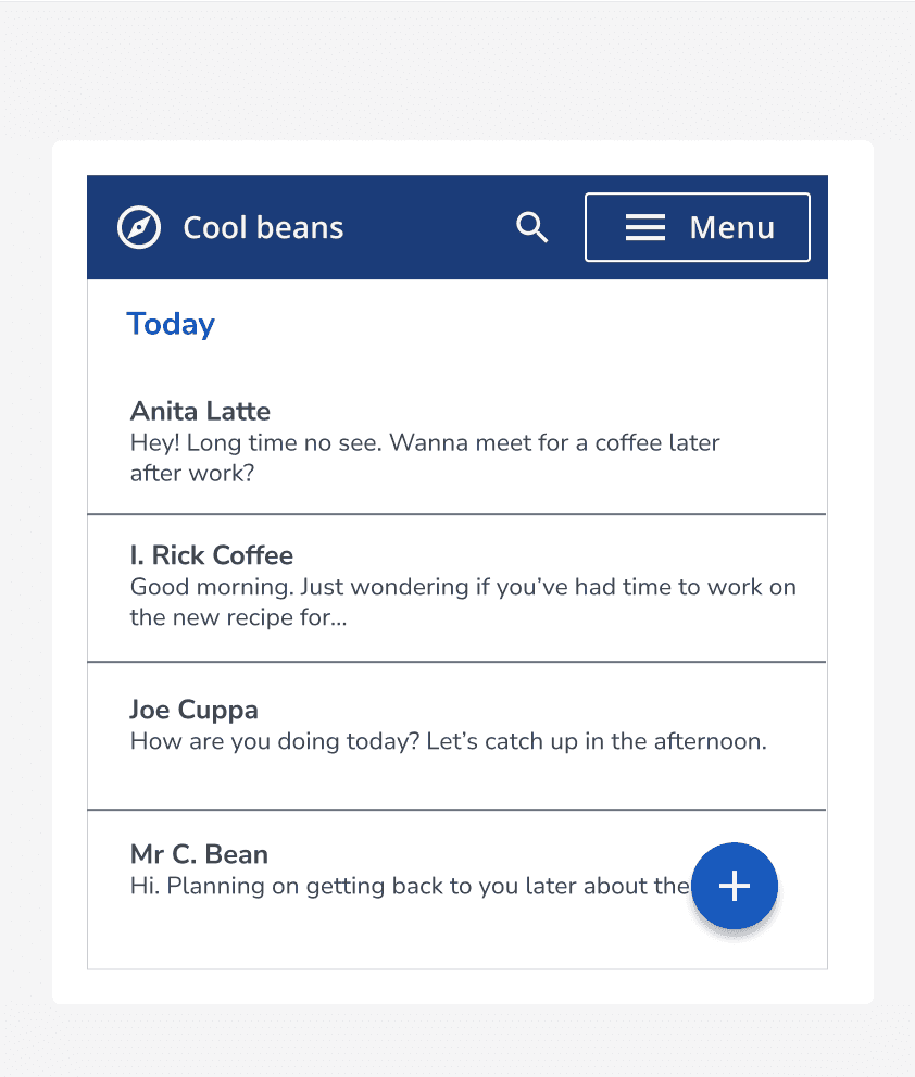

Component variants
There are five types of variants which display dividers in diverse ways.
Border style
Use a default divider for a simple way to group content. For a decorative approach, use the dashed divider.
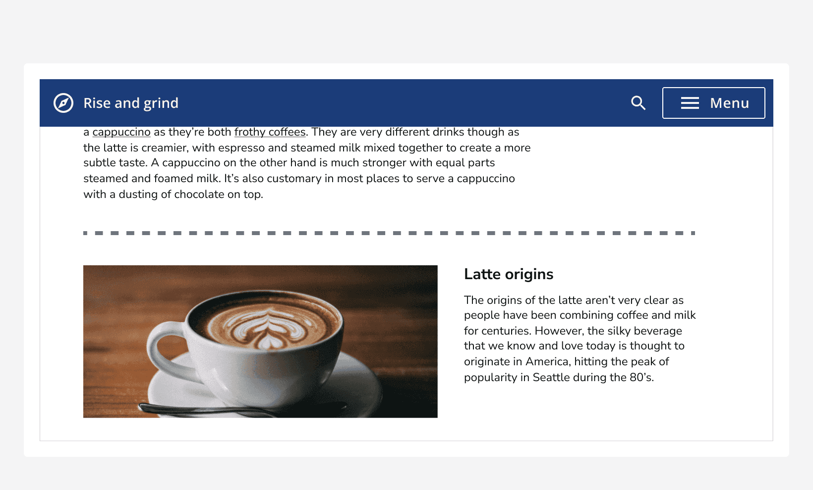
Weight
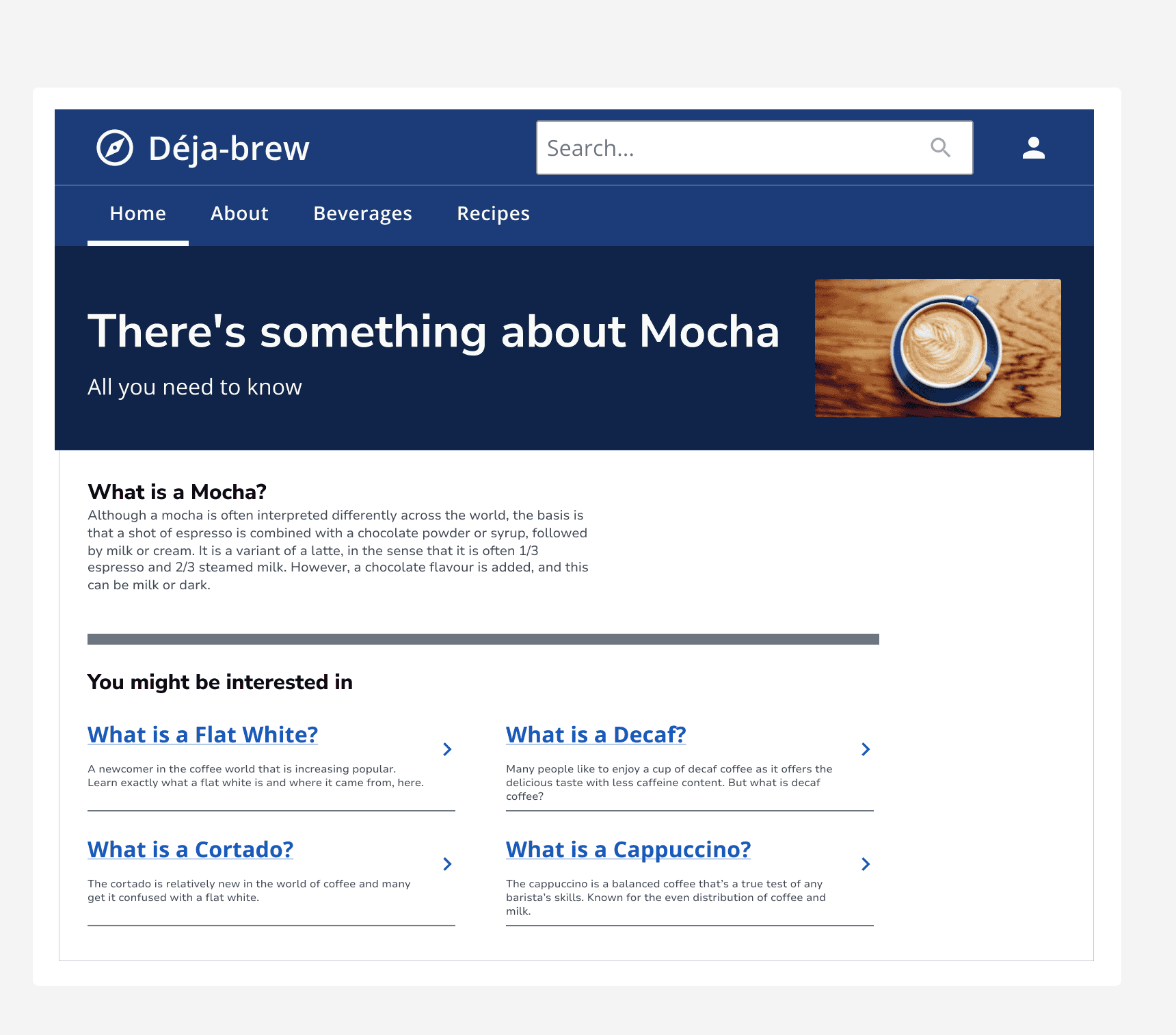
The divider component has four weights to choose from. These are thin, medium, thick and very thick.
Alter the weight of the divider to create a clear and logical structure of the page; for example, using a thicker divider to clearly separate unrelated content, whilst using thinner dividers to group together less important content.
Label and orientation
Pair dividers with labels to help define content groupings. Place the label within the divider to reinforce the label's connection to the content below the divider.
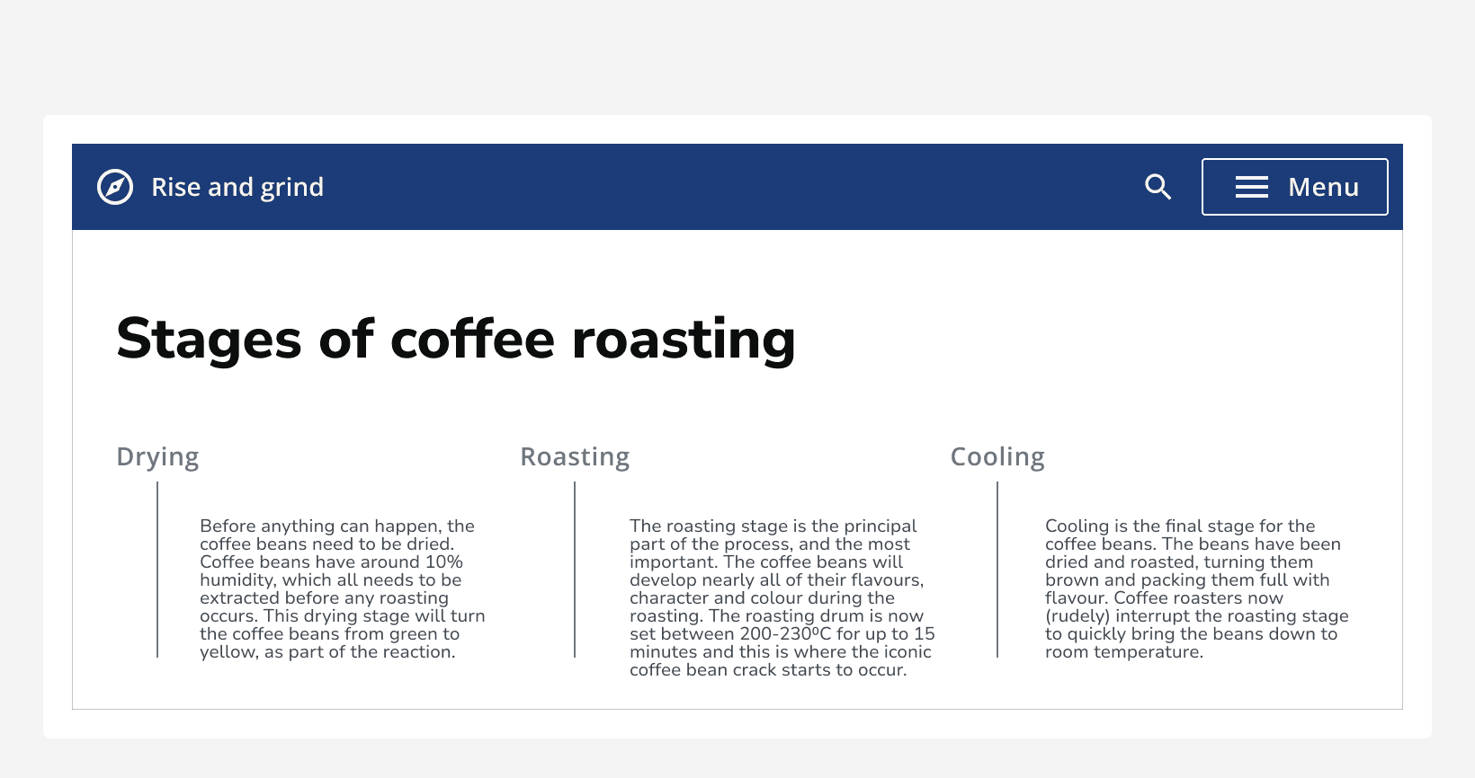
For the horizontal divider, the alignment of the label can be left-aligned, centred, or right-aligned. For the vertical divider, the label can also be centred, or placed at the top or bottom of the divider.
Make sure the text in the label is brief so that it clearly aids navigation and page structure. If not, the divider component becomes overwhelming. When the text reaches a certain amount, it will go onto multiple lines which disregards the divider's purpose. The information placed here should be non-essential with textual content placed inside the page content itself.
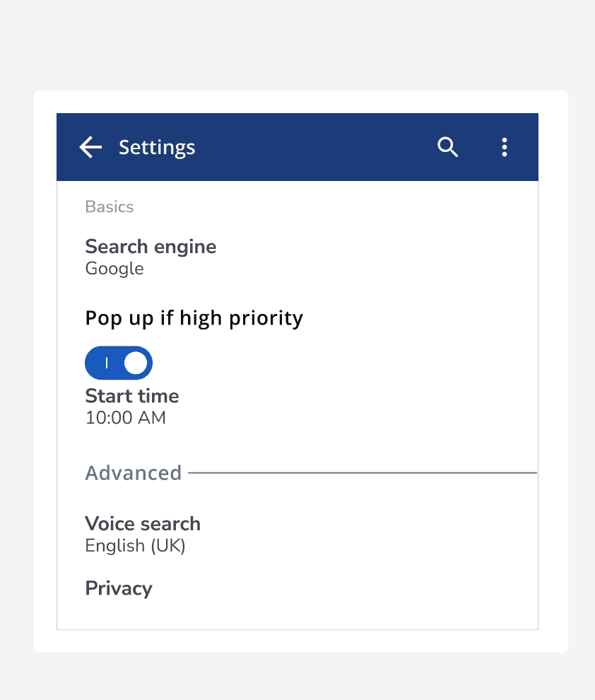
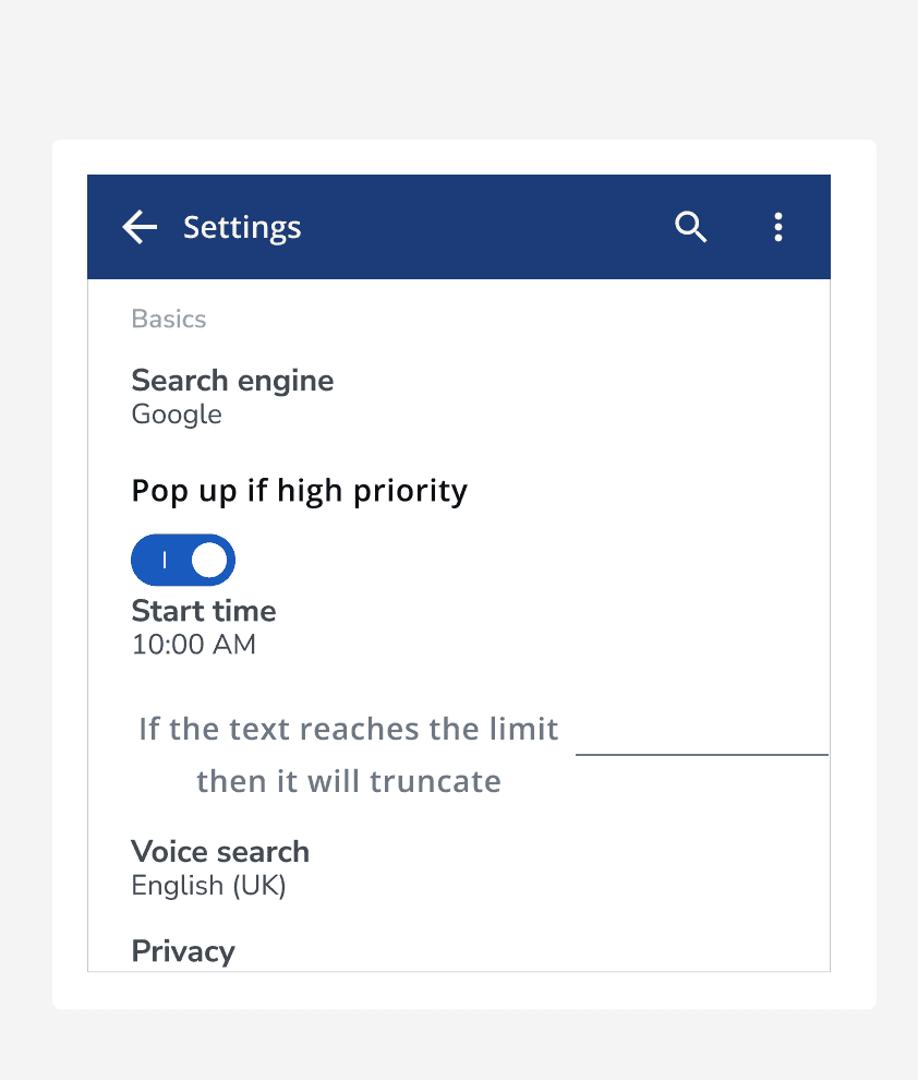
Use horizontal or vertical dividers to create any necessary sections between content. Pair the vertical divider with text to create a title when you want to draw attention to a paragraph.
When to use
Use dividers when you want to group a similar type of content together and create a visual hierarchy between the content.
For example, apply dividers between sections of content to make groups and create the appearance of containers. Try to avoid mixing the different divider variants to ensure a smooth design.
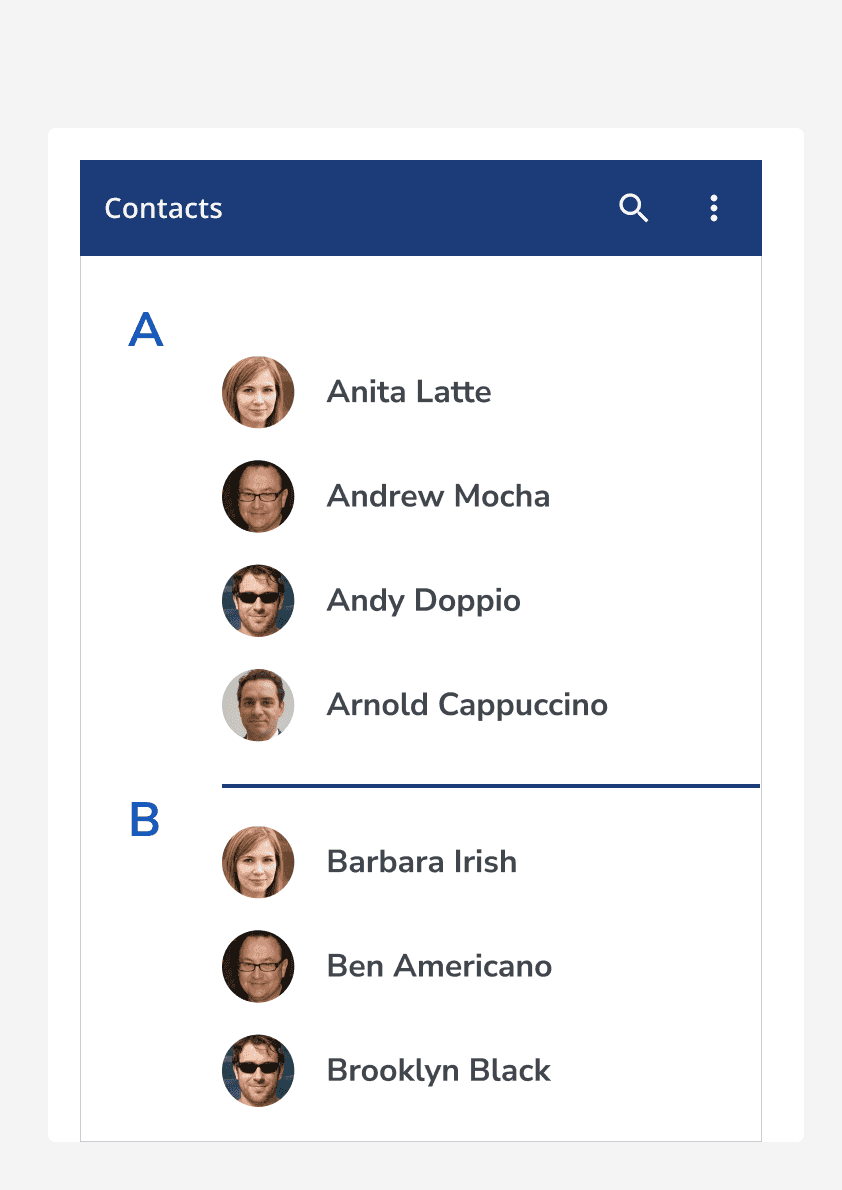
When not to use
Do not use dividers to separate individual items when it is not necessary. Use dividers to group items instead.
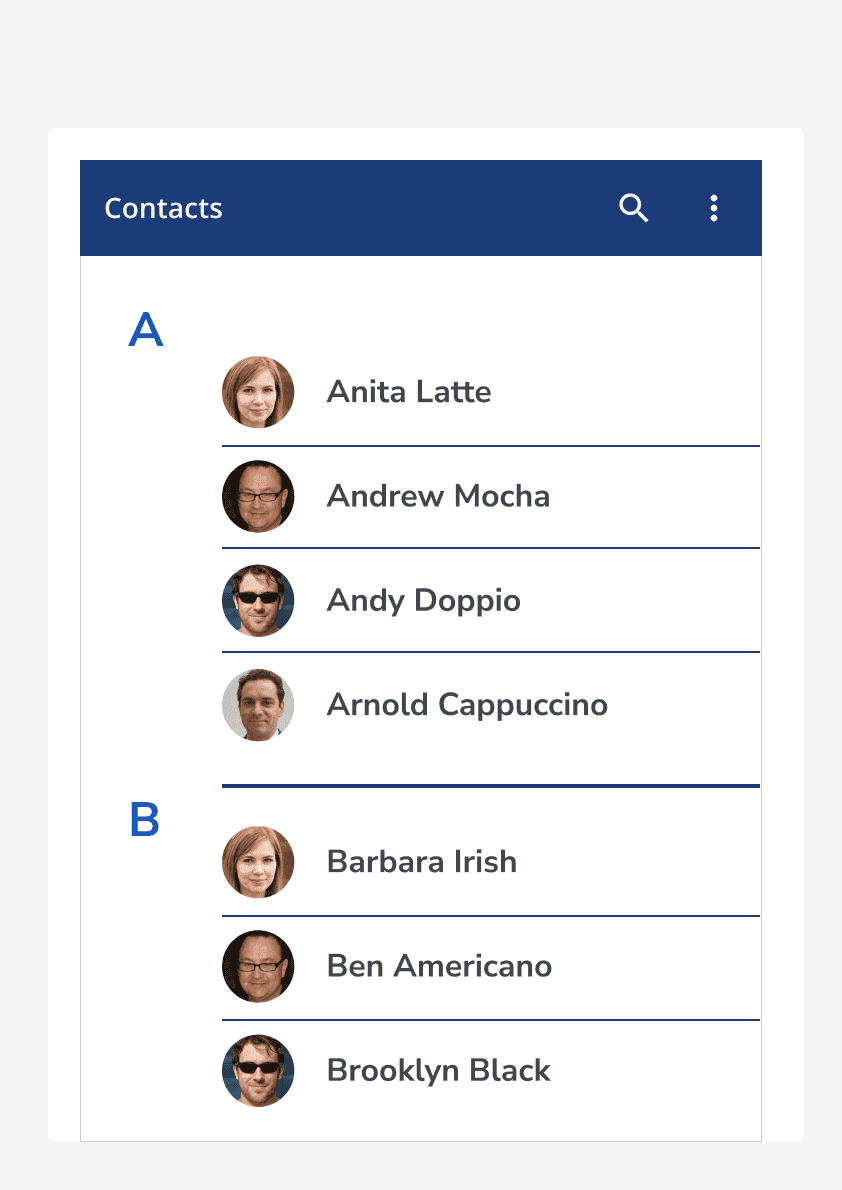
It is important not to over-use dividers. This is because you can often achieve the same effect with a change in background colour or sensible margins.
Hierarchy
Default dividers may be used to separate main sections of content, whereas monochrome, small-sized or even dashed dividers may be better suited to separating lists of elements.
Accessibility considerations
As dividers are commonly a decorative element, they do not need to obey the same colour contrast rules as text or other interface components. Consider setting the divider's appearance so that it blends nicely with the rest of your application.