Intelligence Community Design System ICDS Get started Accessibility Styles Components Patterns Community
Show navigation section

Footer

Guidance Code Accessibility

Introduction

An example of the footer component.

Interactive example

Accessibility Styles Components Patterns

When to use

There are two types of footer that display links in different ways. These are single line footers and grouped footers.

Use a footer on every page so that the required legal information is displayed.

Single line

Use single line footers when eight or fewer links are required and there is no need to split those links into groups.

Grouped

Use grouped footers when more than eight links are required or the links can be grouped meaningfully.

Colour

The background colour of the footer reflects the chosen brand colour for the application. Set the global brand colour token to change the footer’s appearance.
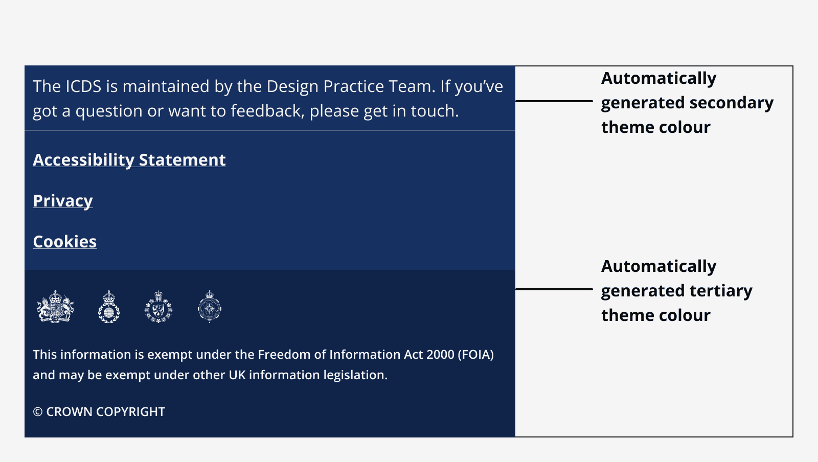
A footer using automatically generated secondary and tertiary shades of the app’s brand colour as the background colours for the footer’s link section and logo section respectively.
Change the global brand colour token to change the footer’s appearance.

Sizing

The footer always extends to the full width of the viewport.

Don’t embed the footer within another container that is not full width.
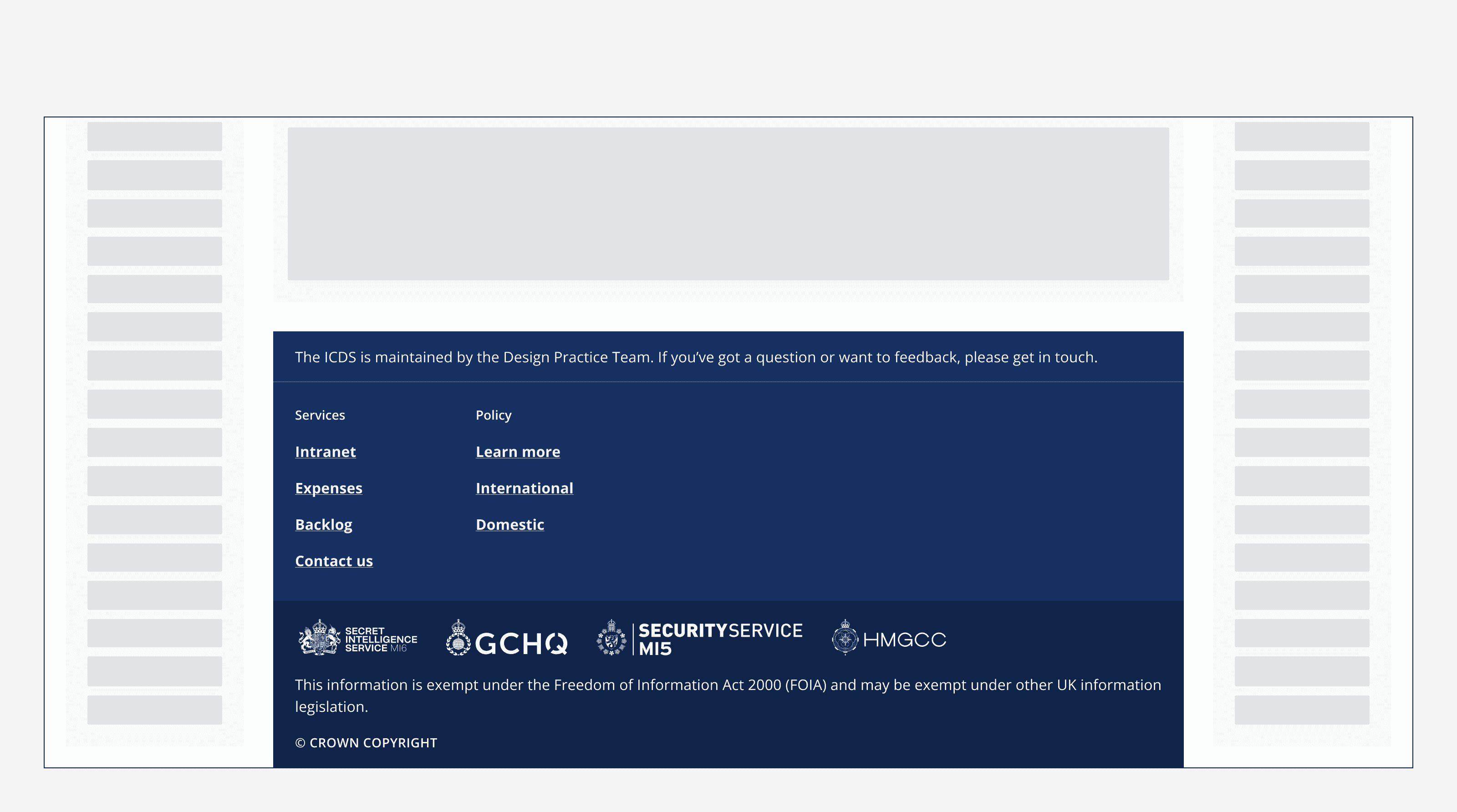
A footer positioned centred between two other content areas that sit to the left and right of the footer.
Don’t place the footer within other content. Always make sure it's the full width of the viewport.

Layout and placement

Placement

Always place the footer at the bottom of the page and below the fold, meaning users should scroll to see it.
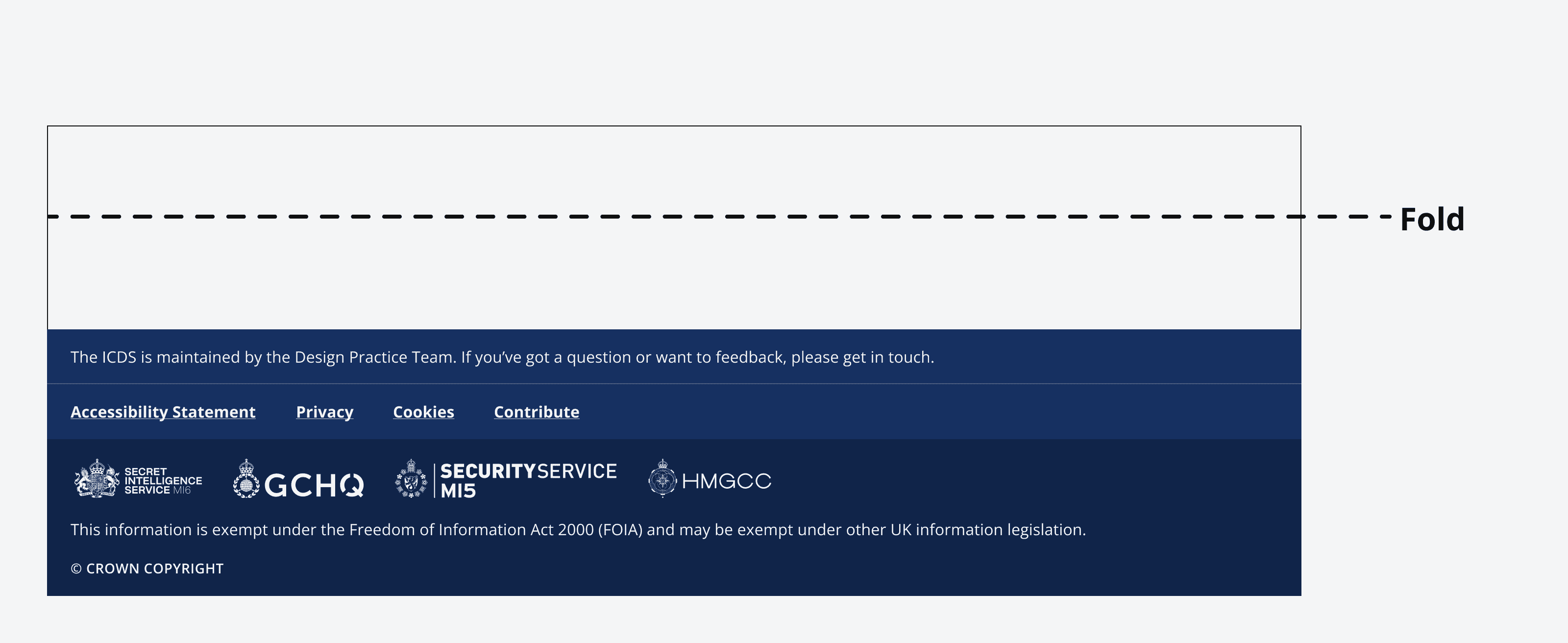
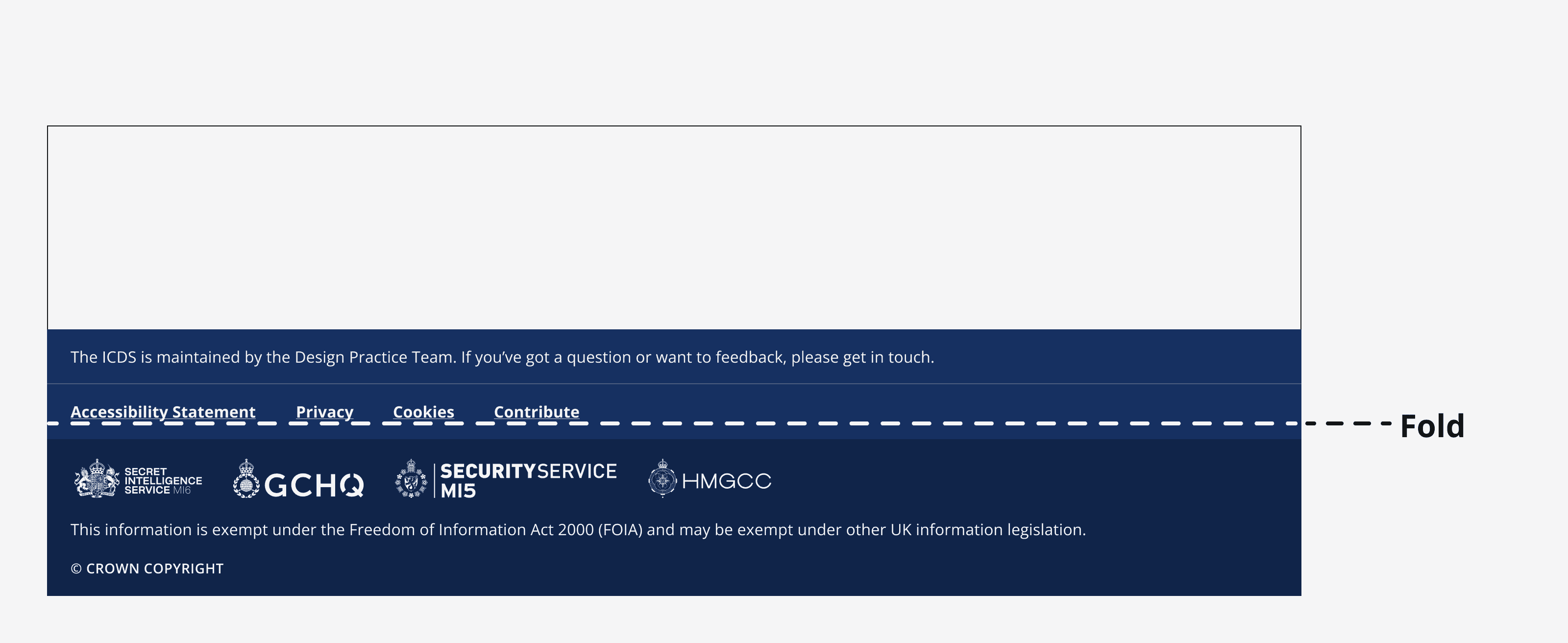
A footer component placed below the fold within a page design.
Footer placed correctly below the fold on a page.
A footer component placed above the fold within a page design.
Footer placed incorrectly above the fold.

Position the footer adjacent to the side navigation if your app uses one.
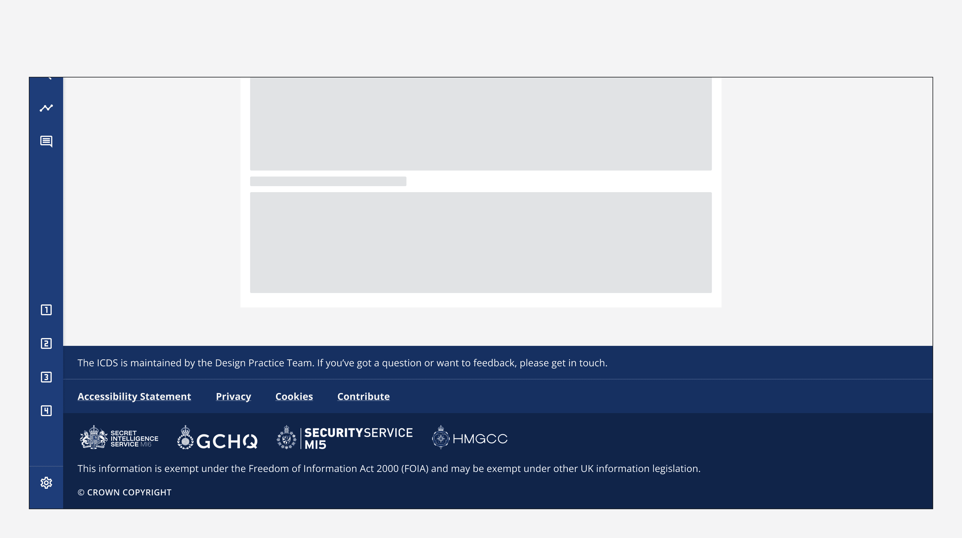
An example app showing a side navigation component with a footer component positioned on the right and adjacent to the side navigation.
Place the footer adjacent to the side navigation.

Alignment

The footer can be set to left-aligned, centred or full width.

Use left-aligned to align footer content to the left of the main body of the page. This works well with apps that use the side navigation.
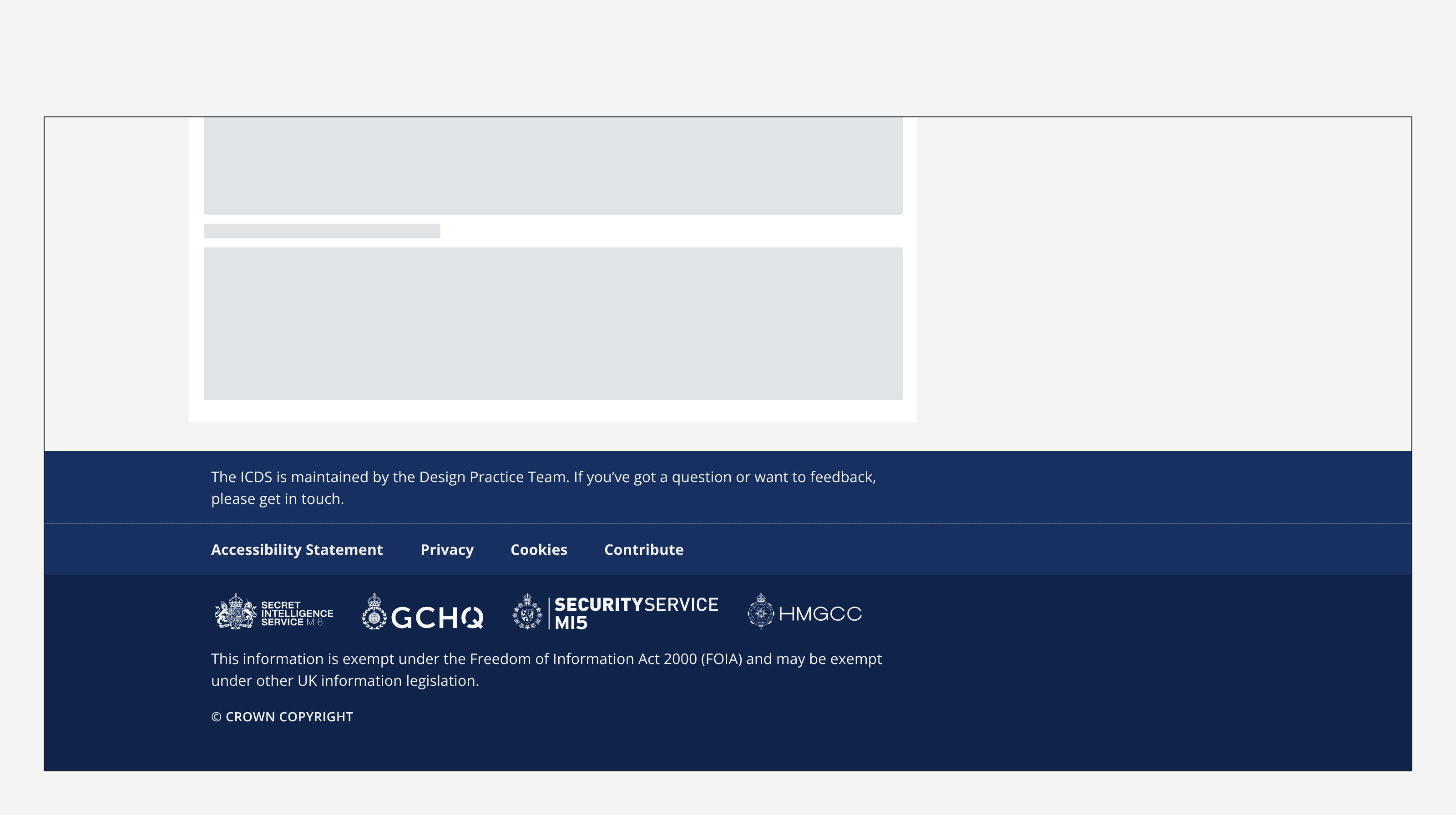
A footer component with its content left aligned.
A footer with its content left aligned.

Use centred alignment to centre footer content to the main body of the page.
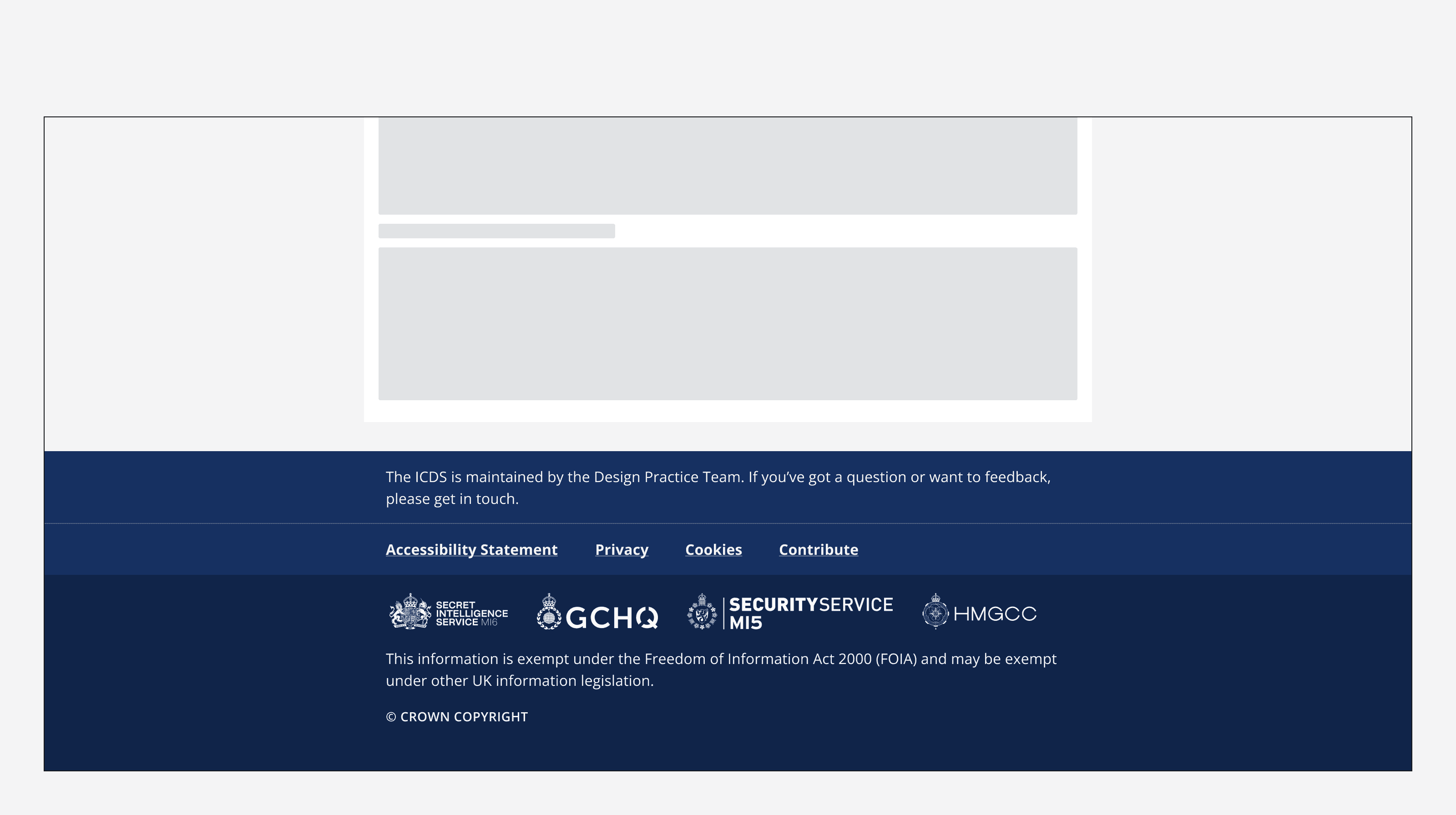
A footer component with its content centre aligned.
A footer with its content centre aligned.

Use full-width to position footer content so that it spans the full width of the viewport.
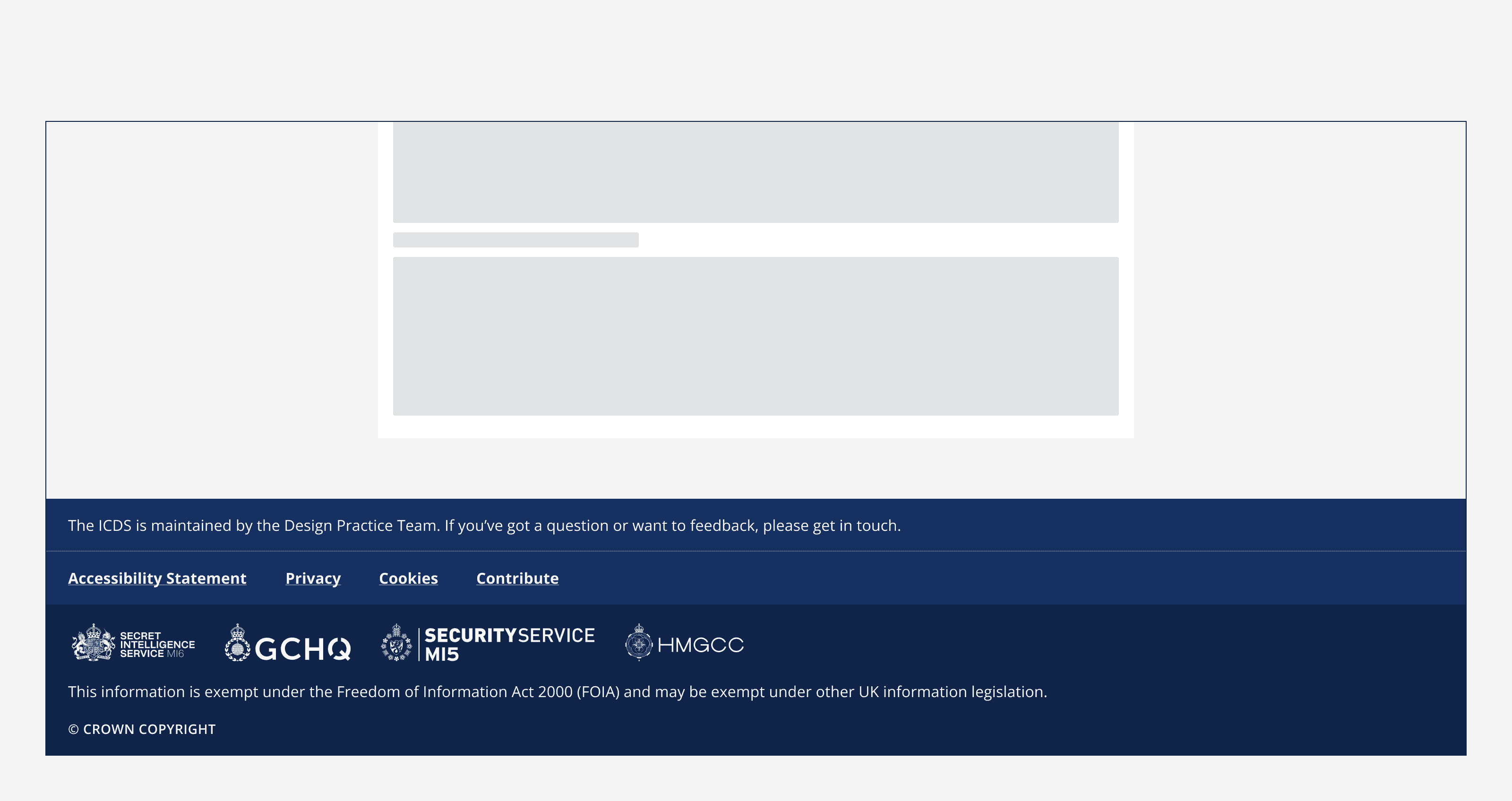
A footer component with its content aligned to the full width of the viewport.
A footer with its content aligned to the full width of the viewport.

Content

Footers provide a set of links that can be accessed from every page within an app. Specify either single links or grouped links when using a footer.

Give link groups clear labels when using grouped links.

Order the links so that the most important links appear at the top left of the links section.

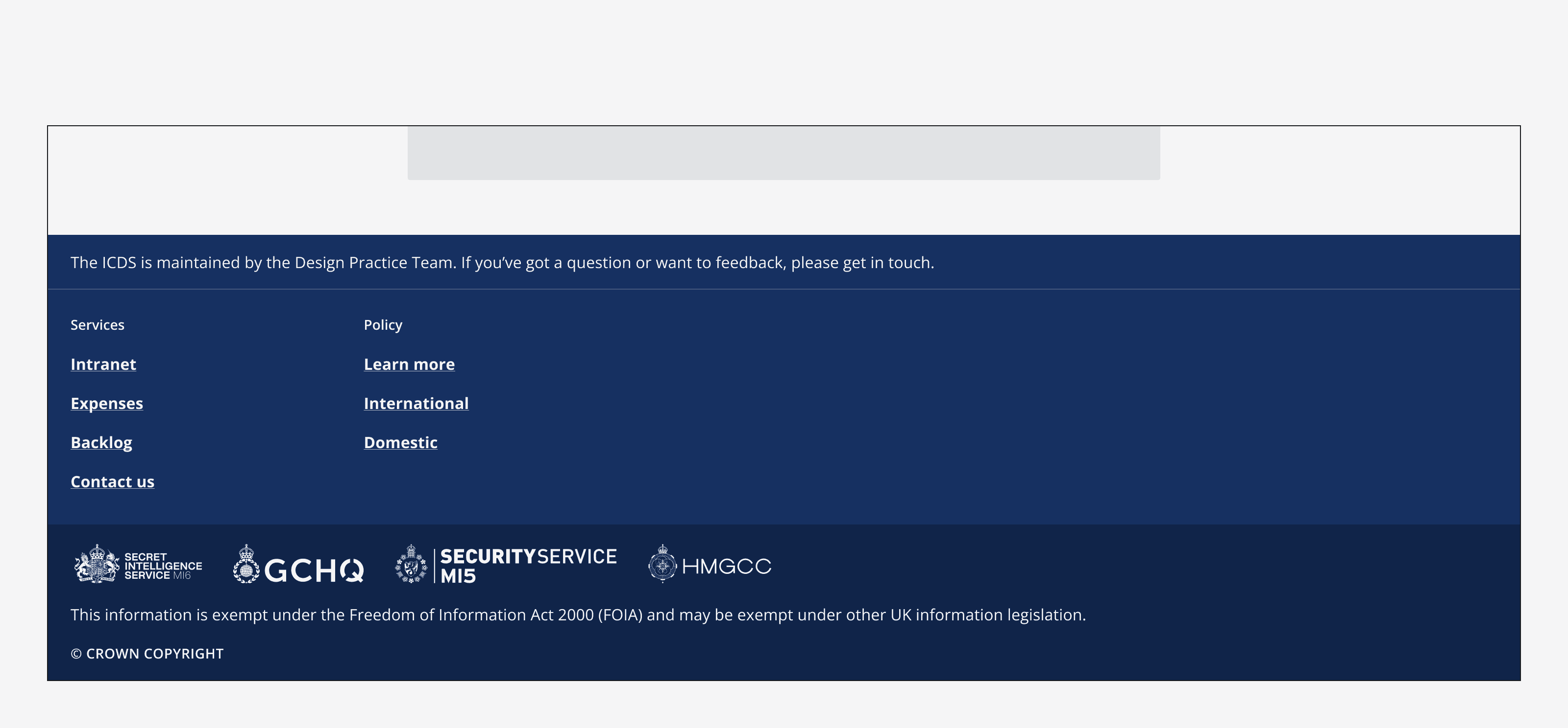
A footer showing a single set of links. The four links include ‘Accessibility statement’, ‘Privacy’, ‘Cookies’ and ‘Contribute’.
A footer with a single set of links.
A footer showing two groups of links. The two link groups are titled ‘Services’ and ‘Policy’ and each group includes a set of links.
A footer with grouped links.

Logos

Footers can include a number of different logos. The logos appear at the bottom of the footer. Choose the correct theme (i.e., light or dark) of your logo to match the selected brand colour background.
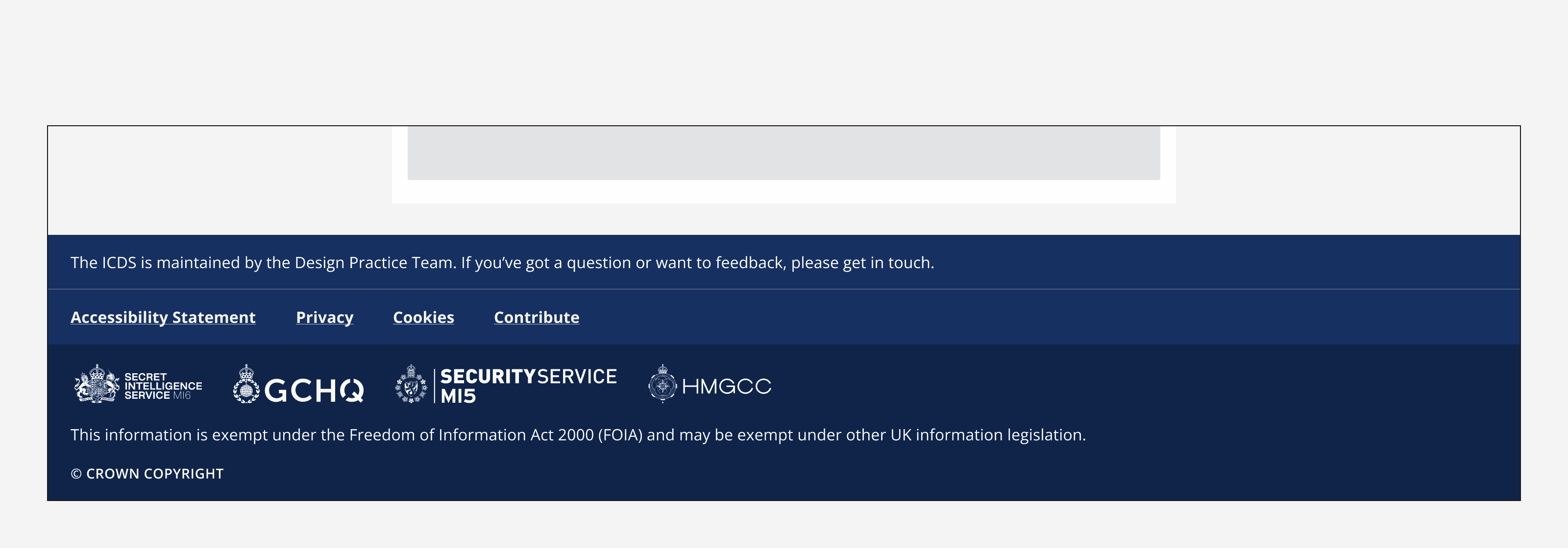
A footer displaying four different logos on a large screen.

Additional information

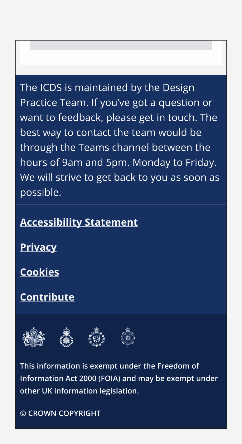
Provide additional information in either the top section above the links or in the bottom section below the logos. Any additional information provided should be concise and easy to understand.
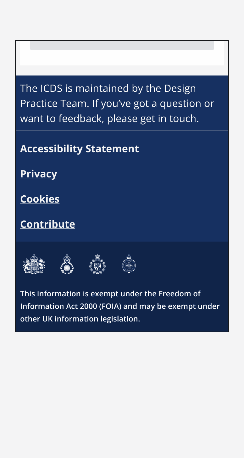
A footer component showing concise and easily understandable information. It reads ‘The ICDS is maintained by the Design Practice Team. If you’ve got a question or want to feedback, please get in touch.’
Concise and easily understandable information shown in the footer.
A footer component showing overly lengthy information. It reads ‘The ICDS is maintained by the Design Practice Team. If you’ve got a question or want to feedback, please get in touch. The best way to contact the team would be through Microsoft Teams between the hours of 9am to 5pm, Monday to Friday. We will strive to get back to you as soon as possible.’
The information included in the footer is too long.

Last reviewed 3 February 2023 .
Navigated to Footer - Intelligence Community Design System