Pagination bar
Pagination bar
Canary components
Canary components are unstable components that are released for testing purposes.
We value any feedback from users willing to try them in their applications.
These components should not be used in production apps without understanding the risk that changes may occur in order to fix bugs or improve functionality.
For more information on Canary components, read our approach to
Additional details on the props and events for this component can be found in the
Introduction
Pagination bar utilises the pagination component and provides further control over the display of additional information and actions.
Interactive example
When to use
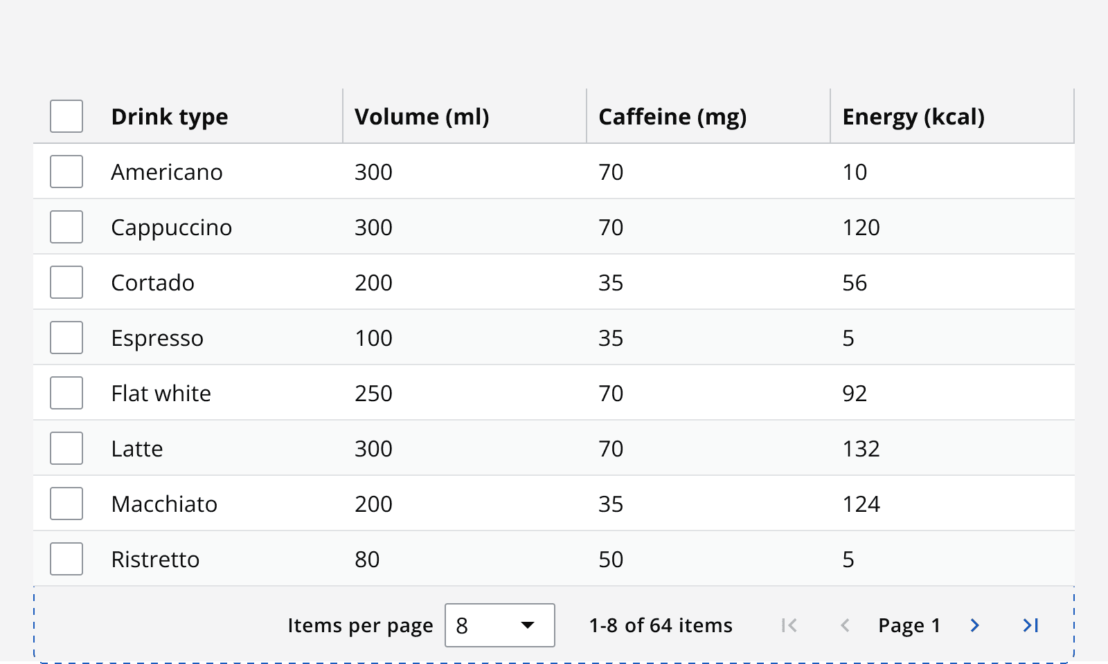
Use a pagination bar to provide more navigation functionality through particularly complex data sets. For example, use pagination bars with data tables to navigate large data sets easily.

A pagination bar includes either complex or simple pagination and provides additional controls over pagination including:
-
Items per page selector: Switch the number of content items visible per page.
-
Item count: Display the range of currently visible items as well as the total number of items.
-
Go to page shortcut: Allow quick access to any page number by typing the page number and hitting ‘go’.
When not to use
Avoid using a pagination bar with linear content such as articles or blogs. Scrolling down the page makes it easier to consume this content.
Avoid using a pagination bar when the size of the content is unknown or if it frequently changes. This causes the number of pages to change frequently and means it is hard to create a ‘last page’ option.
Use an infinite scrolling pattern when navigating content should be explorative, or when there is a near infinite amount of content. For example, newsfeeds and comments threads can be near endless and infinite scrolling allows exploration by simply continuing to scroll.
Interaction behaviour
In a pagination bar, when the number of items per page is changed, the pagination component and the item count updates to show the new number of pages. Make sure to update the pagination component if anything else on the page changes the number of pages. For example, setting a filter may reduce the number of pages required to display the filtered results.
Colour
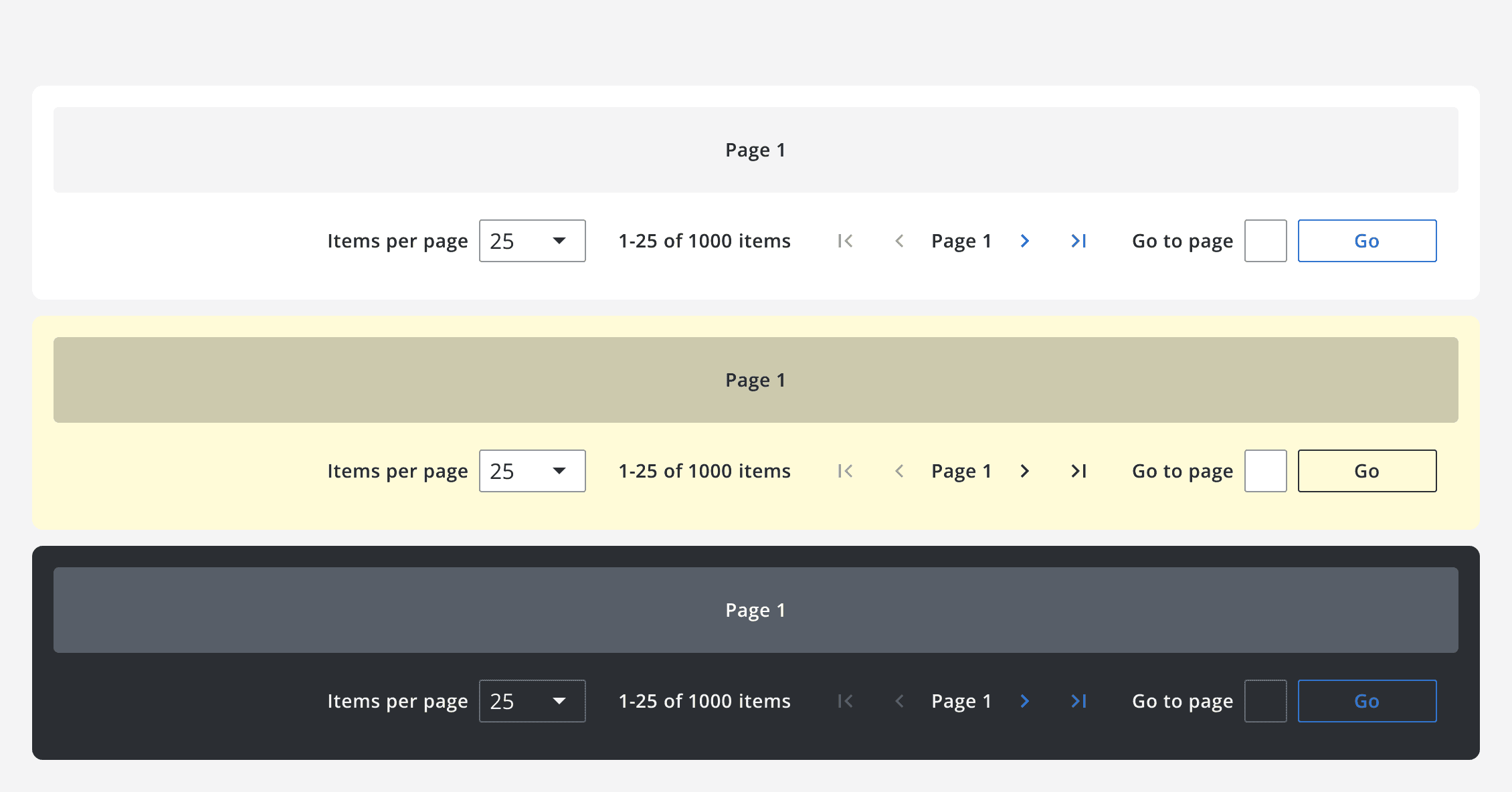
Use the default, dark and light theme pagination bars withmonochrome={true}
when placing them on different coloured backgrounds to ensure the correct contrast ratios are met.

Layout and placement
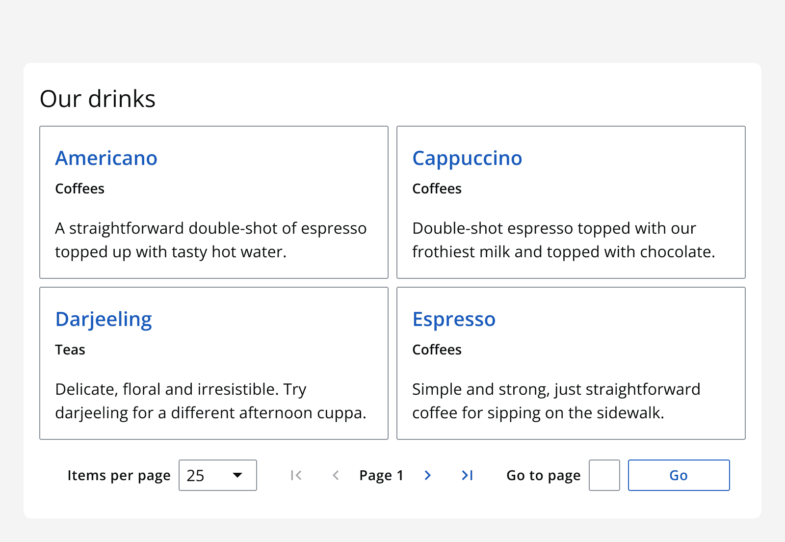
Place the pagination bar component so that it is obvious what it controls. Match the width of a pagination bar to the width of the page.
Try to place the pagination bar at the bottom of the page it controls, as this encourages the user to read through the page before moving to the next. However, placing another method of pagination at the top of the page is still a valid option.

For large page containers that require scrolling, use two pagination components at the top and bottom of the page container to provide easy access to navigation when at either the top or bottom of the page.

Content
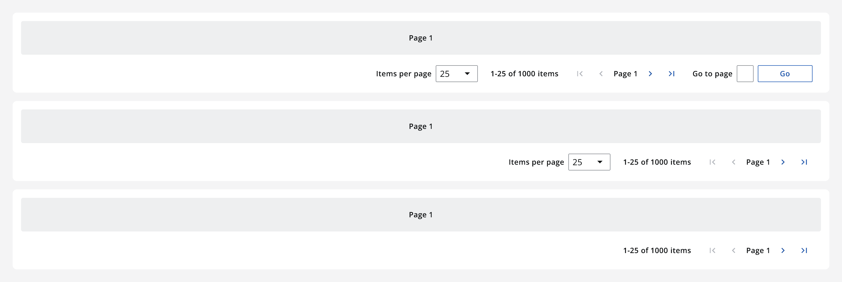
Select which elements within a pagination bar you want to display. Each element in the pagination bar can be toggled on or off except for the pagination component itself, which can be switched to use complex or simple pagination.
