Popover menu
Popover menu
Introduction
Click on the 'More Information' button below to view an example of the popover menu component.
Interactive example
When to use
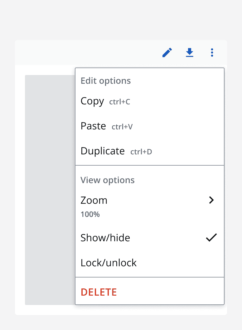
Use a popover menu to place multiple actions behind a single trigger. This is especially useful when there is not enough space to include all actions on the base page. Popover menus are commonly used for ‘More actions’ and often triggered using an icon button.
When not to use
Don’t use a popover menu if there are only a small number of actions. Consider if the actions can be better placed on the page itself.
Avoid placing important actions in popover menus as these may be missed. Instead, use popover menus to house secondary or less important actions and place your most important actions on the page itself.
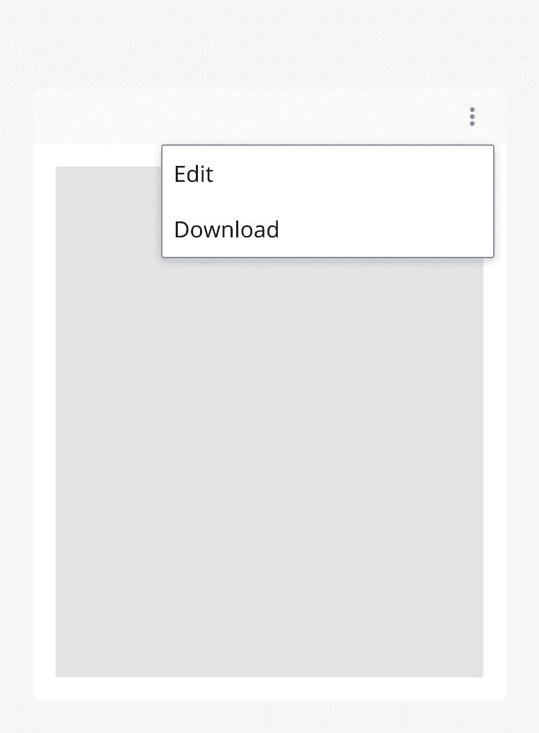
Don’t include any other content within a popover menu other than the elements described in this page. If additional information is required about an action, consider using a
Interaction behaviour
When you click a trigger element, a popover menu appears. Make sure to associate the popover menu with a trigger and ensure that the trigger can be actioned via any input mode.
When you click a menu item within a popover menu, the popover menu will hide and the menu item’s associated action will be triggered.
Sizing
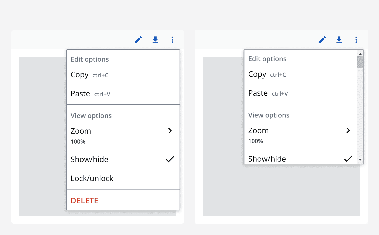
By default, popover menus expand vertically to hug their contents. Set a max-height on the popover menu to constrain the height and allow the menu to scroll. Avoid setting the width of the popover menu to be greater than the available viewport.
Layout and placement
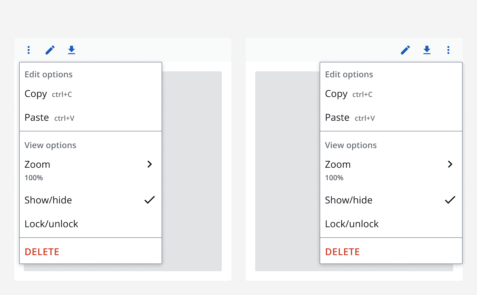
Popover menus appear adjacent to their triggering element. By default, they appear below and aligned to the left of the trigger element. However, if no space is available, the popover menu will appear above or aligned to the right of the trigger element.
Content
Popover menus contain menu items, menu toggle items, menu groups and menu sections.
Labels
Follow the
Always specify an accessible label for the menu items. The accessible label can include more detail than is described in the visible label.
For example, a menu item may have a visible label that reads ‘Edit’. The accessible label may read ‘Edit record’. This includes more information to aid assistive technology users.
Icons
Use an icon on a menu item to provide additional meaning or to aid in recognition. Menu items, menu toggle items and parent menu items can display an icon.
Make sure that the icon is understandable and relevant to the action.
Always provide alternative descriptions for icons if they aren't decorative. Only use icons if they are necessary.
Menu items
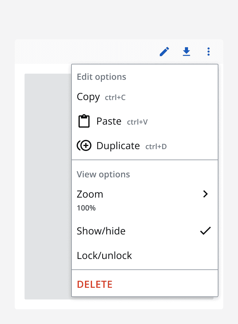
Use the 'default' variant of menu items for single actions that do not have a selection status.
Add an additional description to a menu item to provide additional context. Keep the description concise and consider if the action is too complicated if too much information is required to describe the action.
If a keyboard shortcut is available for a menu item’s action, then display it using the keyboard shortcut label.
Use the 'destructive' variant of a menu item to highlight a destructive action. Position destructive actions at the bottom of a popover menu.
Specify a menu item as a parent if it has children that appear in a sub-menu. When clicked, the sub-menu will slide into view.
Menu toggle items
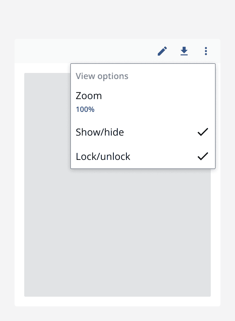
Use the 'toggle' variant of menu items for actions that provide an ability to toggle something on or off. Menu toggle items will display a checkmark when toggled on and hide it when toggled off.
Like default menu items, provide an icon or a description to add additional context if required.
Menu groups
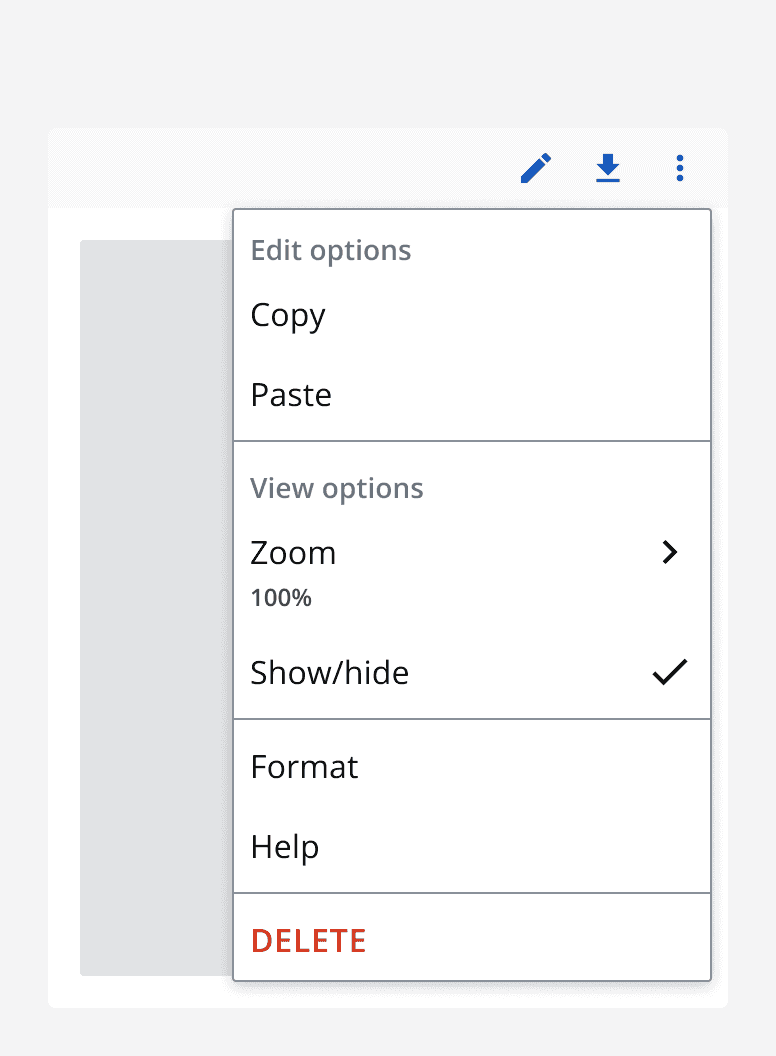
Use menu groups to organise menu items into sections within the popover menu. Provide a label for the menu group to describe its contents. Alternatively, leave the menu group label blank if a description is unnecessary.
Parent menu items
Use a parent menu item to open sub-menus that include more menu items. Use this to contain similar actions or options relating to the menu group name.
Sub-menus
Use a sub-menu to contain a parent menu item’s children items. Use sub-menus for multiple related actions that are opened from the main menu.
The sub-menu displays the same label as the parent menu item. Clicking the back button in a sub-menu will return the user to the parent menu item in the main menu.
Use menu items, toggle menu items, menu groups or parent menu items in a sub-menu but avoid nesting too many levels of sub-menus as this can be confusing to navigate.
Accessibility considerations
When specifying the trigger element for a popover menu, make use of ‘aria-expanded’ and ‘aria-collapsed’ so that a screen reader announces the appearance of the popover menu.