Skeleton
Skeleton
Introduction
Skeleton has three variants:
-
Circle
-
Text
-
Rectangle
Interactive example
Circle
Use the circle variant as a placeholder for any circular components, like avatars and circular logos.
Text
Use the text variant as a placeholder for any text or labels that sit outside of any component. This applies to helper text for input labels, headings and body text.
Rectangle
Use the rectangle variant as a placeholder for any other components. This includes buttons, chips and tags, input fields and cards.
When to use
Use skeleton variants as a placeholder for when a full page or individual components are loading. Don't nest skeletons. If a label or text is wrapped inside a component, for example in cards, only use the skeleton variant of the component that wraps the other components.
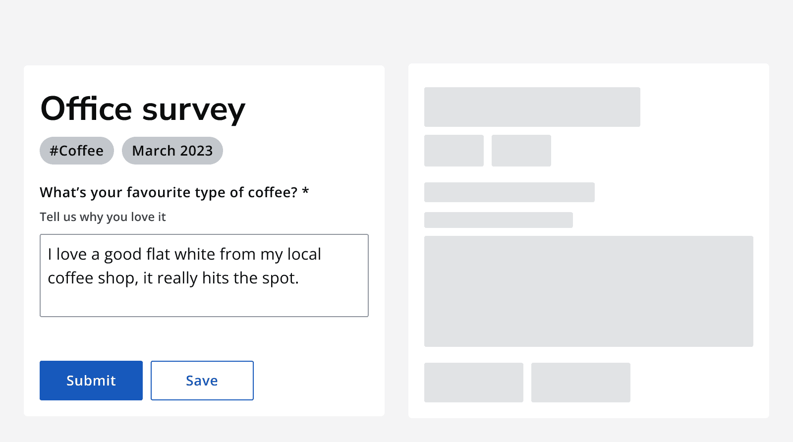
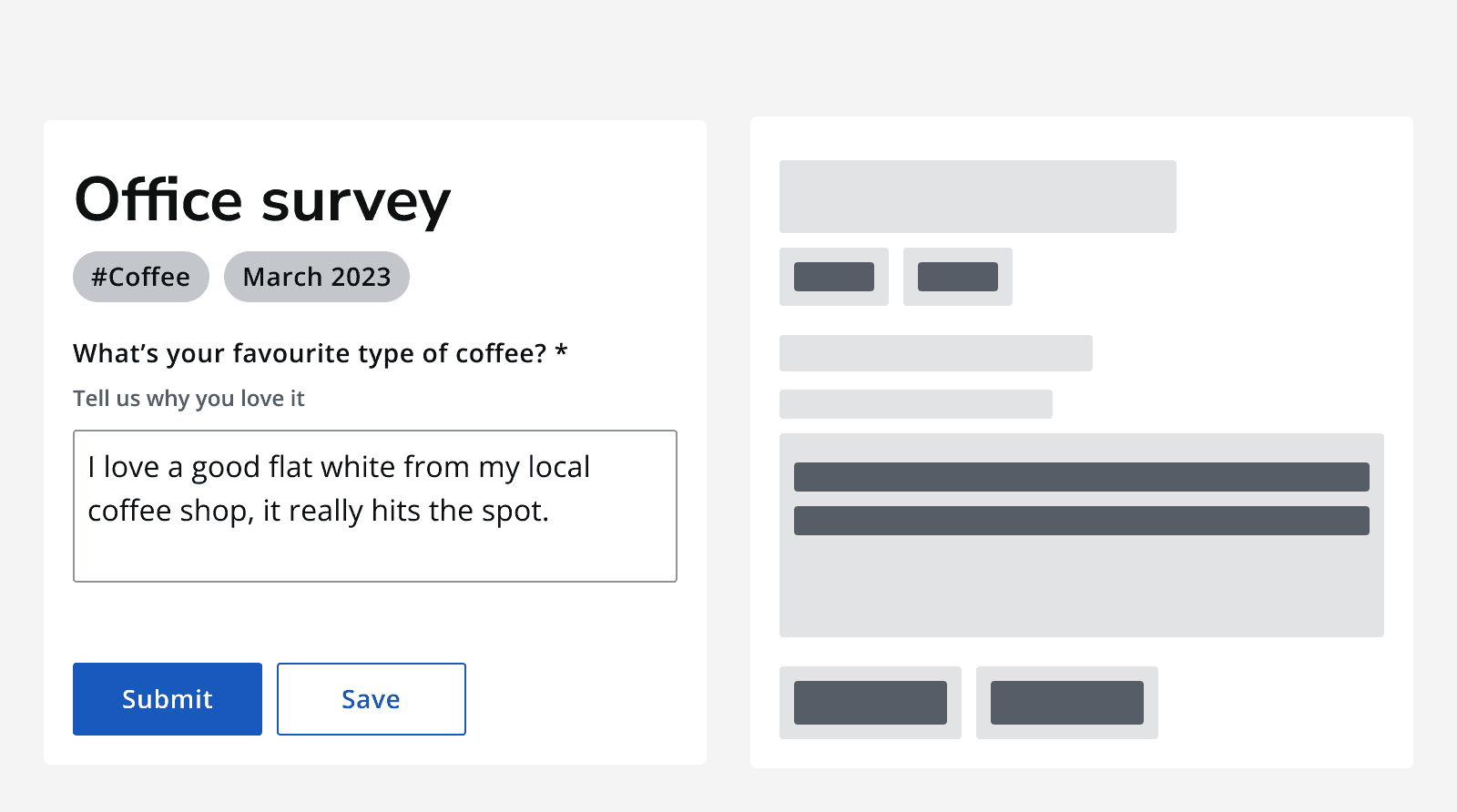
Sizing
Set the height and width of the skeleton to match the size of the component that will replace it once loaded.
When using the text variant, set the skeleton’s height to match the text style of the text that will replace it once loaded.
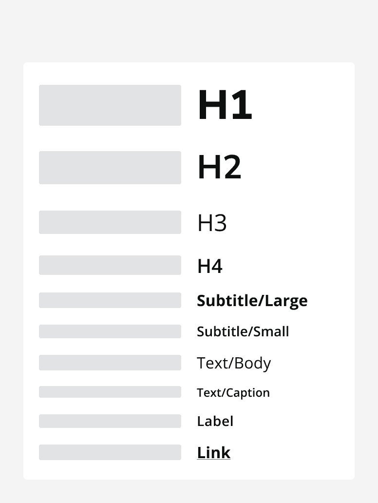
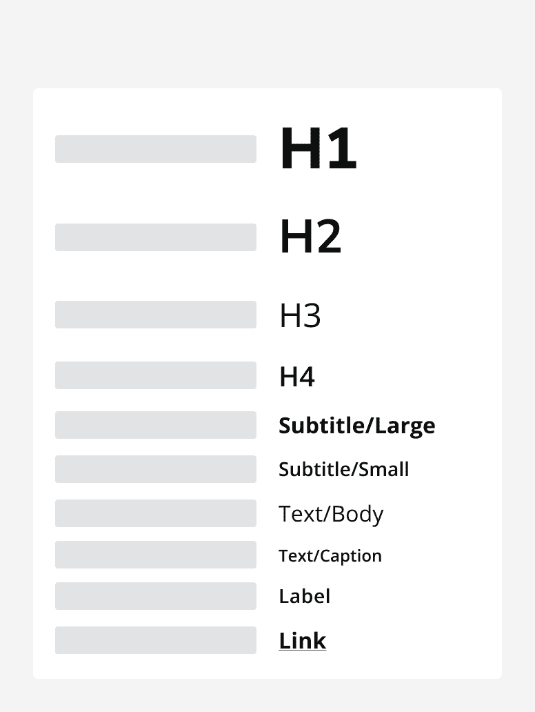
Don't replace large bodies of texts with one single large text skeleton. Replace each line with a separate text skeleton.


When not to use
Avoid displaying skeleton placeholders when something will load in 300ms or under to avoid flashing on the page. If needed, manually specify a 300ms delay, after which the skeleton component is displayed.
Don’t use skeleton loading states when the loading progress can be calculated. Instead, use
Don’t use skeleton components when the general structure of the page that will replace skeleton variants is not known. Instead, use