Text field
Text field
Component variants
There are two types of text field:
-
Single line text fields
-
Multi-line text fields (also known as text areas)
Text fields
Use text fields for entering and editing single lines of text.
Interactive example
Text areas
Use text areas for entering and editing large amounts of text that require more than a single line.
Interactive example
When to use
Use text fields as part of a form or other data collection page for capturing text input.
Content
Labels
Use clear labels to indicate what information should be entered into the field.
Helper text
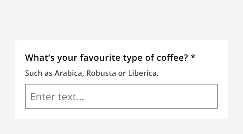
Use helper text in addition to the field label when additional information helps users understand what information is required.

When setting minimum and maximum values using themin
andmax
props, make sure to add an indication of these formatting rules in the helper text.
Placeholder text
Use placeholder text to optionally provide an example of what to type into the field.
Only use placeholder text if it makes it easier to fill in the text field.
Don't use placeholder text to convey additional meaning other than an example of the expected input.

Icons
When including an icon in a text input make sure that the icon is understandable and relevant to the type of input required by the field. Always provide alternative descriptions for icons. Don't use icons if they aren't necessary.
Character count
Include a character limit and counter to show how close the current input is to the maximum input length.

Layout and placement
Field width
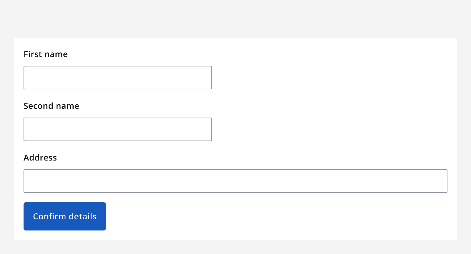
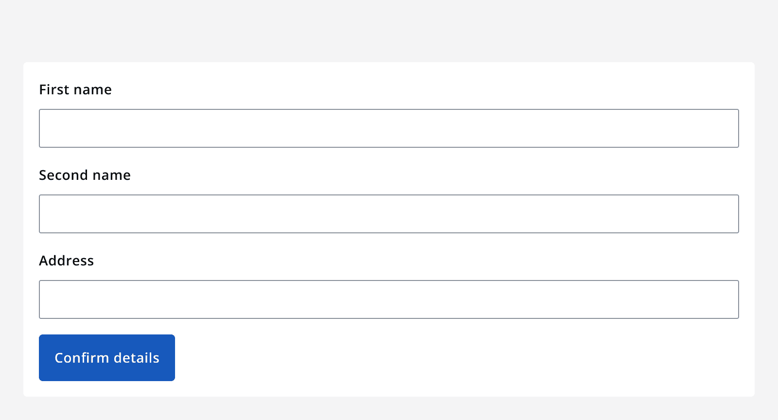
Make the width of the field reflect the length of content you expect the user to enter.


Validation (error handling)
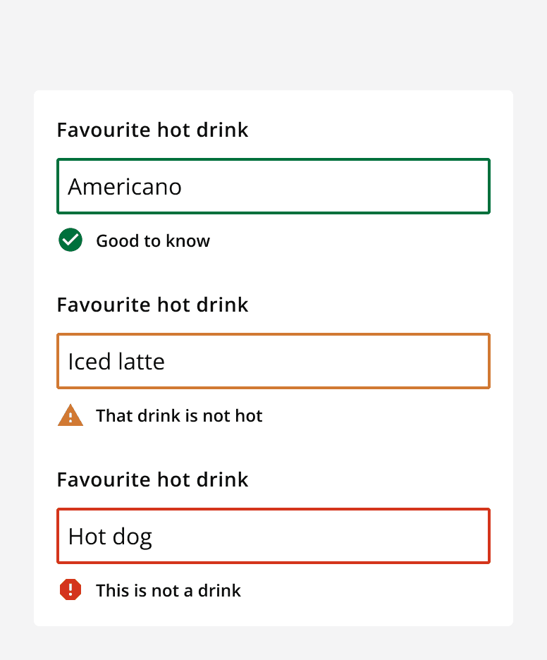
Real-time validation helps the user streamline their process and efficiently complete a form. All error validation should be accompanied by an error label. Use inline validation for successes that don't require success labels.
