Back to top
Back to top
Introduction
An example of the back to top component.
Interactive example
Component variants
There are two variants of the back to top component:
-
Default
-
Icon-only
When to use
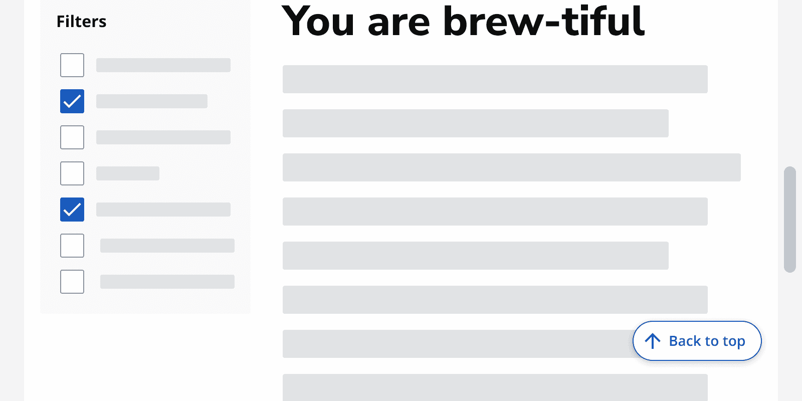
Default
Use this component for pages with a lot of content that requires scrolling, such as intranets, reports and content-heavy apps.
Consider using it on all apps to improve usability for everyone, including keyboard-only and some assistive technology users.
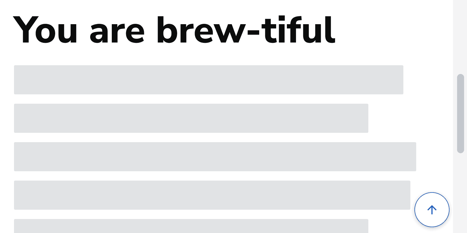
Icon-only
The icon-only back to top button should be used when a page is zoomed, to minimise overlapping content.
When not to use
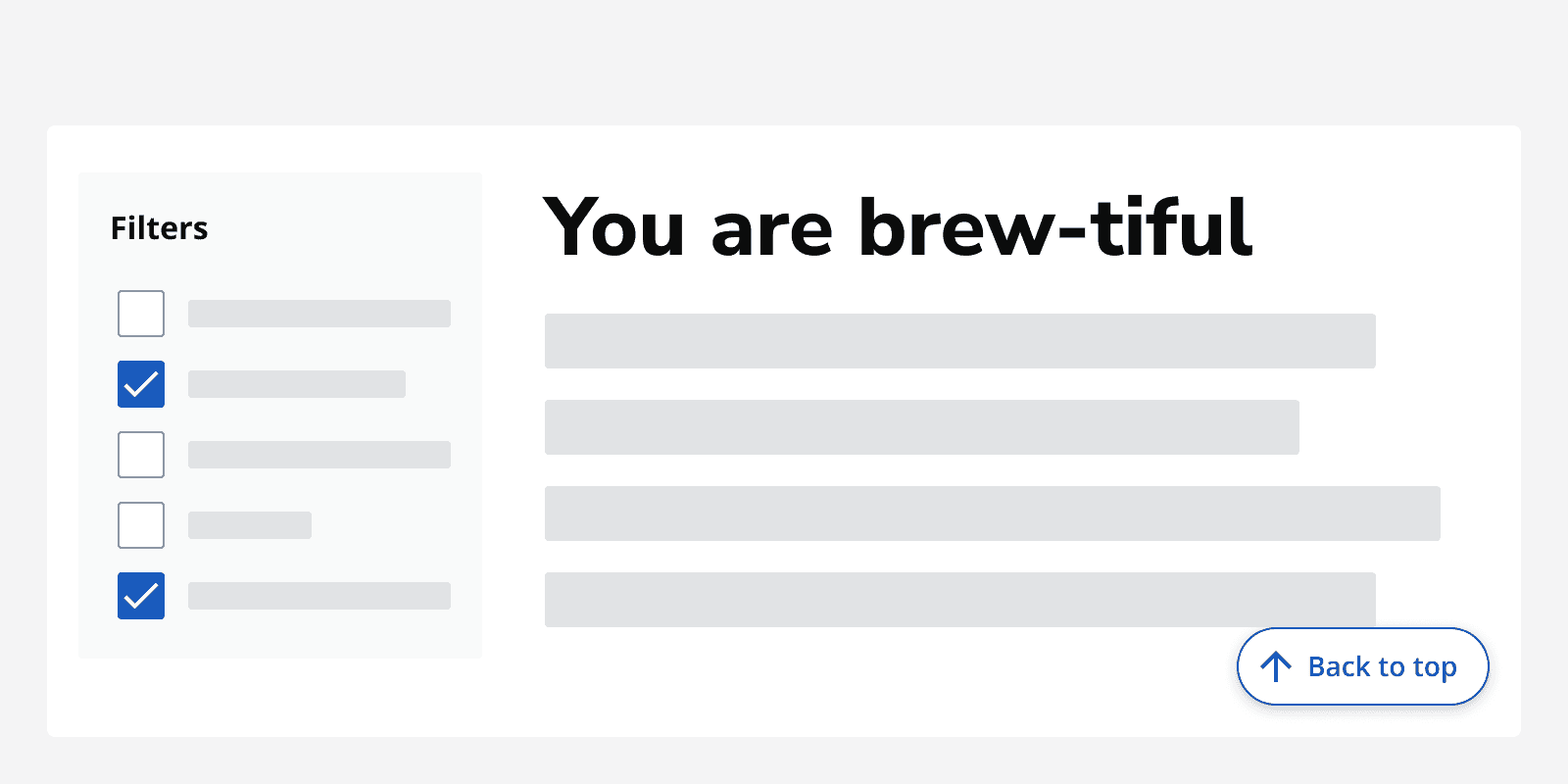
Don't use when the page is designed to fill the viewport without scrolling.
Don't display the back to top button when the page is already scrolled to the top.
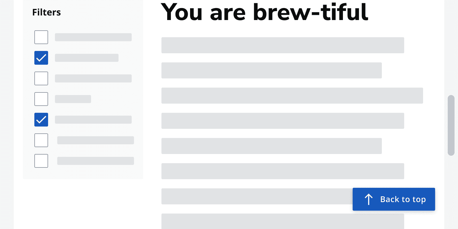
Only use the provided back to top component. Don't use any other button in place of the back to top component.
Avoid using the default back to top button when zoomed, as it may obscure important page content. The icon-only back to top button should be used instead.
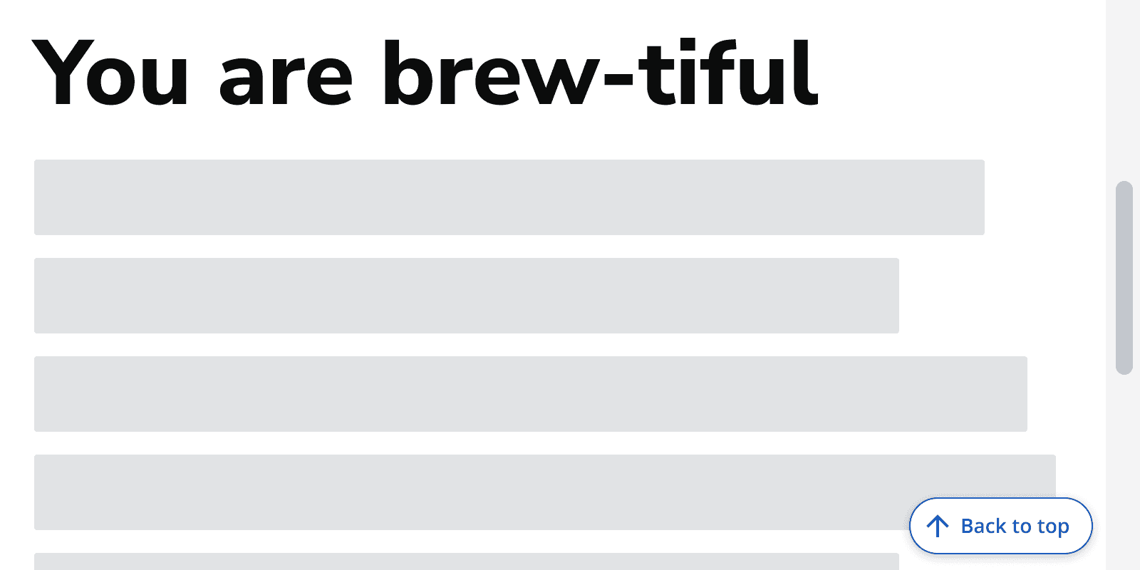
Interaction behaviour
The back to top button targets themain
region in your code.
Avoid setting focus to the top of thebody
because users will have to navigate through the header and navigation.
Layout and placement
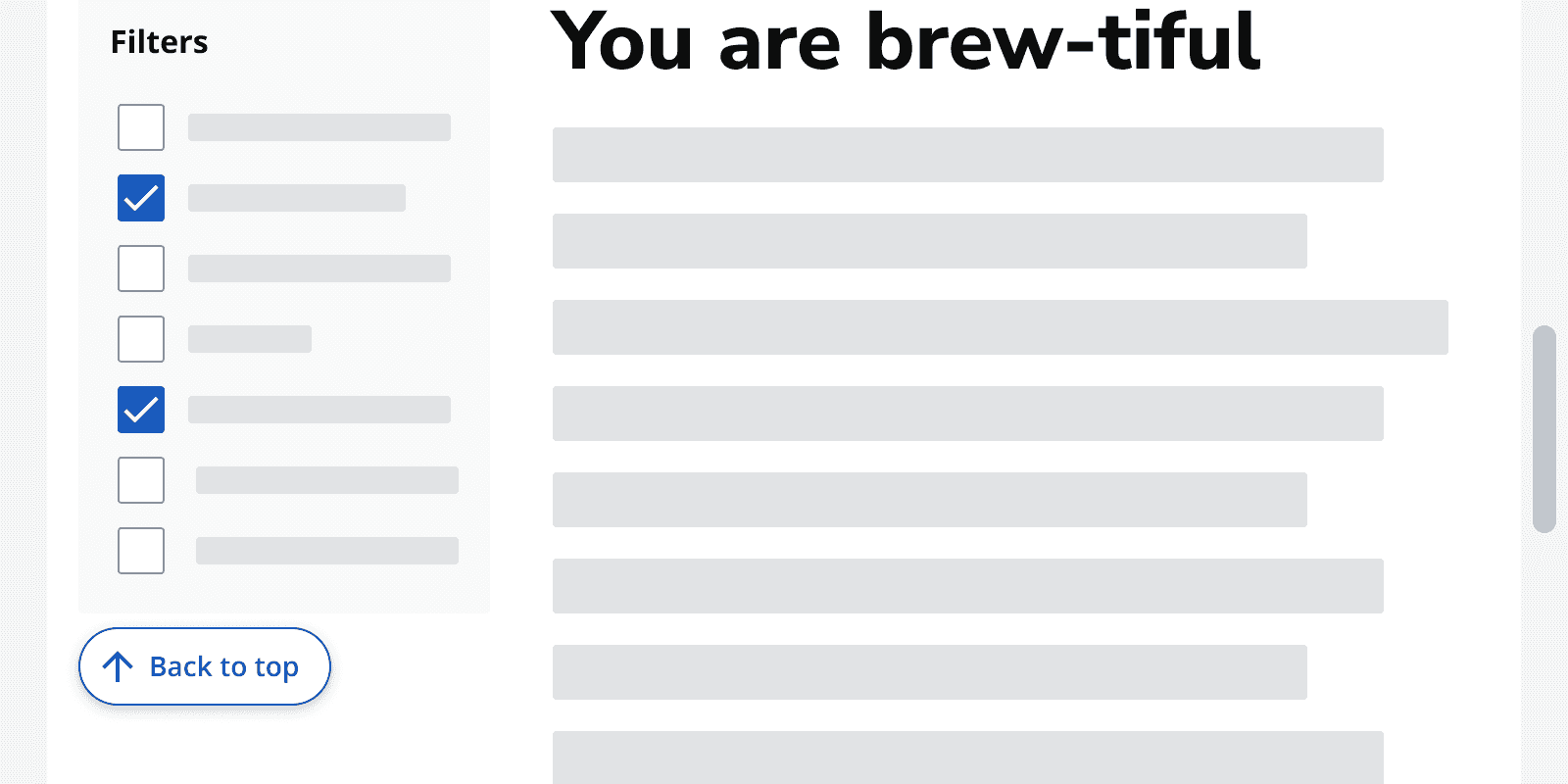
Don’t place the back to top button anywhere else as it may obscure important information or interactive components.
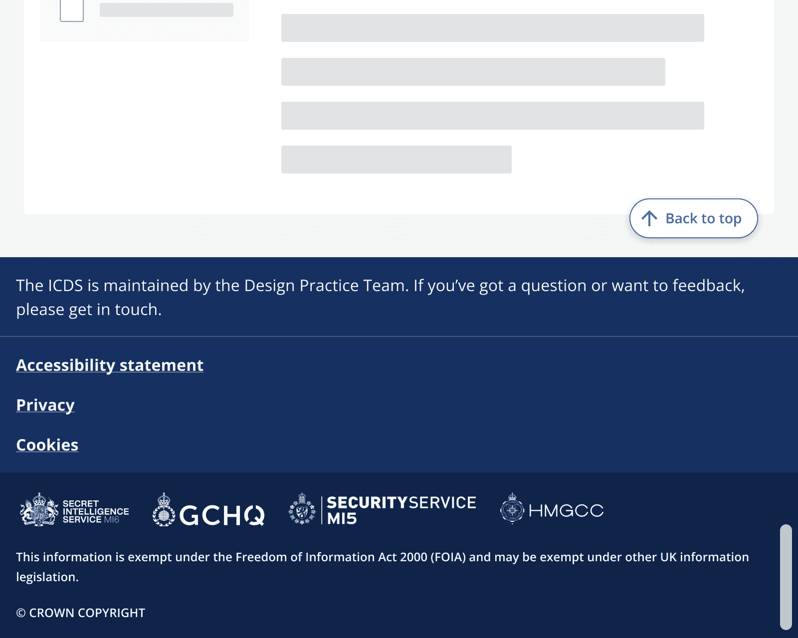
When the bottom of the page is reached, the back to top button anchors into place above the
Motion
When clicked, the component should navigate to the top of the page without any scrolling animation.