Breadcrumb
Breadcrumb
Introduction
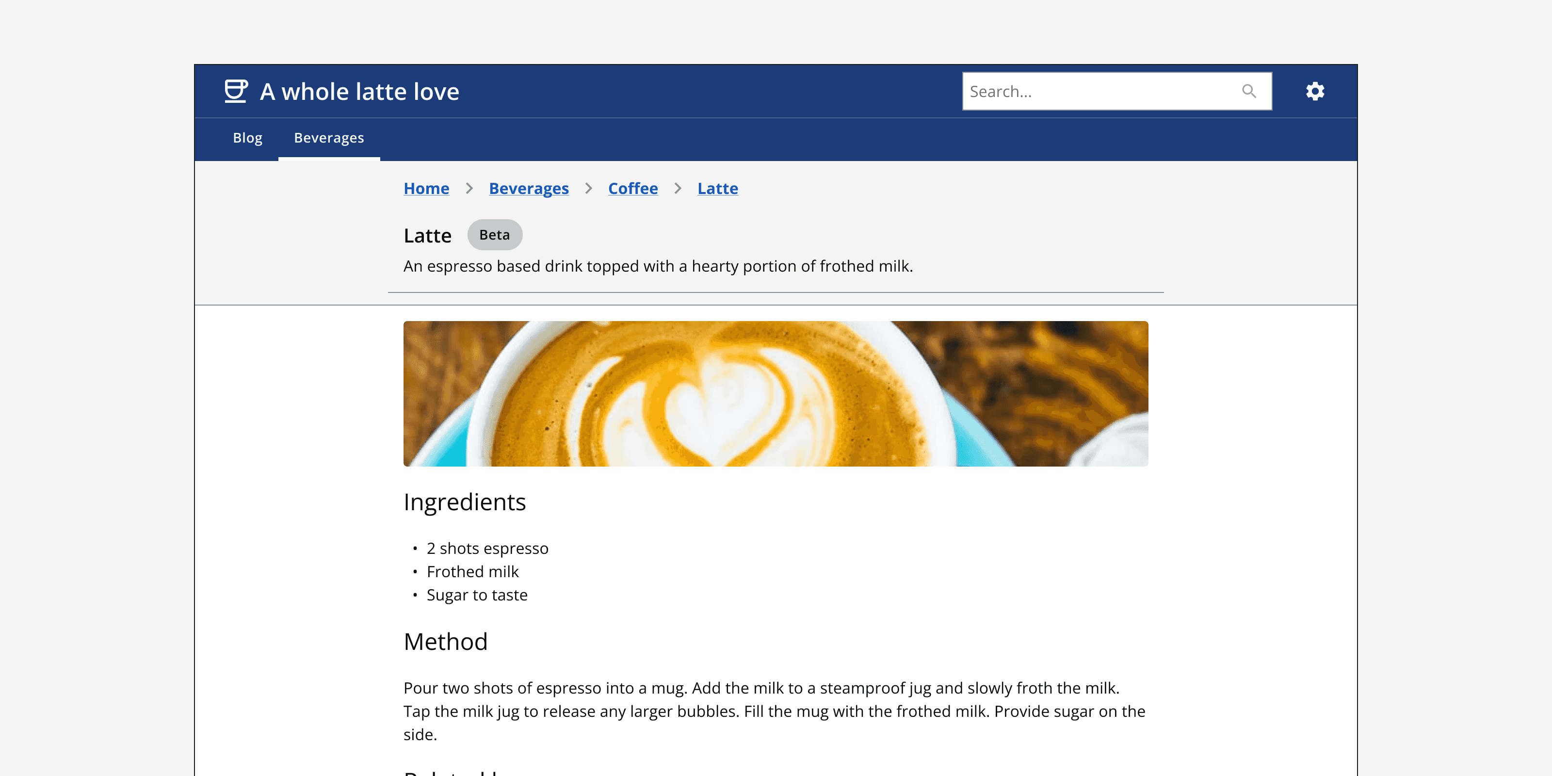
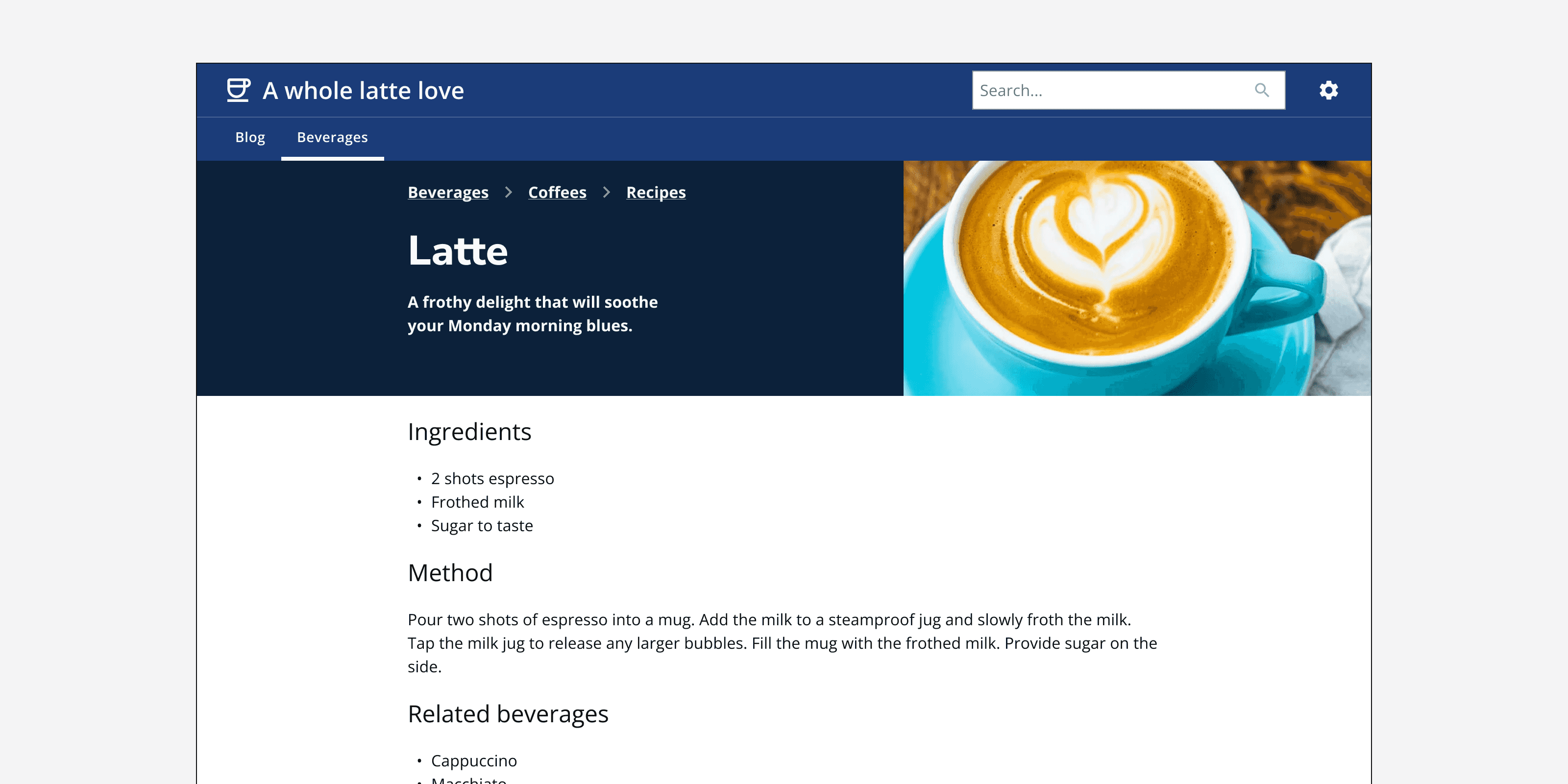
An example of the breadcrumbs component.
Interactive example
When to use
Use breadcrumbs to describe an app’s hierarchy and where the current page sits within it. Use breadcrumbs for apps that have a large number of pages within a complex structure.
Show the current page’s parents, grandparents and other ancestors so that the user can easily move back up the hierarchy. Always show a link to the app’s homepage as the top-level link in the breadcrumb component.
Use breadcrumbs as a secondary navigation option to supplement the app’s main navigation method.

Use the ‘back breadcrumb’ for apps with simple structures that are only one or two levels deep. Show the current page’s immediate parent in the back breadcrumb link.
Use a condensed breadcrumb to hide the middle steps between the page’s parent and the homepage. However, always allow the condensed breadcrumb to be expanded to show the full path.
When not to use
Don’t use breadcrumbs as the primary method of navigating through an app’s pages. Always include a global navigation method to allow any page to be easily accessed from any other page.
Don’t use breadcrumbs to show the history of recently visited pages. Only use breadcrumbs to show the location of the current page within an app’s structure.
Don’t use breadcrumbs if the app’s structure is only one or two pages deep. Use the ‘back breadcrumb’ or use a different method to indicate the page’s position.

Don’t include the current page as a link within the breadcrumbs. Instead use clear titling on the page itself to label the current page. If displaying the current page within the breadcrumb, then make sure it is not clickable.

Avoid showing more than six levels in a breadcrumb. Consider your app’s information architecture and whether the site’s structure can be flattened. If this can’t be achieved, use hub pages as the first link in a breadcrumb, which themselves provide a method of returning back to the homepage.
Colour
Always use the default theme of breadcrumbs to ensure that the links are recognisable as links. However, use the light or dark theme withmonochrome={true}
if breadcrumbs are positioned on different coloured backgrounds to ensure good colour contrast.

Content
Make sure that the breadcrumb label is the exact title of the page it links to.
Layout and placement
Always position breadcrumbs at the top of page content but below main navigation components such as the