Intelligence Community Design System ICDS Get started Accessibility Styles Components Patterns Community
Show navigation section

Top navigation

Guidance Code Accessibility

Component variants

Top navigation has two variants: standard and one with a mega-menu.

Standard

Use a standard top navigation for apps with eight or fewer navigation options.

Interactive example

With mega-menu

Use a top navigation with mega-menu for apps with more than eight navigation options, or options that can be grouped into categories. The main link groups are displayed in the top navigation and open a mega-menu when hovered over or focused.

Interactive example

When to use

Use the top navigation component for intranet-style and content-heavy apps. Use it for apps with complex page structures where every page should be accessible from any other page using the mega-menu.

Use top navigation alongside additional components like page headers to create a variety of different layout and navigation styles.

When not to use

For apps with a small number of pages, use side navigation as it's better suited for providing quick access and maximising the screen space for page content.

Use either top navigation or side navigation. Don't use both at the same time.
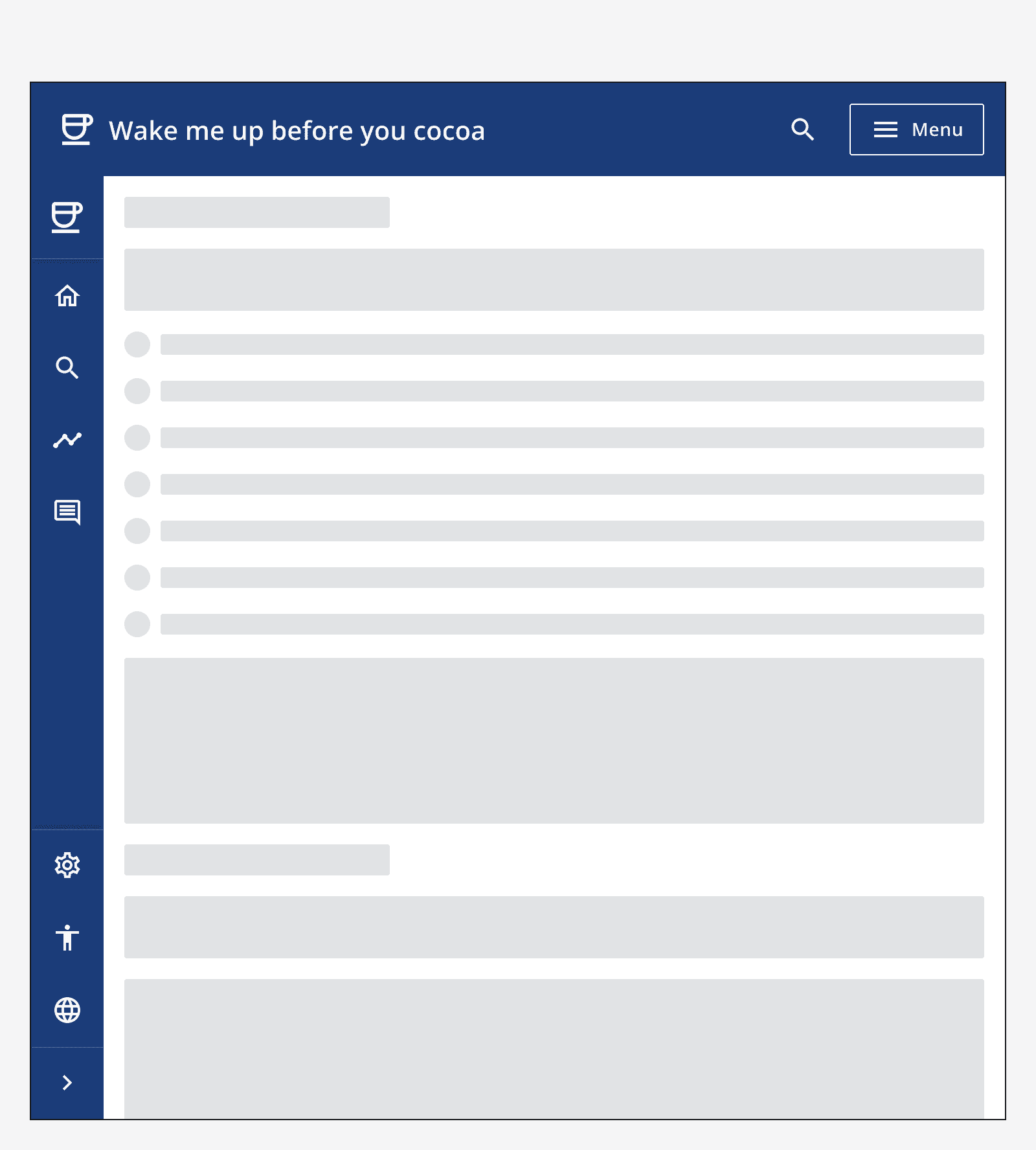
An example app that shows a top navigation and side navigation used on the same page.
Don't use both top navigation and side navigation at the same time.

Optional elements

Include an optional search bar to provide search functionality on every page in the app.

Include secondary links or actions that appear on the right-hand side of the top navigation. Use these for global utilities like application settings, or as links to other related sites.

App status and version

Use the title adornment and app version to display the app's info in the top navigation.

An example of top navigation with a search bar included as well as secondary links and app status and version information.
Top navigation with search bar, secondary links and app status and version.

Interaction behaviour

When using a top navigation with mega-menu, the menu is displayed when hovering over, or focusing on, the main navigation groups.
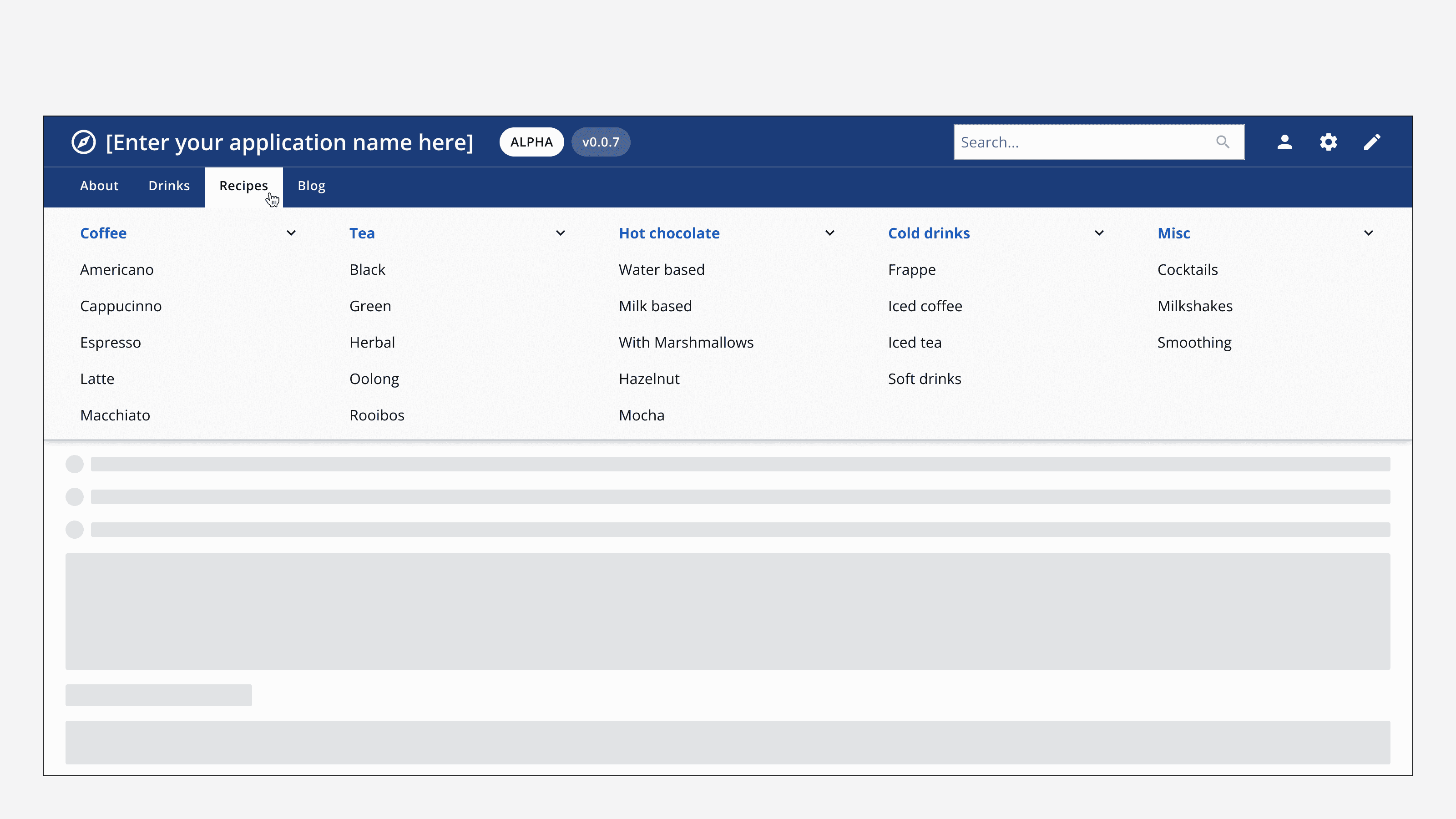
An example top navigation with mega-menu showing the mega-menu appearing when the user hovers over a navigation group in the top navigation component.
A mega-menu is displayed when hovering or focusing on the top navigation's main groups.

On smaller screens, both top navigation variants will display a menu button that opens a drawer menu from the right-hand side of the screen. The drawer menu can display lists of single links or grouped links that can be expanded and collapsed.
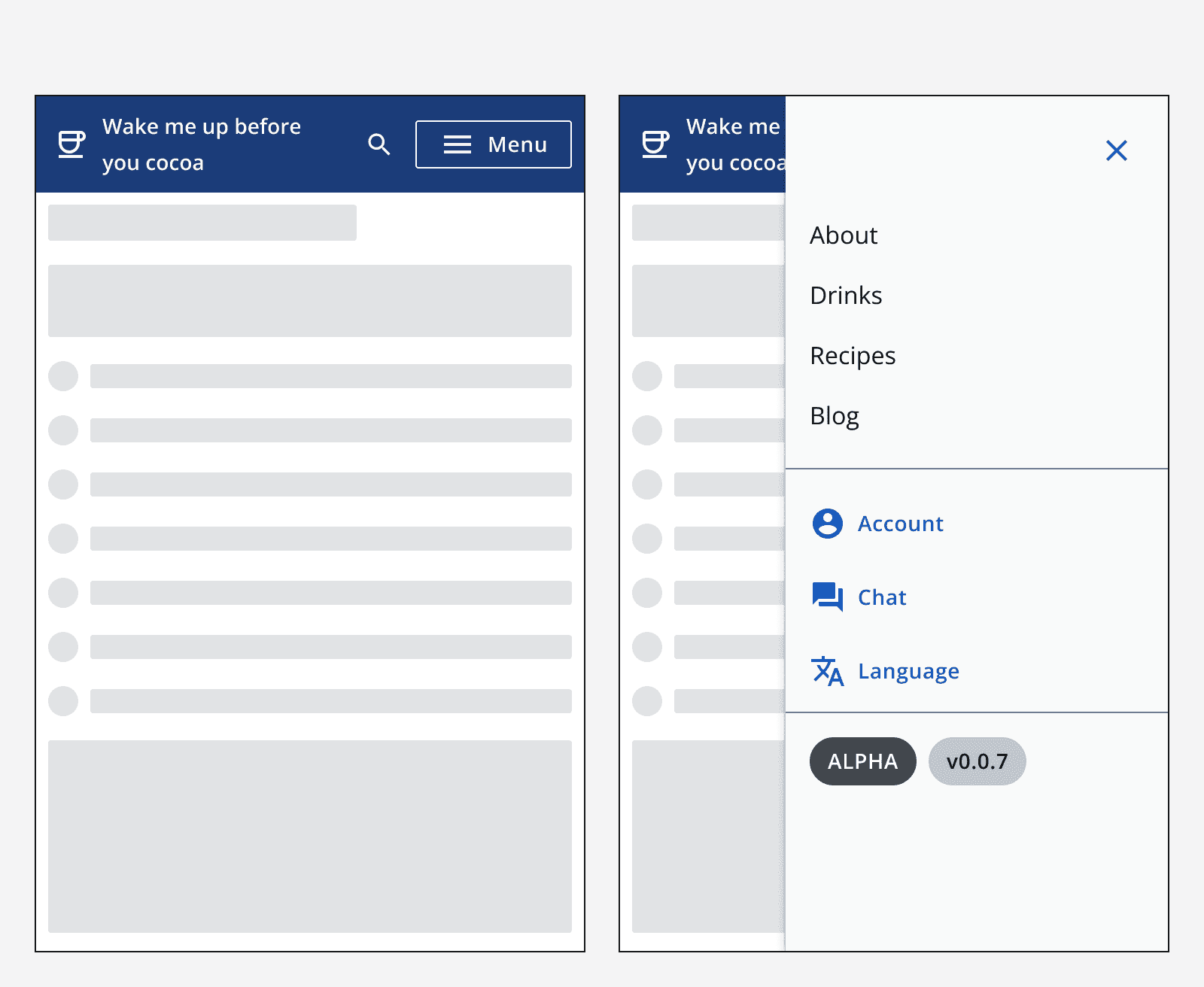
An example of top navigation displayed on a smaller screen. It displays a menu button that opens a drawer menu that includes the navigation links.
Top navigation displayed on smaller screens uses a drawer menu to display its navigation links.

Colour

The top navigation uses the app's brand colour as the background and automatically sets the foreground colour to ensure accessible contrast ratios.

Change the app's brand colour to change the background colour of the top navigation and help distinguish your app from others your users may use.

Six examples of top navigation components using different brand colours.
Examples of top navigation using different brand colours.

Sizing

Always position the top navigation at the top of the screen and make sure that it horizontally fills the browser window.
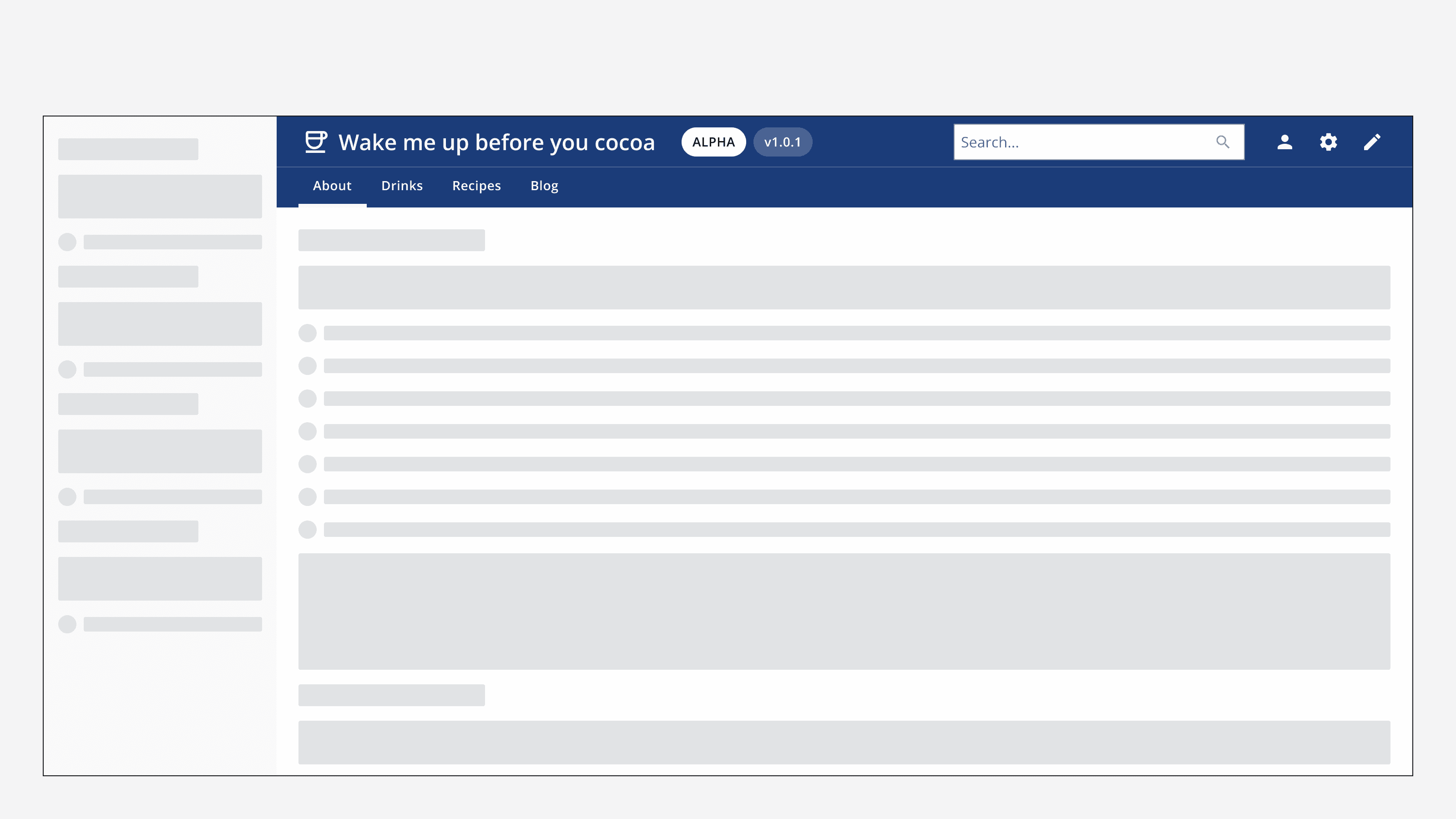
An example app with top navigation that does not horizontally fill the browser window.
Don't position the top navigation so that it does not horizontally fill the browser window.

Layout and placement

Alignment

Align the top navigation's content either full width or centred.

Use full width alignment to position the top navigation content to the left and right of the browser window.
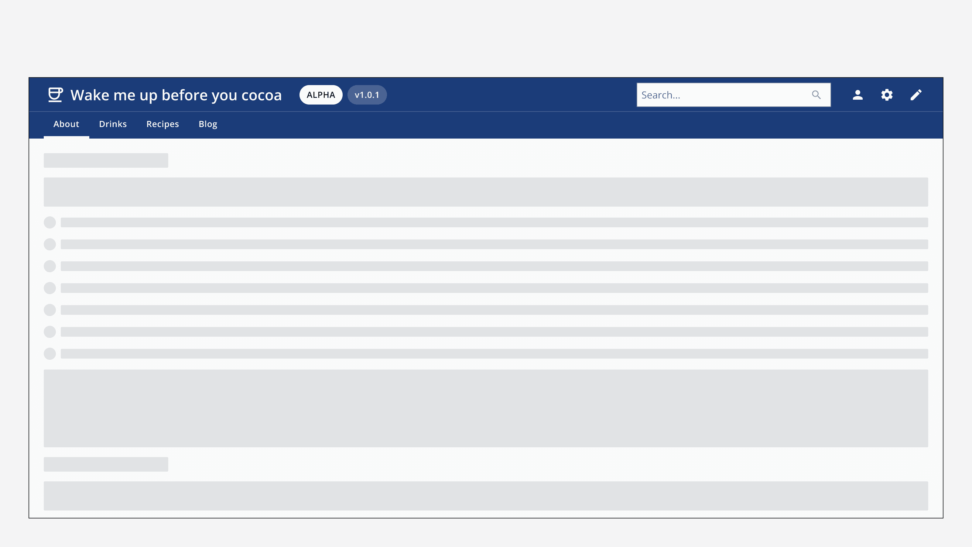
An example top navigation that is aligned full width. The app name and main navigation is aligned to the left-hand side of the browser window and the secondary links and search bar is aligned to the right.
Use full width alignment to position the top navigation content to the left and right of the browser window.

Use centre alignment to position the top navigation content in line with other page content.
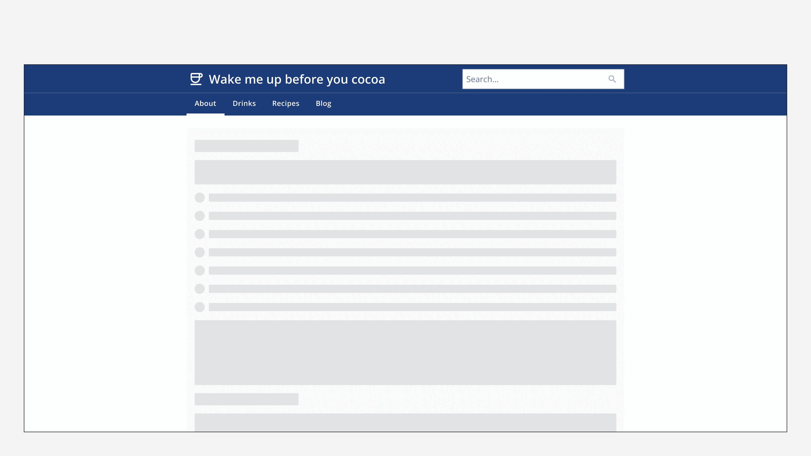
An example top navigation with its content aligned to centre. The top navigation content aligns with the page margins used for the rest of the page content.
Use centre alignment to position the top navigation content in line with other page content.

Content

Labels and icons

Follow the content style guidelines for all navigation option labels as well as each option group label.

Follow the icon style guidelines when selecting icons for menu options or secondary links.

Make sure to keep navigation option labels concise, as they may not all fit within the top navigation on all screen sizes.

For the standard variant, don't use more than eight links as this may not display correctly.
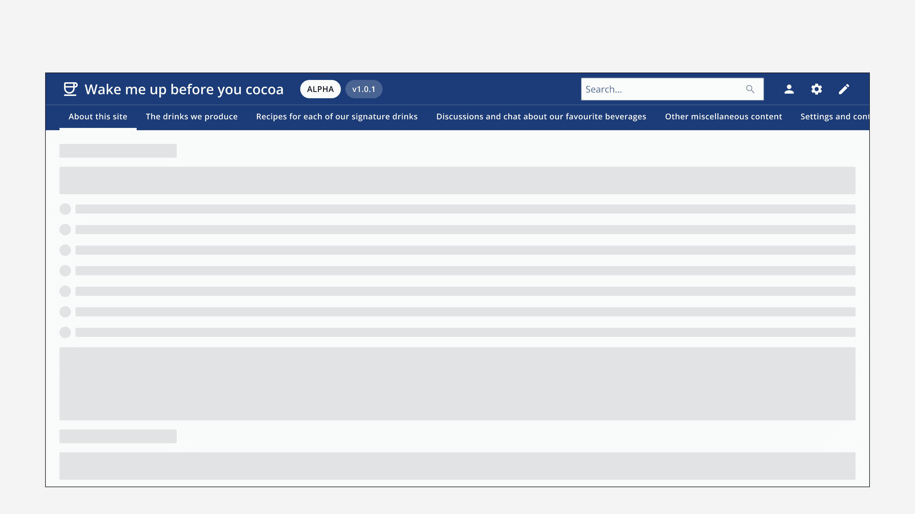
An example top navigation with eight links with long labels. The links don't fit horizontally within the top navigation.
Don't use lengthy navigation option labels as they may not fit on all screen sizes.

Mega-menu

Include up to five columns of navigation links in the mega-menu and aim to keep the number of links in each column to six or fewer.
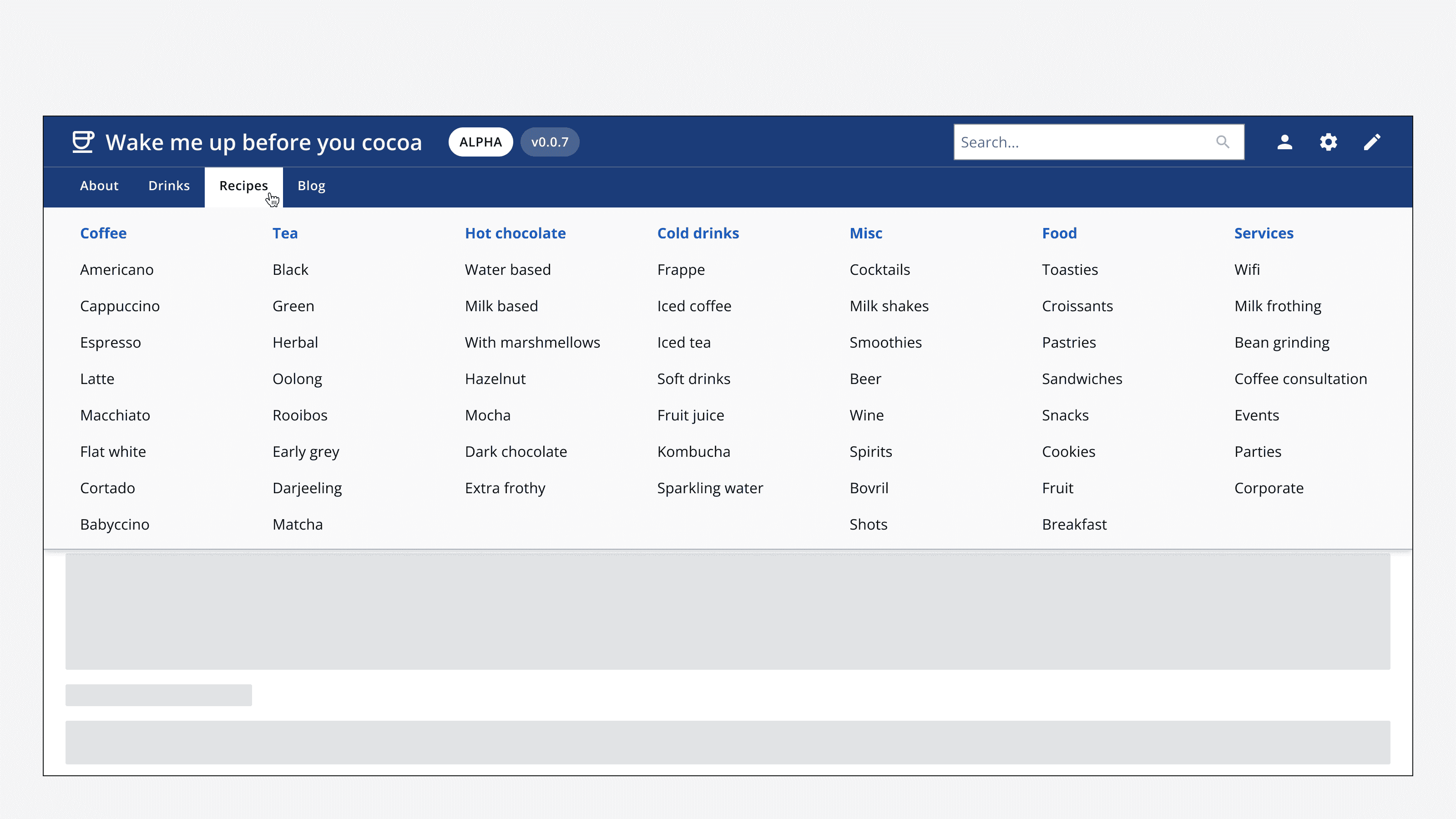
An example top navigation with mega-menu that shows seven columns of links, with each column containing eight links.
Avoid using a mega-menu with more than five columns of links, and avoid using more than six links in each group.

Last reviewed 3 February 2023 .
Navigated to Top navigation - Intelligence Community Design System