Intelligence Community Design System ICDS Get started Accessibility Styles Components Patterns Community
Show navigation section

Button

Guidance Code Accessibility

Component variants

There are five variants of button:

  • Primary buttons

  • Secondary buttons

  • Tertiary buttons

  • Destructive buttons

  • Icon buttons

Interactive example

Add to order View coffees Find out more Cancel order

When to use

Primary buttons

Use primary buttons to provide high emphasis to a key action. Use them for the most important action on a page or within a container.

Secondary buttons

Use secondary buttons to provide medium emphasis for less important actions on a page or within a container.

Group these buttons to provide a set of actions of equal priority.

Tertiary buttons

Use tertiary buttons to provide low emphasis for low priority actions on a page or within a container that aren't important or used frequently.

Use tertiary buttons for dismissive actions such as to close a dialog, navigate back a step or to cancel an action.

Destructive buttons

Use destructive buttons for actions that can't be reversed. For example, use them for a delete action that can't be undone.

Icon buttons

Icon buttons work like a normal button but don't include a visible text label. Use them to provide a compact method of triggering an action.

Use icon buttons for well understood actions that are represented clearly by the icon's visual content. For example, a 'bin' icon indicates a delete function. Read more about iconography for guidance on selecting and creating icons.

Always provide a textual description available programmatically and a visible label that is displayed using a tooltip when hovering on an icon button.

When not to use

Buttons should trigger actions and affect content on the current page or container. To navigate to a new page or open a new tab use links instead.
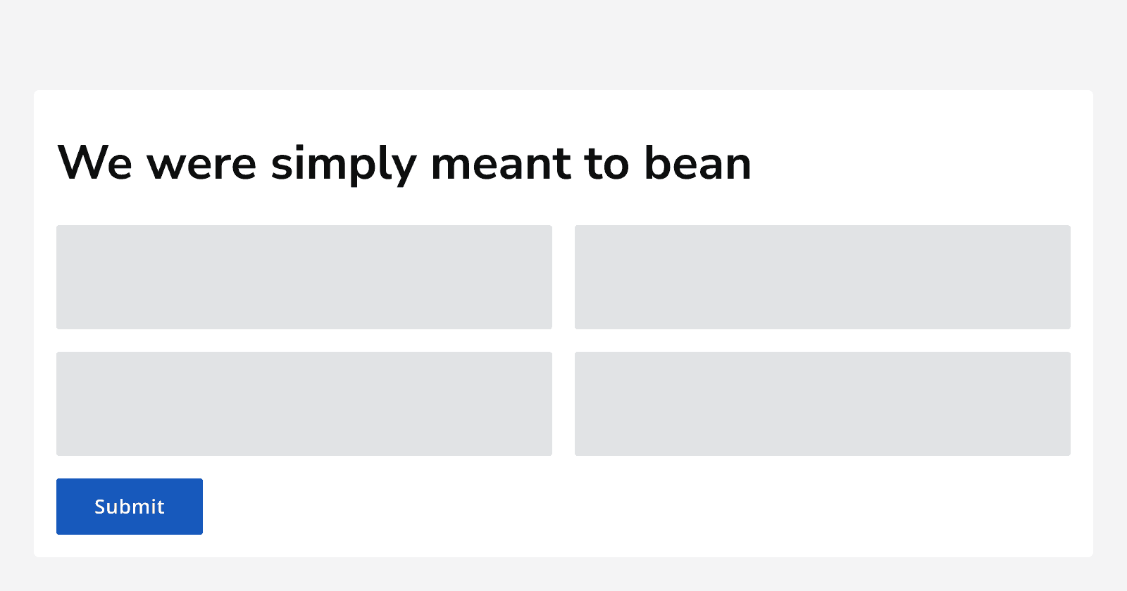
An example page showing a primary button labelled 'submit' at the bottom of a page.
Use buttons to complete actions on the page such as adding or deleting an item, confirming or closing a dialog, or as a tool in a toolbar.
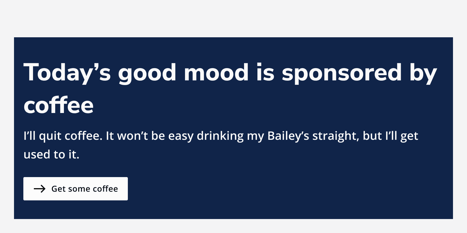
An example of a page with a hero banner with the title 'Today's good mood is sponsored by coffee.' A secondary button is displayed on the hero banner acting as a link to a new page called 'Get some coffee'.
Don't use buttons to navigate users to a new page.

Interaction behaviour

When an action triggers a background task, use the button loading state to provide feedback to the user that something is happening.

Interactive example

Loading

Colour

Don't change a button colour as this makes them less recognisable as actions.

Appearance

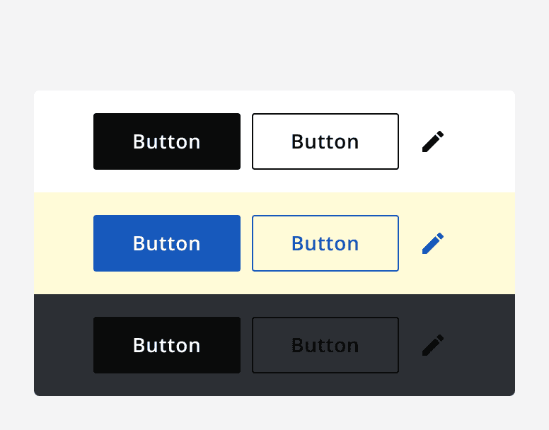
Primary, secondary, tertiary and icon buttons have default, light and dark appearance options.

Use different button appearances when placing buttons on coloured backgrounds to ensure good contrast and avoid colours clashing. Use light appearance buttons on dark backgrounds and use dark appearance buttons on light backgrounds.

When you use the UI Kit components together they will select the appropriate variant.
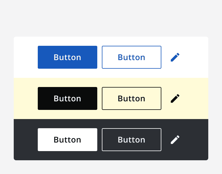
Button variants on a white background, dark button variants on light coloured backgrounds, and light button variants on dark backgrounds.
Use different appearance options on different coloured backgrounds to ensure good contrast and avoid colours clashing.
A bad example showing dark button variants used on a white background, coloured button variants on coloured backgrounds, and dark button variants on dark backgrounds.
Use the correct button appearance to meet minimum contrast requirements.

Sizing

Buttons have three different sizing options: default, small and large.

Use components of the same size together. For example, use a default sized button with a default sized input component, or use a small sized button with a small sized input component.
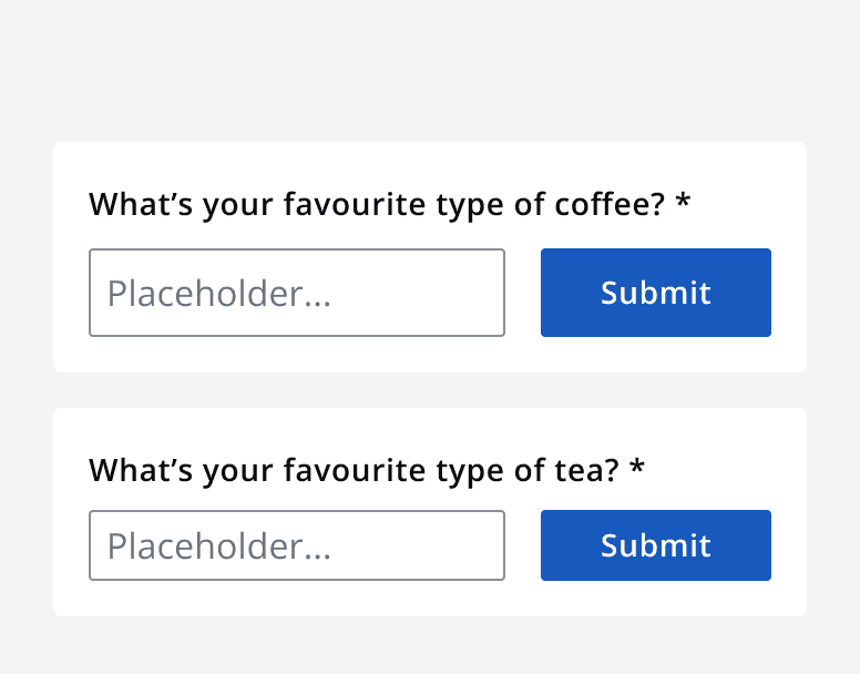
A form with correctly sized components. A normal sized input component is paired with normal sized button, and a small sized input component is paired with a small sized button.
Use the correct buttons sizes to match other UI component sizes.
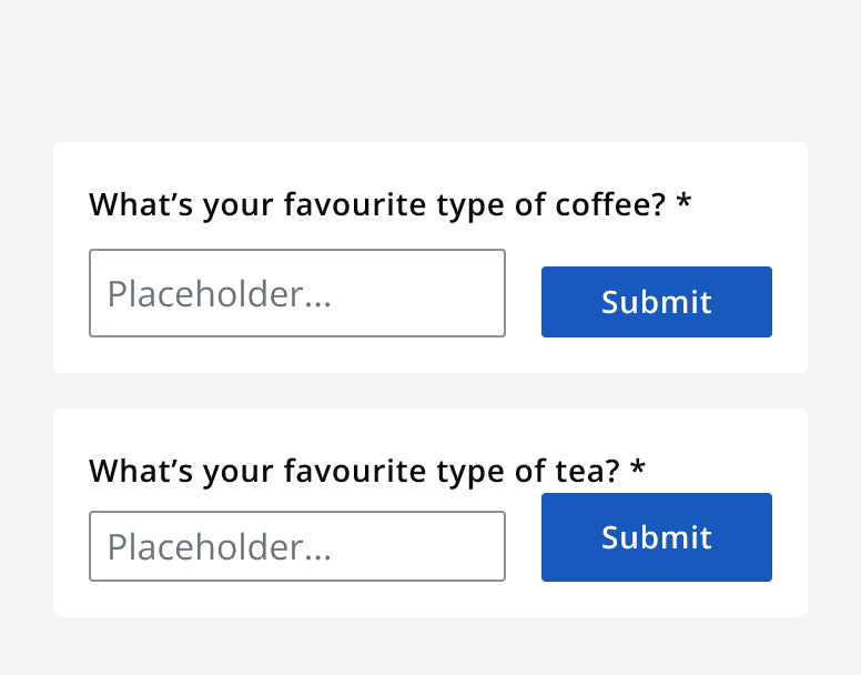
A form with incorrectly sized components. A normal sized input component is paired with small sized button, and a small sized input component is paired with a normal sized button.
Don't mix different sized components.

Use large buttons only for high emphasis actions that sit independently from other UI elements.
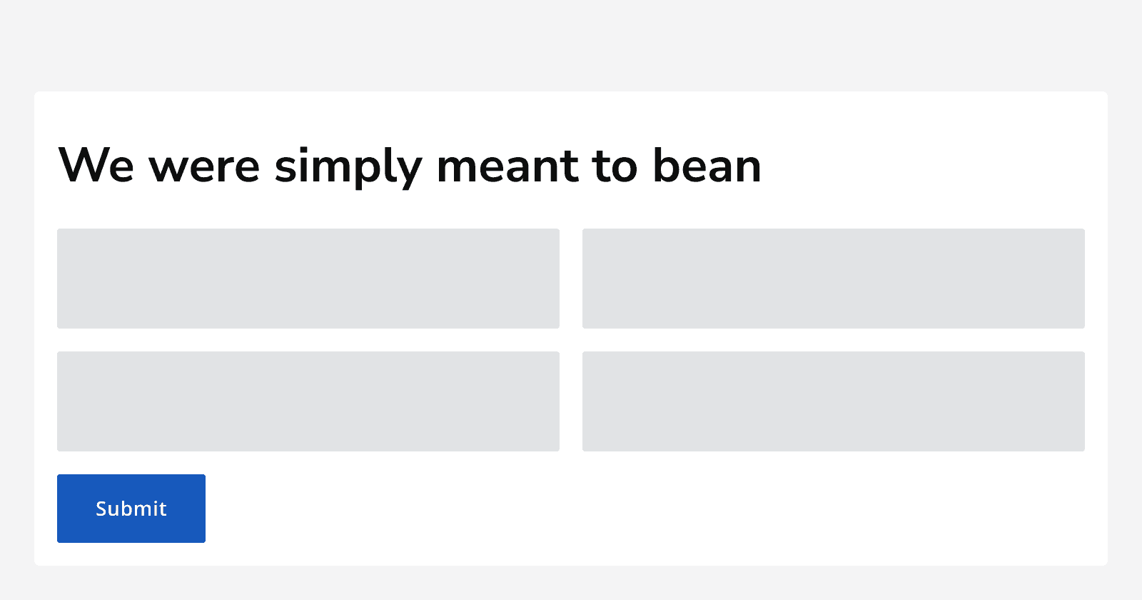
A page showing a large sized button on its own at the bottom of the page content.
Use large buttons for standalone, higher priority actions.

Layout and placement

Button hierarchy

Use only one primary button on a page or within a container. Show the most important action with a primary button.

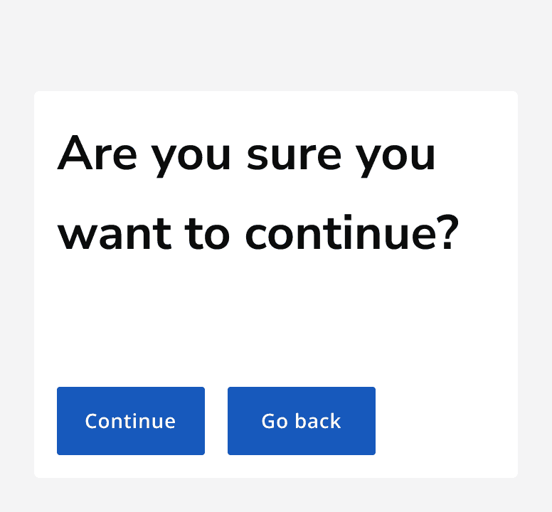
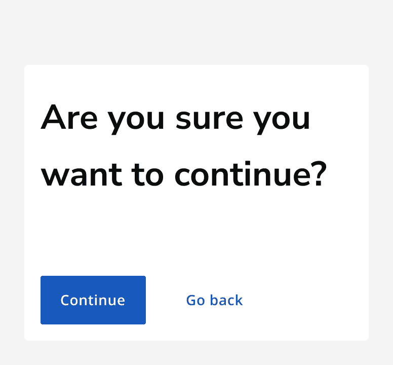
A dialog box reading 'Are you sure you want to continue?' using a primary button for the important 'continue' action and a tertiary button for the lower priority 'Go back' dismissive action.
Use a primary button for the most important action or when you want to influence an action.
A dialog box reading 'Are you sure you want to continue?' using one primary button for the 'Continue' action and another primary button for the 'Go back' action.
Two primary buttons make it less clear what the expected action is.

Use secondary buttons to perform secondary or lower priority actions.

Group multiple secondary actions to provide a set of possible actions with an equal priority.
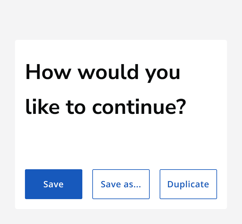
A dialog reading 'How would you like to continue?' showing a single primary button for the 'save' action and two secondary buttons for the 'save as...' and 'duplicate' actions.
Use multiple secondary buttons to provide lower priority actions, whilst using a primary button for the higher priority action.
A dialog that reads 'Are you sure you want to continue?' showing a primary button for the 'continue' action, as well as a tertiary button providing the dismissive 'Go back' action.
Use tertiary buttons to provide a dismissive or cancellation action when paired with a primary button that provides the main call to action.

Button grouping

Group buttons to provide a set of actions.

Highlight the primary action in the group using a primary button. Use all secondary or all tertiary buttons for the rest of the actions.

Don't mix secondary and text buttons to provide multiple actions in a group.

An example page showing a button group containing a primary button indicating the main ‘Submit’ call to action and two secondary buttons for the lower priority ‘Duplicate’ and ‘Save as’ options.
Use a primary button to highlight the key action in a button group.
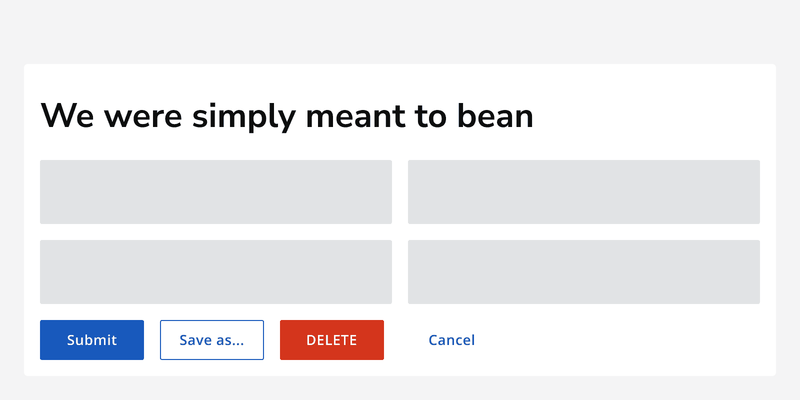
An example page showing a button group comprised of a tertiary button for the ‘Cancel’ action, a destructive button for the ‘Delete’ action, a secondary button for the ‘Save as’ action and a primary button for the ‘submit’.
Don’t use different button types for different actions in a group.

Place primary buttons on the left of a button group unless presented in a modal window where they should be located on the right. This follows common reading patterns when viewing a page and a dialog.
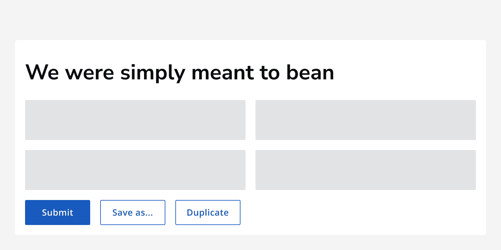
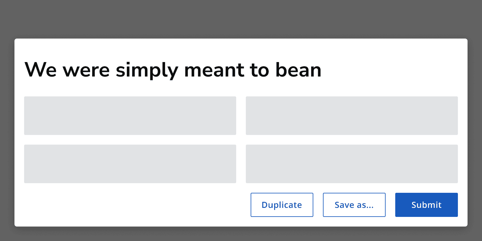
An example page showing a button group positioned in the main page content aligned to the left of the page. The group has a primary button positioned on the left and two secondary buttons to its right.
Position primary buttons to the left when on a page.
A dialog showing a button group positioned to the right. The group has a primary button positioned on the right of the group and two secondary buttons on its left.
Position primary buttons to the right when on a dialog.

Content

Labels

Follow the content style guidelines when writing button labels.

Add useful labels to buttons so that they don't rely on context. Avoid using long labels and keep them specific and concise.
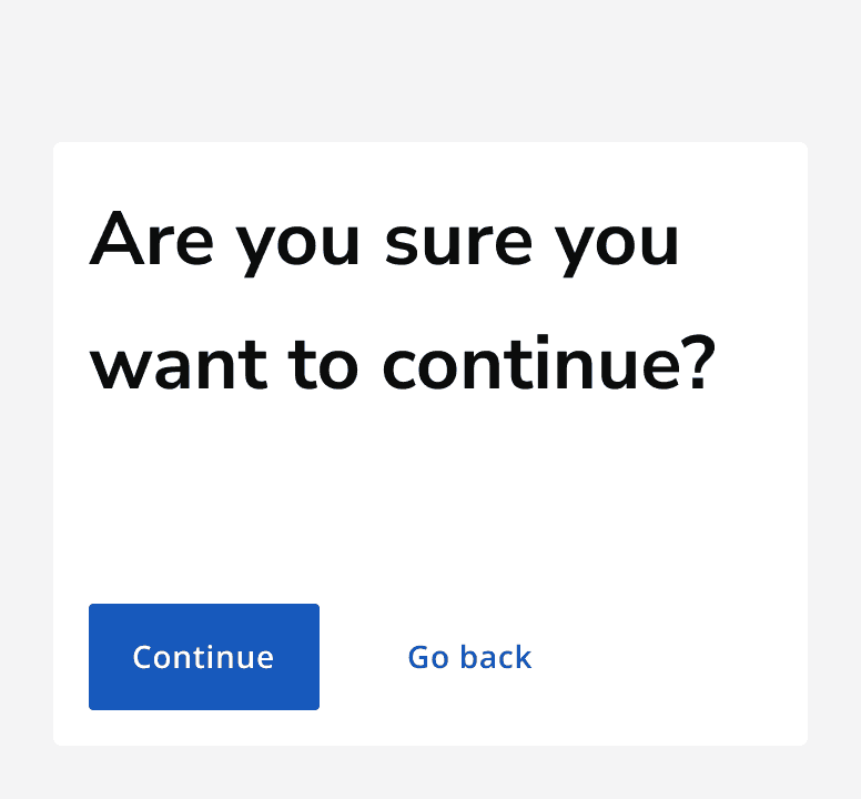
A dialog with the heading ‘Are you sure you want to continue?’. There are two buttons in the modal with labels which read ‘go back’ and ‘continue’.
Use concise but specific labels.
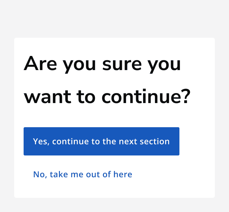
A dialog with the heading ‘Are you sure you want to continue?’. There are two buttons in the modal with labels which read ‘No, take me out of here’ and ‘yes, continue to the next section’.
Don’t use long labels or generic labels.

Always specify an accessible label for the button. The accessible label can include more detail than is described in the visible label, but make sure that the visible label text is included within the accessible label.

For example, a button may have a visible label that reads ‘Submit’. The accessible label may read ‘Submit form’. This includes more information to aid assistive technology users, but still includes the full visible label.

Icons

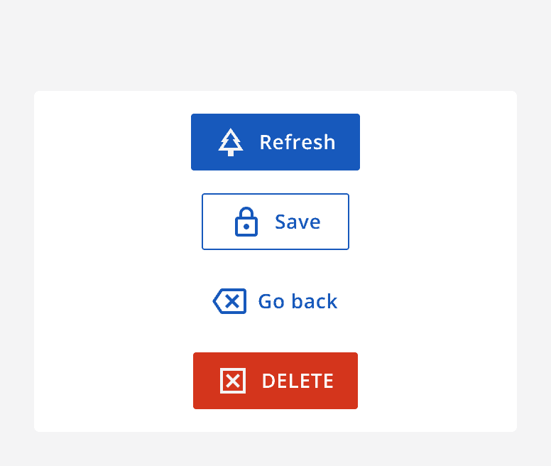
Use an icon on a button to provide additional meaning or to aid in recognition. All button types can display an icon.

Make sure that the icon is understandable and relevant to the action.

Always provide alternative descriptions for icons if they aren't decorative. Only use icons if they are necessary.
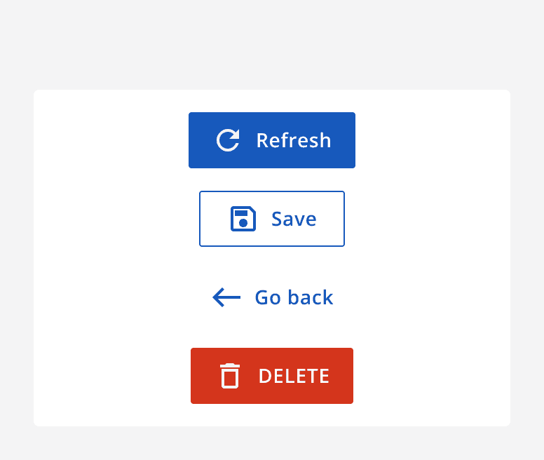
A set of buttons with icons that clearly relate to the action. The icons used are a circle arrow for refresh, a floppy disk for save, a back arrow for go back, and a bin for delete.
Use icons with clear meaning to add clarity to the action.
A set of buttons with icons that are unrelated to the action. The icons used are a Christmas tree for refresh, a padlock for save, a box rectangle for go back and a box cross for delete.
Don’t use complicated, unrelated or ambiguous icons on buttons.

Accessibility considerations

Add labels to all icon buttons using a tooltip , which is useful to sighted users too.

Use useful and context-free labels. If necessary, add additional context in the accessible label.


Last reviewed 10 May 2024 .
Navigated to Button - Intelligence Community Design System