Intelligence Community Design System ICDS Get started Accessibility Styles Components Patterns Community
Show navigation section

Link

Guidance Code Accessibility

Component demo

Links can include a launch icon to the right of the link for clarity.

Interactive example

Return to the café homepage

When to use

Use links to navigate to a new page.

Links can be applied to any text element but will use the link styling.

Always show a launch icon when a link is set up to open a page in a new tab or window, or when directing to an external app.
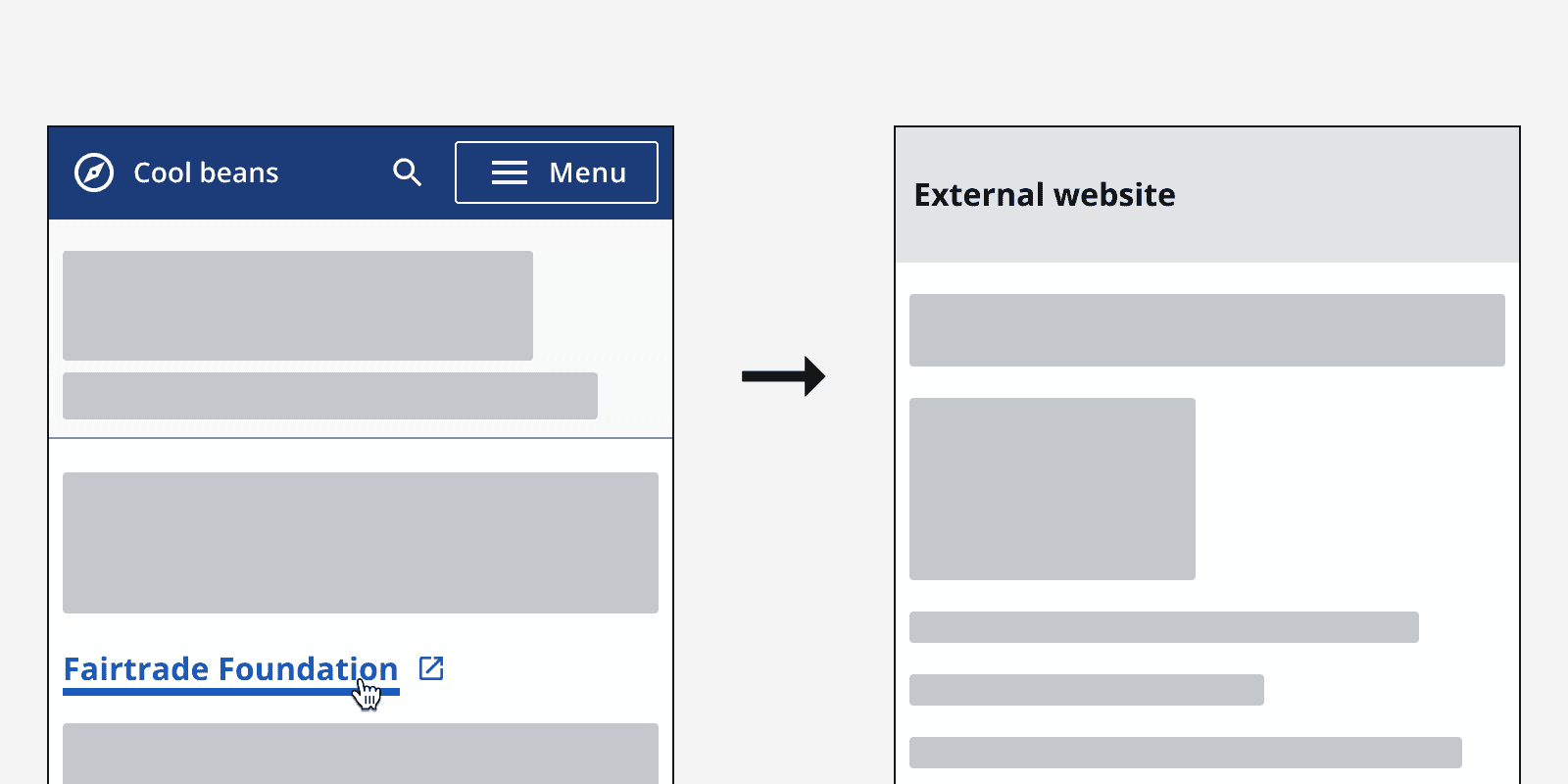
An example of a link labelled ‘Fairtrade Foundation” featuring a ‘launch’ icon to denote it will open a new tab or page.
Always include an external link icon formed by a square and an arrow when directing users to an external address.
An example of a link labelled ‘Fairtrade Foundation” not featuring an external link icon.
Don’t use a default link for links that open a new tab or website.

When not to use

Don’t use a link to display an action on a page, use a button instead.
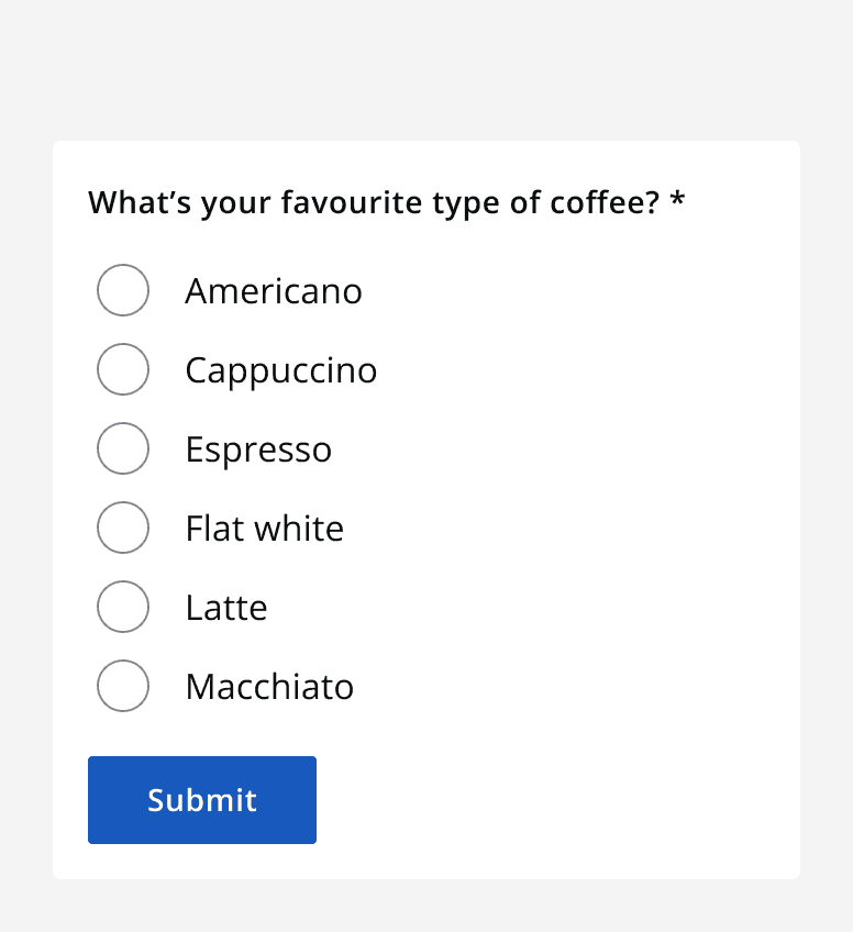
An image of an example form featuring a group of radio buttons, with a submit button at the end.
Use a button when displaying a clickable action.
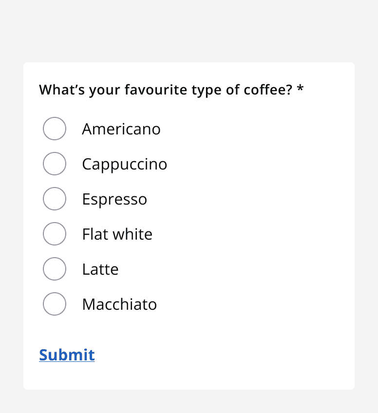
An image of an example form featuring a group of radio buttons, and a link labelled ‘Submit’ at the end.
Don’t use a link to initiate an action.

Colour

Once a link has been visited, the browser will remember this and the link will change to use the visited styling.

Your browser is set to remember what links have been visited. Visited links feature a different colour style.

All other states will use specific hyperlink styling .

Use default theme links when used inline with other text.
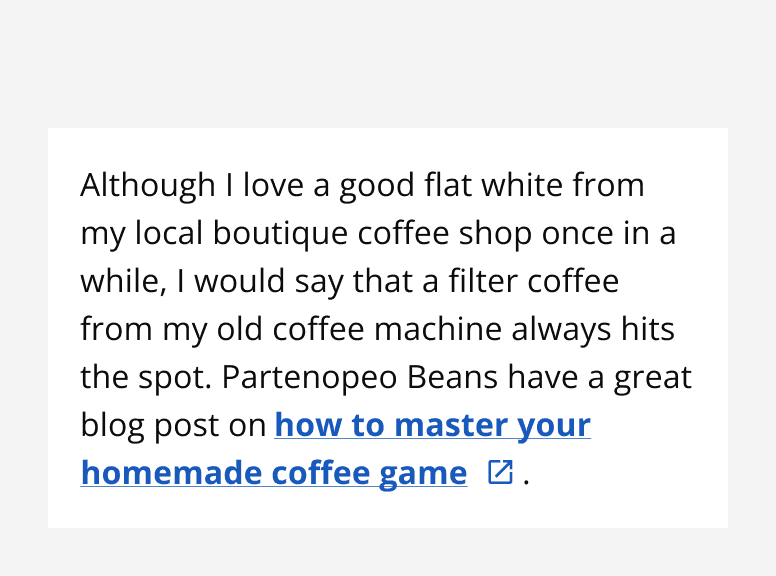
An example paragraph with black text, featuring a link with blue colour styling.
When using links, always use a different colour to the adjacent text.
An example paragraph with black text, featuring a link the same colour styling.
Avoid using the same link theme as the adjacent text.

Use the light or dark theme links withmonochrome={true} when listing a series of links on different coloured backgrounds.
An image of a footer with two navigation groups titled ‘Services’ and ‘Policy’ which house a list of several links. Every text element in the footer is white, including the hyperlinks.
Use light theme links when displaying links on a dark background.

Content

Always use a concise string of text in a link rather than displaying the full URL. Make sure the link text is descriptive enough to be relevant to the page the link points to.

Don’t omit important descriptive information from the link text. Avoid using unnecessarily lengthy descriptions, but strike a balance between relevance and conciseness.

Interactive example

About our coffees
Use concise but relevant links.
An example of three links. One reads ‘www.coffeeshop.com/about-our-coffees', the second reads ‘Let us tell you all about our speciality coffees’, and the third reads ‘Coffees’.
Don’t use URLs in the link text, don’t use unnecessarily long link text, and don’t omit important descriptive information.

Email addresses

When linking to email addresses use the full email address in the link text. Don’t describe the contact without showing the email address.

Interactive example

info@icds.co.uk
Show the full email address.

Interactive example

ICDS team
Don’t embed labels when linking email addresses.

Accessibility considerations

When reading a page, screen reader users might navigate to links independently of the adjacent content. Make sure links are descriptive enough that they make sense out of context.

Consider that some screen readers allow users to view a full list of all links present on a page. This may be ordered either alphabetically, or in order of appearance. Make sure to label links with relevant information at the beginning of the string of text. For example, don’t embed “How to contact us”, but rather “Contact us”.


Last reviewed 4 March 2025 .
Navigated to Link - Intelligence Community Design System