Intelligence Community Design System ICDS Get started Accessibility Styles Components Patterns Community
Show navigation section

Checkbox

Guidance Code Accessibility

Introduction

An example of the checkbox component.

Interactive example

When to use

Use checkboxes to allow a user to select any number of options from a list. Checkboxes are grouped into a checkbox group to provide multiple options. Any number of options can be selected and any type of checkbox can be included within the checkbox group.
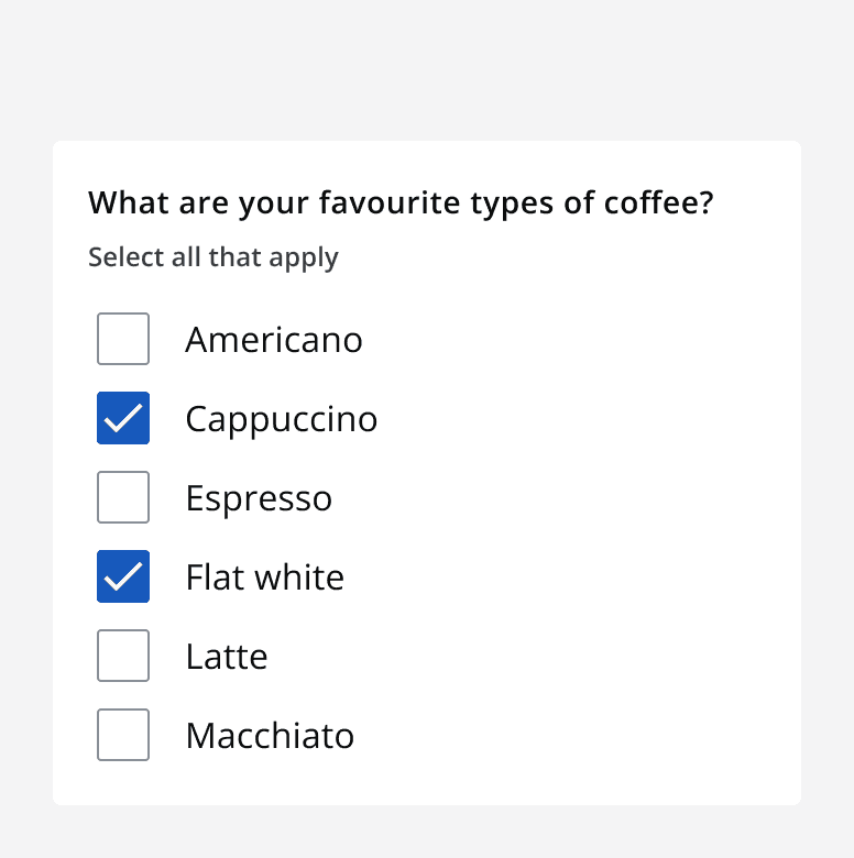
A checklist asking the question ‘What are your favourite types of coffee?’ with six options where two are checked.
Use the checkbox group to provide a number of options that can be selected.

Use a single checkbox on its own to allow a user to agree with a statement. For example, use a single checkbox to allow a user to mark whether they agree to a terms and conditions statement.
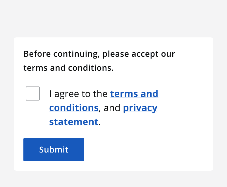
A single unchecked checkbox with a label that reads “I agree to the terms and conditions, and privacy statement”.
Use single checkboxes to allow a person to agree to a statement.

Use a checkbox with a conditional field to display a related additional element when that checkbox is selected. The conditional field can be set to static so that it is always visible and becomes enabled once the checkbox is selected. If the conditional field is set to dynamic the field is displayed only when the checkbox is selected.

When not to use

Don’t use checkboxes when only one option from a list can be selected. For single select lists, use radio buttons .

Interaction behaviour

Checkboxes have three possible selection states: selected, unselected and indeterminate.

Display the indeterminate selection state when the selection of child elements is mixed.
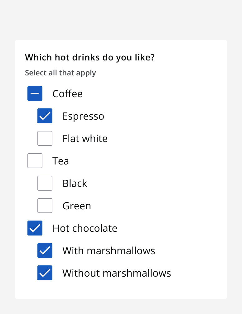
A checkbox group asking ‘Which hot drinks do you like?’. A checkbox with label ‘coffee’ shows its indeterminate state as only one of its two child checkboxes is selected.
A nested checkbox group that shows an indeterminate state on a parent checkbox when only some of its children are selected.

Checkboxes are selected or unselected by clicking any part of the checkbox, including the label.

Sizing

Use small sized checkbox groups for compact layouts. Always use small components with other small input components.
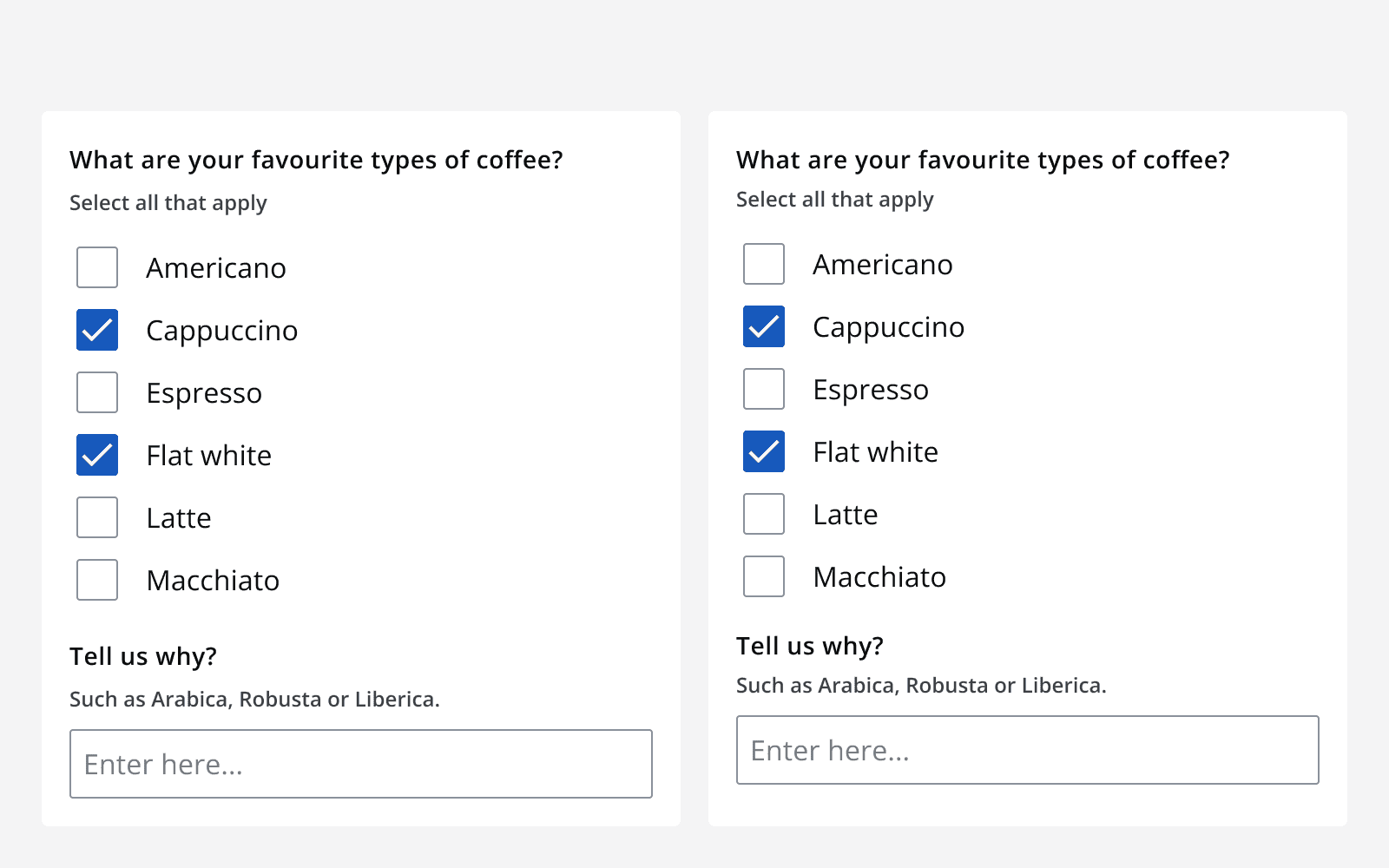
Two forms containing a checklist and a text input. One uses default sizing resulting in larger spacing between components. The other uses small sizing that reduces space between components and results in a shorter vertical height for the same form.
Use small sizing for compact layouts.

Validation

There are two types of error that can occur on a checkbox: a checkbox input error or an error on a checkbox’s conditional field.

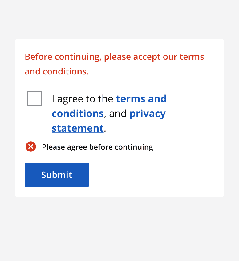
A checkbox input error is when the checkbox or checkbox group component itself is responsible for the error. This is shown using the checkbox error state.
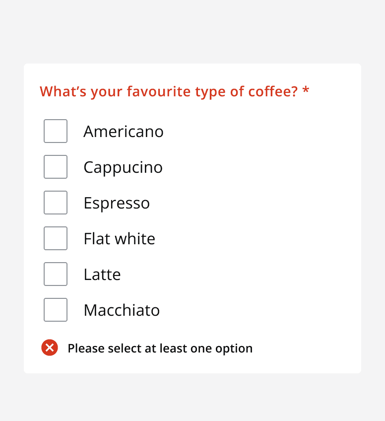
A checklist asking 'What are your favourite types of coffee?' with helper text stating 'Select at least one'. Six options are shown but all are unchecked. An error message is displayed below the checklist reading 'Please select at least one option'.
Checkbox group error state shown correctly.
An unchecked checkbox with label 'I agree to the terms and conditions and privacy statement' alongside a submit button. An error state is shown after the checkbox reading 'Please agree before continuing'.
Single checkbox error state shown correctly.

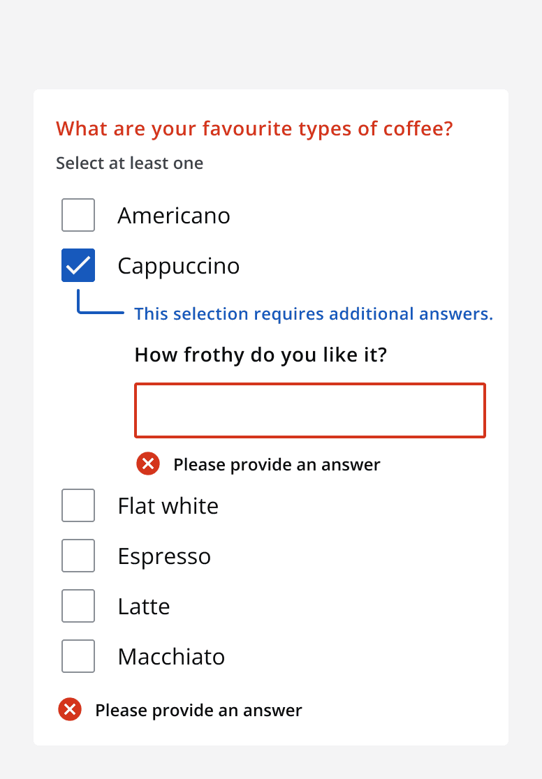
For errors on a checkbox’s conditional field, the error is shown only on the conditional field itself and not the wider checkbox or checkbox group component.
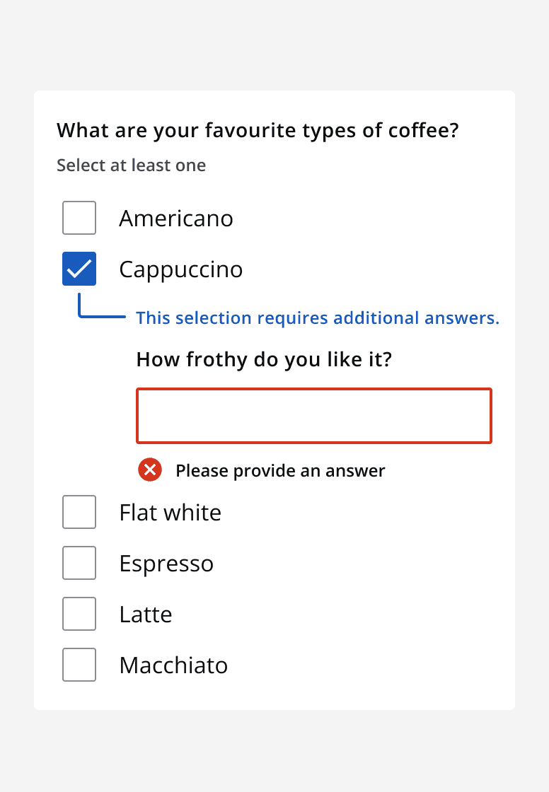
A checklist asking ‘What are your favourite types of coffee’. Six options are shown and one labelled ‘Flat white’ is selected and shows a conditional field that asks ‘How frothy do you like it?’. An error message is displayed below the conditional field reading ‘Please provide an answer’.
Checkbox conditional field error shown correctly.
A checklist asking ‘What are your favourite types of coffee?’. Six options are shown and one labelled ‘Flat white’ is selected and shows a child field that asks ‘How frothy do you like it?’. An error message is displayed below the child field reading ‘Please provide an answer’. Another error message is displayed below the checklist repeating the same error message.
Checkbox conditional field error shown incorrectly. Only the field needs to show the error state and not the parent checkbox or checkbox group.

Content

Labels

Follow the content style guidelines for checkbox group labels as well as each individual checkbox label. Use the checkbox group label to ask the question, and use the checkbox options to provide possible answers.

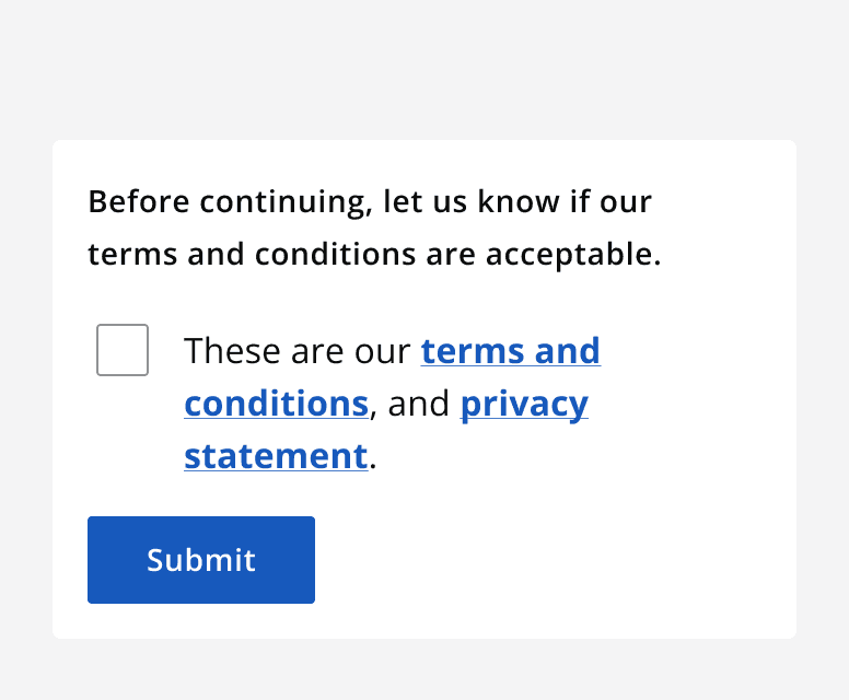
Make sure to use labels that make it easy to understand what selecting the checkbox represents. Avoid using ambiguous labels that make it unclear whether to select a checkbox or not.

A short form asking the user to agree to the terms and conditions. A single unchecked checkbox with label ‘I agree to the terms and conditions and privacy statement’ is shown alongside a submit button.
Use clear and concise wording in checkbox labels that makes it easy to understand what selecting the box represents.
A short form asking the user to agree to the terms and conditions. A single unchecked checkbox with label ‘These are our terms and conditions and privacy statement’ is shown alongside a submit button.
Don’t use ambiguous wording that makes it hard to understand what selecting the box represents.

Last reviewed 3 February 2023 .
Navigated to Checkbox - Intelligence Community Design System