Intelligence Community Design System ICDS Get started Accessibility Styles Components Patterns Community
Show navigation section

Radio button

Guidance Code Accessibility

Introduction

An example of the radio button component.

Interactive example

When to use

Use radio buttons in a radio button group to present a set of selectable options.

Use radio buttons when only one option can be selected from a list.

Use a radio button with a conditional field to display a related additional element when that radio button is selected. The conditional field can be set to static so that it is always visible and becomes enabled once the radio button is selected. If the conditional field is set to dynamic the field is only displayed when the radio button is selected.

When not to use

Don’t use radio buttons on their own, they should always appear as part of a radio button group.

Don’t use radio buttons when the user can select multiple options from the list. Use checkboxes instead.
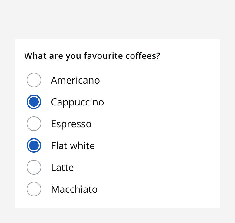
A radio button group titled ‘What are your favourite coffees?’ with two out of six radio buttons showing as selected.
Don’t use a radio button group to allow multiple selected options from a list.
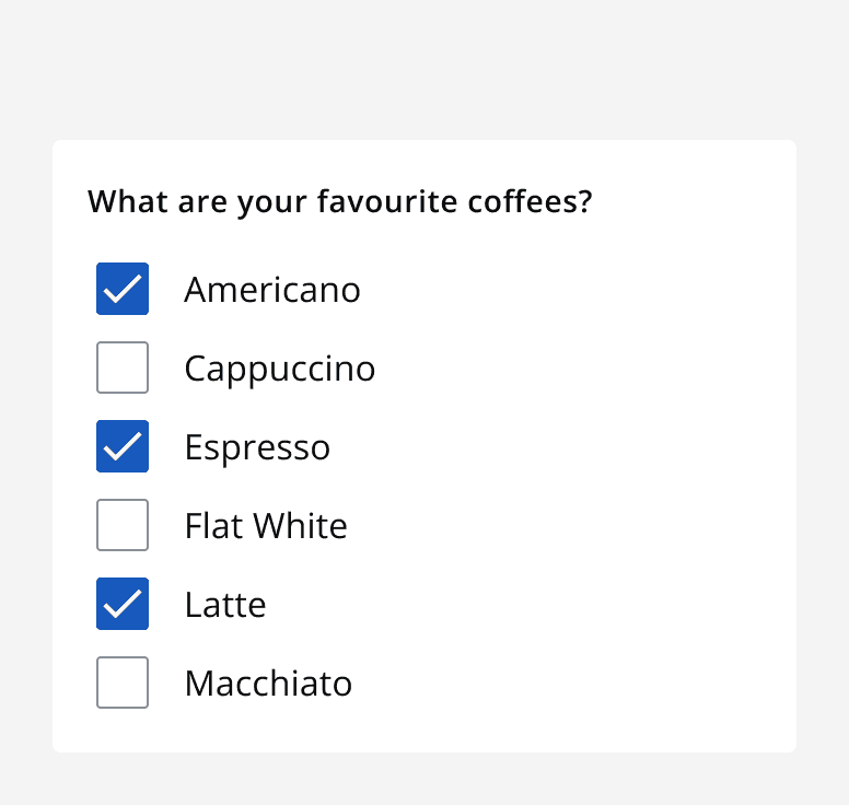
A checkbox group titled ‘What are your favourite coffees?’ with two out of six checkboxes selected.
Use a checkbox group to allow multiple sections from a list.

Don’t use radio buttons to turn something on or off. Use a switch instead.
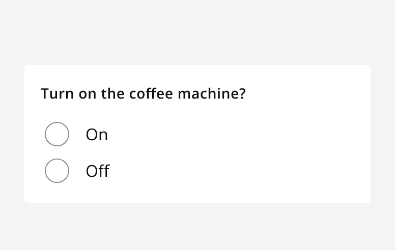
A two option radio button group with the label ‘Turn on the coffee machine?’ with options for ‘On’ and ‘Off’.
Don’t use radio buttons to turn something on or off.
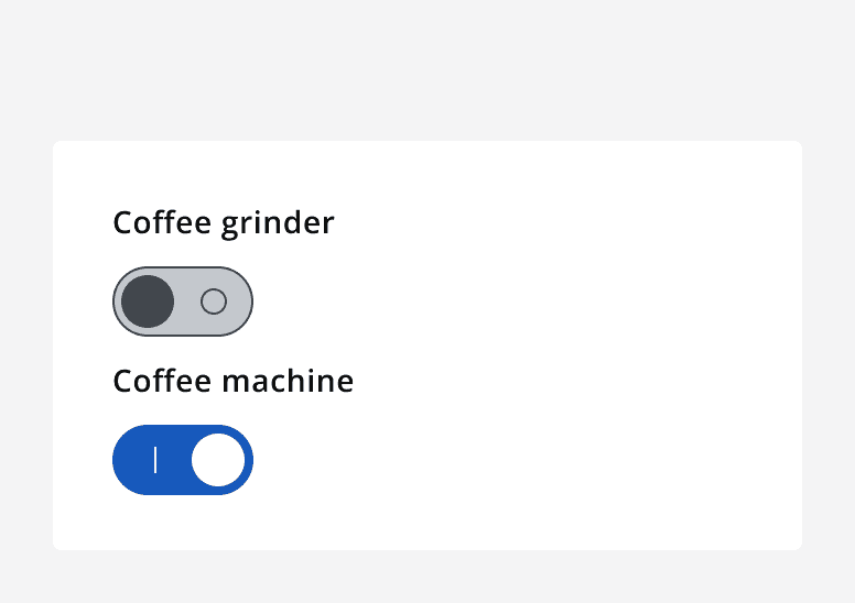
Two switches under the heading 'equipment'. One switch is toggled on whilst the other is off.
Use a switch to toggle something on or off.

Interaction behaviour

In most circumstances, set a default selected option from a radio button group to help people understand that something must be selected, and to expedite the completion of the input using the commonly preferred option.

Alternatively, use a radio button group without a default selected option to force people to select an option before moving on. This eliminates bias towards a single option and avoids people skipping over the question by leaving the default selection.

Sizing

Use small sized radio button groups to achieve compact layouts. Always use small sized components with other small sized components.

Layout and placement

Stack radio buttons when there are more than two options.
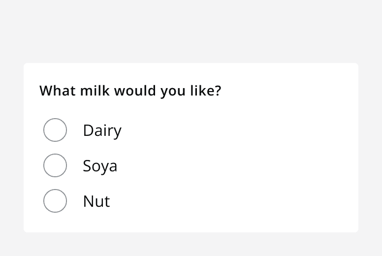
A radio button group titled ‘What milk would you like?’ with three radio buttons for ‘dairy’, ‘soya’ and ‘nut’ stacked vertically.
Always display radio buttons as a stack when there are more than two options.
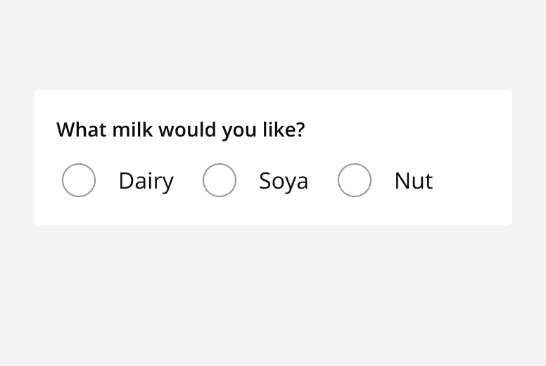
A radio button group asking ‘What milk would you like?’ and showing three options for ‘Dairy’, ‘Soya’  and ‘Nut’ displayed in a row.
Don’t display radio button groups with more than two options in a row.

If there are only two options, you can display them either stacked or in a row.
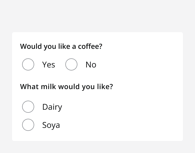
A radio button group asking ‘Would you like a coffee?’ with radio buttons for ‘Yes’ and ‘No’ displayed in a row. A second radio button group asking ‘What milk would you like?’ with radio buttons for ‘Dairy’ and ‘Soya’ displayed stacked.
Display radio buttons as a stack or in a row when radio button groups have two options.

Validation

There are two types of error that can occur on a radio button: a radio button input error or an error on a radio button's conditional field.

A radio button input error is when the radio button group itself is responsible for the error. This is shown using the radio button error state.
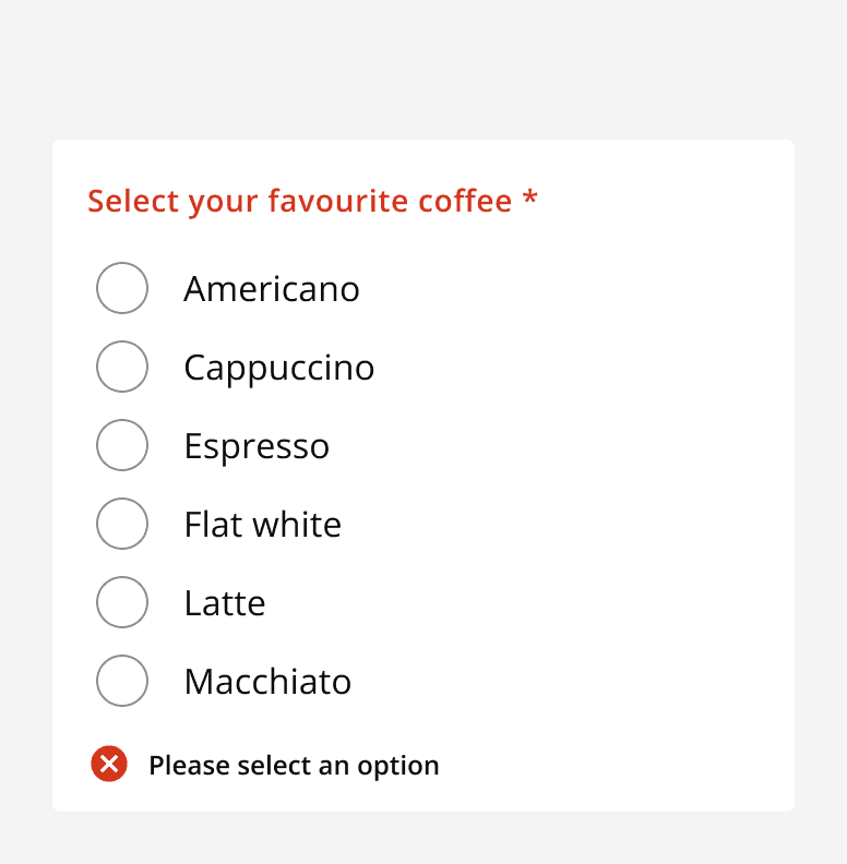
A radio button group displayed with no radio button selected with an error message reading ‘Please select an option’.
When there’s an issue show an error message next to the entire radio button group.

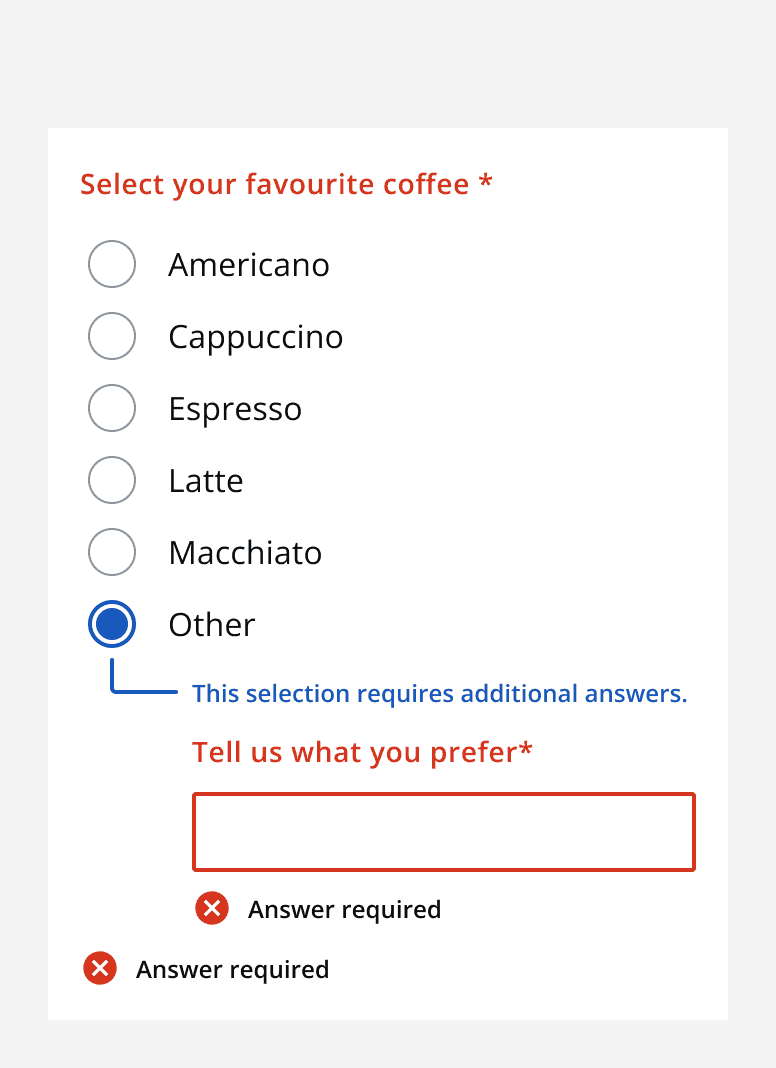
For errors on a radio button’s conditional field, the error is shown only on the conditional field itself and not on the parent radio button group component.
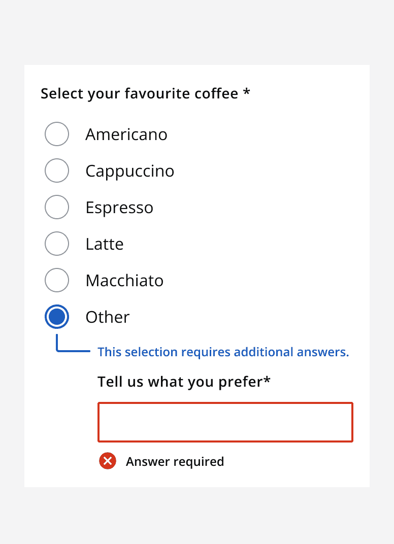
A graphic showing a radio button group with four options and an error reading ‘Answer required’ displayed with an empty input field that is a conditional field of one of the radio buttons.
Error validation shown correctly on the field causing the error.
A graphic showing two error labels incorrectly applied to a radio button group. One error reading ‘Answer required’ is displayed with an empty input field that is the conditional field of a radio button. The other error, also reading ‘Answer required’ is displayed with the whole radio button group.
Only display the error on the field causing it. Don’t display an error on the field as well as the radio group.

Content

Labels

Follow the content style guidelines for radio button group labels as well as each individual radio button label. Use the radio button group label to ask the question, and use the radio button labels to provide possible answers.


Last reviewed 3 February 2023 .
Navigated to Radio button - Intelligence Community Design System