Intelligence Community Design System ICDS Get started Accessibility Styles Components Patterns Community
Show navigation section

Switch

Guidance Code Accessibility

Introduction

An example of the switch component.

Interactive example

When to use

Use switches to turn a single option 'on' or 'off' and when you want the selection to take immediate effect.

Use switches when there is an obvious default value: either 'on' or 'off'.

When not to use

Don't use a switch when the selection of the option should take effect after a separate trigger such as a submit button. Instead, use a single checkbox .
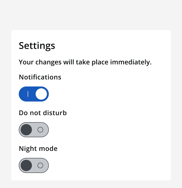
An example settings panel with text that says 'Your changes will take place immediately'. Three switches are displayed for 'notifications', 'don't disturb' and 'night mode'.
Make sure the change in a switch's state causes immediate effect.
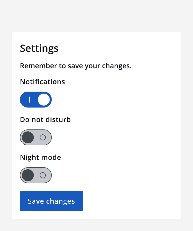
An example settings panel with text that says 'Remember to save your changes'. Three switches are displayed for 'notifications', 'don't disturb' and 'night mode'. A button that says 'Save changes' sits below the switches.
Don't use a separate trigger to make the change in state take effect.

Switches always have a default state: either 'on' or 'off'. Don't use a switch if there is no default setting. Instead, use checkboxes or two radio buttons .

Don't use a switch as an input in a form. Use them to instantaneously control a single option.

Don't use a switch for 'yes' or 'no' answers. Use two radio buttons instead.
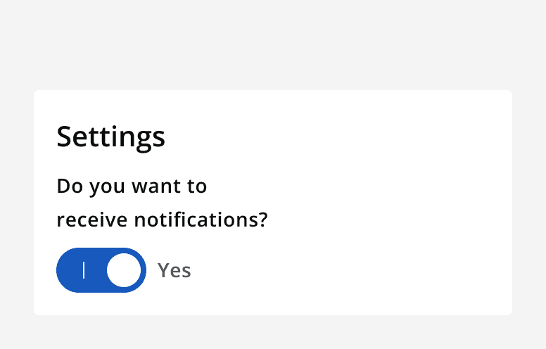
An example settings panel with a single switch with a heading that says 'Do you want to receive notifications?''. The switch is in the 'on' position and it has a label that says 'Yes'.
Don't use a switch for 'yes' or 'no' answers.

Interaction behaviour

Avoid automatically altering a switch's state based on another trigger. A change in a switch's state should always be the user's decision.

Avoid changing a switch's state without the user’s specific instruction.

Sizing

Use a medium sized switch in most scenarios where other medium sized components are used.

Use a small sized switch with other small sized components for compact layouts.

Content

Use clear labels so that it's obvious what the switch will do when in the 'on' or 'off' position. Don't make them neutral or ambiguous. The switch should read 'Label: on' or 'Label: off'.

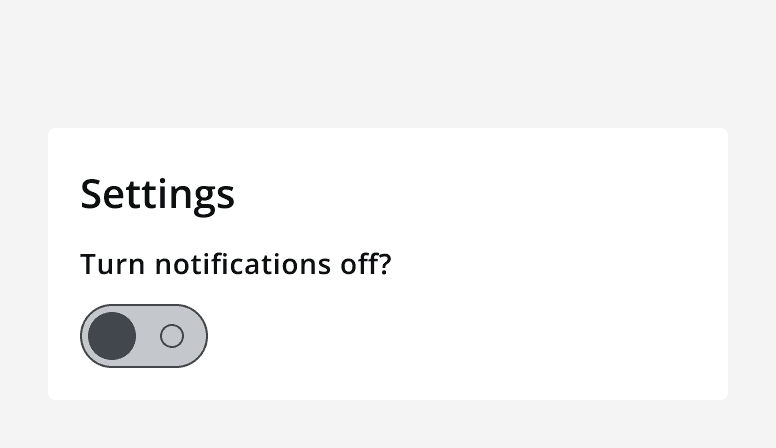
For example, a switch to turn notifications 'on' or 'off', with a label that says 'Notifications', is understandable when read as 'Notifications: on' and 'Notifications: off'. If the label said 'Turn notifications off', it's ambiguous and more difficult to understand what the 'on' and 'off' position will do.
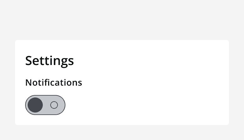
An example settings panel with a single switch in the 'off' position. It's label says 'Notifications'.
Give switches labels that make it clear what the switch will do in either the 'on' or 'off' position.
An example settings panel with a single switch in the 'off' position. It's label says 'Turn notifications off?'.
Don't give switches ambiguous labels that makes it hard to understand what the switch will do.

Avoid using additional labels that say 'on' or 'off' in the switch label. The position of the switch describes this itself. Changing the label between state changes makes it difficult to understand the current state.

Don’t change the switch’s label at the same time as the state changes.

Use an icon with a switch label only if it aids the recognition of the option.

Don't group switches with icons with other switches without icons.
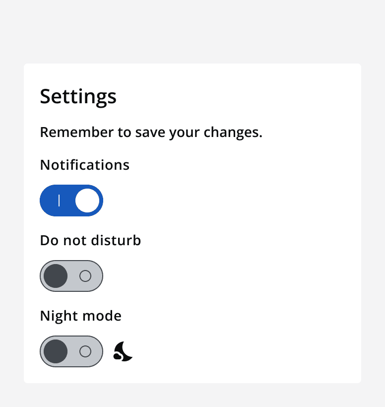
An example settings panel with three switches. The first switch is on with a label that says 'Notifications'. The second switch is off with a label that says 'Don't disturb'. The third switch is off with a label that includes a moon icon and says 'Night mode'.
Don't mix switches with icons with switches without icons.

Last reviewed 3 February 2023 .
Navigated to Switch - Intelligence Community Design System