Intelligence Community Design System ICDS Get started Accessibility Styles Components Patterns Community
Show navigation section

Hero

Guidance Code Accessibility

Introduction

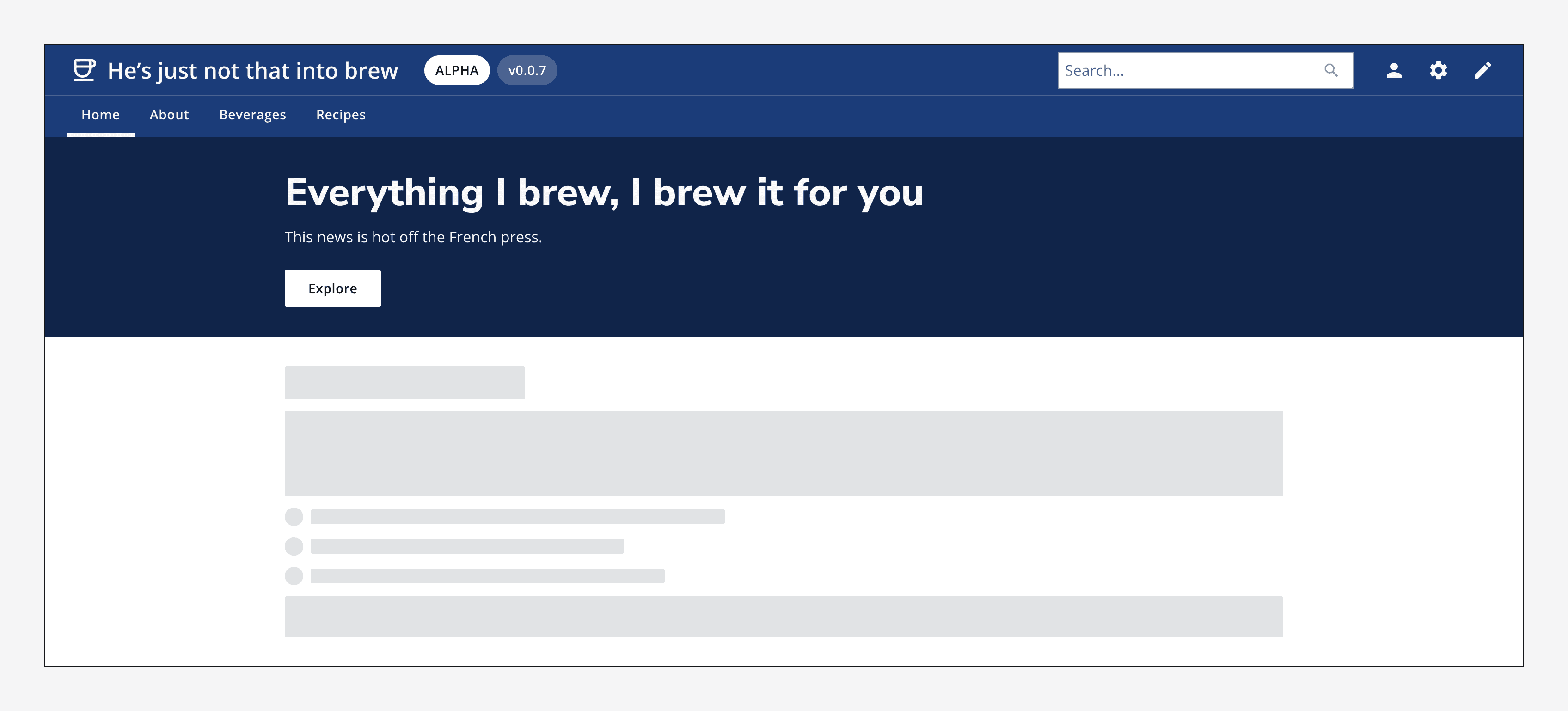
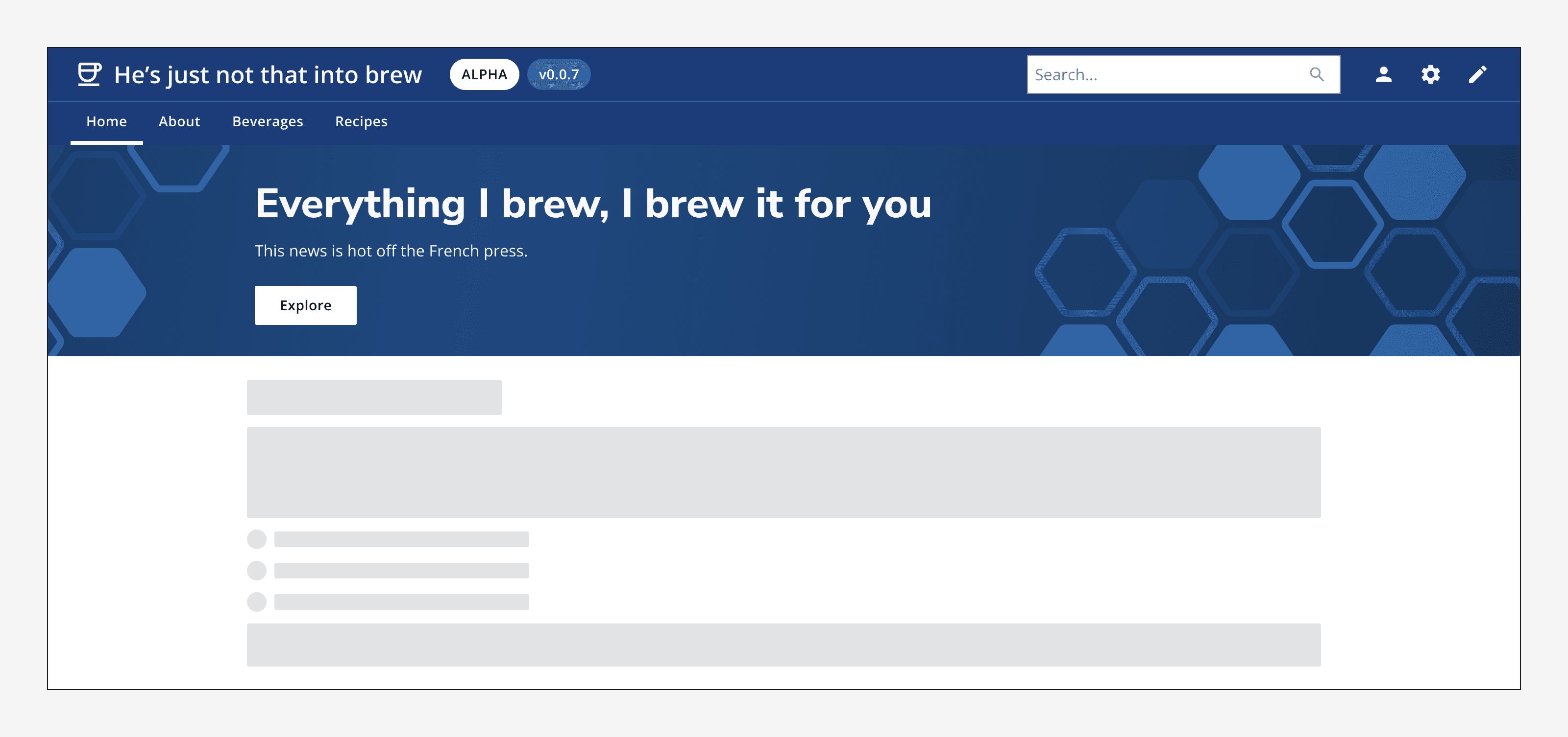
An example of the hero component.

Interactive example

Explore Check out our new drinks

When to use

Use the hero on a homepage to introduce your app or service and provide navigation to its main functions. Use the hero to catch a user's attention as it's often the first thing that they see.

When not to use

Don't use hero banners part way through page content to introduce sections. They should always appear at the top of the page to act as an introduction to the full page.
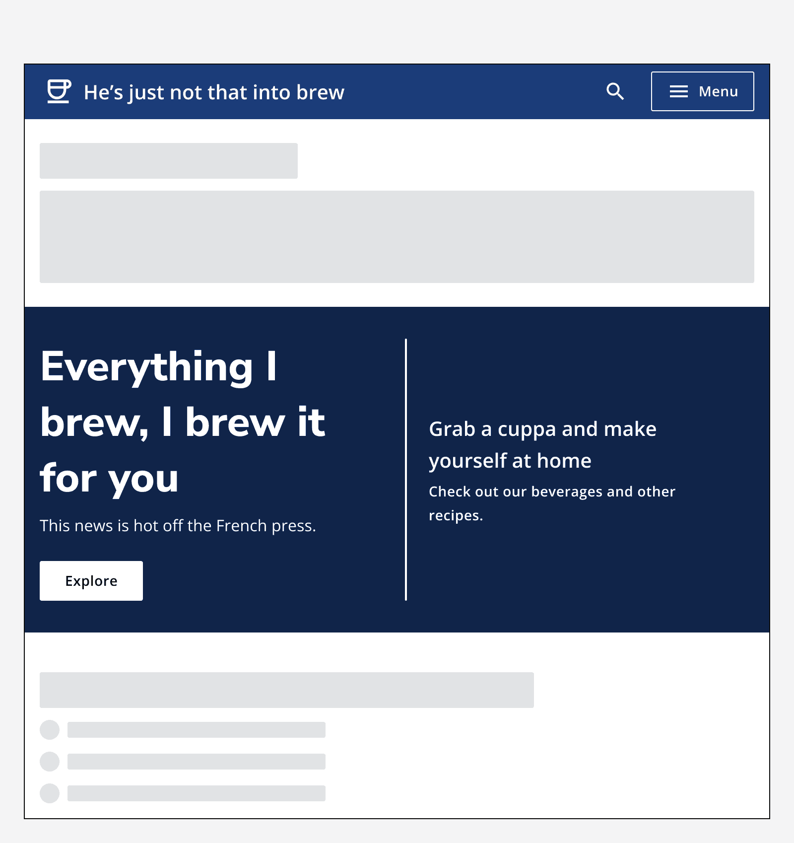
An example application with some content at the top of the page, then a hero banner introducing a section, and then more content.
Don't position hero banners part way through a page. Always position them at the top of page content.

Colour

Hero banners use an automatic secondary variant of an app's chosen brand colour.
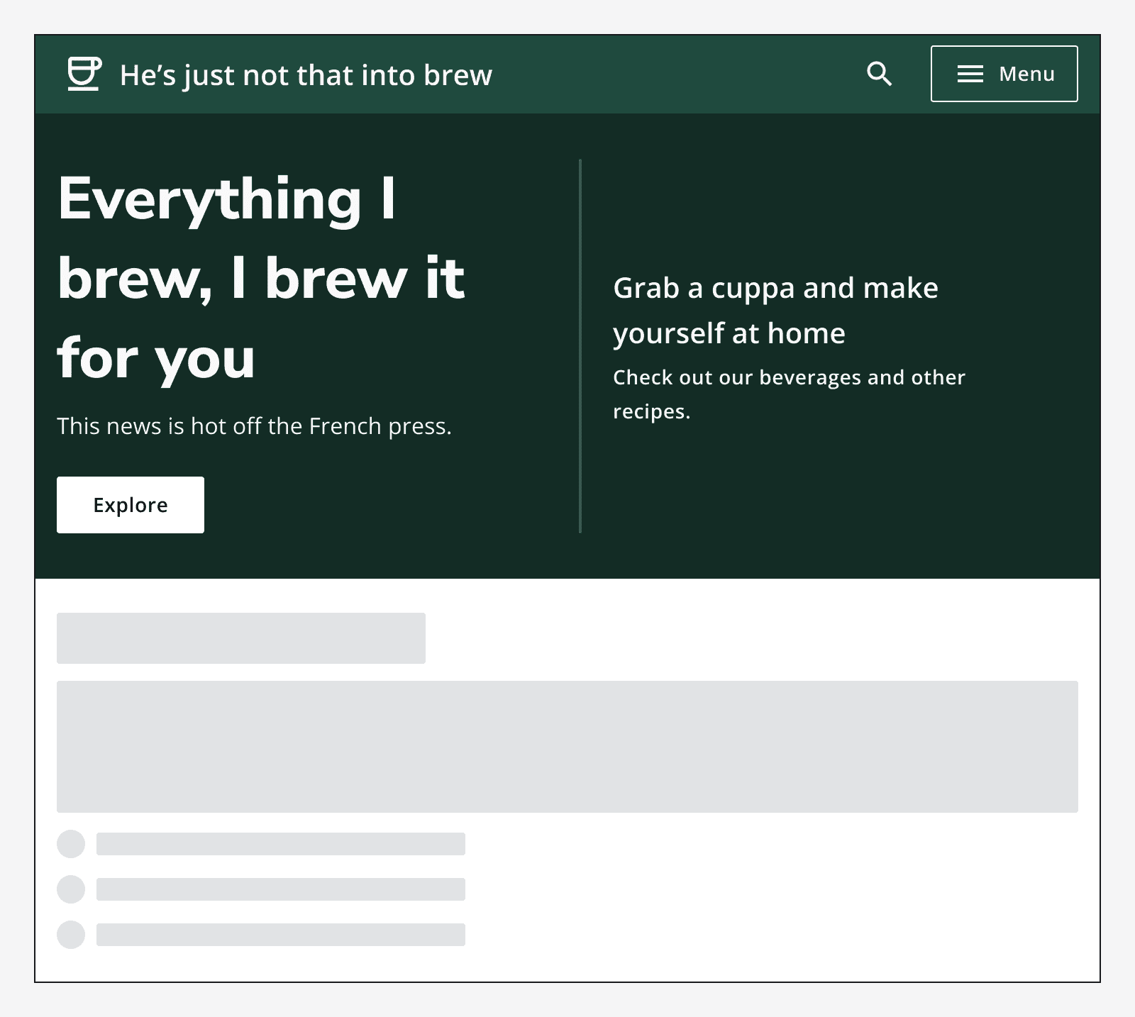
A hero banner with background colours based of the selected green brand colour.
Hero banners automatically set their colour based on the selected brand colour.
A hero banner with a grey background colour and black text.
Set the hero background colour to grey when colour is not appropriate.

Sizing

Use default sized hero for most applications. Use small sized hero banners for apps with compact layouts.

Layout and placement

Always position the hero banner at the top of the page and make it span the width of the container.
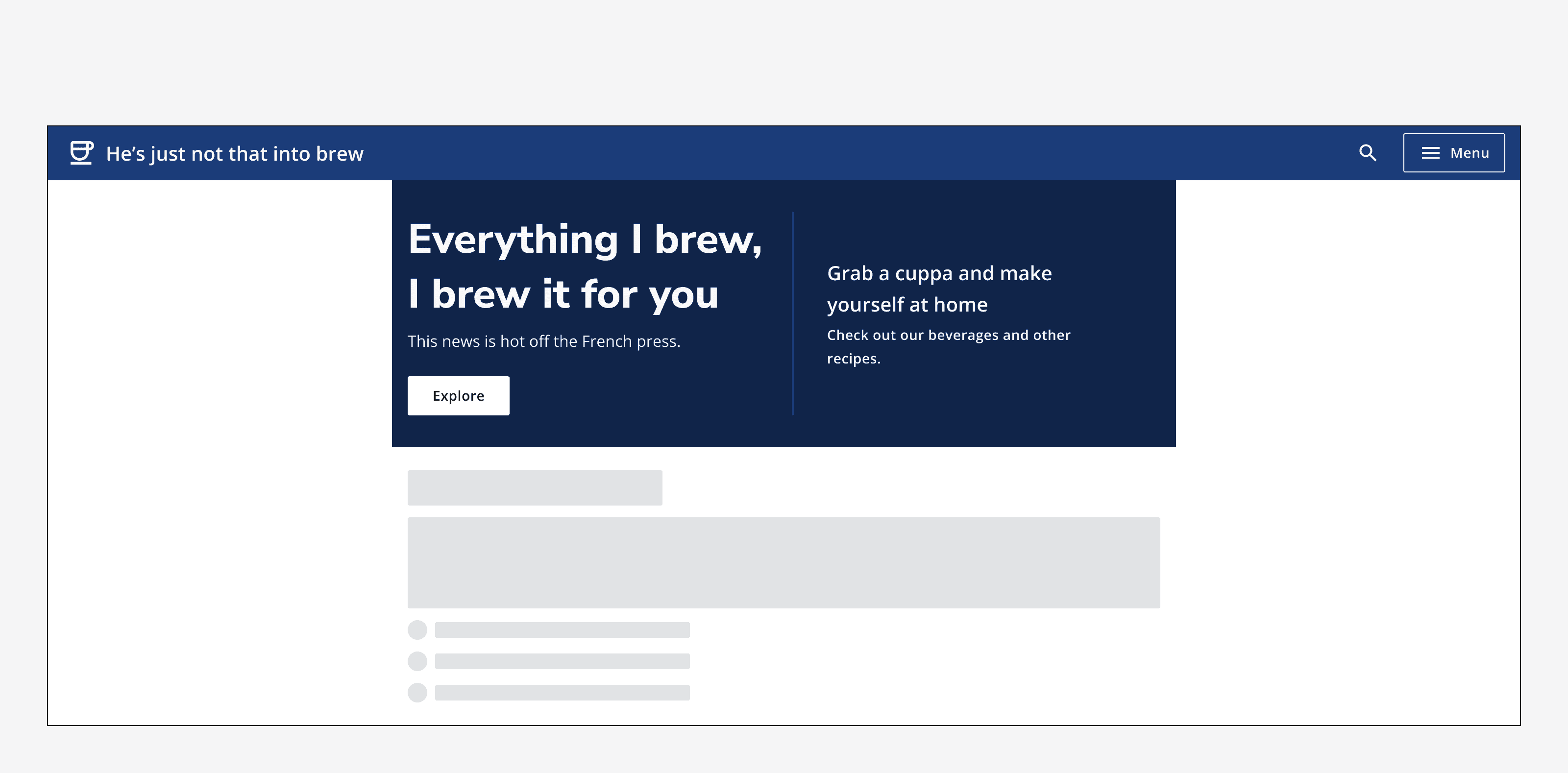
A hero that is embedded within a container and doesn't span its full width.
Don't place the hero so that it does not span its container's full width.

Use the alignment options to align the hero content to either full-width, left or centre of its container.
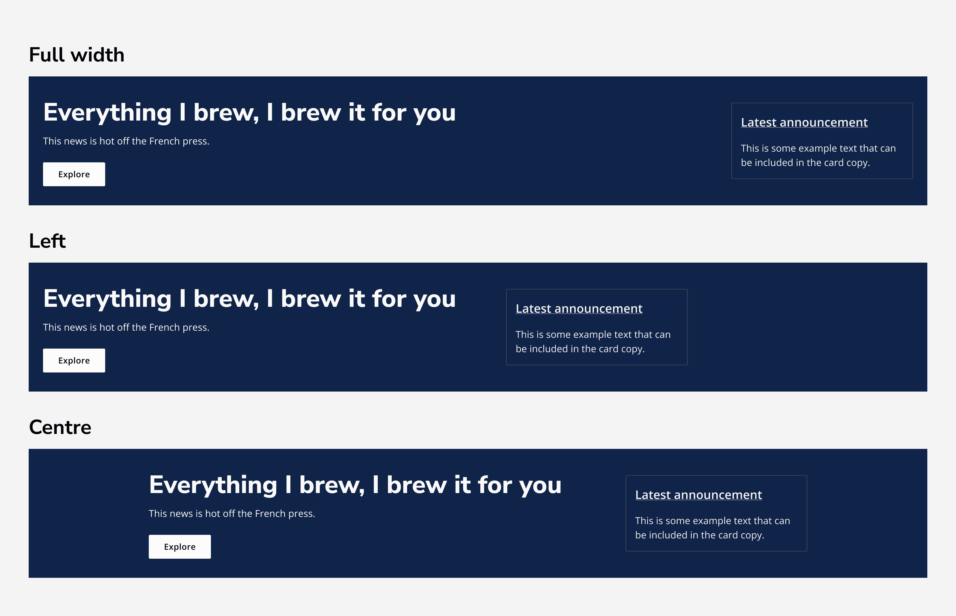
Three examples of a hero with content aligned to the full-width of the container, the left of the container, and to the centre of the container.
Use full-width, left or centre alignment to position the hero's content.

Content

Interaction area

Use the hero's interaction slot to add interactive elements such as buttons, links or search bars.

Don't add too much to the slot as it may become too busy. A hero should introduce the page, but not contain all of the page's content.
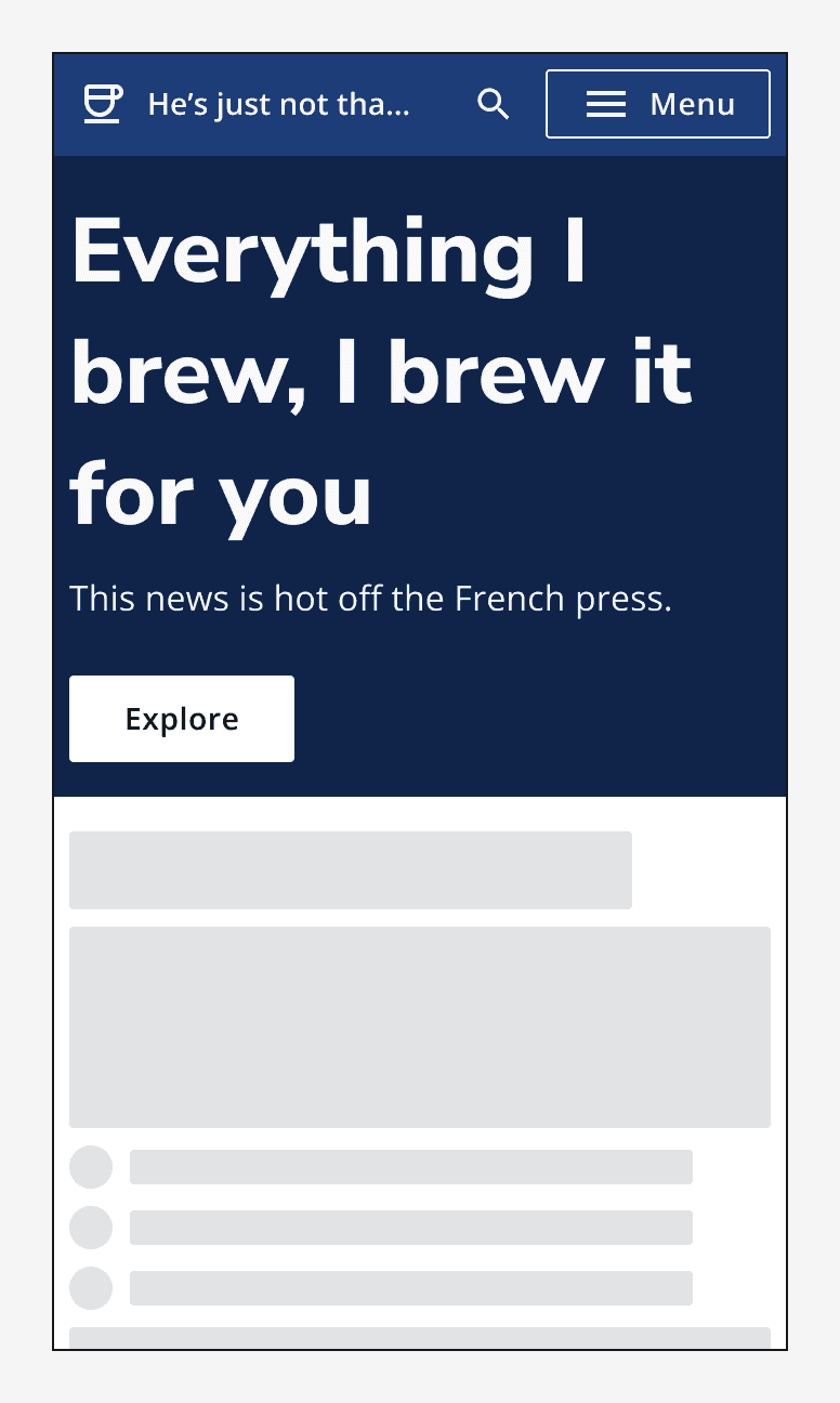
A hero that says 'Everything I brew, I brew it for you' with a button that says 'Explore'.
Use buttons to provide actions in the interaction area.
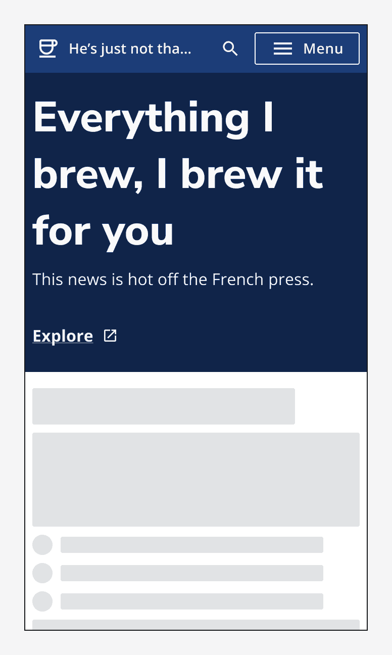
A hero that says 'Everything I brew, I brew it for you' with a link that says 'Explore'.
Use links to provide navigation from the interaction area.
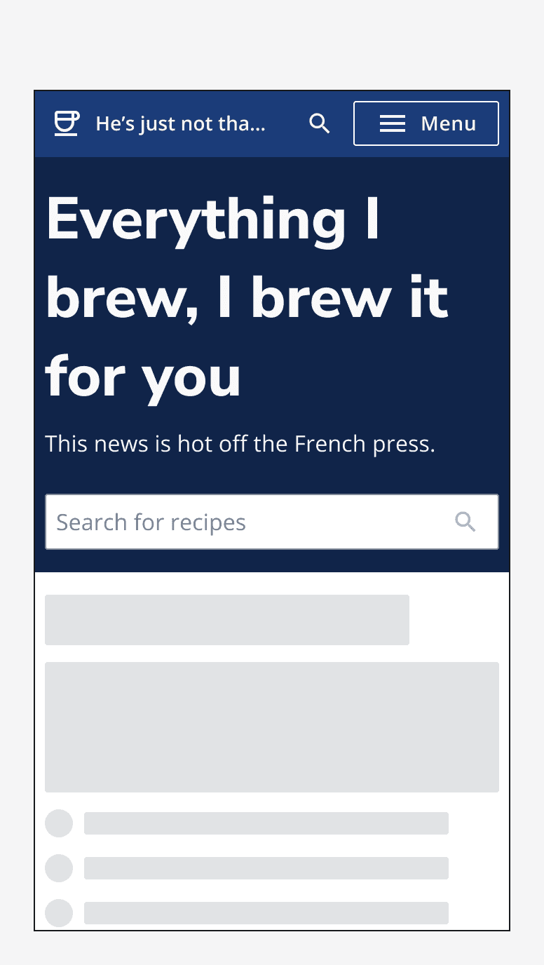
 A hero that says 'Everything I brew, I brew it for you' with a search bar in the interaction area.
Use simple inputs to provide page level functions in the interaction area.
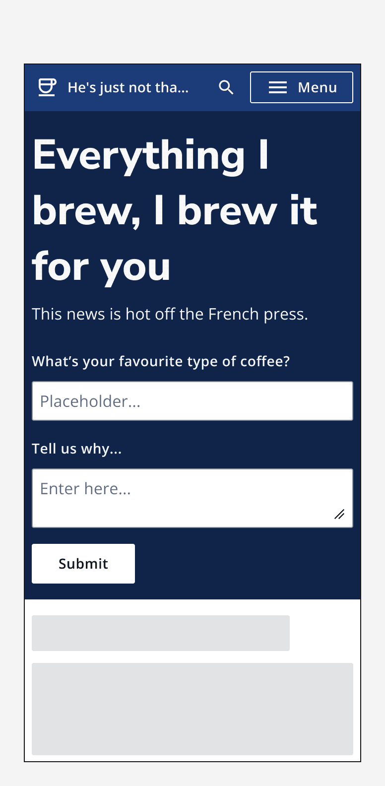
A hero that says 'Everything I brew, I brew it for you' with a text field, a text area and a button in the interaction area.
Don't use complex forms in the interaction area.

Secondary area

Use the hero's secondary area to add additional information or navigation options. For example, use a clickable card to provide a link to recent posts, use a secondary heading to give more info about the app, or keep it empty to help the main heading stand out.
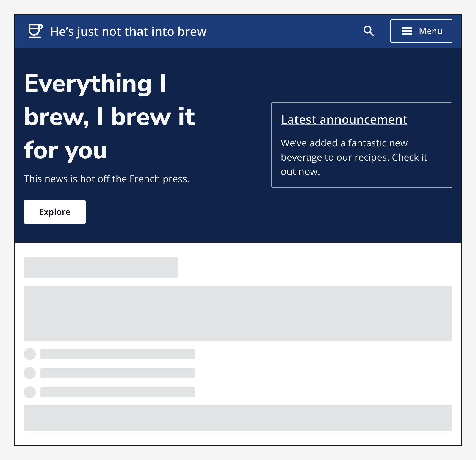
A hero with a clickable card in the secondary area that says ‘Latest Announcement’.
Use clickable cards to provide links to other pages.
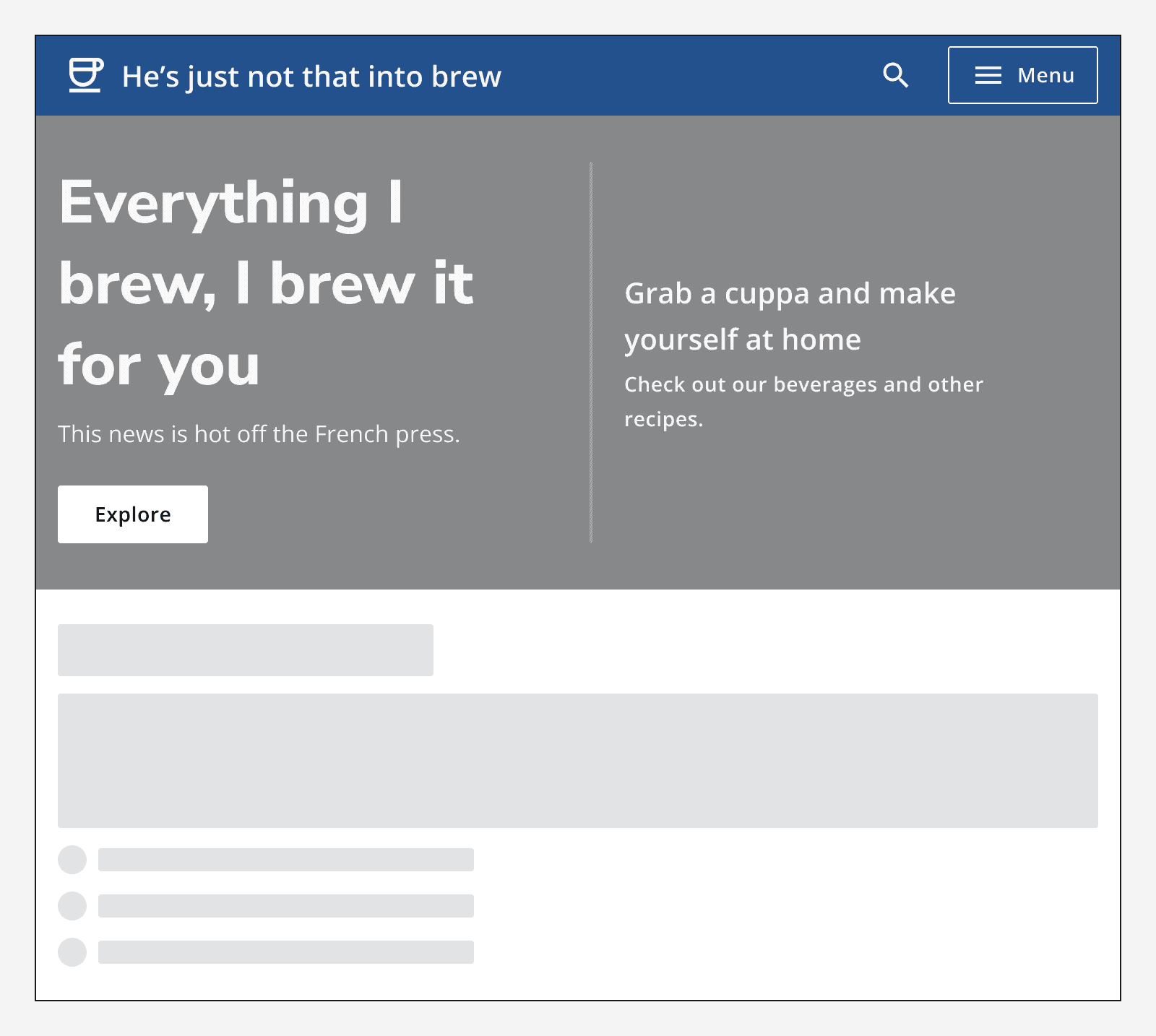
A hero with a secondary heading in the secondary area that says 'Grab a cuppa and make yourself at home'.
Use a secondary heading in the secondary area to provide more information.
A hero with a title that reads 'Everything I brew, I brew it for you' with no content in the secondary area.
Keep the secondary area empty to provide more emphasis to the main hero heading.

Imagery

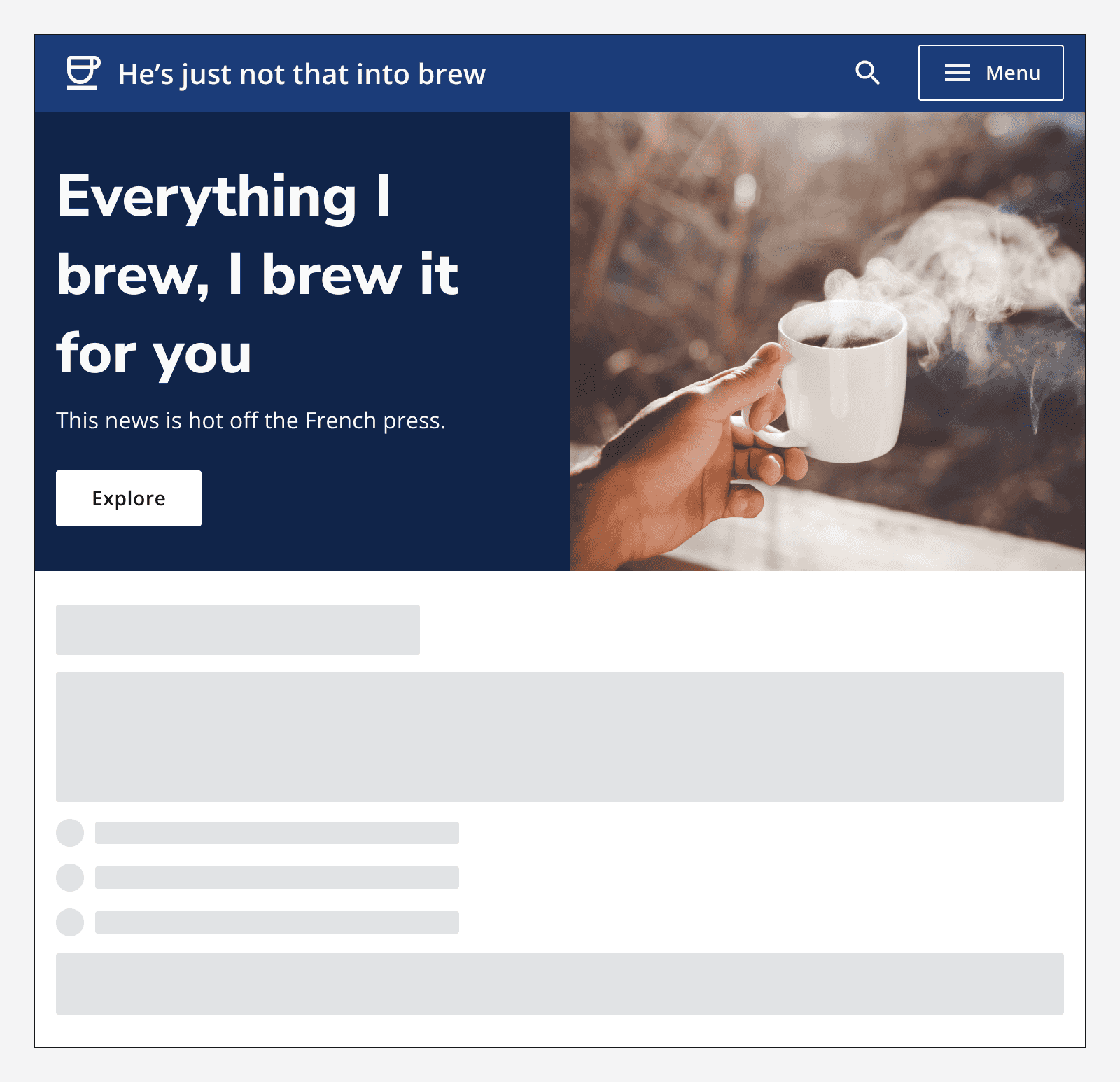
Use imagery on a hero to add personality to your app. Either embed the image in the secondary area, specify a full-size image to fill the secondary area, or add an image to the hero background itself.
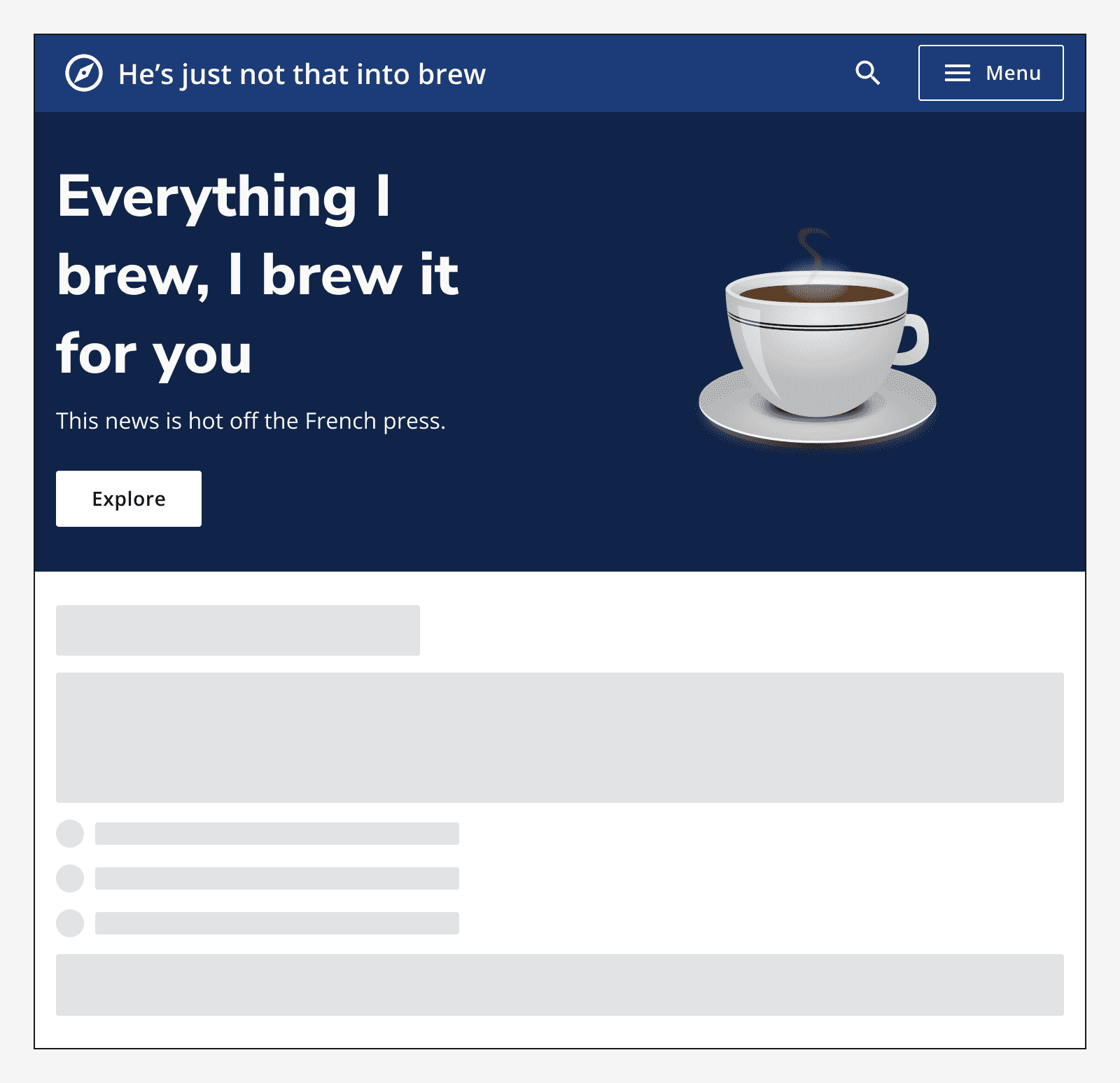
A hero with an image of a coffee cup in the secondary area.
Use embedded images in the secondary area.
A hero with a full height image of a hand holding a coffee cup in the secondary area.
Use full-height images in the secondary area for greater emphasis on the imagery.
A hero with an image of a hexagon patterns as the background.
Use an image as the hero's background to add personality.

When using an image background, ensure that you include 'safe areas' in your image to avoid the image's content interfering with the hero's text content.

Always specify alt-text with any image that you use so that its content can be understood equally by everyone.
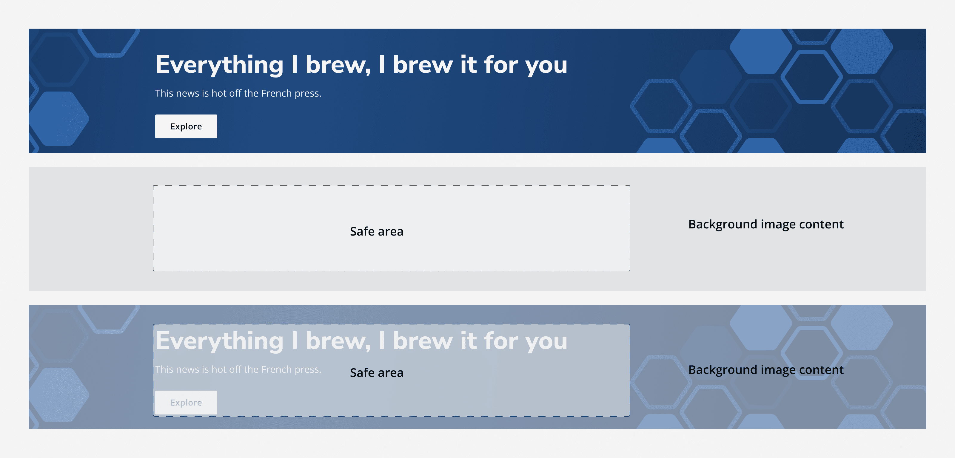
A diagram showing safe areas for background imagery. The safe area appears on the left-hand side under where the hero's text content lives. The image content appears outside of the safe areas.
Use safe areas with hero background images to avoid content interfering.

Last reviewed 3 February 2023 .
Navigated to Hero - Intelligence Community Design System