Intelligence Community Design System ICDS Get started Accessibility Styles Components Patterns Community
Show navigation section

Stepper

Guidance Code Accessibility

Introduction

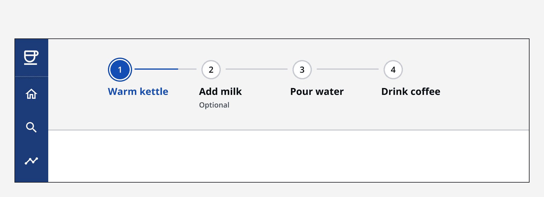
An example of the stepper component.

Interactive example

Component variants

Default

Use the default stepper when you have the available space.

Compact

Use the compact variant for compact layouts or processes with many steps.

When to use

Use steppers when a multi-step linear process is required. Steps are displayed from left to right and show the direction of movement through the process.

An image showing a form titled 'Make a coffee' featuring a stepper with four steps, titled 'Take order', 'Make drink', 'Take payment', and 'Finish'. The first step is selected, and the page below shows three input fields and a button labelled 'Confirm order'.
Stepper component being used to describe the steps of a multi-step form.

Always indicate which step the user is currently on. This gives a sense of control and describes their position in the process in relation to where they have been, as well as how much they have left to do.

When not to use

Don't use the stepper to indicate a non-linear process where steps can be completed in any order. Linear processes require each step to be completed in order.

Interaction behaviour

Steps

Steps are single elements that together form the stepper. Steps have four different states:

  • Active: Indicates that the step is available but not yet completed by the user. This step type is rendered as current if displayed in the compact stepper.

  • Current: Shows the step the user is currently on.

  • Completed: Shows a previous step that has been completed by the user.

  • Disabled: Shows a step that is unavailable. This could be because it's conditional on another step. If a step is always unavailable, then it should not be included in the stepper when it's loaded.

Interactive example

Layout and placement

Always align steppers to the left and place them above the main body content of the page.
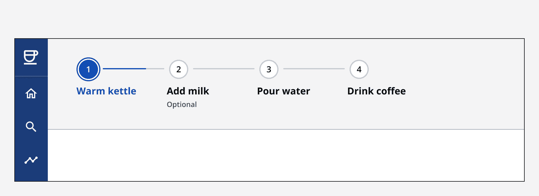
An image showing a stepper with four steps, titled 'Warm kettle', 'Add milk', 'Pour water', and 'Drink coffee'. The first step is selected, and the stepper is accurately placed at the top-left of a page.
A stepper that is left-aligned at the top of the page, showing how the stepper should be implemented.
An image showing a stepper with four steps, titled 'Warm kettle', 'Add milk’, 'Pour water’, and 'Drink coffee'. The first step is selected, and the stepper is incorrectly placed in the centre of a page.
A stepper that is centre-aligned at the top of the page, showing how the stepper should not be implemented.

When a stepper is too large to fit comfortably within its container, it will switch to use the compact stepper. This shows the current step along with its status, as well as the next step in the process.
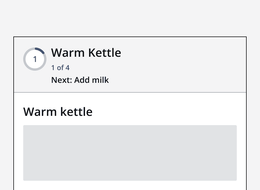
A compact stepper showing the current step labelled 'warm kettle' and the next step label 'add milk'.
The compact stepper shows the current step as well as the next step in the process.

Content

Labels

Use the heading to describe each step concisely in one or two words. Avoid using lengthy headings.

An image showing a stepper with four steps, labelled 'Take order', 'make drink', 'Take payment', and 'Finish’. The first step is selected.
Use concise labels within a stepper.
An image showing a stepper with four steps, each with very long labels. The first step is selected.
Avoid using long labels within a stepper.

When a stepper is used, always use page titles and section headings on the page content itself.
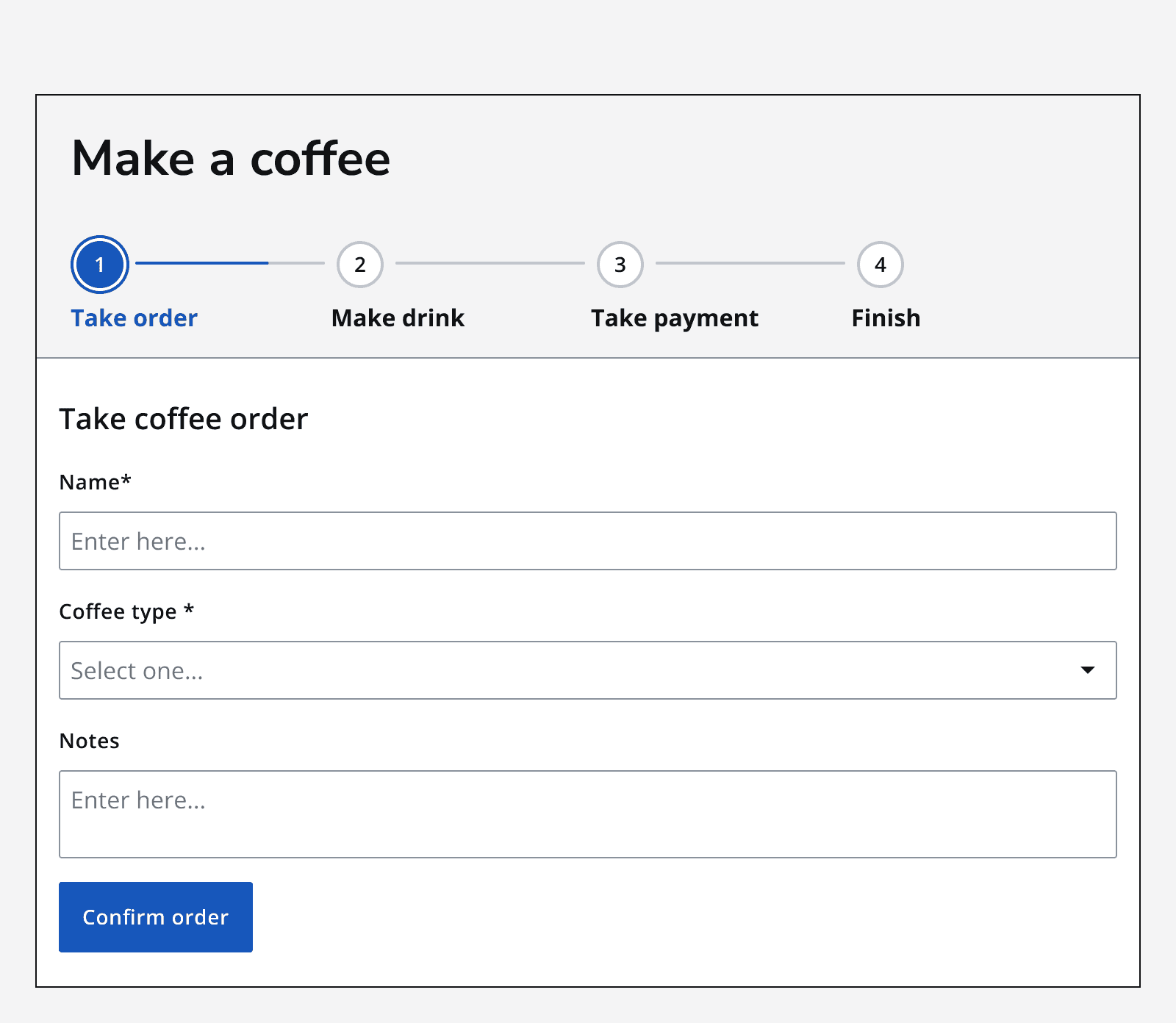
An image showing a form titled 'Make a coffee' featuring a stepper with four steps, labelled 'Take order', 'Make drink', 'Take payment', and 'Finish’. The first step, 'Take order', is selected, and the page below shows three input fields and a button labelled 'Confirm order'.
A stepper accompanied by a page title, showing how the stepper should be implemented.

Hide step information only if the step content is clearly labelled itself. Do not omit step labels if no headings are provided in the step content.
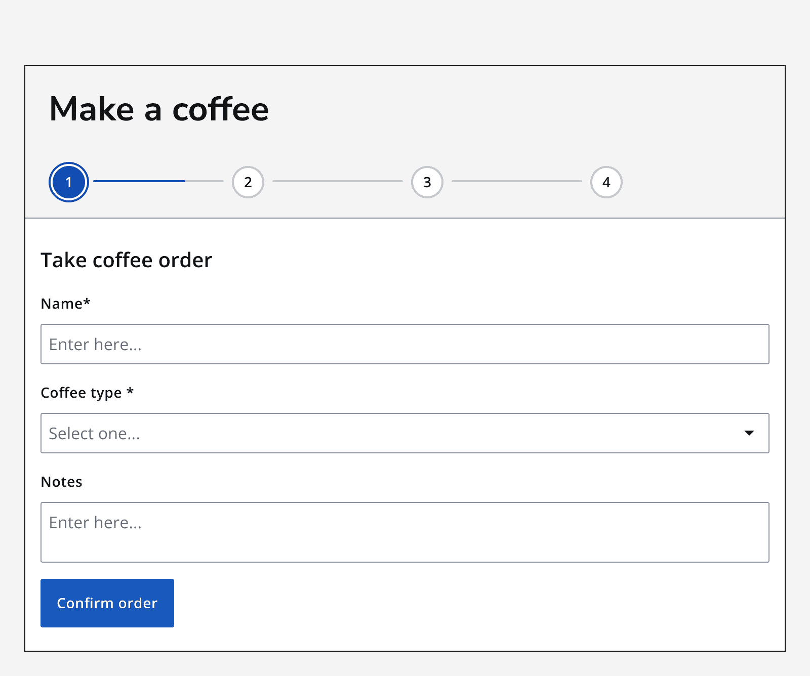
An image showing a form without a heading featuring a stepper with 4 steps, each without a label. The first unlabelled step is selected, and the page below shows three input fields and a button labelled ‘Confirm order’.
Don’t use a stepper without step labels if the page content does not include the step name in a heading.

Set a status to show whether the step is required or optional in the subheading. Override the subheading text to provide a custom message.

Validation

Validate each step as the user moves through the process. Use the standard error handling approach to display inline alert and error messages if the user attempts to proceed to the next step without first completing the current step correctly.


Last reviewed 3 February 2023 .
Navigated to Stepper - Intelligence Community Design System