Intelligence Community Design System ICDS Get started Accessibility Styles Components Patterns Community
Show navigation section

Alert

Guidance Code Accessibility

Introduction

Alerts are displayed inline with other page content and show status depending on the severity of the message.

Interactive example

Alerts have five status variants:

  • Neutral

  • Success

  • Warning

  • Error

  • Info

When to use

Use an alert to notify a user without blocking or interrupting them.

Position alerts in line with page content so that they are closely associated with the related content that follows them.
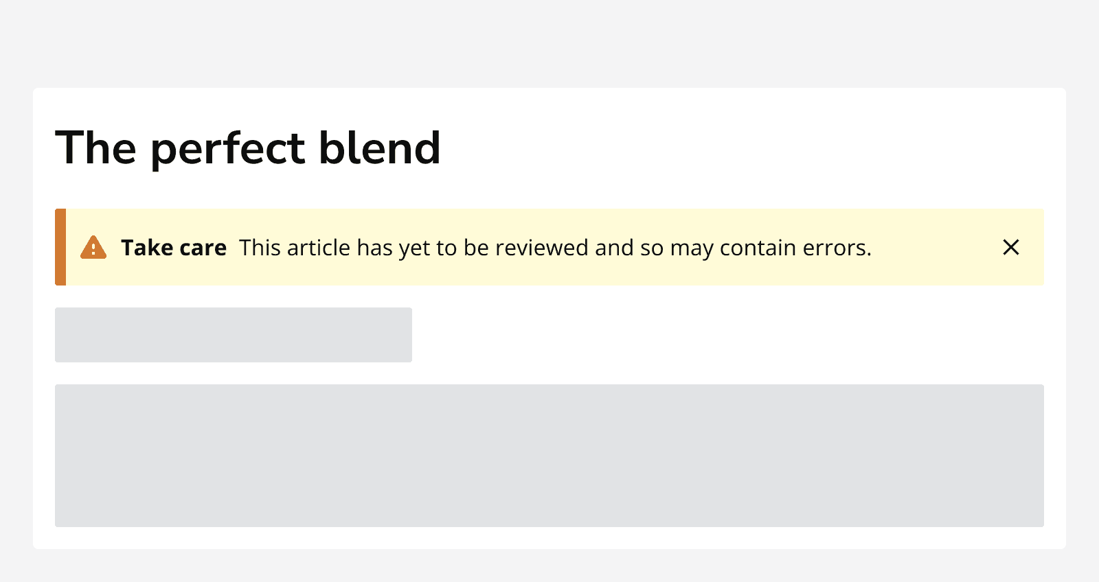
An article titled ‘The perfect blend’ displaying a warning alert which reads ‘Take care. This article has yet to be reviewed and so may contain errors’.
Use alerts in line with other associated page content.

Use alerts to:

  • Summarise form validation errors.

  • Inform of failures in a particular part of an app.

  • Inform of a success when returning to a homepage, confirmation page or starting location.

  • Make important information stand out from surrounding content.

Include a button or link within an alert to provide related interactions.

Include a dismiss button within an alert to allow the alert to be dismissed.
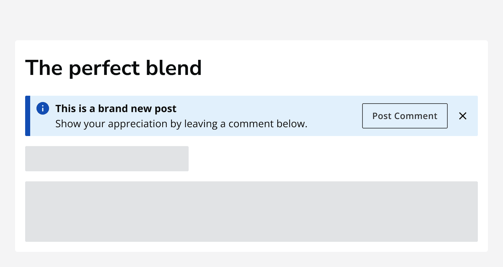
An article titled ‘The perfect blend’ showing an information alert with an action button that says ‘Post comment’ and a dismiss button. The alert message says ‘This is a brand new post. Show your appreciation by leaving a comment below.
Include a button or link to provide actions on an alert. Use a dismiss button to allow the alert to be dismissed.

When not to use

Don’t use alerts for passive feedback on a process, for example 'draft discarded' or 'email sent'. Use toasts instead.

Don’t overlay alerts on page content. Alerts are placed inline with the rest of the page content.
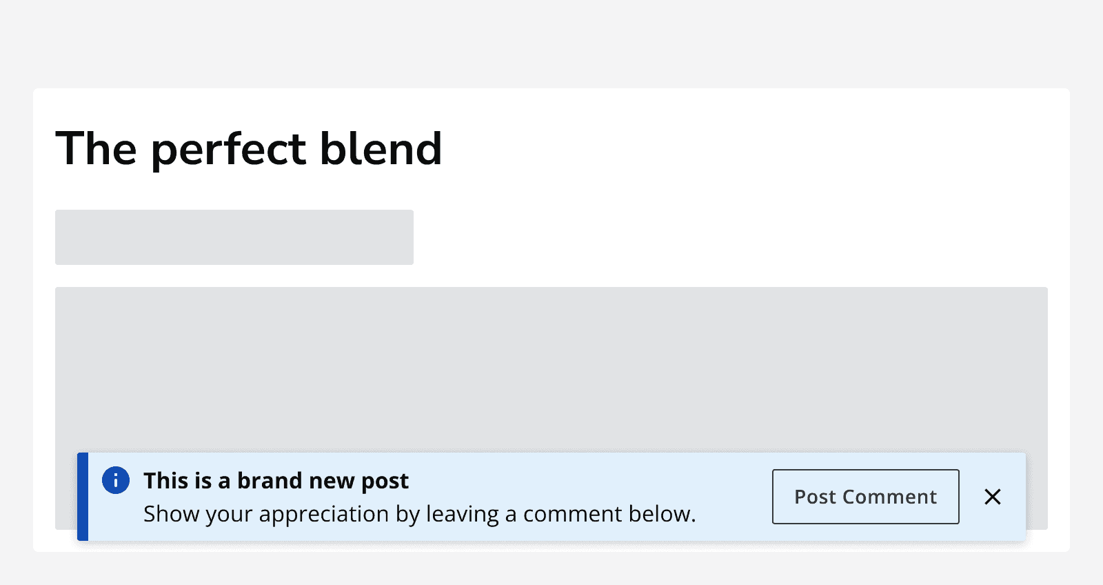
An article titled ‘The perfect blend’ with an information alert overlaid on top of the page content.
Don’t use alerts positioned above/on top of page content.

Use the form validation pattern for errors on a text field or in a form.

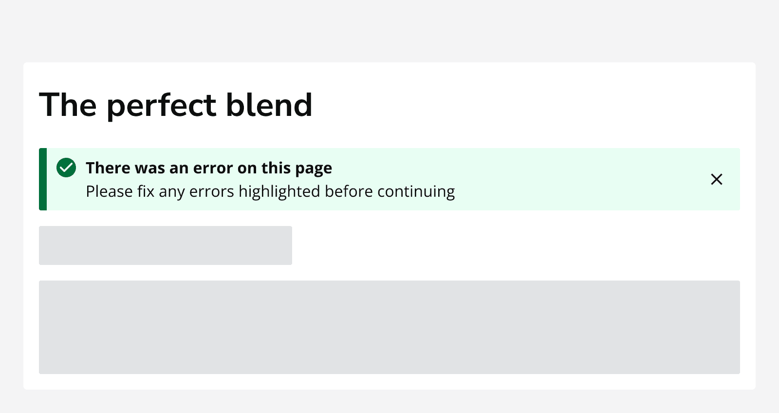
A form titled ‘The perfect blend’ that contains 2 skeletons. A success alert shows an error message that says ‘There was an error on this page. Please fix any errors highlighted before continuing.’
Do not use an alert variant that is not related to its message.

Content

Avoid using lengthy message content in an alert. Use dialogs or a full page error message to display longer messages.

Use a title on an alert to provide a short description of the alert content.
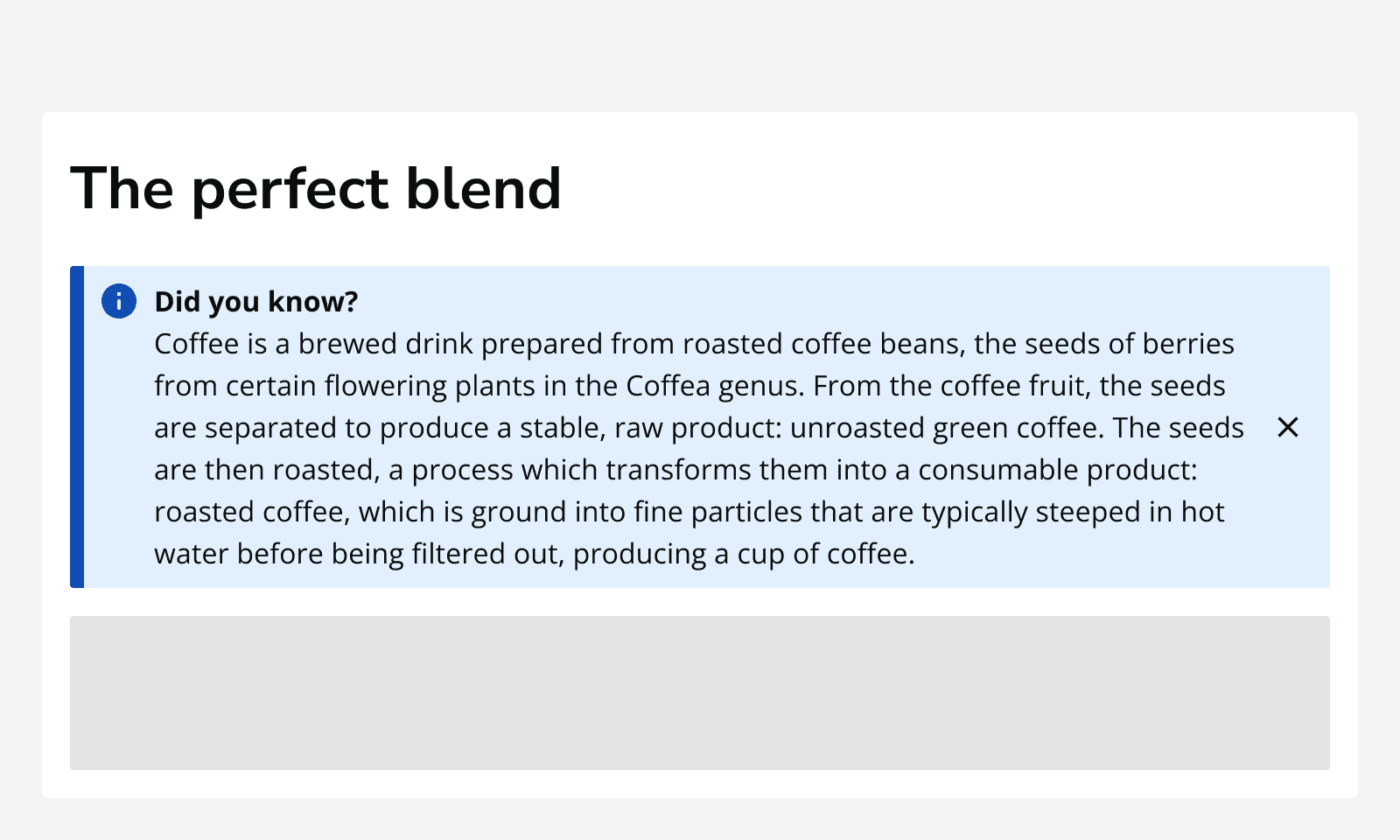
An image of an article titled ‘The perfect blend’ showing an info alert with a lengthy message that takes a lot of room to display among other page content.
Avoid using lengthy messages within an alert.

Use the default icons with success, warning, error and info alerts.

When using neutral alerts, specify an icon to be used from the iconography guidance . Always specify alt text when using any custom icon.


Last reviewed 22 August 2023 .
Navigated to Alert - Intelligence Community Design System