Intelligence Community Design System ICDS Get started Accessibility Styles Components Patterns Community
Show navigation section

Tabs

Guidance Code Accessibility

Introduction

An example of the tab component.

Interactive example

Ingredients Method History Tab One - Ingredients

When to use

Use tabs to organise large amounts of related content into different sections and allow people to quickly switch between them. Tabs display one section at a time.

Always consider the amount of content presented on one page and decide if it can be reduced or split across multiple pages to make it more digestible instead of placing into tabs.

When not to use

Don’t use tabs if the order of the content is important, such as in a checkout process. Instead use a stepper to order the sections into a linear process.

Don’t use tabs if the content on different tabs needs to be compared.

Colour

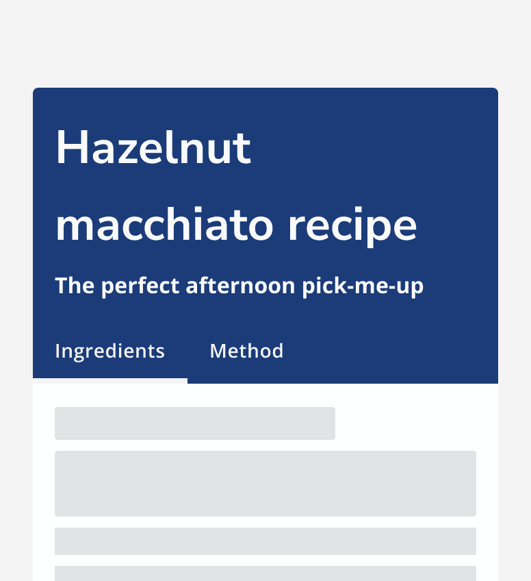
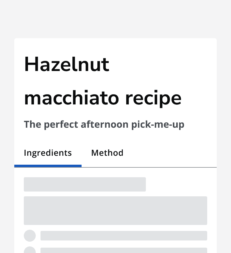
Use a dark tab bar on light backgrounds and use a light tab bar on darker backgrounds.
A recipe site showing a recipe titled ‘Hazelnut macchiato recipe’. The recipe sits on a white background and has a dark tab bar with two tabs for ‘Ingredients’ and ‘Method’.
Use a dark tab bar on light backgrounds.
A recipe site showing a recipe titled ‘Hazelnut macchiato recipe’. The recipe sits on a dark blue background and has a light tab bar with two tabs for ‘Ingredients’ and ‘Method’.
Use a light tab bar on dark backgrounds.

Layout and placement

Always place tabs directly above the content container that they control.

Don’t position tabs so that they are unconnected from the content that belongs to them.
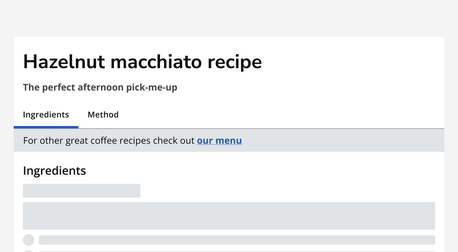
A recipe site showing a page titled ‘Hazelnut macchiato recipe’. The page title has a tab bar showing two tabs ‘Ingredients’ and ‘Method’. Between the tab bar and the tab container is a link to ‘our menu’.
Don’t separate the tab container from the tab bar.

On smaller screen sizes, tab bars with a large number of tabs will collapse into a compact tab selector instead.
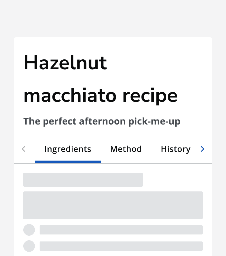
A recipe site showing a page titled ‘Hazelnut macchiato recipe’. The page title has a tab bar showing a series of tabs. Three tabs are viewable on the screen and scroll buttons are displayed in the tab bar indicating that more tabs can be scrolled into view.
A tab bar showing multiple tabs in a compact layout. Scroll controls are added to navigate through the tab bar.

Content

Labels

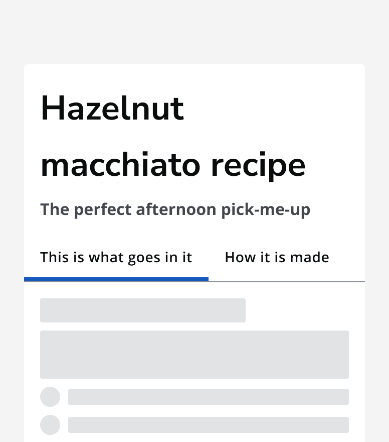
Keep labels short and informative so that the tab’s content is clear. Tab labels always display on one line, so keeping them short means that more tabs can be displayed if required.
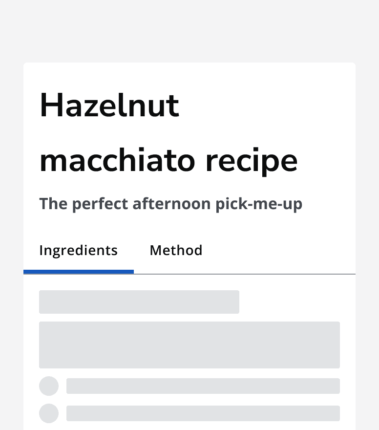
A recipe page showing a tab bar with two tabs labelled ‘Ingredients’ and ‘Method’.
Use concise labels on tabs.
A recipe page showing a tab bar with two tabs labelled ‘This is what goes in it’ and 'How it's made’.
Don’t use long labels.

Order of tabs

Arrange the tabs in an order that makes the most sense in context. Always show the first tab by default when the page loads. Place the most important content in the first tab.

Avoid using six or more tabs as this may add too much complexity to the page. Consider if content can be reduced or split across multiple pages instead.
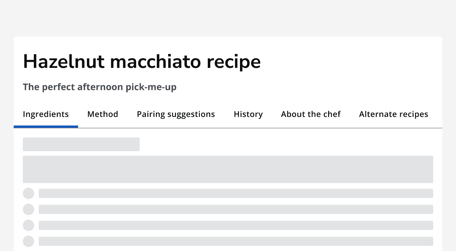
A recipe page with a tab bar with six tabs.
Avoid using too many tabs as it can complicate the page.

Icons

Add icons to tab labels to provide an extra visual cue to the tab’s content. Ensure that icons are relevant to the tab content.
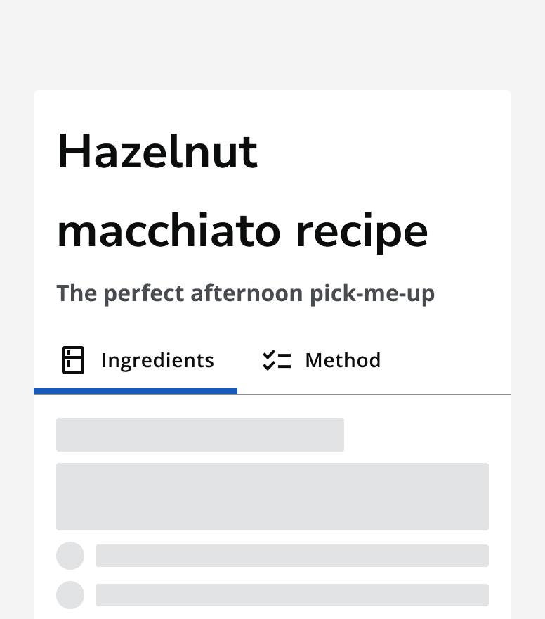
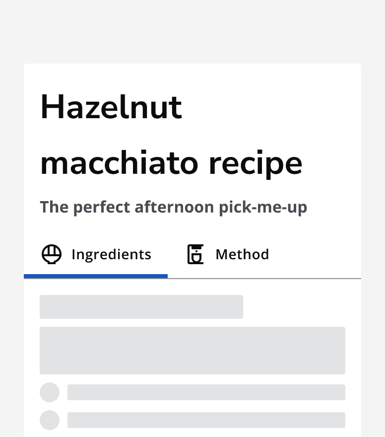
A tab bar with two icon tabs labelled ‘Ingredients’ and ‘Method’. The ingredients tab has a fridge icon and the method tab has a checklist icon.
Use clear icons on tab labels.
A tab bar with two icon tabs labelled ‘Ingredients’ and ‘Method’. Both icons are difficult to understand as they don't clearly match the label.
Don’t use ambiguous icons.

Don’t use icons for some tabs and not others. Always apply icons to all tabs if using them.
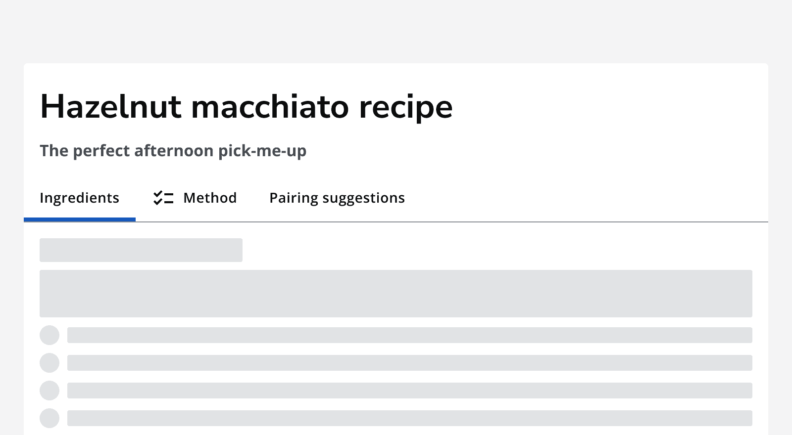
 A recipe page that shows a tab bar with three tabs. Only one tab out of the three uses an icon.
Don’t mix normal tabs with icon tabs. Use either all normal tabs or all icon tabs.

Accessibility considerations

When deciding to use tabs, consider whether this component gives users the most understandable and usable way of navigating between the content.

Consider laying out your content into a single page with anchor links to move between sections.

Also consider using other containers that are more suited to responsive behaviour such as accordions, which use a single column.


Last reviewed 3 February 2023 .
Navigated to Tabs - Intelligence Community Design System