Tree view
Tree view
Canary components
Canary components are unstable components that are released for testing purposes.
We value any feedback from users willing to try them in their applications.
These components should not be used in production apps without understanding the risk that changes may occur in order to fix bugs or improve functionality.
For more information on canary components, read our approach to
Additional details on the props and events for this component can be found in the
Introduction
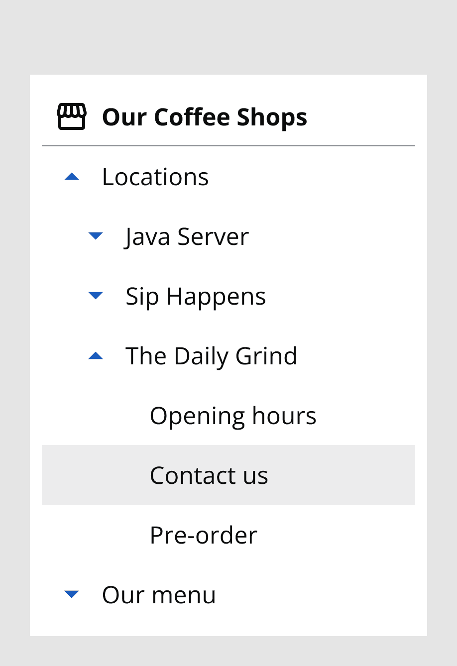
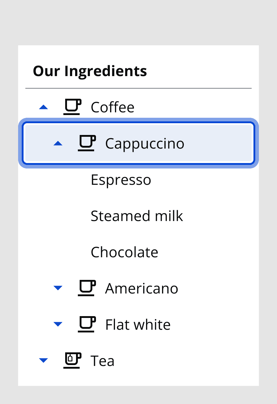
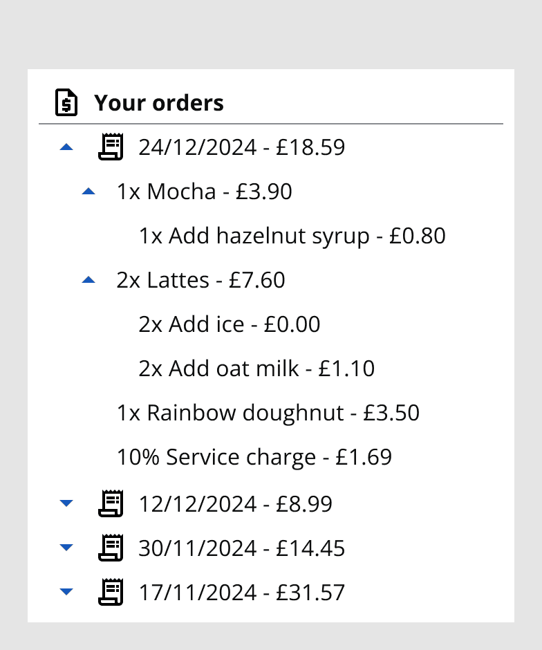
Tree views allow for a large array of items to be displayed compactly, providing quick navigation throughout an application.
Interactive example
When to use
Use tree view to display further navigation options in the application, such as web pages following the home page.

Use tree view for hierarchical navigation options, such as related subsections to the current page or topic.
Use the tree view title bar to provide further clarity on the context of your tree view items.

When not to use
Avoid using tree view for dense or complicated data display. Consider if this could be displayed better with a

Avoid using tree view in a drawer or section with restricted width, as the nested layers for child tree items require width to expand into.
Avoid using multiple tree views on the same web page; consider using tabs which navigate to separate sections.
Colour
Use the dark or light theme to achieve colour contrast compliance when using tree view on different coloured backgrounds.
Sizing and placement
Set the tree view’s vertical size dependent on the number of tree view items to be displayed. Large items take up more height so are good to use when there are fewer navigation options. Small items allow for denser and more compact options so are best to use in situations with many nested layers of navigation items.
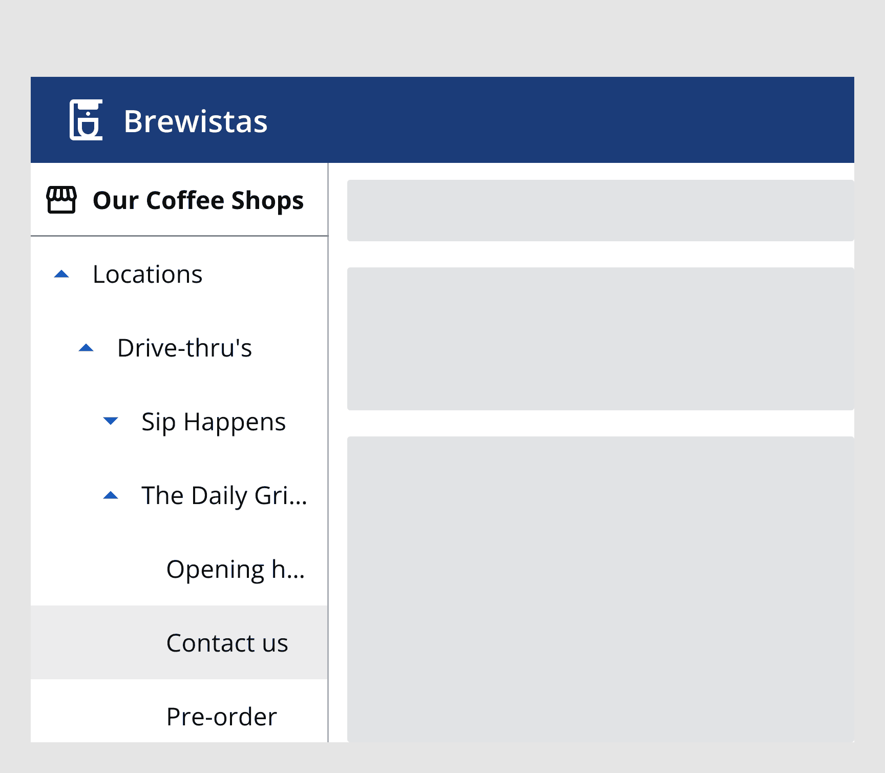
The width of the tree view is set by the screen size or the container it is placed within. Tree view item text will wrap onto the following line if it overlaps the side of the container. Text can instead be truncated with a tooltip with thetruncateTreeItem
prop.
Place the tree view at either side of the page to ensure it can always be accessed independent of the screen content. Tree views should fill the whole height of the container they sit within.

Interaction behaviour
When a tree view item is selected, the link it points to will be loaded if provided. Any nested items will appear underneath the parent item.
Tree view items can scroll within the tree view if they surpass the height of the container.