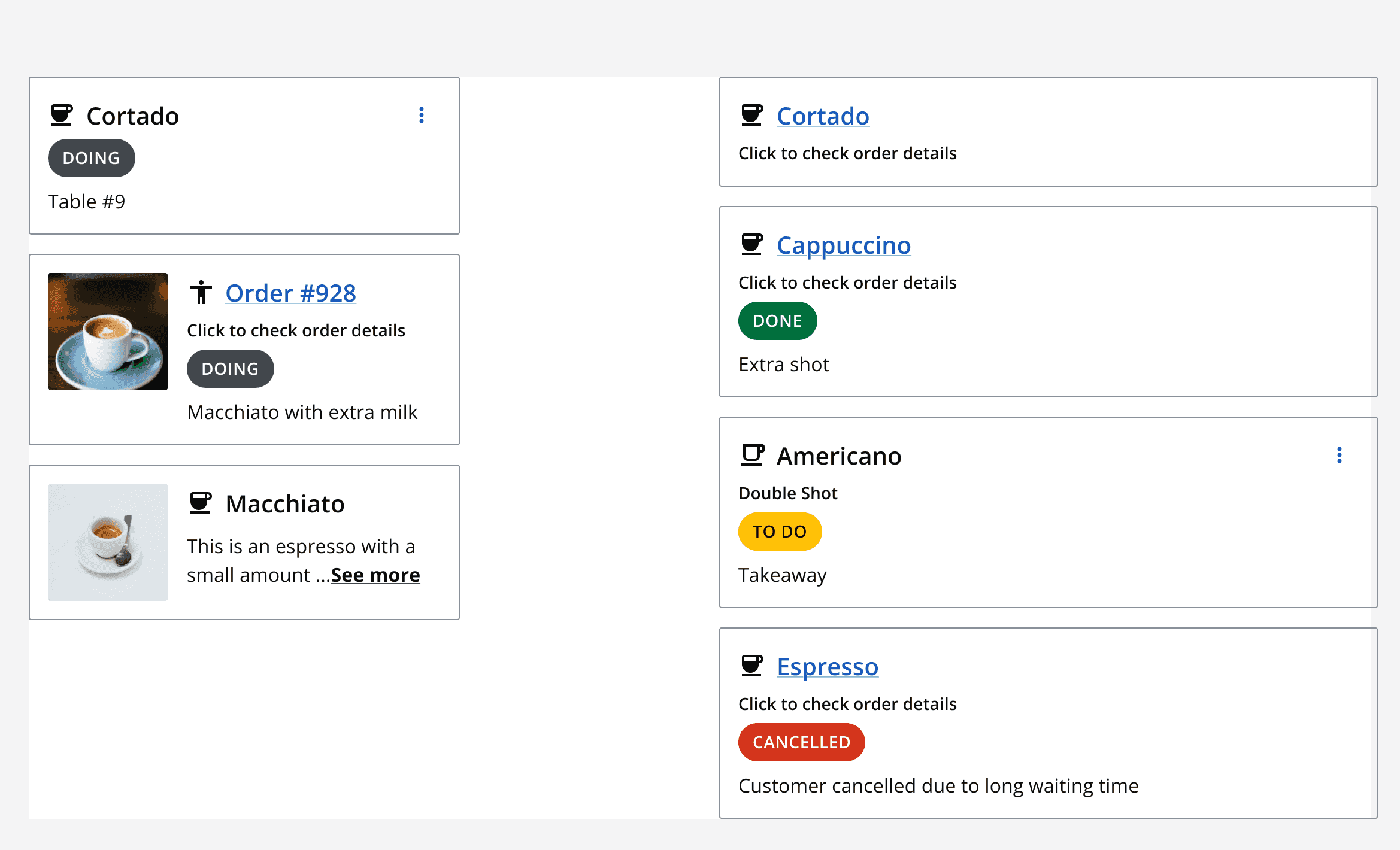
Card (horizontal)
Card (horizontal)
Canary components
Canary components are unstable components that are released for testing purposes.
We value any feedback from users willing to try them in their applications.
These components should not be used in production apps without understanding the risk that changes may occur in order to fix bugs or improve functionality.
For more information on Canary components, read our approach to
Additional details on the props and events for this component can be found in the
Introduction
A horizontal card uses the same structure as clickable and static vertical cards, although presenting the content in a horizontal layout with the image on either the left or right.
Horizontal cards do not currently contain an interaction area as they are designed for display rather than function. Horizontal cards are best suited for presenting a summary of information with an image in a pleasing way. The card can be clicked on to find out more about the item on a dedicated page.
Component demo
Interactive example
Component variants
The horizontal card has two main variants:
Density
Two options are available for density: default and spacious.
Size
There are three size variants: small, medium and large.
When to use
Use a horizontal card when vertical space is limited and you need to display information about an item in a visually pleasing way.
When not to use
Don’t use a horizontal card to display large amounts of content about an item, consider using a
Interaction behaviour
Horizontal cards utilise a heading area which controls interactions with the card. The heading area can be either static or clickable. If you need a card to contain an interaction area, consider using a vertical instead of horizontal card.
Static
Interaction with a horizontal card containing a static heading is limited to the card menu.
Clickable
A horizontal card with a clickable heading contains the card heading as a clickable link element.
Clickable cards contain one interaction, therefore text in the card body cannot be hidden.
Sizing
Use the size options to resize the horizontal card to fit your design space. Match the selected size to other components in the same section so that they are aligned.
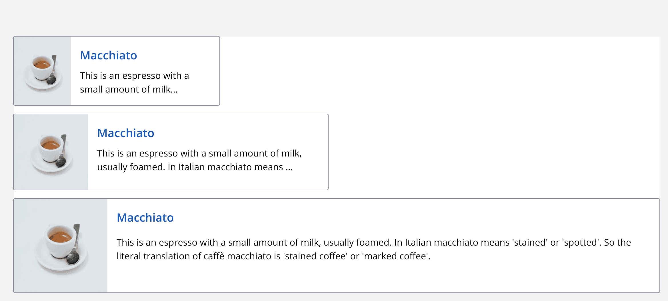
Use the small size when available width is limited and use the large size for a wide horizontal card display.
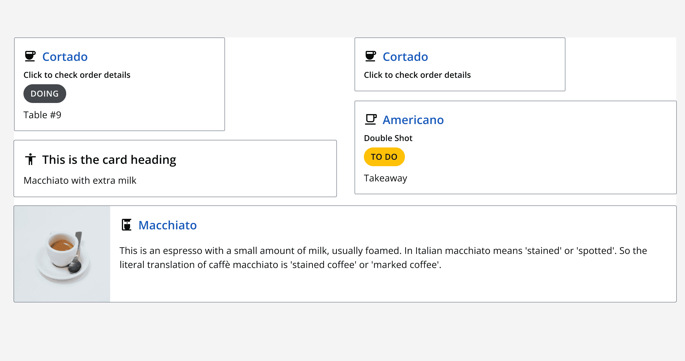
Density
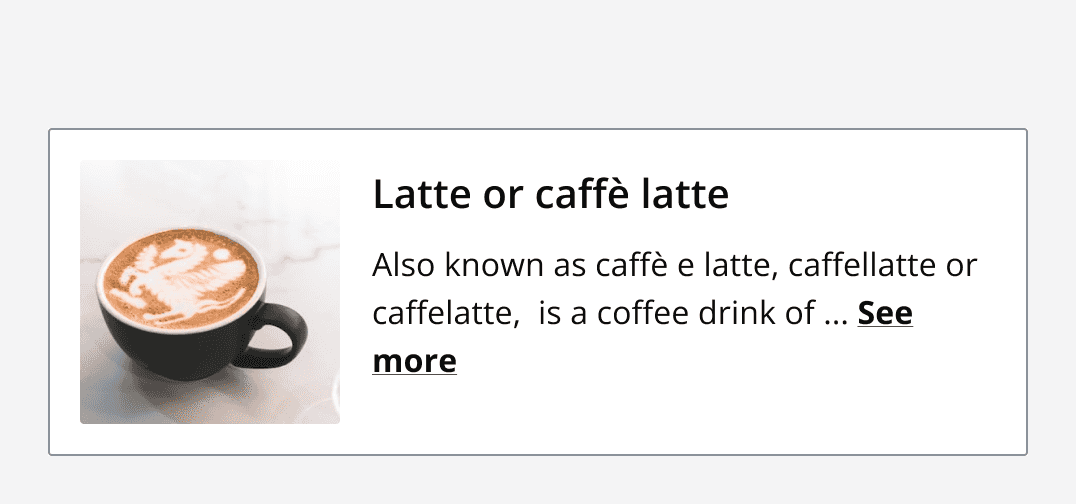
A horizontal card with a default density has no margin between the image and card border, for a more compact styling.
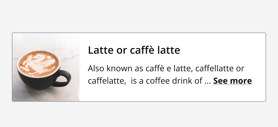
A horizontal card with a spacious density maintains a 16-pixel margin between the image and card border.
Content
Horizontal card content is similar to the static and clickable variants of

1. Heading area
The default horizontal card layout cannot contain a subheading or adornment due to space limitations.

The heading area can contain:
-
A: Icon/Avatar
-
B: Heading
-
C: Card menu
A spacious horizontal card can contain a subheading and an adornment.

The spacious density heading area can contain:
-
A: Icon/Avatar
-
B: Heading
-
C: Subheading
-
D: Adornment
-
E: Card menu
2. Image
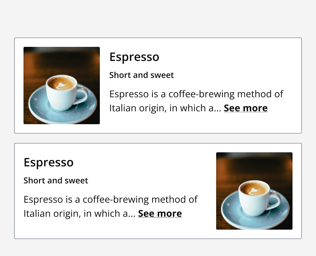
If an image is displayed, it can be placed to the left or right of the content.
3. Content area
Add a descriptive message within the card content section. Static cards can include a 'see more' link to expand hidden content.
Since clickable cards can only contain one interaction, text can't be hidden.
