Side navigation
Side navigation
Introduction
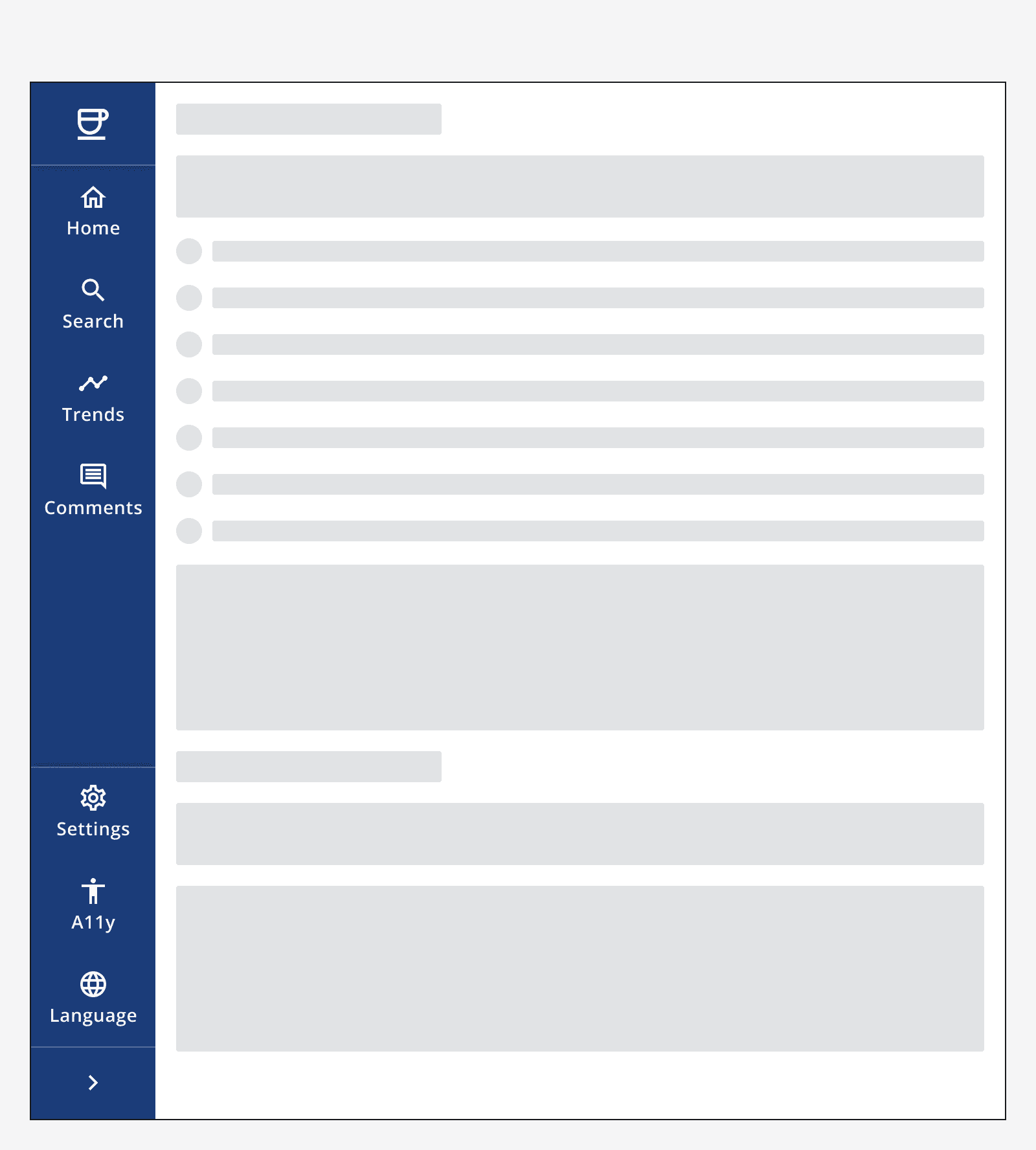
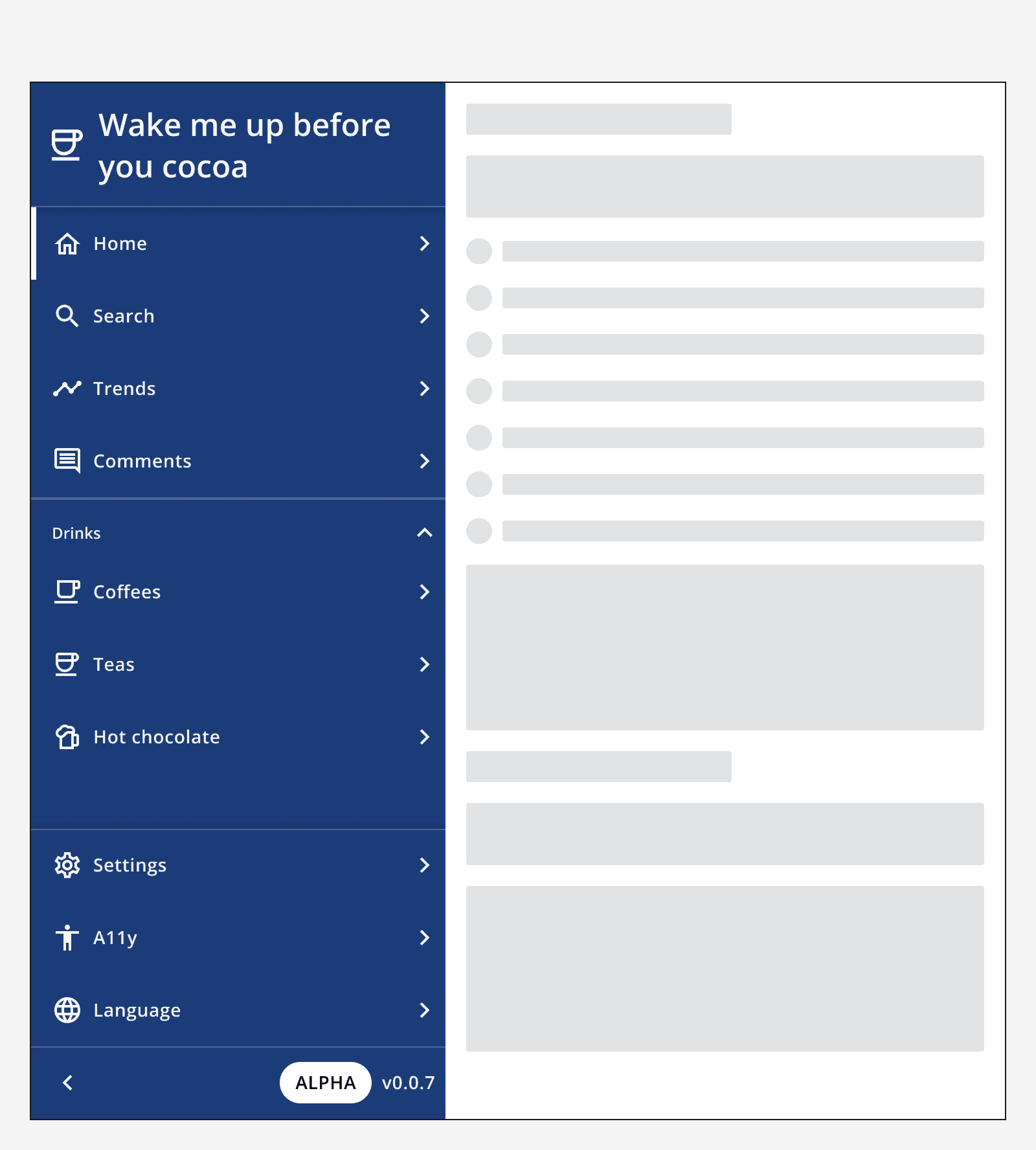
An example of the side navigation component.
Interactive example
When to use
Use side navigation to help provide more screen space for the main content. Side navigation is well suited to apps that have mutually exclusive features that need to be switched between easily on any page.
Use side navigation alongside additional components like
When not to use
For intranet-style and content-heavy apps, use
Use either side navigation or top navigation. Don't use both at the same time.
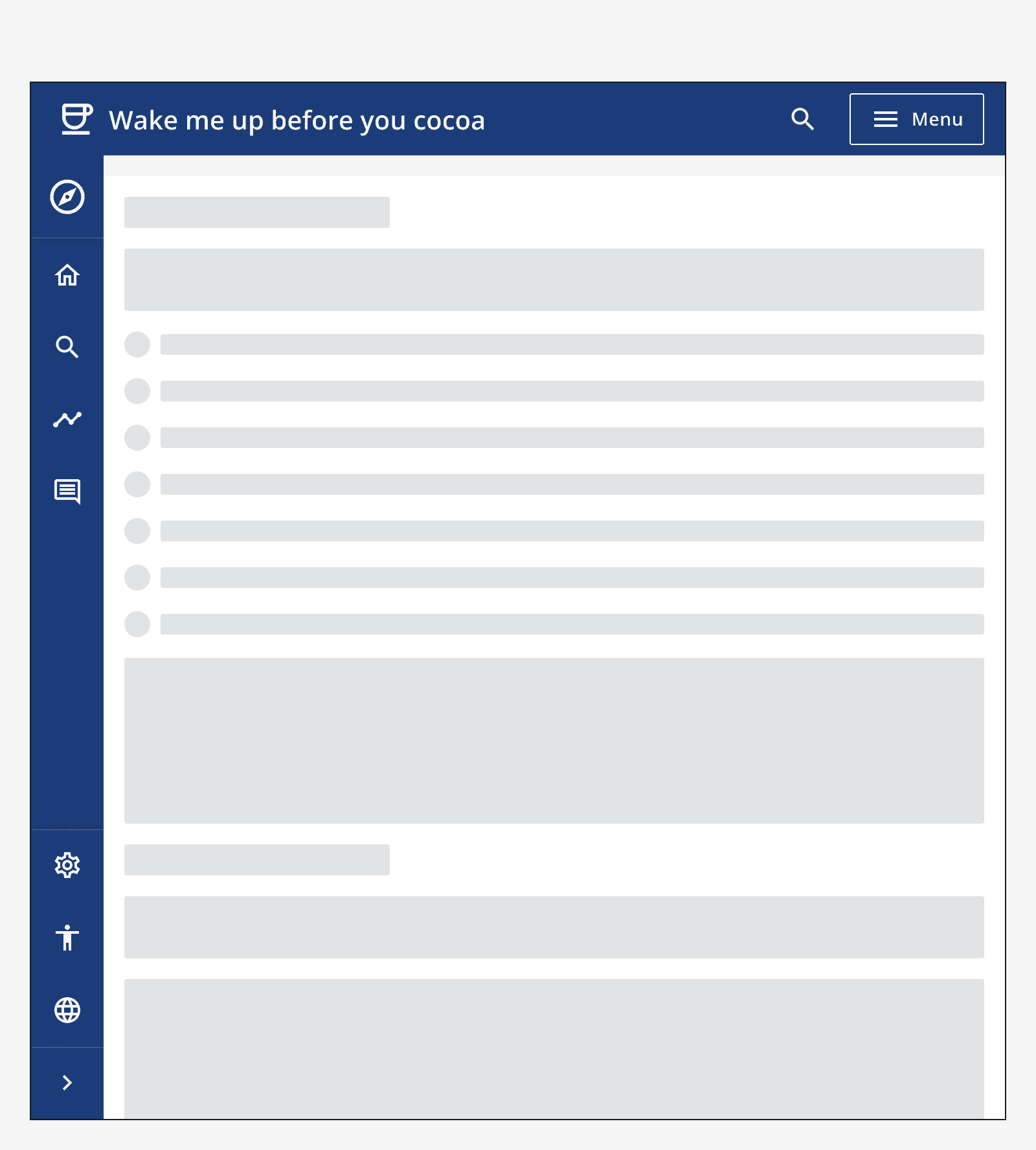
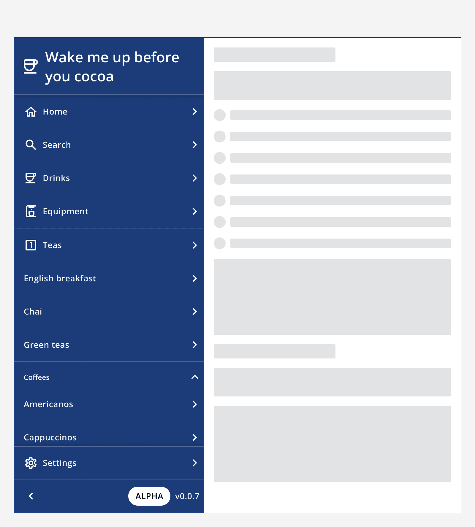
Avoid using side navigation if the app has many destinations grouped into a multi-level hierarchy. Instead use a
Interaction behaviour
Side navigation is expandable and displays the navigation labels and app info when expanded. Choose whether to display the side navigation as expanded or collapsed by default when the page loads.
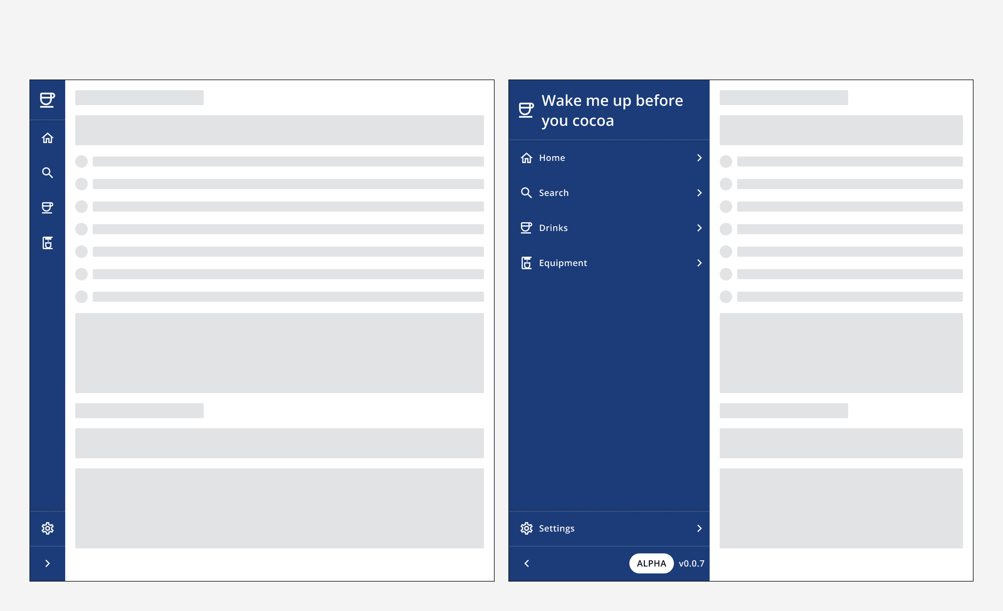
Set the side navigation to static if you want it to be either permanently expanded or permanently collapsed. This removes the expansion toggle button from the bottom of the side navigation.

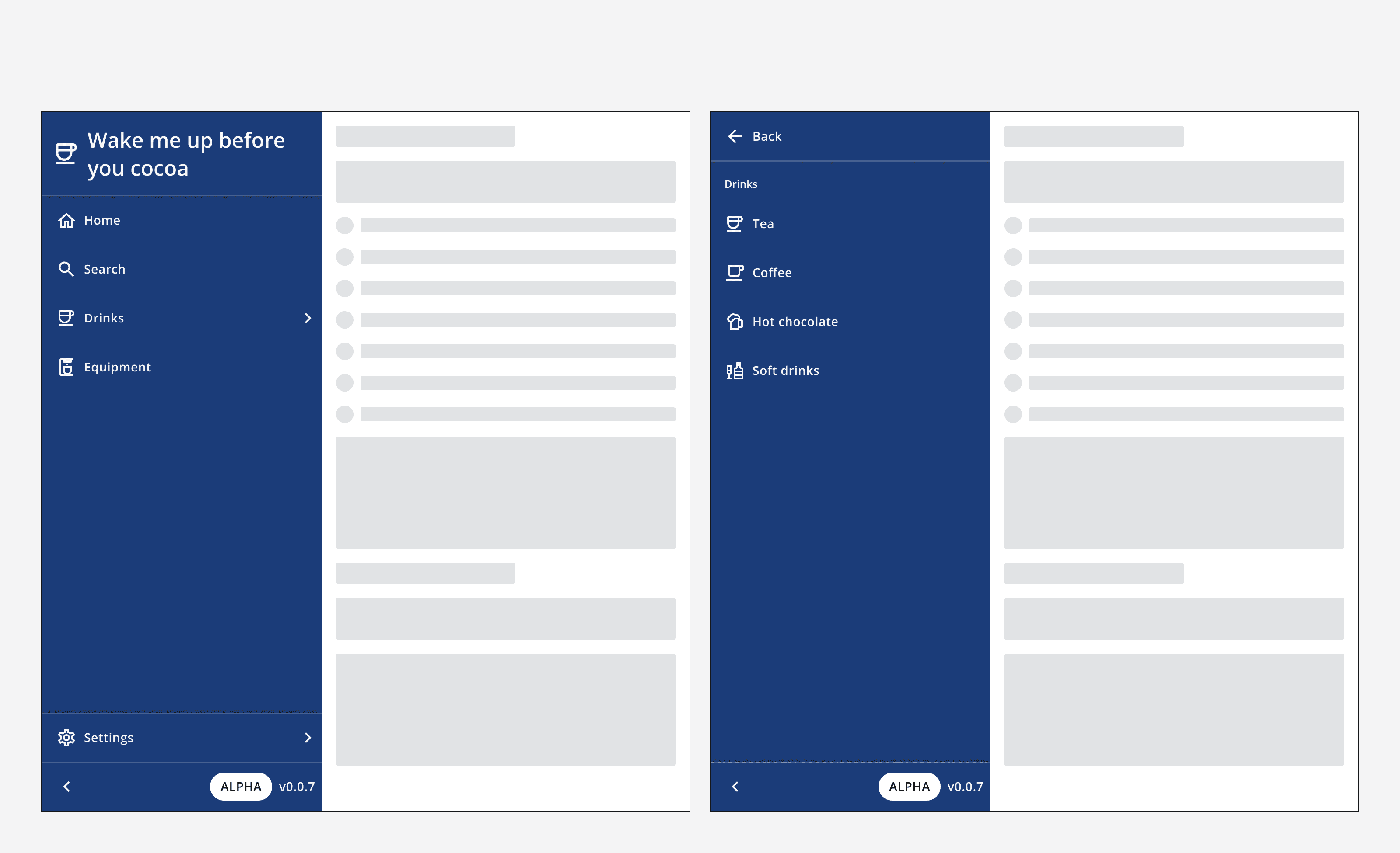
Use a drill-down menu option to provide access to child links in a sub-menu. The sub-menu can be closed by using the back button in the sub-menu's top section.
Sub-menus can be nested, but avoid creating overly deep page hierarchies and consider using top navigation with grouped links instead.
Colour
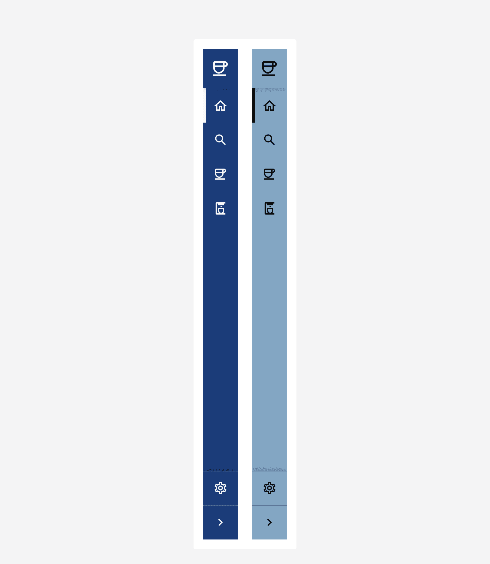
The side navigation uses the app's
Layout and placement
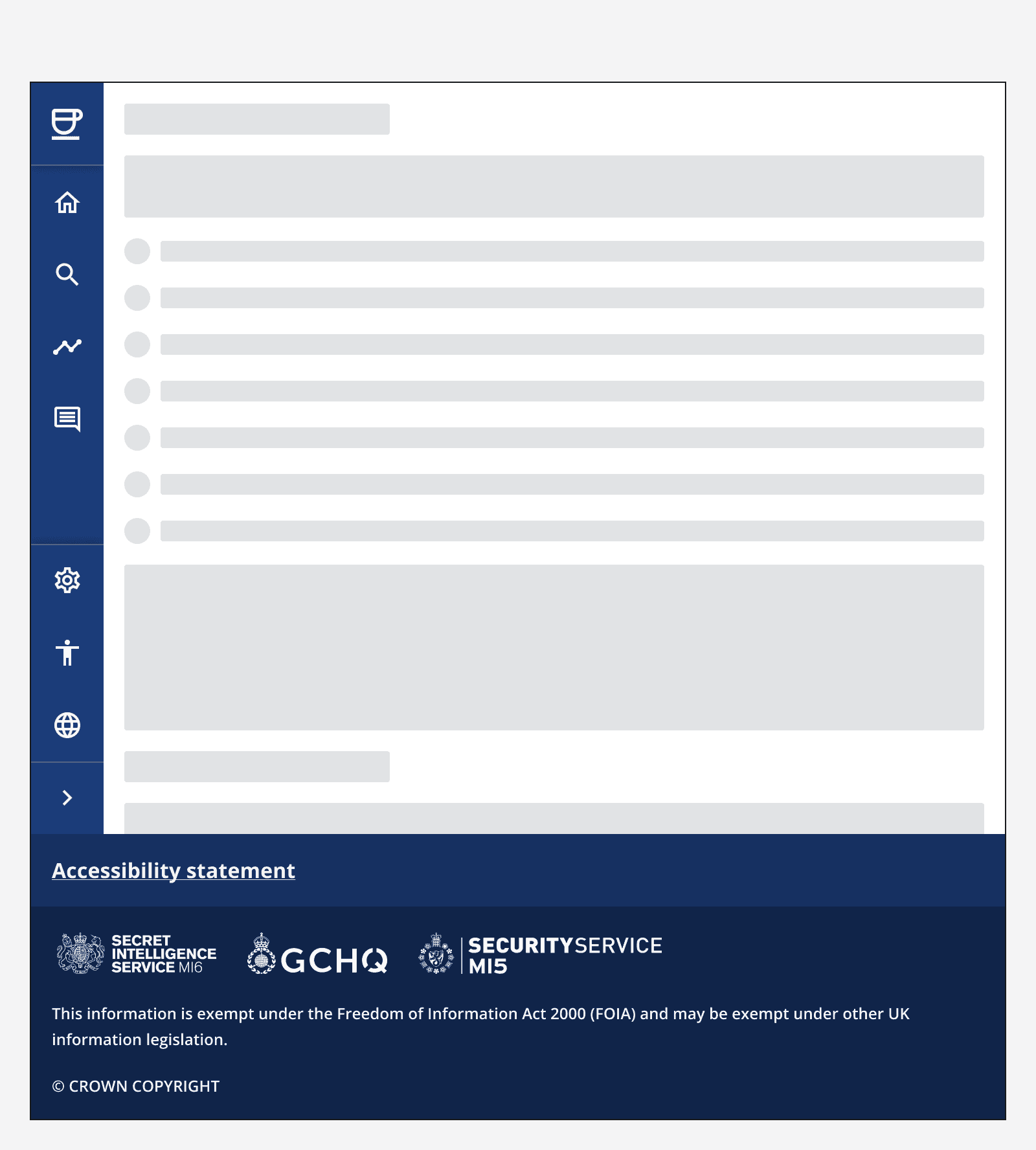
Always position the side navigation on the left hand of the screen and make sure that it vertically fills the browser window.
Content
App information
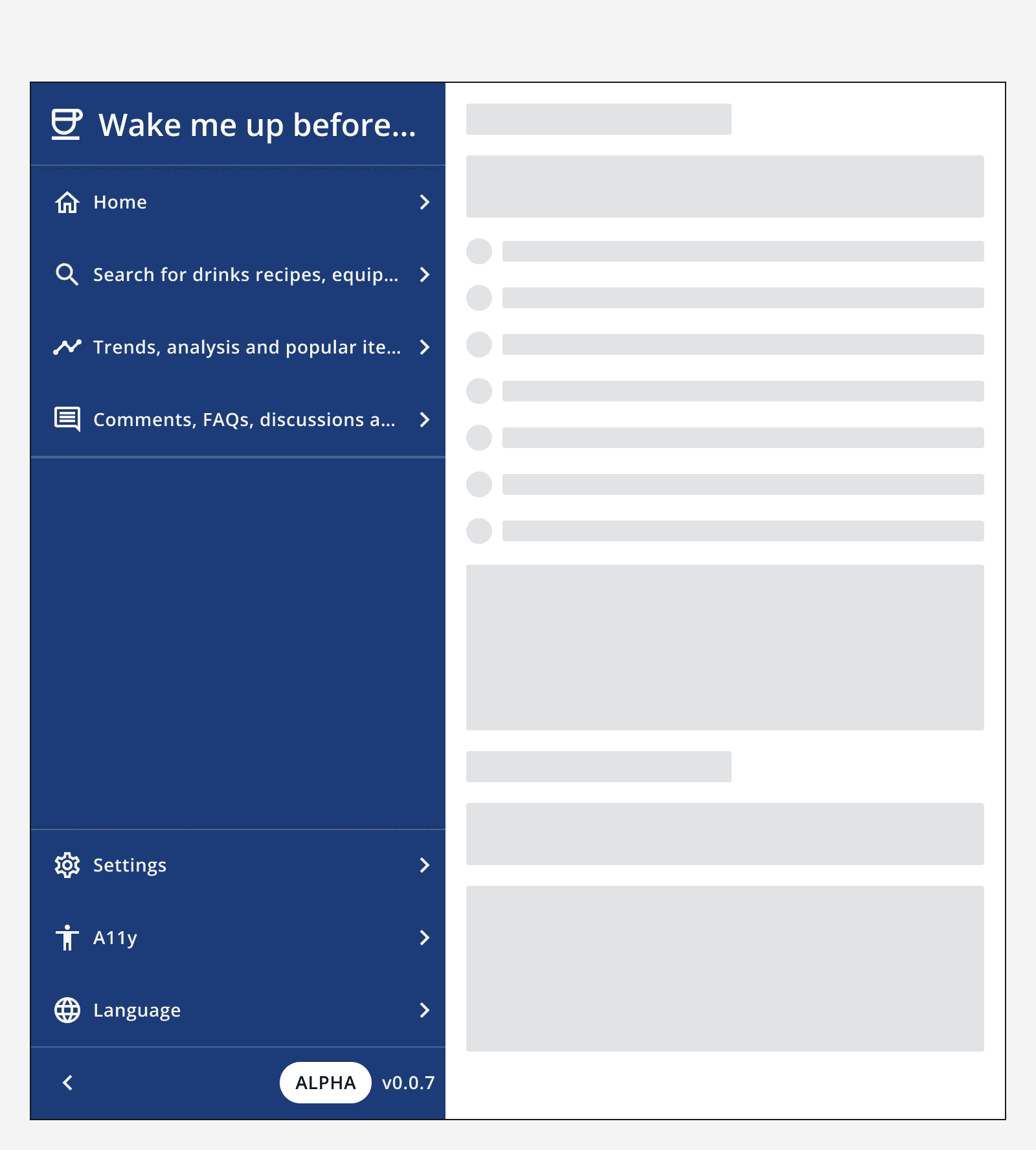
Use your app's name, icon, status and version information in the side navigation's app info fields.
Labels and icons
Follow the
Follow the
Keep labels concise as they will truncate if they are too long to display in the side navigation.
Menu items
Set the side navigation menu items to reflect your app's main navigation links.
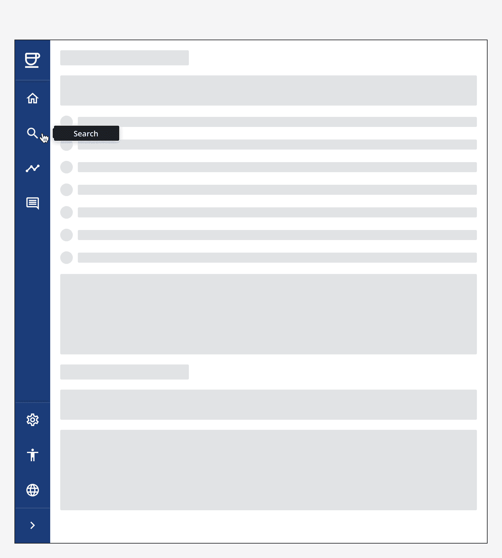
By default, menu items will only display their icon when the side navigation is collapsed. The item label will be displayed via a tooltip when hovering or focusing on the menu item.
Set the menu items to display their labels in the collapsed state by default if this will aid the recognition of the feature. However, take care when doing this as long menu item labels will be truncated.
Group related menu items into expandable menu item groups.
Use a drill-down menu item if the menu item has a large number of child links to display. This will display the child links in the side navigation's sub-menu.
Bottom menu items
Use the sticky bottom menu section to provide quick links to global app features or external links.
Accessibility considerations
Make sure to include alt-text when specifying icons for menu items.