Elevation
Elevation
Interaction layers
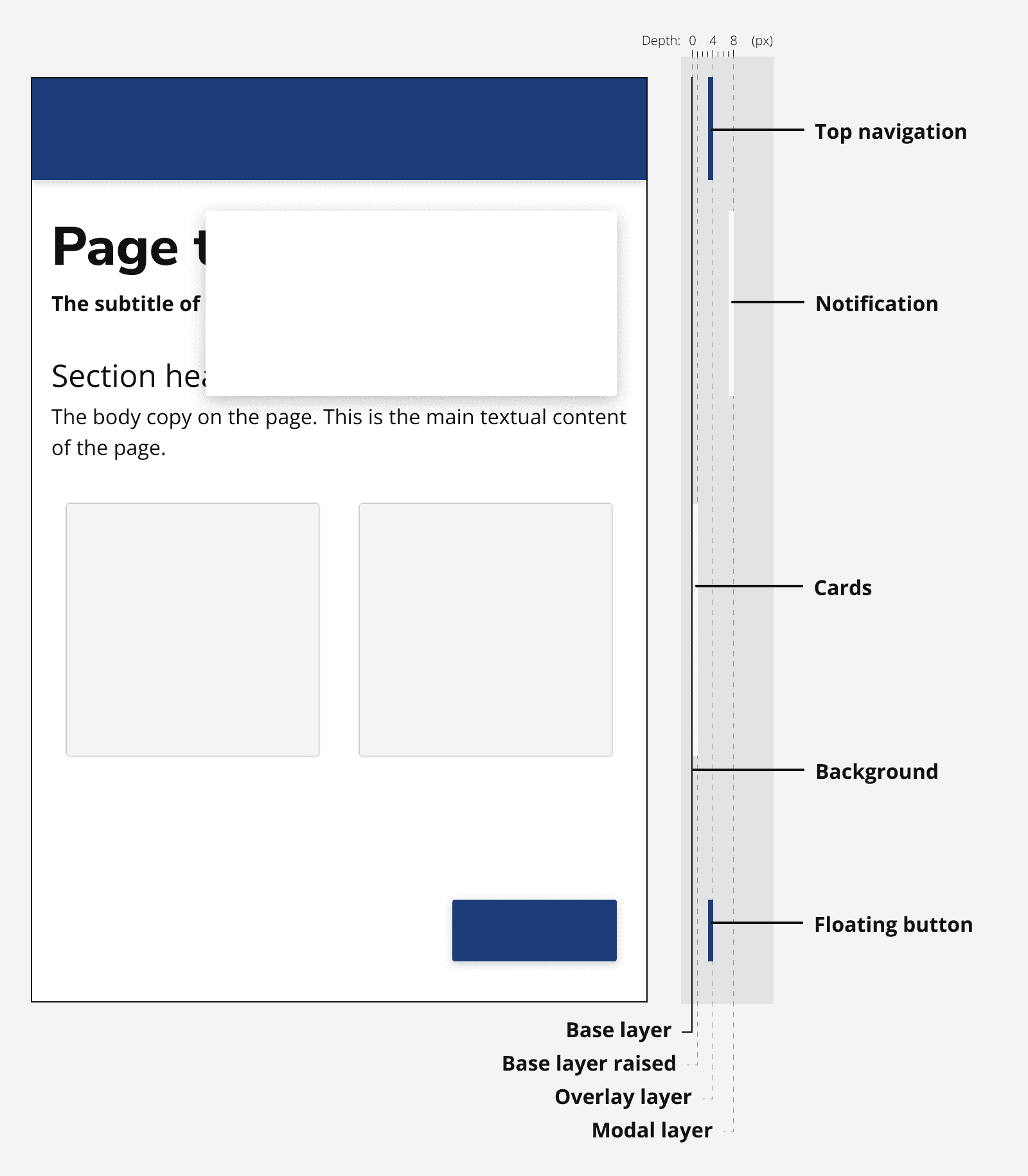
Adding elevation with shadow helps to provide hierarchy to components.
An app can be considered to be a set of different interaction layers that hold different types of components that exhibit similar behaviour. Components on each of these layers cast differing levels of shadow to provide the appearance of different heights from the page.
There are three layers:
-
The base layer contains most of the page content and scrolls within the viewport. Its contents are on the bottom layer of an app so cast little or no shadow.
-
The overlay layer contains components that overlay the base layer. These overlaid components may stick to the viewport when scrolled and cast a small shadow.
-
The modal layer sits above all other content and contains components that are important to display to the user and interrupt their current task. Components on this layer cast a large shadow.

Tokens are provided for the z-index values of components which sit above the base layer as well as the base z-index itself:
| Token | Component | Calculated z-index |
|---|---|---|
| --ic-z-index-base-value | Base z-index value. Used to calculate z-index of other ic components that sit above the base layer. | 0 (Base) |
| --ic-z-index-page-header |
|
Base + 10 |
| --ic-z-index-back-to-top |
|
Base + 20 |
| --ic-z-index-menu |
Menu for
|
Base + 50 |
| --ic-z-index-popover |
|
Base + 50 |
| --ic-z-index-navigation-item |
Navigation item used in
|
Base + 50 |
| --ic-z-index-navigation-menu |
Navigation menu used in
|
Base + 60 |
| --ic-z-index-side-navigation |
|
Base + 60 |
| --ic-z-index-dialog |
|
Base + 100 |
| --ic-z-index-tooltip |
|
Base + 110 |
| --ic-z-index-toast |
|
Base + 110 |
| --ic-z-index-classification-banner |
|
Base + 200 |
Users can change the base value in their css:
:root {
  --ic-z-index-base-value: 1000;
}
Which will cause all other z-index tokens to be calculated from this new value.
Additionally, users can change the z-index value for a specific component, either globally:
:root {
  --ic-z-index-tooltip: 200;
}
Or for a specific instance or instances of a component:
<ic-tooltip id="my-tooltip-id">...</ic-tooltip>

#my-tooltip-id {
  --ic-z-index-tooltip: 300;
}<ic-tooltip class="my-tooltip-class">...</ic-tooltip>
.my-tooltip-class {
--ic-z-index-tooltip: 300;
}Shadows
Each interaction layer has a defined shadow to provide the sense of depth.
| Token | Description | Perceived depth |
|---|---|---|
| none | Components on the base layer cast no shadow. | 0px |
| --ic-elevation-raised | Raised components sit on the base layer and cast a slight shadow. | 1px |
| --ic-elevation-overlay | Components that sit in the overlay layer cast a small shadow. | 4px |
| --ic-elevation-modal | The modal layer contains components that appear highest and cast a large shadow. | 8px |
Accessibility considerations
The shadows are purely decorative and don't provide any additional meaning that can't otherwise be understood from the page contents or code.
Shadows aren't used to distinguish a component from adjacent components or background layers. The components themselves provide enough contrast to ensure they stand out.