Section container
Section container
Introduction
When creating a page, use section containers to group content and align the margins with each other as well as other components.
Section containers are used in components to control alignment of their content. The following components use section containers with the specified alignments.
-
Top navigation -
Footer -
Hero -
Page header
Component demo
Interactive example
When to use
Use a section container to group multiple elements and align them on a page. Use multiple section containers to ensure alignment between them all.

When not to use
Avoid nesting section containers as it can be difficult to maintain alignment. Instead, use multiple section containers to align each group of content differently.
Sizing
The size of the section container changes dependent on the size of the viewport. The margins and maximum width of the container are automatically set so that the content will respond to changes in the viewport.
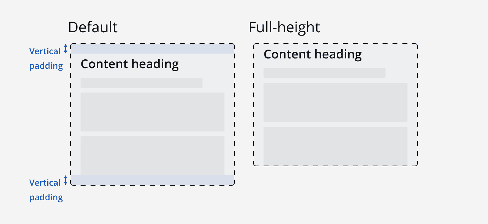
Make a section container full height to remove the vertical padding and help align vertical content more easily.

Layout and placement
Use the alignment properties of the section container to change how they align with the viewport.
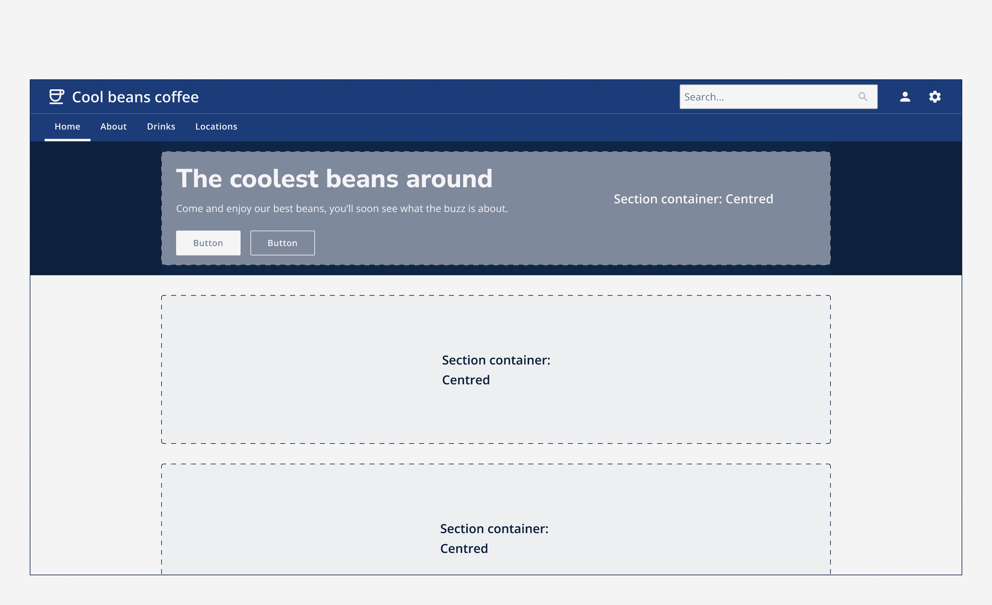
Use centre alignment to position the section container in the centre of the viewport.

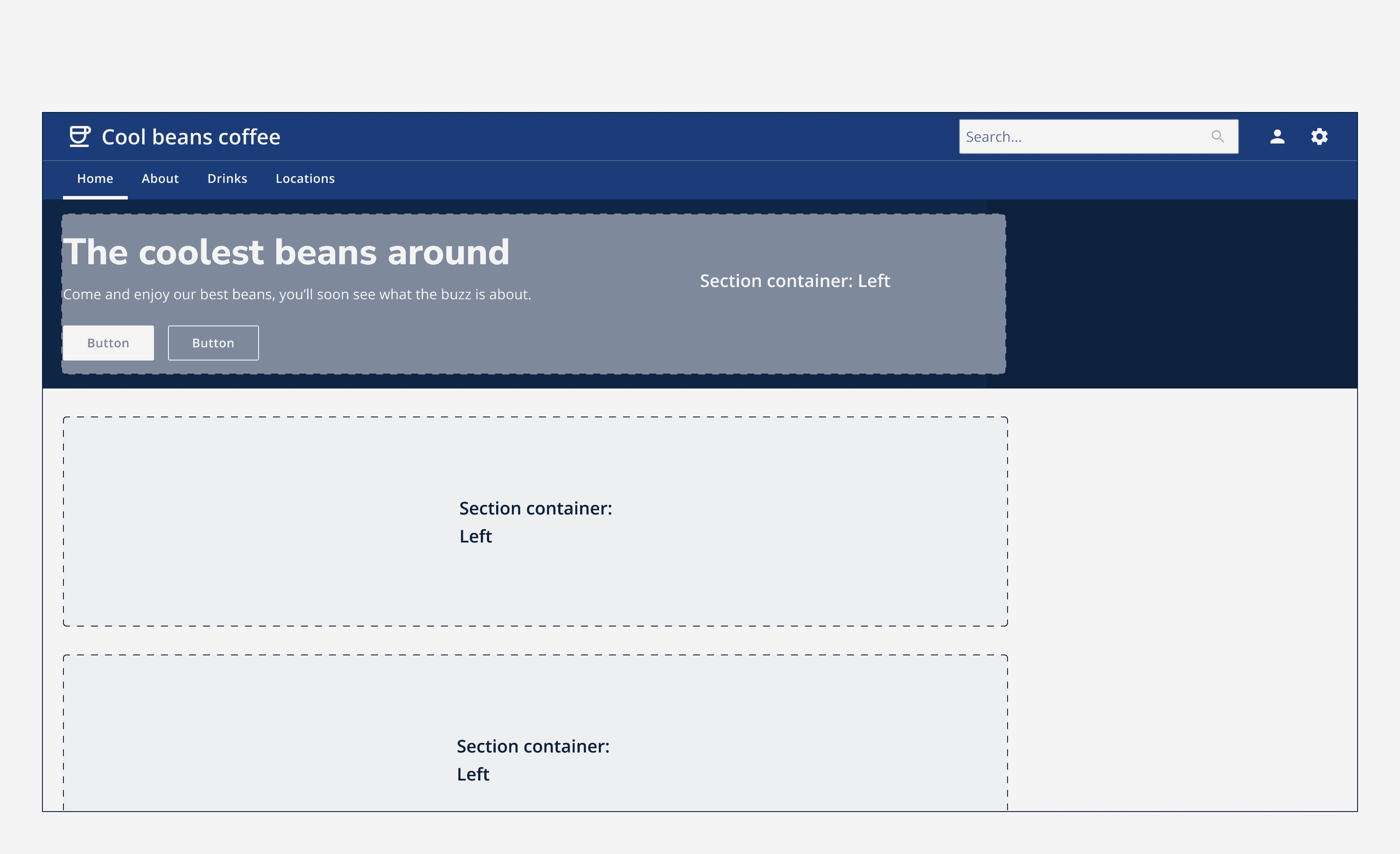
Use left alignment to position the section container to the left of the viewport.

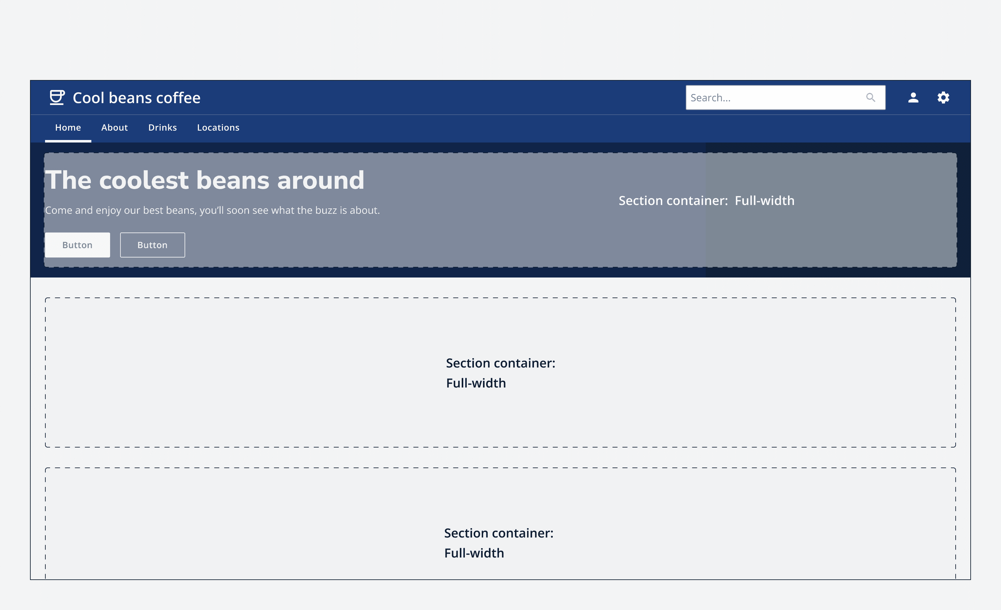
Use full-width alignment to make the section container span the full width of the viewport.

Content
Group any combination of content within a section container. Align the content relative to the section container. By default content is aligned to the left, but overide this to create custom internal layouts, whilst having the section align automatically with other containers on the page.
Future work on this component
-
Add grids to section container to align internal content.