Toggle button
Toggle button
Introduction
A toggle button is a type of button that shows a selection status and so is commonly used to turn a setting ‘on’ or ‘off’. It is similar to a
An icon toggle button provides the same functionality but removes the visible text label in favour of an icon to represent its meaning.
Interactive example
When to use
Use a standalone toggle button to provide access to a single option that can be toggled ‘on’ or ‘off’. Make sure to clearly label the toggle button so that it is clear what toggling the setting would achieve.
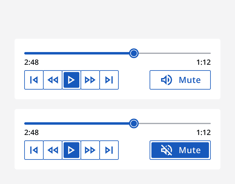
For example, use a standalone toggle button for a mute button in an audio player.
Use toggle buttons in dense layouts or sections of an app that don’t have a lot of space. Use other selection methods, such as
For example, use toggle buttons when creating a toolbar as the small size and contained selection states allow for multiple settings to be organised within a small space.
Use an icon toggle button to provide a setting with no text label, but an icon instead. Take care when selecting the icon so that it is clear what the setting is and always provide an accessible label so that it can be understood by users of assistive technology.
Group toggle buttons to provide multiple options for a setting or control. Select whether the toggle button group can have multiple options toggled on at one time, or if only one should be selected at a time.
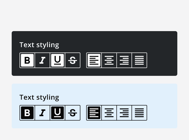
For example, use a multi-select toggle button group to provide text styling options in a text editor where an item of text could be set to bold as well as italic.
Similarly, use a single-select toggle button group to provide text alignment options in a text editor where an item of text can only have one alignment option at a time.
When not to use
Consider whether toggle buttons are the best selection method for your use case.
Avoid using toggle buttons or toggle button groups to capture input within a form, instead use checkboxes or radio buttons.
Avoid using toggle buttons to control the state of another content section in your app. Instead, use
Interaction behaviour
When implementing a toggle button group, set the selection type to either single-select or multi-select. Single-select allows only one option to be selected at a time, where multi-select allows multiple options to be selected.
If using a single-select toggle button group, choose whether the selection method should be automatic or manual. The automatic selection method selects the option as you navigate through the options, whereas manual selection requires the option to be manually selected after navigating to it.
Use manual selection if no selected option is viable for the toggle button group.
For example, an audio player could use a toggle button group for its play, fast forward and rewind buttons. Only one option can be selected at a time, but all options can also be turned off.
Colour
Use thetheme
andmonochrome
props when placing toggle buttons on different coloured backgrounds. This makes sure that a good colour contrast can be achieved in adherence to the accessibility guidelines.
Don’t mix different coloured buttons in the same toggle button group, always use the same colour for all toggle buttons within a group.
Don’t re-colour the icons in a toggle button, make sure they match the text label so that they also achieve a high colour contrast ratio.

Sizing
Use the size options to resize the toggle buttons. Match the selected size to other components in the same section so that they are vertically aligned.
Set a custom width for a toggle button instead of the default behaviour that hugs the toggle button’s label or icon. Text labels will wrap onto multiple lines if the custom width is too small to fit the label in one line.
Use the full width properties to make the toggle button or toggle button group expand to horizontally fill its container.
Content
Take care when choosing a toggle button’s text label so that it is clear what will happen when it is toggled ‘on’ or ‘off’. Don’t use neutral or ambiguous labels. The toggle button should be read ‘label: on’ or ‘label: off’.
Don’t change the text label on a toggle button between different selection states as it causes it to become ambiguous as to what state it is in. Instead, keep the label the same, but use the icon to indicate a change in state.
For example, when using a toggle button for a mute button, the label should read ‘mute’ and the state of the button indicates whether ‘mute’ is ‘on’ or ‘off’. The change in icon also helps to indicate the current state.

Use an icon on a toggle button to add a visual indicator of its function. Take care to choose an appropriate icon that clearly represents the toggle button’s function and doesn’t introduce ambiguity into its meaning.
Set the icon position to be either left, right or above the text label. Don’t use different icon positions on different toggle buttons within a toggle button group. Use the toggle button group’s icon position to set all toggle buttons’ icons to the same position.
Aim to only include two to six toggle buttons within a toggle button group. The larger the number of buttons the less horizontal space is available to display the labels. If more options are required, consider using a
Accessibility considerations
When labelling toggle buttons, consider adding an accessible label that includes the visible label. This provides more context to users of assistive technology.
Always provide an accessible label when using icon toggle buttons as this is what identifies the purpose of the icon toggle buttons to screen readers.
When using a toggle button group, set a label for the group explaining the setting. This is not displayed visibly but is used to identify the group when navigated using assistive technology.
Select the optimal appearance option when using toggle buttons on different coloured backgrounds to maximise the colour contrast. User interface controls need to achieve 3:1 ratio with adjacent colours.