Focus indicator
Focus indicator
Enclosing components
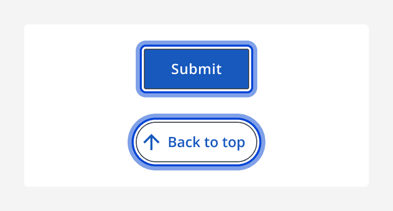
The focus indicator shows users where they are on a page. It encloses most components and inherits their shapes. They are especially useful for keyboard-only and power users.
When applied to squared components, for example
When applied to rounded components, for example

Links
When links are focused, the indicator will appear as the hover state.
Positioning and layout
Adjacent to components
For most components, the focus indicator will enclose the full component, appearing directly adjacent to its borders.
Internal to components
Focus indicators are required to be fully visible. For components that are adjacent to other components, or the viewport edge, the focus indicator appears internal to the component to remain visible.
Enough padding is provided within these components so that no content is obscured. Make sure to always confirm that no part of the focus indicator or the component's content is clipped or obscured.
Navigation
Keyboard navigation controls vary between components. For specific information, refer to the 'Accessibility' tab in a component's page.
Accessibility considerations
We've designed this style token to meet the emerging
Given the requirements are still a draft and may be subject to change, we will track these criteria to make sure this style token remains conformant.