Dialog
Dialog
Introduction
Dialogs prompt users for additional information to proceed with their task. Dialogs appear modally, meaning that the user must take action to acknowledge the dialog before continuing.
Dialogs work best when used for short tasks or to alert the user to information relevant for their current task. A dialog appears on top of the main page content and is persistent until dismissed.
Component demo
Interactive example
When to use
Use dialogs to interrupt the user flow to display, collect or confirm information that is important to enable the user to continue their task.
Add action buttons to a dialog to present the user with a set of actions to choose from to continue.
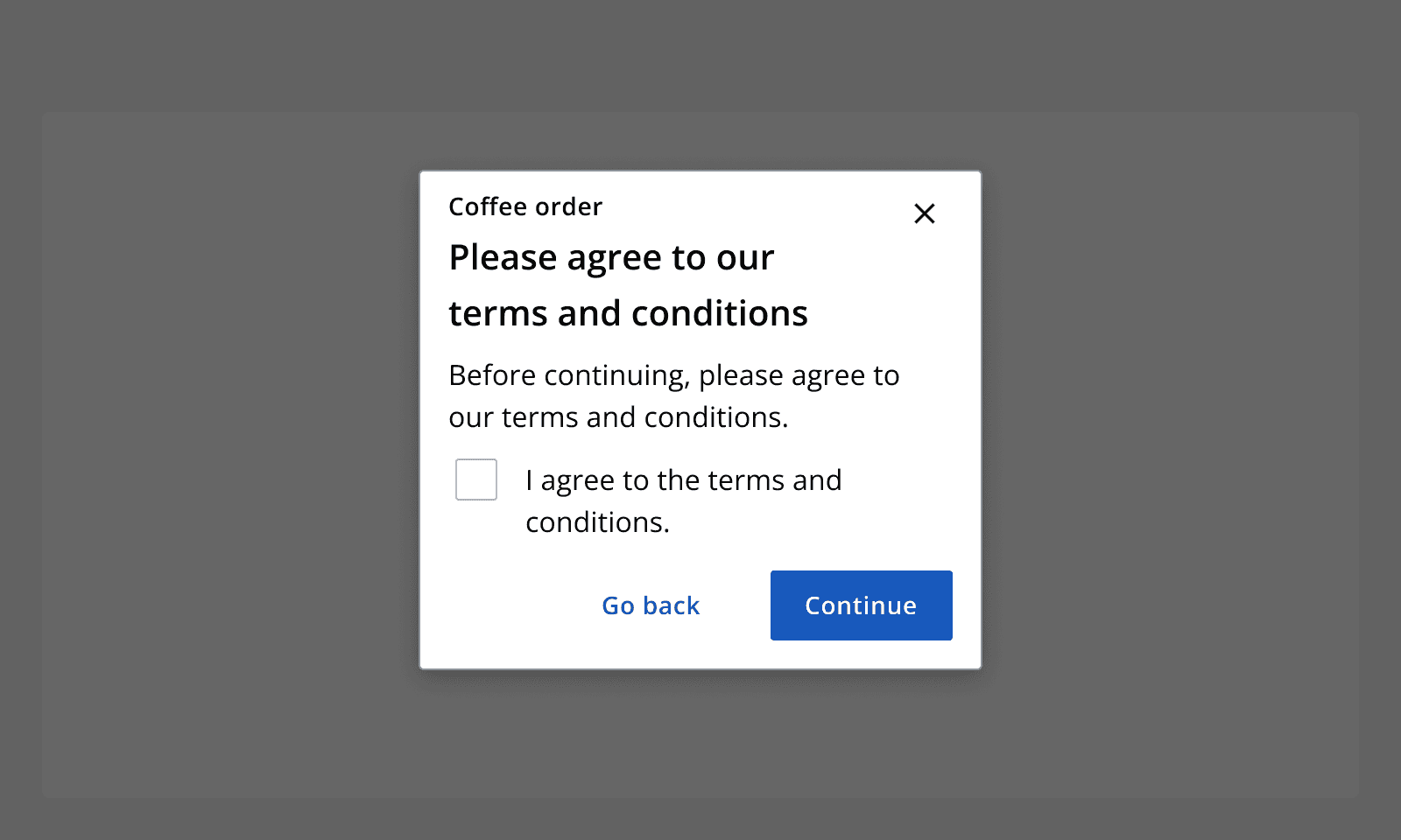
Add interactive content inside a dialog's content area to capture key input, such as providing confirmation of understanding by checking a checkbox.
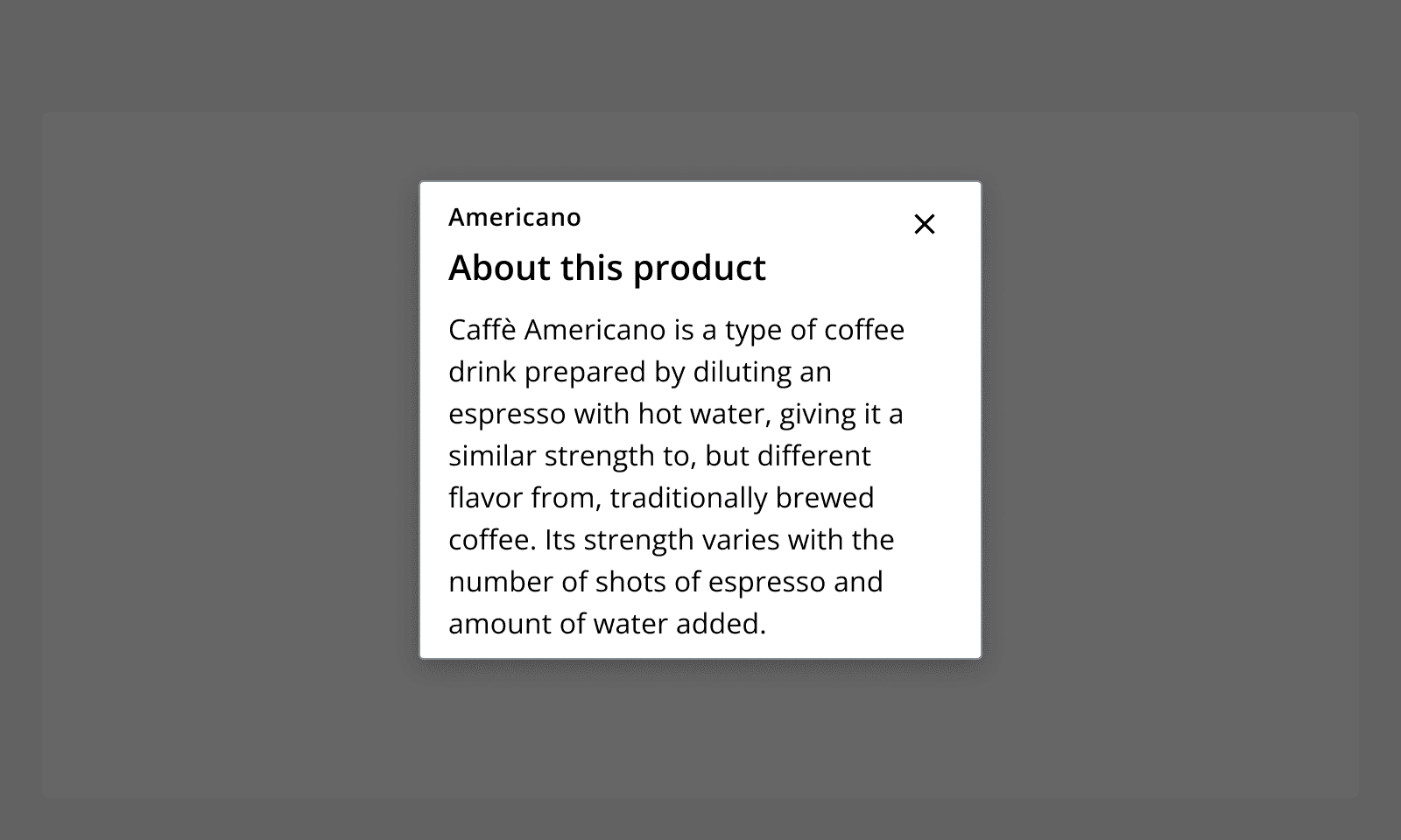
Use dialogs to show additional information that can be opened from the underlying page. These dialogs can be passive and contain no actions other than a dismiss button to close the dialog.
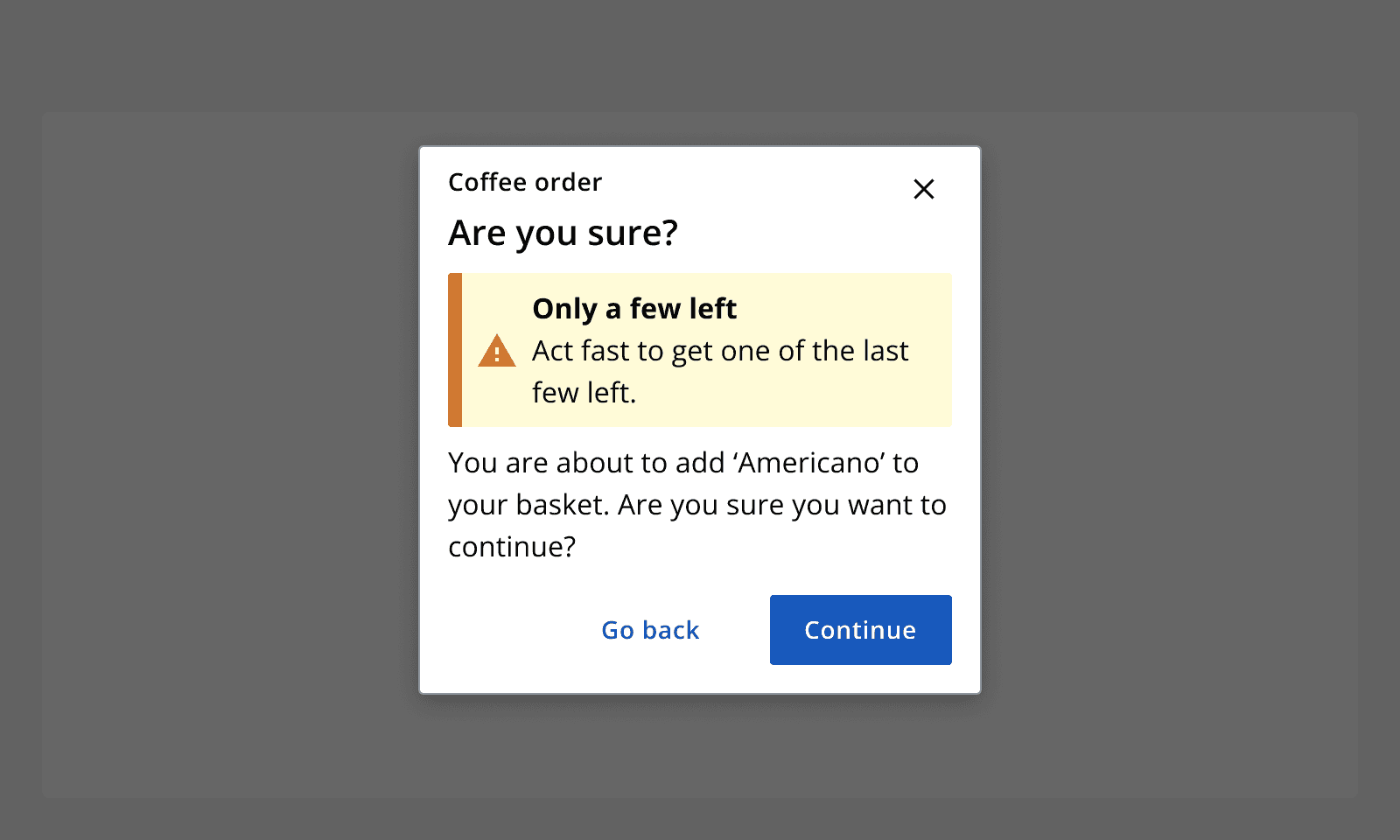
Add a status
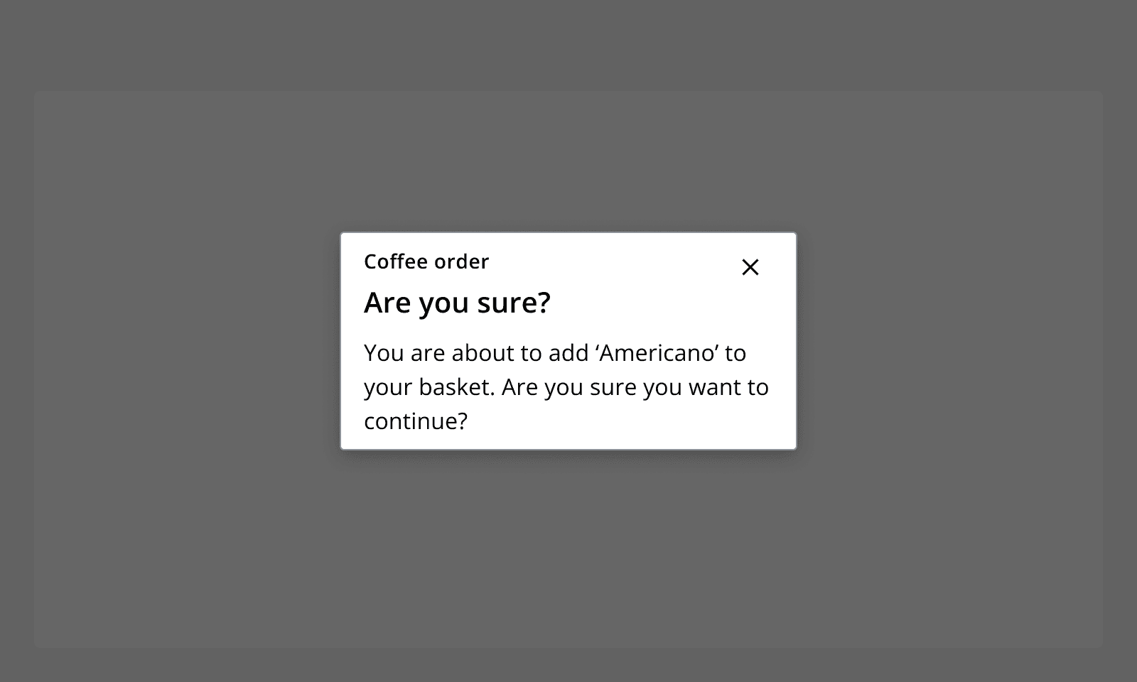
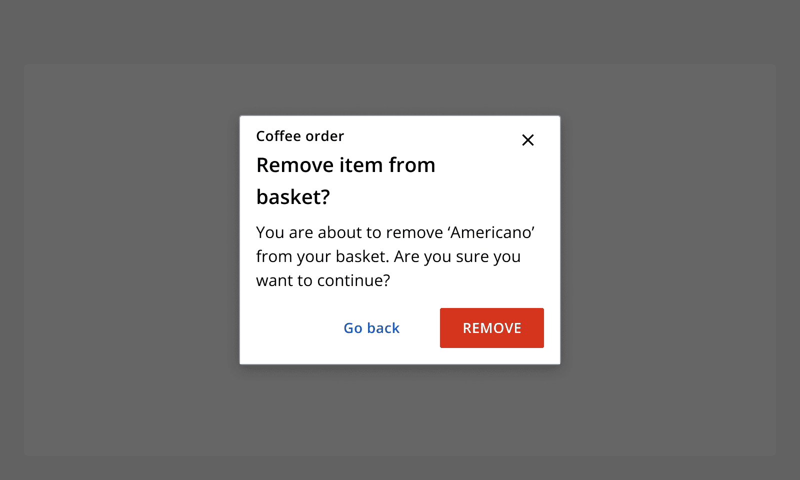
Use dialogs when a destructive action is about to take place. Ask the user to confirm if they want to continue to conduct the action and provide a way of cancelling the action.
When not to use
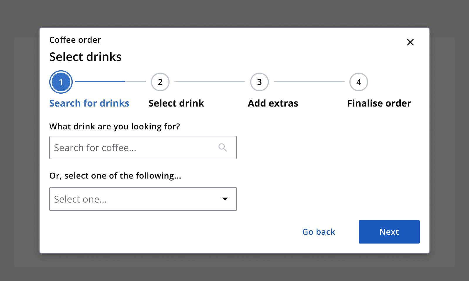
Avoid using dialogs to contain complicated tasks or processes. Instead consider if such complex tasks could be placed on a page themselves.
Don't place important information inside a dialog if it is not part of the main flow of task. Such information can be missed so consider placing it on the page itself. Avoid repeating information in a dialog that is displayed on the page itself.
Don't use dialogs when information from the main page content is required to complete a task within a dialog. Keep all information required to complete the task in a dialog within the dialog. If more information is required, consider if dialogs may not be suitable for the task.
Avoid overusing dialogs to bring every decision in a task to the user's attention. Use dialogs for the key actions in a task instead. Dialogs may be ignored if used too frequently.
Only show dialogs after a user action has triggered it, and make sure its content is contextual to the user action. Don't show dialogs if a user has not performed a specific action on the page.
Interaction behaviour
Display dialogs after users complete a specific action on a page such as clicking a 'submit' button.
Always make sure the dismiss button is included within a dialog, and select whether to allow the dialog to close by clicking on the background scrim.
When a dialog is displayed, the page content in the background cannot be interacted with.
Content can scroll within the body of a dialog, whilst the header section and interaction section are sticky at the top and bottom of the dialog window.
Sizing
Set the dialog's size dependent on the amount of content that is being displayed in it. Large dialogs take up most of the screen so are good to use when there is a lot of content to display such as a table. Small dialogs only use a small amount of the screen so are best used for short additional information.
On extra small breakpoints all dialogs automatically change to their full-screen setting to provide maximum space for their content.
Content
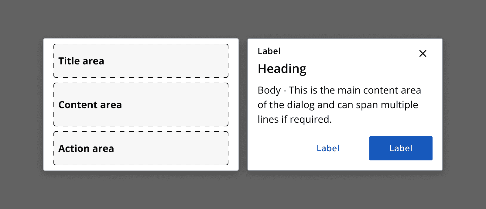
Always give dialogs a meaningful heading and describe the task that the dialog contains.
Add an optional label to a dialog to add categorisation or other secondary information.
Specify any content within the dialog's body section, but take care not to place too much information in a dialog if it is best placed as a page itself. Also, consider using a full page instead of a dialog when lots of interactive elements are required.
Always follow the
When adding interactive content to a dialog and it has popover elements, to avoid the elements being cut off within the content area, use the propdisableHeightConstraint
to allow the dialog to stretch to contain its content.