Empty state
Empty state
Component demo
Interactive example
When to use
Use an empty state component to communicate to people that no content is available to display. Use them to engage people and guide them on what is best to do next by including a button or a link to the next best action.
Empty states are used for many different reasons such as:
-
No content yet exists due to the first-time use of the functionality.
-
Data was not successfully loaded.
-
A query or search term yielded no results.
-
Data was removed resulting in nothing remaining to display.
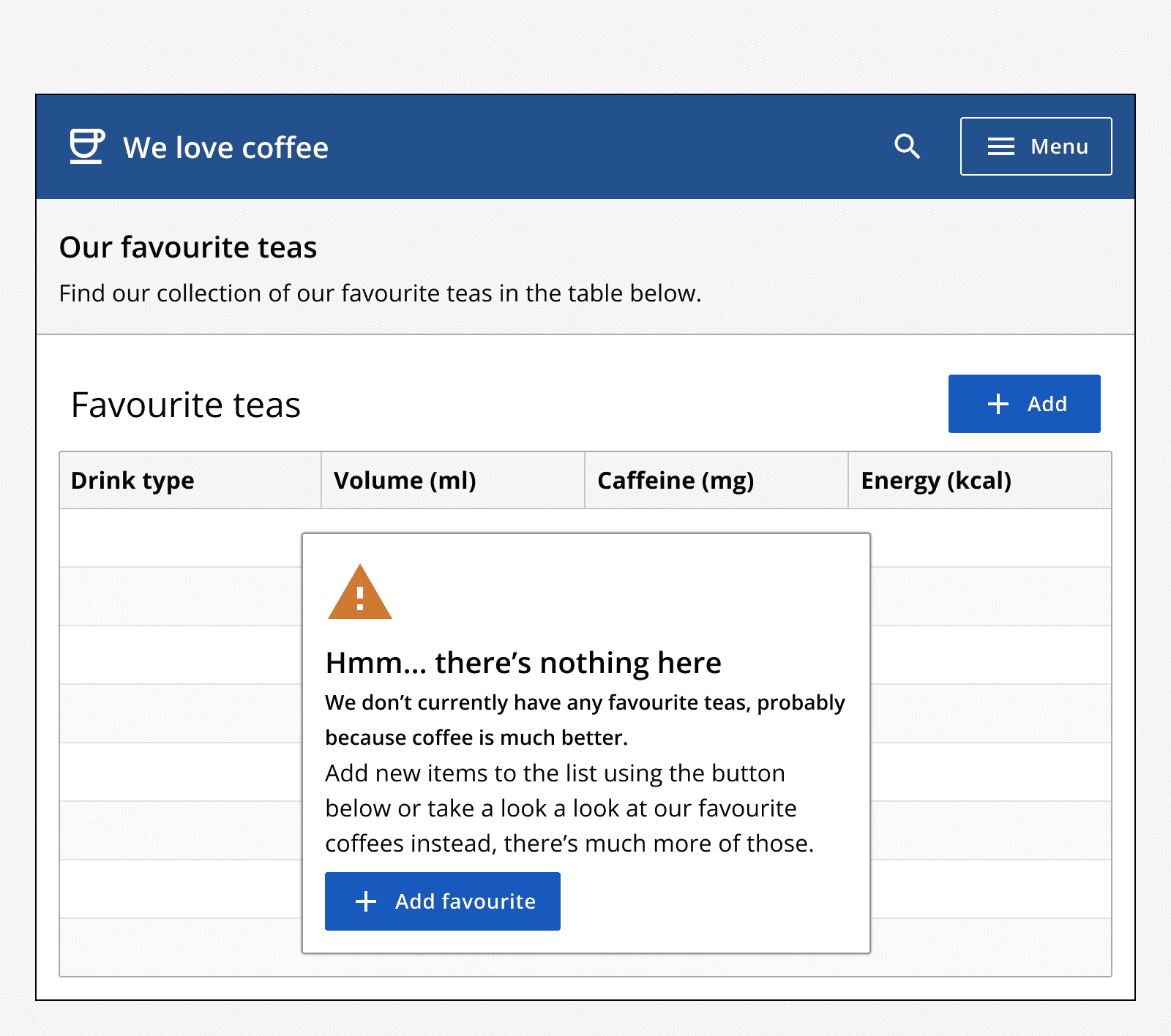
Use empty states when no data can be displayed in a component’s contents. For example, show an empty state when no data is available to display in a data table, or if a search term didn’t find any results.
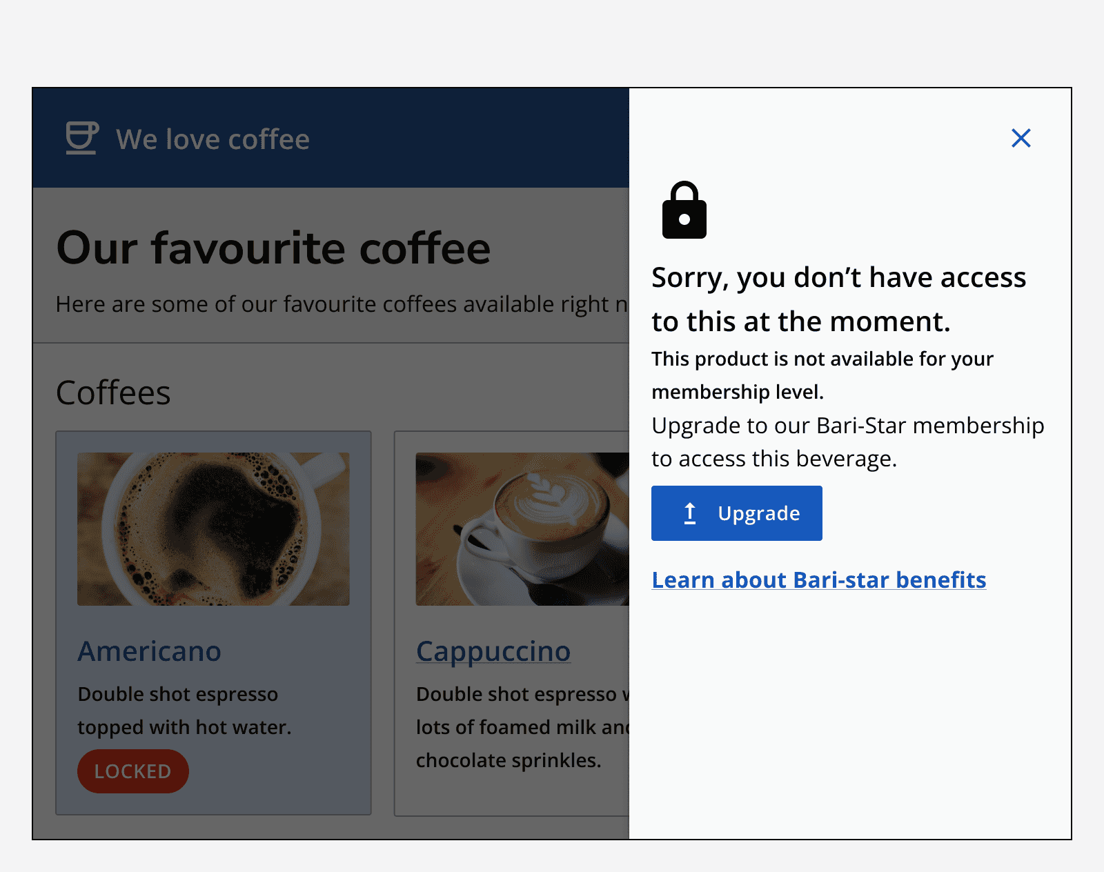
Use empty states to highlight access issues. If a user does not have access to some content, use an empty state to provide this messaging as well as a means of continuing.
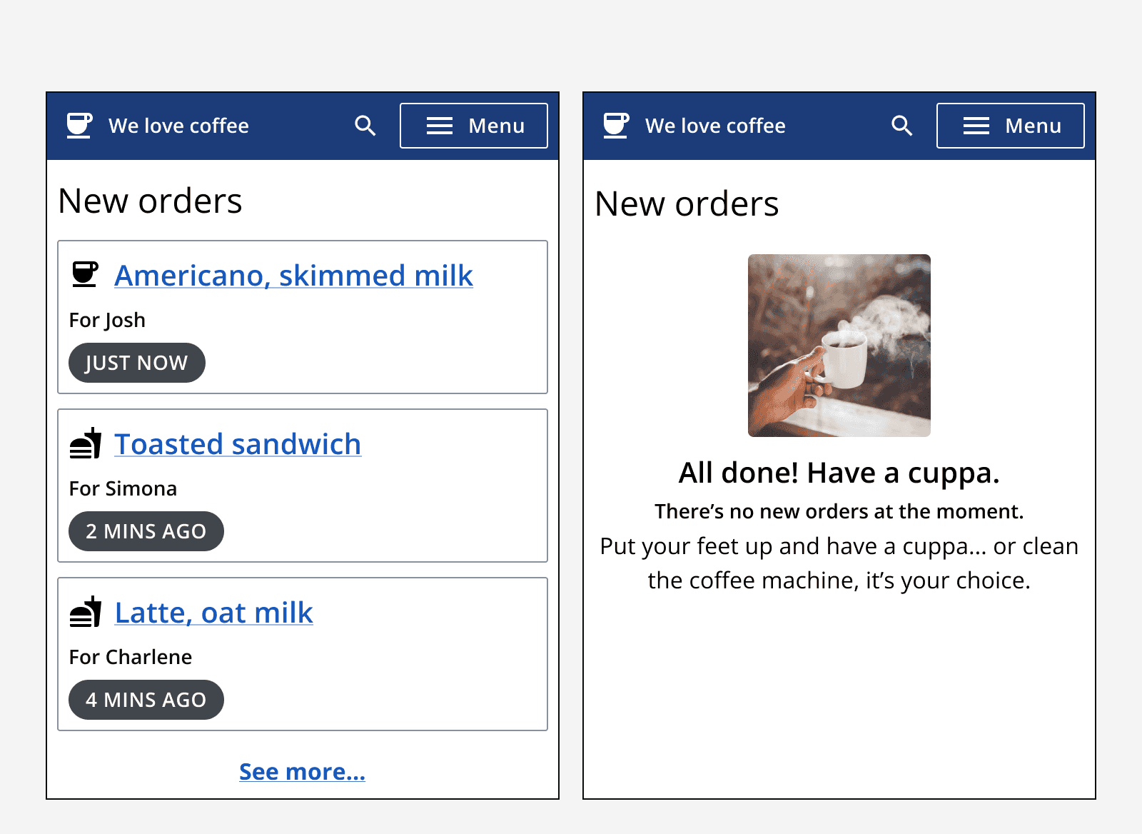
Empty states are not always due to errors, so use positive messaging as well. For example, in a to-do list app, all items might have been cleared and so the empty state message may be celebratory.
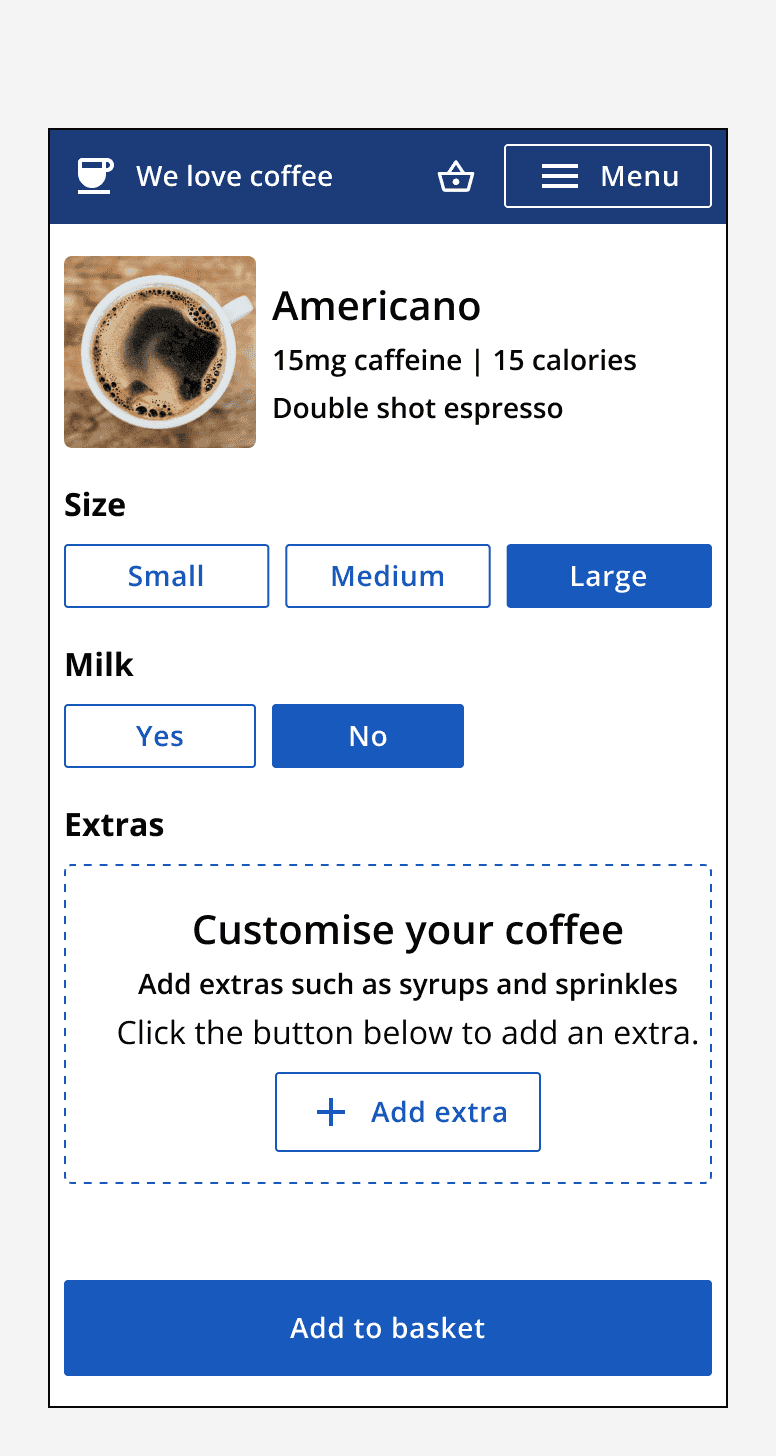
Use empty states as starting points for processes that require people to add input into an app. For example, a calendar entry may have no events yet, so use an empty state to prompt for an event to be added.
When not to use
Avoid using custom components instead of empty states. The empty state component creates an easily understandable, consistent method of indicating that no data is available and therefore what to do next.
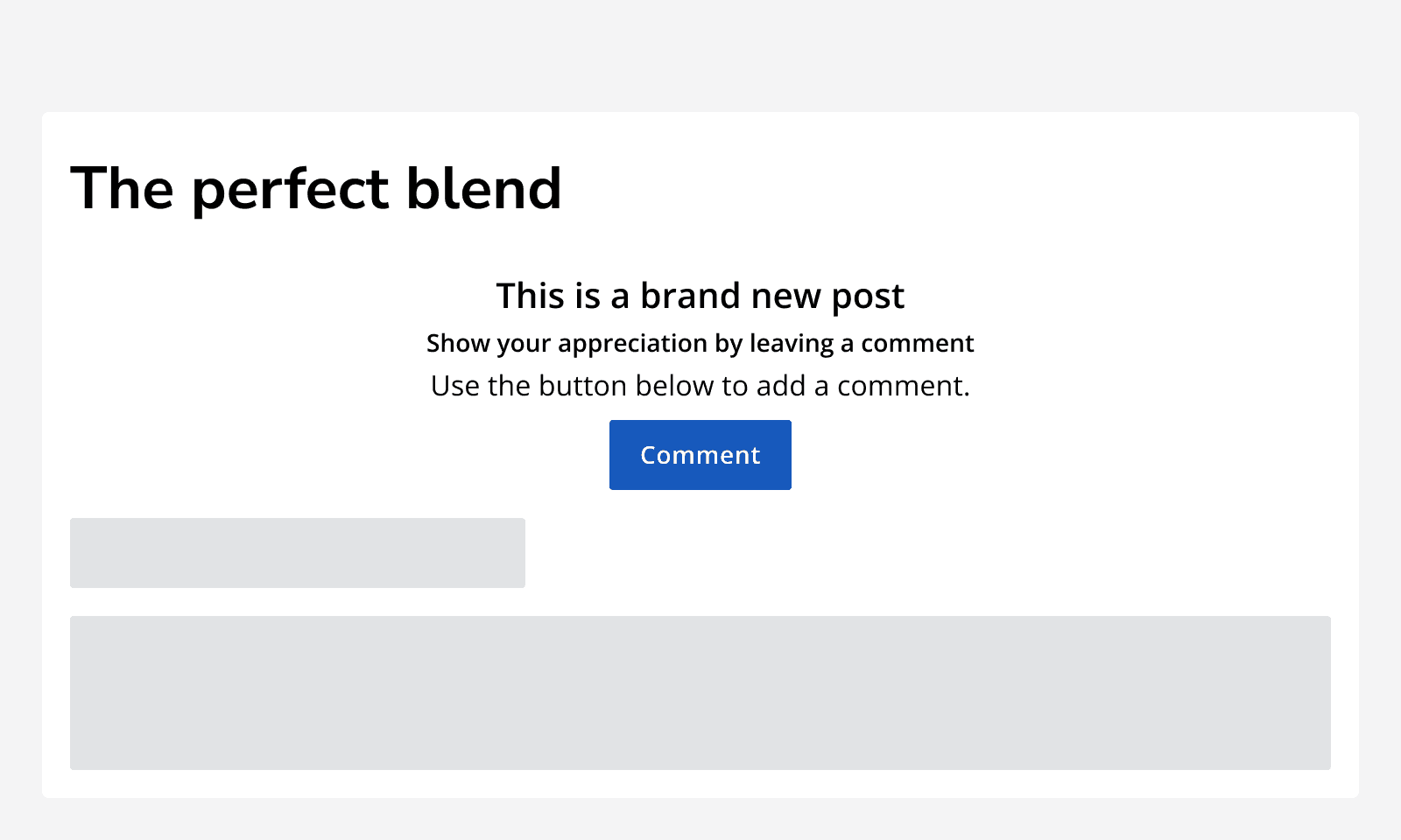
Don’t use empty states to communicate other messages to people that are not related to something being empty, use
Don’t use empty states to show error messages that could otherwise be displayed using other
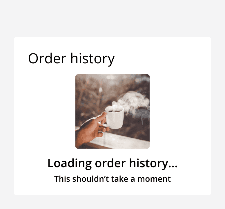
Don’t use empty states to indicate something is loading, instead use a
Sizing
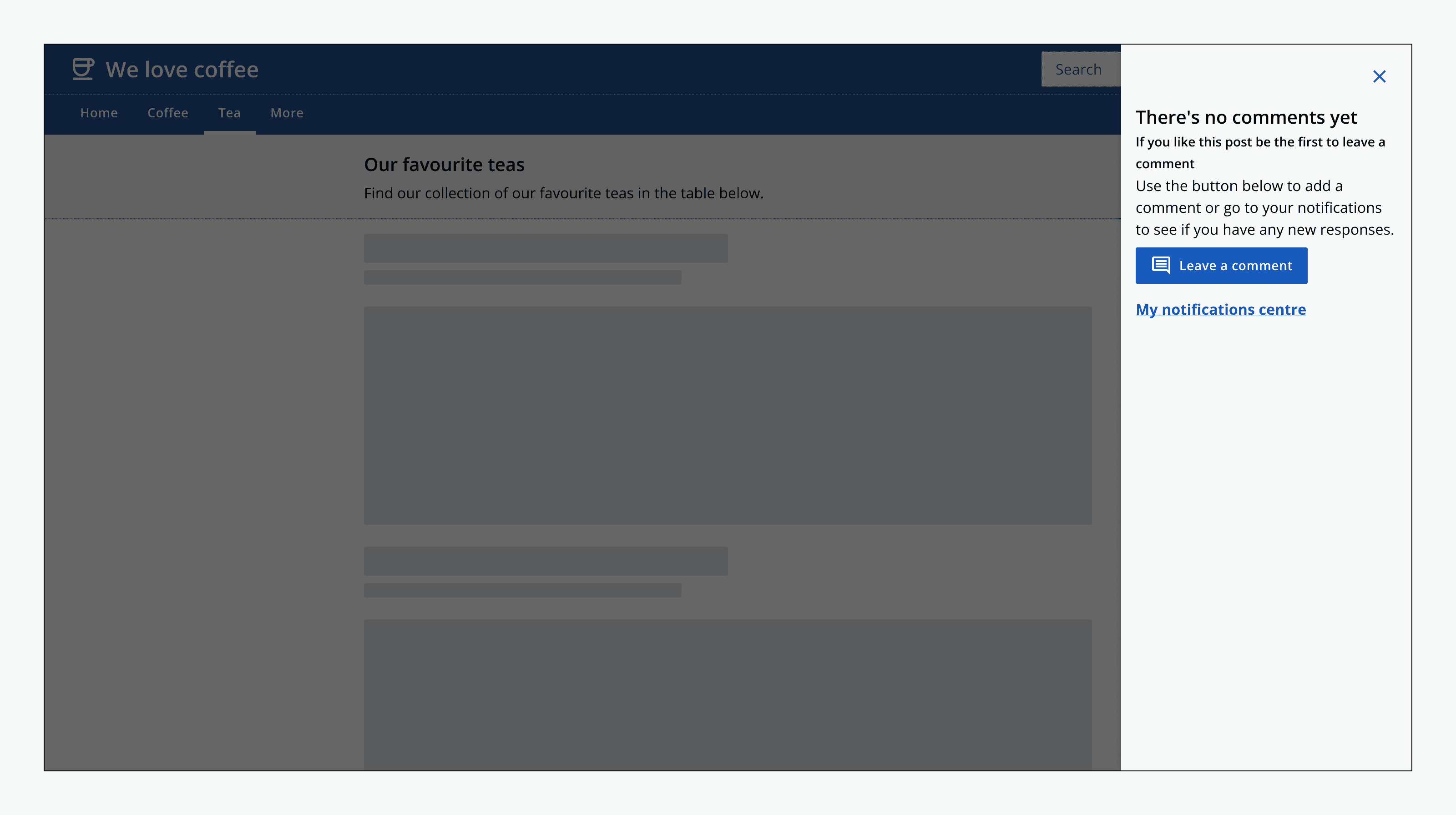
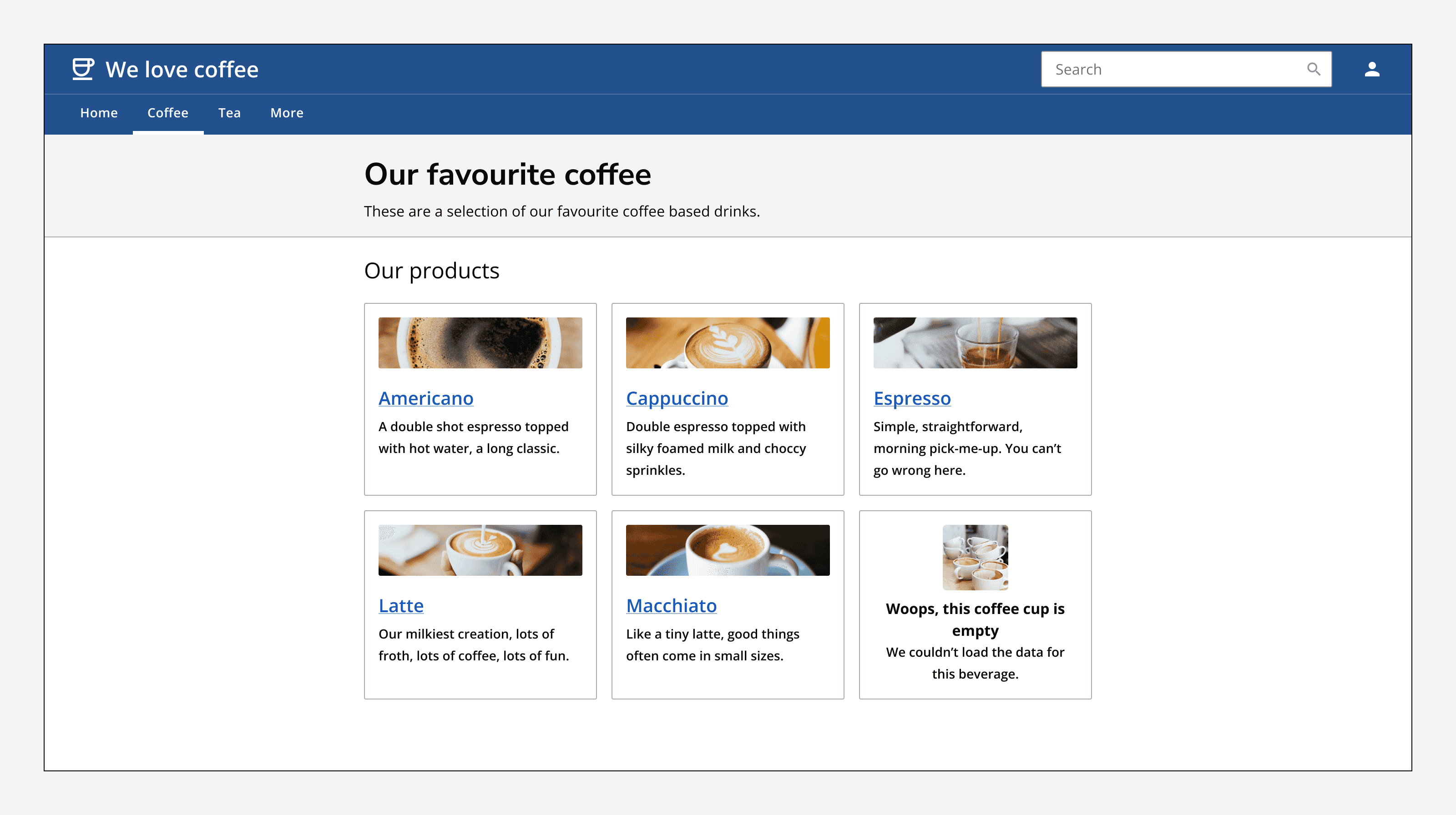
Embed empty states in components that would otherwise show data. For example, use them in containers, cards, dialogs or data tables.
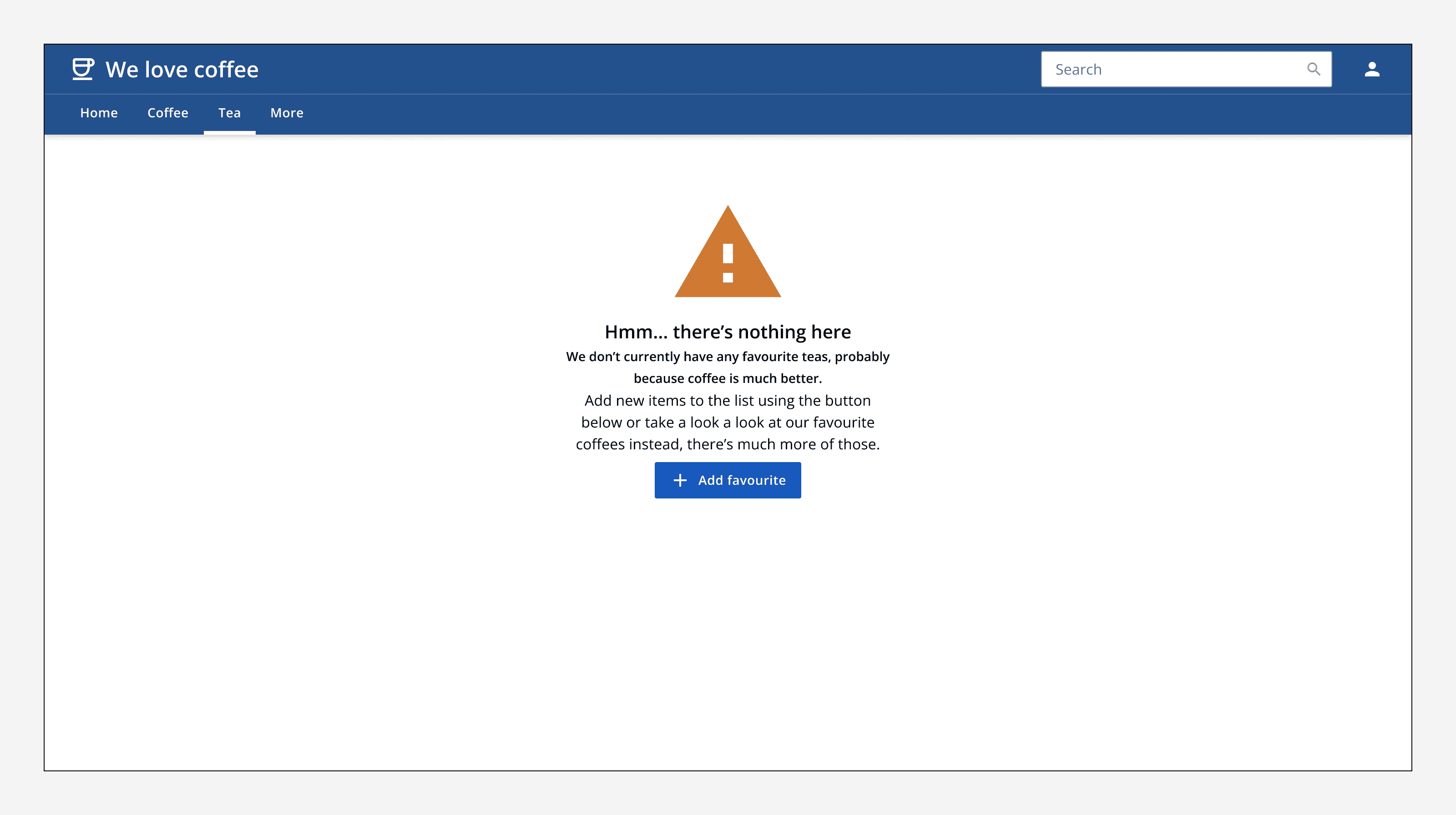
Use an empty state on a full screen in case something couldn’t be loaded, or there is no content available yet. For example, use an empty state to show a 404 message.
Layout and placement
Set the alignment of the empty state to match the component or container it sits in.
Place empty states at the top and don’t resize the container, keep it sized the same as if the primary content was displayed instead.
Content
Use the empty state to clearly communicate to someone what has happened, why they are seeing the empty state and what to do next.
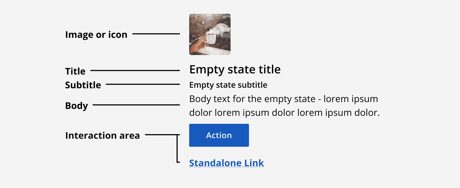
Add an illustration, image or icon to an empty state to provide additional recognition or reinforce the written message.
Use the empty state heading to clearly indicate the state of the empty content.
Use the subheading to add more detail and explain why this may have happened.
Use the body to explain how to rectify the issue, or to explain what is best to do next.
Use the interaction area to include actions and links that will help people to continue through the app. Always include either a primary button or a navigation link, and occasionally include a secondary button or link if other routes are possible.
However, avoid placing too many actions in the interaction area as this will cause confusion about what to do next.
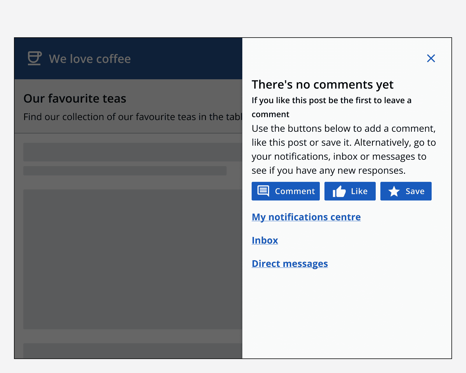
Don’t place other interactive components, such as inputs, in an empty state’s interaction area. If input needs to be collected, then do this on a full page or on a dialog.

Accessibility considerations
If an empty state is displayed as a result of a change on a page, make sure it is announced by a screen reader using a live region.